The World Wide Web: A Top Down Analytic View from Google
By:
Kim Clark
on 7/7/2011
Google has long claimed to be gathering information for the greater good. On each and every analytics profile I create, there is an option to “anonymously share information with Google“. This is something I believe in, since more data is directly related to better metrics. If we allow Google to see our data, to add our information to the larger group, the overall picture of the progression of internet trends is more complete. You can’t manage what you can’t measure. So I do share, with full faith that Google will use the information in a way that will eventually return the favor to me by making my job easier. By proxy, the results we generate for our clients become more successful and the decisions we help make more useful.
As a reward for my faith, I got an email from the good folks on the Google Analytics team last week that turned out to be the first of a promised series of newsletters for users participating in the shared data analytics project. This newsletter offers up some great information on the state of the web today as compared with a year ago.
I find this sort of information to be infinitely fascinating, and because I spend a good part of my work hours digging around in the minutia of our client’s web traffic reports, its interesting to me to see where our sites diverge from the norm and where they echo it.
Here are a few of the highlights shared by Google in their first newsletter: (the following content comes directly from the Google Analytics Team newsletter published on July 2nd, 2011. I did not write, analyze or interpret any of this information, I’m just sharing it.)
Site Metrics
Compared to a year ago, websites have seen reduced pages / visit, average time on site, as well as bounce rate.

Breakdown by Geography
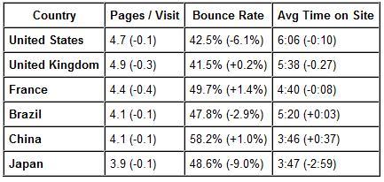
The anonymous database of websites has aggregated geographic breakdown at the country level. Here are a few representative countries and their respective aggregate metrics. The first number in each cell represents the metric for the date range 11/1/10-2/1/11. The parenthesized number is the Year over Year delta compared to a year ago.

Bounce Rate
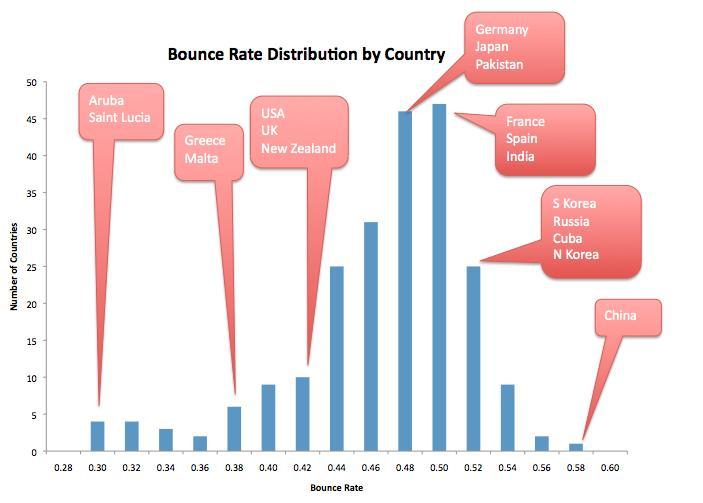
For bounce rate, the distribution by country is plotted below:

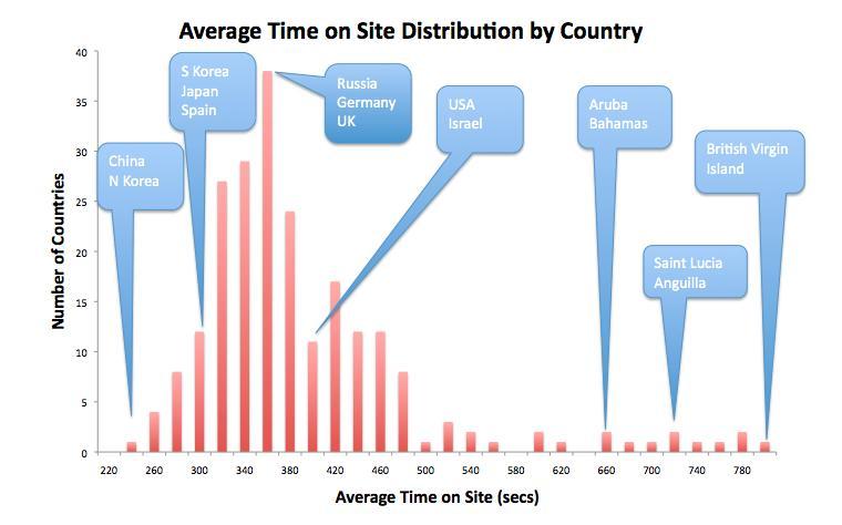
The distribution above is annotated with some countries — which seem to indicate a story of leisure and stage of economic development. For a related metric: average time on site, the distribution by country is plotted below:

The type of countries annotated in the average time on site graph above seem to be in reverse order as those in the bounce rate distribution.
*this makes since in that if bounce rate is an indicator of content not meeting the needs of the user, time on site indicates happy users that stay longer. I also find it interesting that the countries that spend the most time on site, on average, are countries in the Caribbean that prescribe to a phenomenon known as “island time”. Island Time means things happen at their own pace, whenever they get around to it. Very much the opposite of our American “everything happens right now” culture. *
These simple charts have given me lots to think about, and will fuel much conversation over the coming weekend, I am sure. I hope it does the same for you.
Related Posts
Press Release: Louisville Web Design Firm Launches Four New Websites
By: Kim Clark on 8/11/2009
VIA Studio is proud to announce the launch of 4 new websites.
Read More »Revamp Your Reporting with Google Data Studio
By:Ben Wilson on 2/27/2019
This is a 2-for-1 deal! We'll share some insights into making your marketing and website reporting more effective and quicker to produce, and show you how to incorporate Google Data Studio into this process.
Read More »
