Revamp Your Reporting with Google Data Studio
This quick guide is a 2-for-1 deal! We’ll share some quick insights into making your marketing and website reporting more effective, easier-to-read, and best of all, quicker to produce. Secondly, we’ll talk about the awesome and free Google Data Studio, which we think is the perfect tool to help.
How to Revamp Your Marketing and Website Reporting
- Always be re-assessing your reporting
- Focus on key metrics and trends
Always be re-assessing your reporting
Here are some good clues that it’s time to re-assess your reporting:
- If you are kicking out reporting, and no one is asking questions…
- If you’ve been reporting for 6 months or a year, and your reporting process or structure hasn’t changed…
- If you’ve gone three reporting periods and none of your recommendations have been implemented…
That re-assessment could be the depth or frequency of your reporting, or perhaps the metrics on which you report.
Focus on key metrics and trends
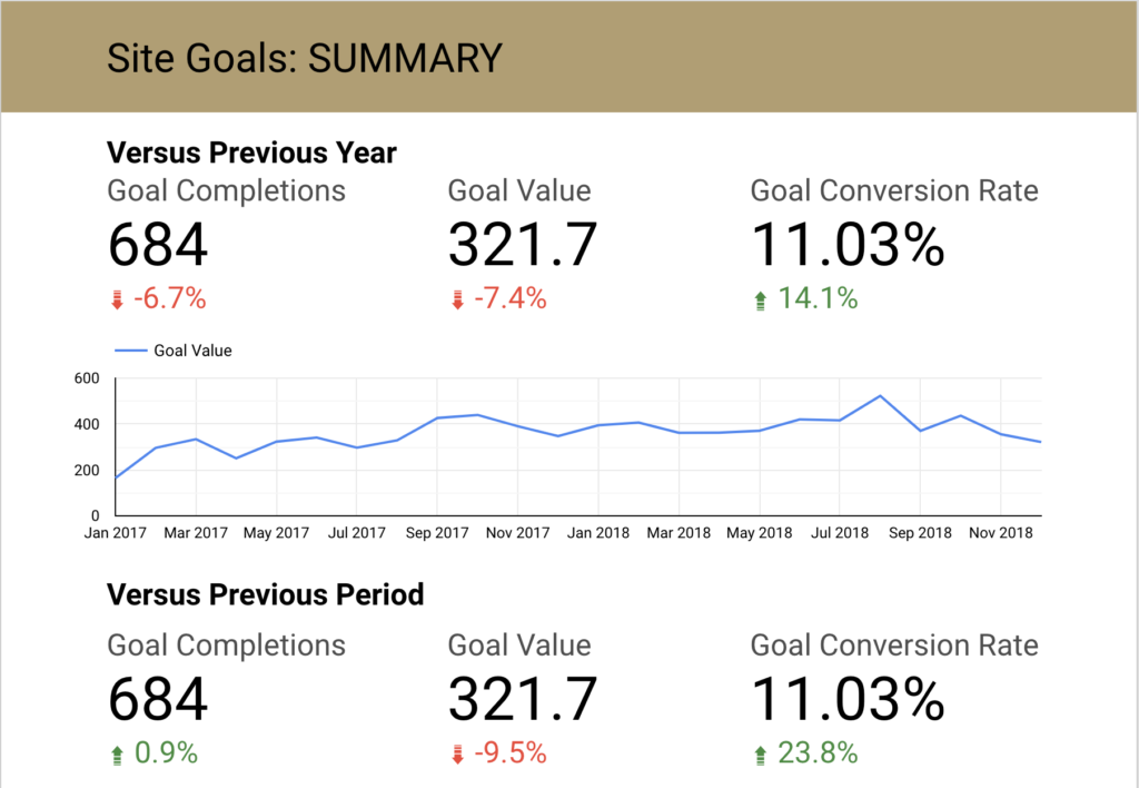
One of the best ways to make your reporting effective is to find and focus on important, key metrics. In 90%* of cases, this will be a discrete conversion. For e-commerce, that might be transactions. For B2B sites, that’s often lead generation. Lead with that. To go one better, report on those key metrics over time, and identify trends.
What this looks like in reality might be like what we do for a B2B client of ours, where we track contact form submissions, email link clicks and phone calls. Each one of those conversions has a value that arbitrarily determined, but valued according to how important each is to the organization. Even though that number might not have a real-world profit context, just having some sort of consistent measurement month-to-month gives us the perspective we need to identify trends.

* Educated guess. If 10% of people are left handed, and I think about all the people I know who are left handed versus all the righties, and then think about all the projects that I report in the same way… that roughly equates. Also, I’m left handed so 10% might be high because of my literal left-leaning bias.
Using Google Data Studio for Fun and Profit
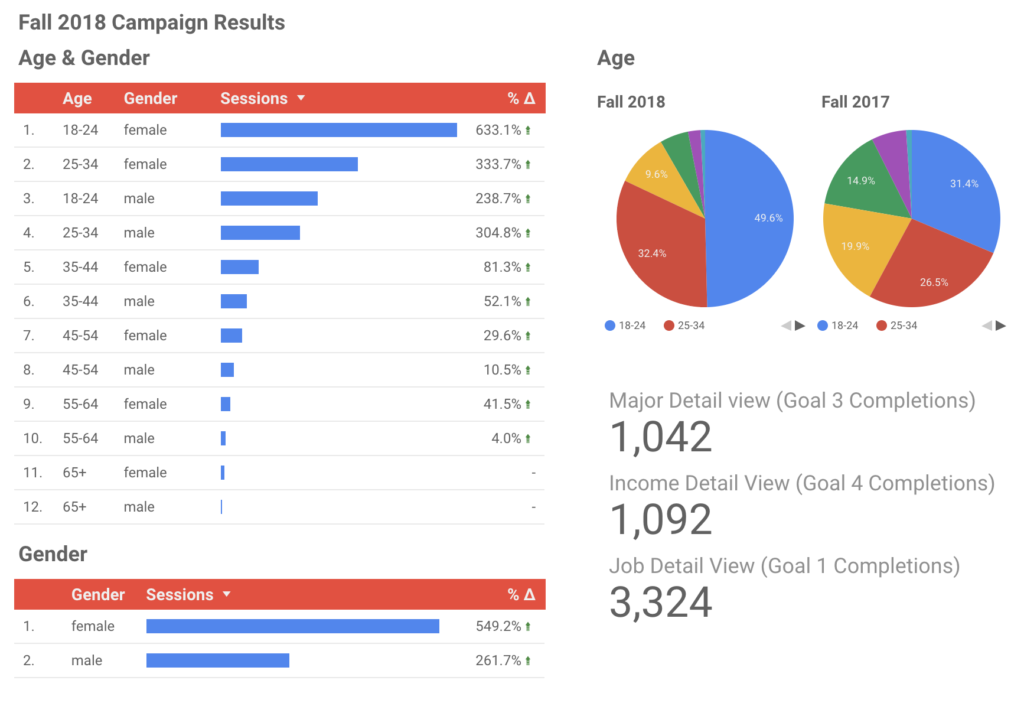
At its core, Google Data Studio is a drag-and-drop data visualization tool to which you can connect Google Analytics, Google Ads, and a ton of other data sources.
In concert with the concept of focusing more on key performance metrics I mentioned above, Google Data Studio has completely retooled how we report here at VIA. Here is some background on why we use it and how
Why Google Data Studio?
Three big things:
- It’s super easy to create custom visualizations from live data – and viewers can control the date range (if you choose)
- You can style it as you see fit (e.g. customize it to the client, or yourself)
- You can export it to PDF
How do we integrated it into our reporting process?
I’m not gonna lie, starting a Data Studio dashboard from a blank canvasand zero experience would be “a steep learning curve”. So, instead, I would recommend getting your hands dirty with some of the stock templates for Google Analytics Website and Google Ads reports.
Creating a dashboard from a template (essentially duplicating a dashboard) is a snap and you can easily switch data sources (e.g. switching from Google Analytics from SiteA.com to SiteB.com), and generally all of the data visualizations will still work.
After having used Data Studio for the past 2(?) years, we now have many templates to pull from – whether it’s an e-commerce site, a “brochure” site or maybe a combined dashboard for Analytics and Google Ads together.
Customizing the dashboard is also fairly straight-forward – you can adjust the theme type and colors and drop in images for logos, etc.

What Google Data Studio is NOT good at
Data Studio is NOT a place where you should record your insights and recommendations on the current reporting period. It has zero functionality for recording or annotating. I mean, I guess you could slap down a text block with your Q2 recommendations, if you wanted, but the formatting options (and frankly the space and the UX for long-form writing is just not great).
To account for this, we use Basecamp to record the highlights, insights and recommendations and I will both link to the LIVE dashboard and provide the PDF snapshot of the dashboard alongside my reporting.
** Well… when I say “super easy”, I mean “after you’ve given yourself 2-3 hours to play around with it”
Ready to get started?
It’s free, so you might as well give Google Data Studio a shot - though perhaps have a reporting subject at hand, otherwise you’ll be staring at a blank canvas.
To learn more, here are some tutorials: This is a comprehensive GDS tutorial from Jeffalytics, which is very tuned to their own reporting ethos, while on the other hand this very brief GDS tutorial is from SEER Interactive, is very straightforward, but provides links to other resources.
Related Posts
Press Release: Louisville Web Design Firm Launches Four New Websites
By: Kim Clark on 8/11/2009
VIA Studio is proud to announce the launch of 4 new websites.
Read More »Getting Started with Google Data Studio Data Blending
By:Ben Wilson on 4/8/2019
Google Data Studio launched Data Blending last summer. This handy tool allows you to blend two different data sources together into a single data source - and then visualize it. Here's a quick look at how you can use it.
Read More »

