Getting Started with Google Data Studio Data Blending
Google Data Studio (GDS) is a free, powerful tool to help you visualize your data (notably Google Analytics and Google Ads) on your terms. We did a short post on it earlier this year – Revamp Your Reporting with Google Data Studio - which if you are just getting started with GDS, I would that read first.
Today – we’re here to talk about a super powerful tool that GDS launched last summer – Data Blending. It’s exactly what it sounds like – you can blend two different data sources together into a single data source – and then visualize it.
Stop me if you’ve heard this one
You have a client that has both a website, and that website has ecommerce (or maybe even a related point-of-sale system), and you are driving traffic through digital advertising and an email system like Mailchimp. All are facets of your business, and each plays a crucial role.
You create individual reports for the website (1), each ad platform (2,3), the email system (4) and the point-of-sale system (5). Maybe you do this reporting by hand, exporting from each system or maybe you’ve read our article from above and put it into Google Data Studio. You’ve got nice, bright, shiny graphs and pie charts for each platform.
That tells the story pretty well for each facet of your business – individually. But together? That’s another story, and one you probably have to spend a lot of time manually crafting. Maybe something like this:
“Since we saw an uptick in Mailchimp click-through-rate (CTR), we saw an uptick in site traffic and foot traffic in the store. That drove sales up. Refer to charts A, B, C and D.”
Unless you spend a lot of time manually importing data into a spreadsheet or another data viz tool – there is no way to see the through-line in the data. And even if you do do that, you have to repeat the process every week, month or whatever to keep those up to date. And then you have to export it or send it to your client. UGH.
…and this is where Data Blending comes in.
Blending data in GDS is pretty easy. You will need at least two data sources, and those two data sources need at least one field in common. These are call “join keys”
Key concept: As long as your two data sources have a common field, you can blend them together.
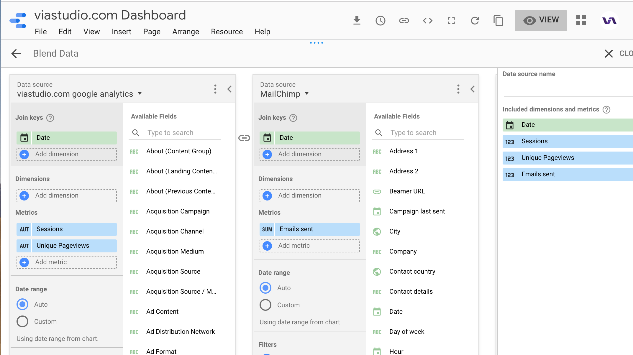
For example, below we have our viastudio.com Google Analytics on the left, and I’ve also added our Mailchimp account as a data source. Both have a “Date” field, and I’m using that as the “join key”.
To be able to visualize the effect of our Mailchimp email sends on website traffic, I’ve added Sessions and Unique Pageviews from Google Analytics and Emails Sent from Mailchimp.

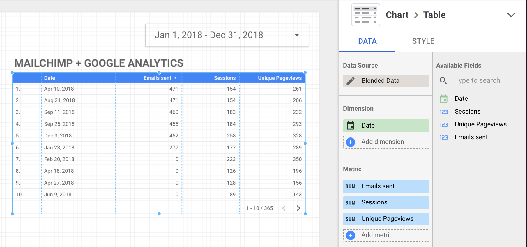
You can then use your new Blended Data Source to feed into one of GDS’s data charts, like this table:

Or, a time series that helps us visualize the effect of email sends on our site traffic:

Conclusion
The above is a fairly simple example – just two data sources. However, the idea that you can now make your data sources RELATIONAL (e.g. like a real database) opens a world of possibilities for the free tool that is Google Data Studio.
Related Posts
Press Release: Louisville Web Design Firm Launches Four New Websites
By: Kim Clark on 8/11/2009
VIA Studio is proud to announce the launch of 4 new websites.
Read More »Revamp Your Reporting with Google Data Studio
By:Ben Wilson on 2/27/2019
This is a 2-for-1 deal! We'll share some insights into making your marketing and website reporting more effective and quicker to produce, and show you how to incorporate Google Data Studio into this process.
Read More »

