Provi
A new brand and identity for a start-up and leader in the beverage alcohol industry.
The Challenge
Provi is modernizing the three-tier industry to bring simplicity to how people communicate and place orders. The historic industry is as much celebrated as it is fast-paced, evolving, and interconnected — and joining the three tiers into a seamless experience is why Provi exists.
Initially, Provi came to us needing a refreshed brand, but a short time after we began, they acquired a major competitor, SevenFifty, and the project quickly evolved into something more ambitious. This acquisition solidified Provi’s position as a major player in the market, and thus called for a new positioning, identity toolkit, and a much more comprehensive brand guide — so we raised our glasses to the challenge, rolled our sleeves up, and got to work.
We gave Provi the tools to communicate its place in the market and the value its tools offer in a multi-tiered, highly competitive, and federally regulated ecosystem.
The Concept
We were deeply inspired by the compelling truths of Provi and their newly acquired company as told by those closest to the two brands — their stakeholders. The beverage alcohol industry is tightly-knit and run by passionate folks who believe in bringing people together through libations.
One aspect that really sets Provi’s new brand apart from its competitors is just that — careful consideration of the industry. We saw the need for a brand concept, identity, and messaging that captures both the essence and needs of the industry. Through a competitive industry analysis, we were able to understand their position in the market relative to their competitors. Provi’s ability to seamlessly connect all three tiers of the industry and make ordering easier for everyone is notably their biggest UVP.
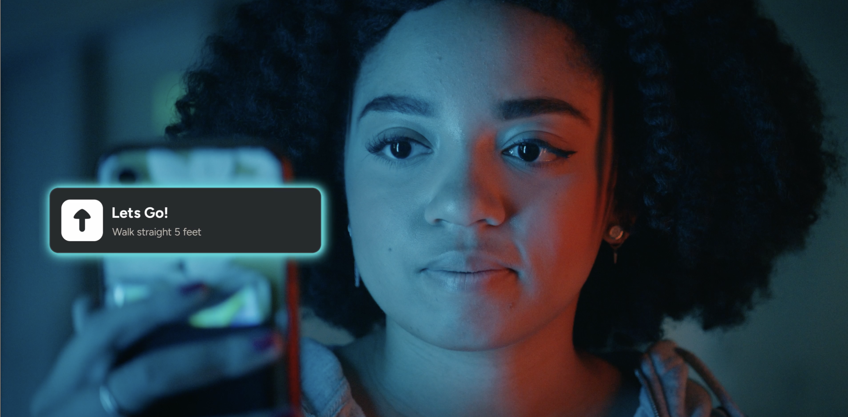
We developed a brand concept — Simple Connection. The new concept leans heavily into an all-in-one marketplace where buyers, distributors and sales reps, and suppliers, can communicate and manage orders quickly and more efficiently than ever before. Because Provi eliminates the need to juggle texts, phone calls, paperwork, and email, using the marketplace is much more intentional and enjoyable. Provi believes that simplicity, organization, and structure free up time to build, maintain, and grow relationships in one of the busiest and most historic industries.
It was crucial that the simplicity and connection be carried all the way through their visual identity, messaging, and website. Doing it while weaving certain aspects of SevenFifty into the brand and communicating Provi’s value to prospective customers and partners was no easy feat. Find out how we did it.

Color Palette
We incorporated blue while working in complimentary colors that are vibrant and stand out. We developed combinations that fit the industry — green (olives) and orange, (blood oranges) and tested them in layout for maximum contrast. The final palette was an evolution from their old brand, and allowed flexibility to be easily translated into their app while feeling fresh and full of energy.

A New Logo – The Result
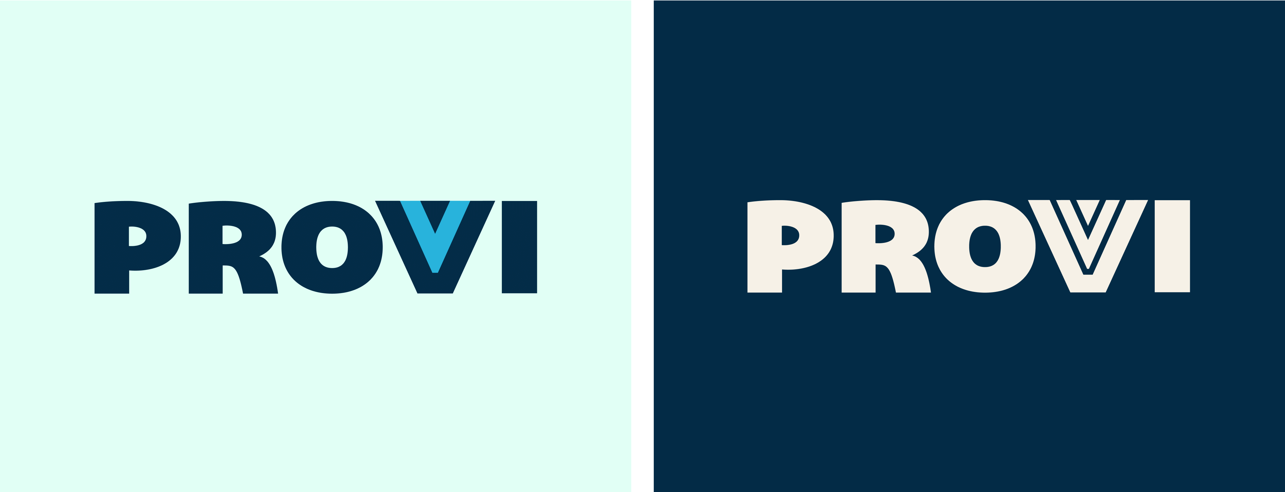
For the final logo and mark, we incorporated a lighter blue that separates the two darker blues in the “V” as a nod to the industry's three tiers. The full martini glass alludes to the idea of a glass always being half full.

We created a strong supporting mark that could stand alone and be used when a user has already been exposed to the brand which led to the creation of a super “P” logo that pulls out the “P.” It’s stylized to look cape-like, supporting the idea of Provi’s simple strength and one-stop shop for all three tiers of the industry.
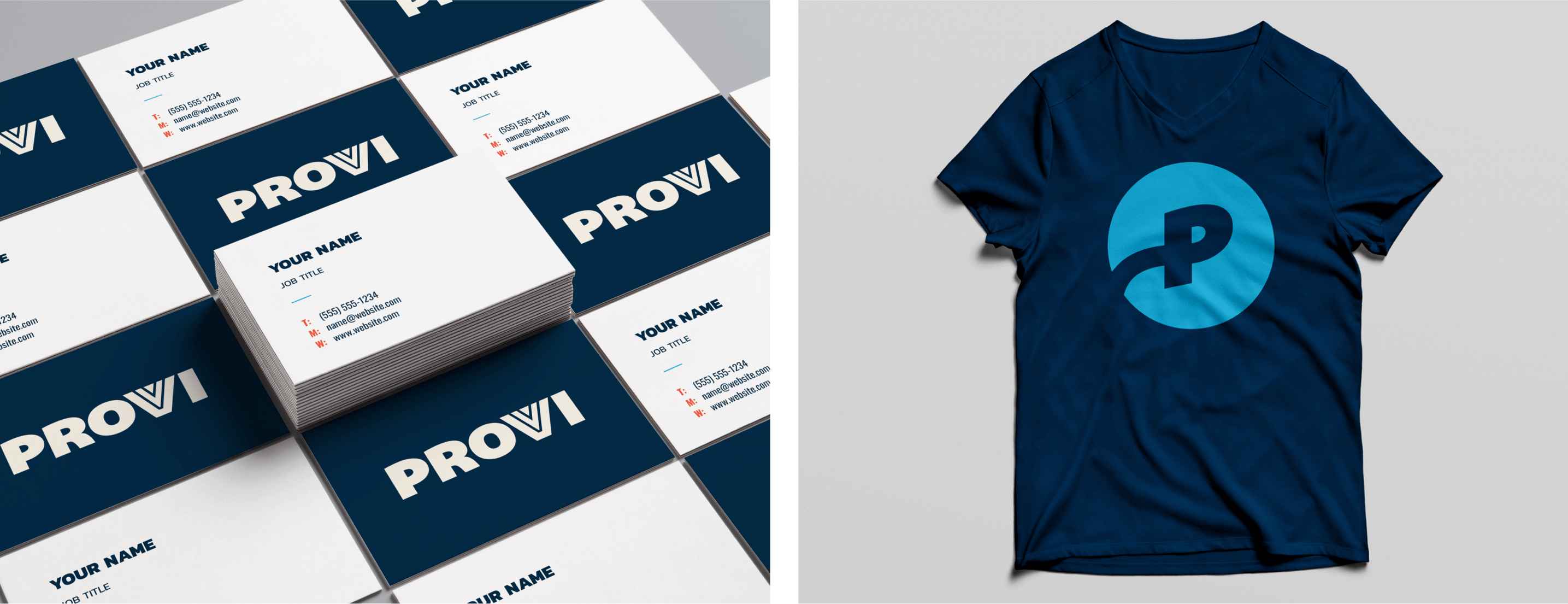
Illustration: A Human Touch
Having human elements in illustrations is important to Provi. The illustrations draw inspiration from vintage packaging and marketing materials as a nod to the history and tradition of the industry, with a modern twist.
The two elements in each illustration represent the two sides of the business — relationships, and connection. We represented and paid respect to the tiers at different handoffs to bridge the gap between them. Whether it’s a distributor working with a consumer or retailer, or a supplier working with a distributor, these audiences will understand that connection in the illustrations.


Content Strategy
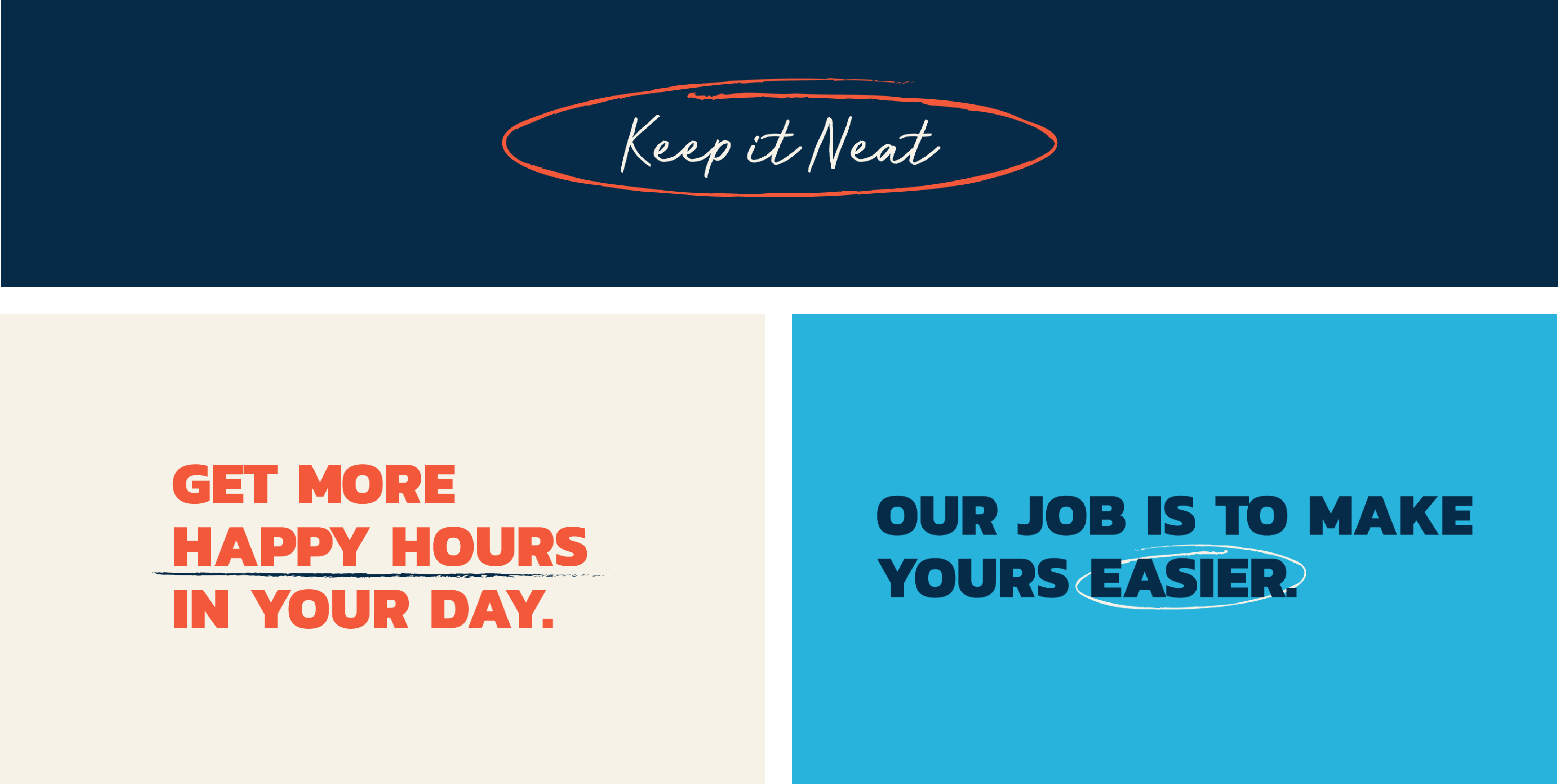
"Mindset" is important to a Voice and Tone guide. It views messaging through a positioning lens, and provides a structured way to think about the organization and their place in an evolving industry.
After a comprehensive Voice and Tone guide was established, we created messaging samples to be used in various marketing materials and mediums. Provi’s tone is different for the four audiences in their industry, which is why creating messaging samples was key, particularly in the development of website content.
Another critical and challenging aspect to consider in this phase was the acquisition of SevenFifty and its publications. Combined, the two brands have a total of four publications.
By the end, we not only defined the positioning of the four publications, but also established publication hierarchy, differentiated their positioning and content, and gave them cohesion in standing together under the parent brand, Provi.
Website
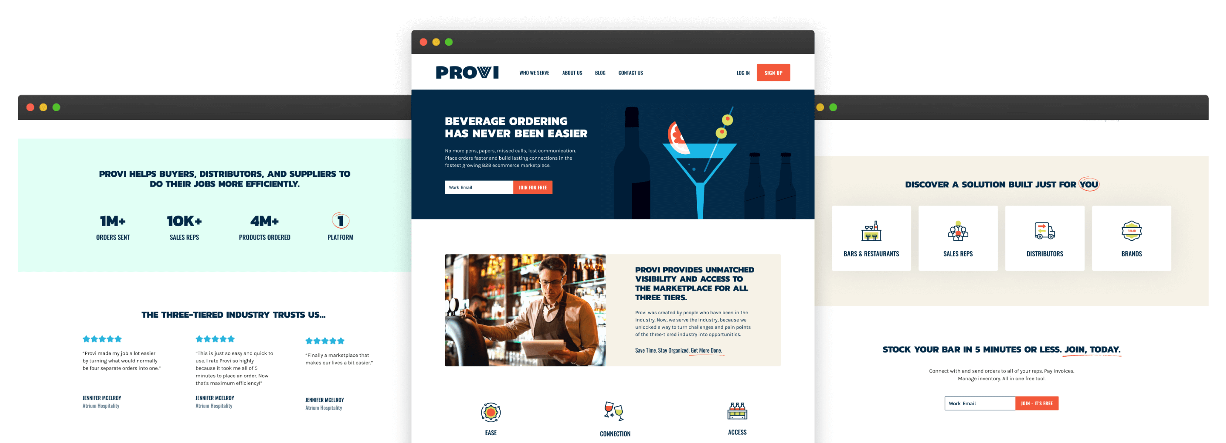
Elevating their marketing website was a major goal of Provi’s so we provided them with designs, copywriting, and direction for the initial website.
We achieved this by creating a fully built-out comprehensive design and component system. Flexibility and scalability were the main factors in the modular solution we provided.
Conclusion
Our immersive branding process delivered to Provi critical insight into creative and messaging that will allow them to communicate and scale for years to come.
Contact VIA today to discuss your branding needs.
