The Challenge
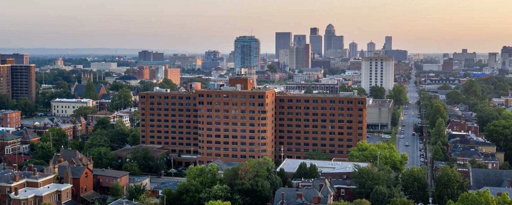
Since the first resident made Treyton Oak Towers their home in 1984, TOT’s (as they call themselves) mission has always been to provide a “complete continuum of care” for a diverse community of seniors and to do so with excellence that is second to none. And that’s exactly what they have done. This hidden gem in the heart of Old Louisville has provided seniors a community in which to live an independent lifestyle as long as possible, and continues to provide a warm and comfortable home as their needs change.
What TOT needed assistance with was communicating their unique values and authentic community to their audience, in an increasingly competitive marketplace. Their messaging and marketing efforts did not reflect the welcoming and personable reality that lies just beyond their front doors.
Together, we helped reimagine and reposition their brand to reflect their true selves and arm them with the refreshed marketing tools they needed to reach prospective residents.

Brand Strategy
In late 2018, we began the process of re-imagining the Treyton Oak Towers brand. As we do with any client, we start at the foundations of the organization and attempt to understand them deeply. In doing so with TOT, we collaboratively identified the values they are most passionate about, that their community members value the most, and the unique aspects that differentiate them in a crowded market. These were their Unique Value Propositions (UVPs):
- A locally-rooted, authentic non-profit
- A rich, supportive community of residents and staff
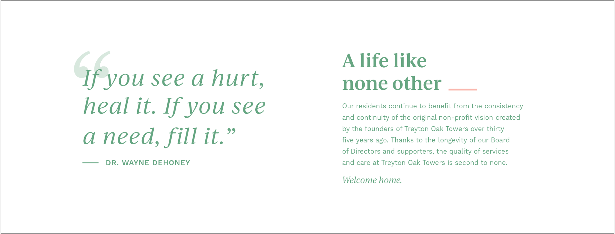
- Culture like none-other
When we are dealing with critical subjects such as aging, security, and housing – these values must be real and not aspirational. They are the truth of the brand.
We then detailed “personas” for their prospective audiences. A persona is demographic and psychographic sketches of a prospective resident, the audience they are wishing to attract. This led us to some critical insights that refocused their marketing efforts on seniors who year by year are becoming more and more independent and technically savvy.
With their unique values and our prospective audience in hand, we defined a new brand concept for Treyton Oak Towers:

Brand Identity Refresh
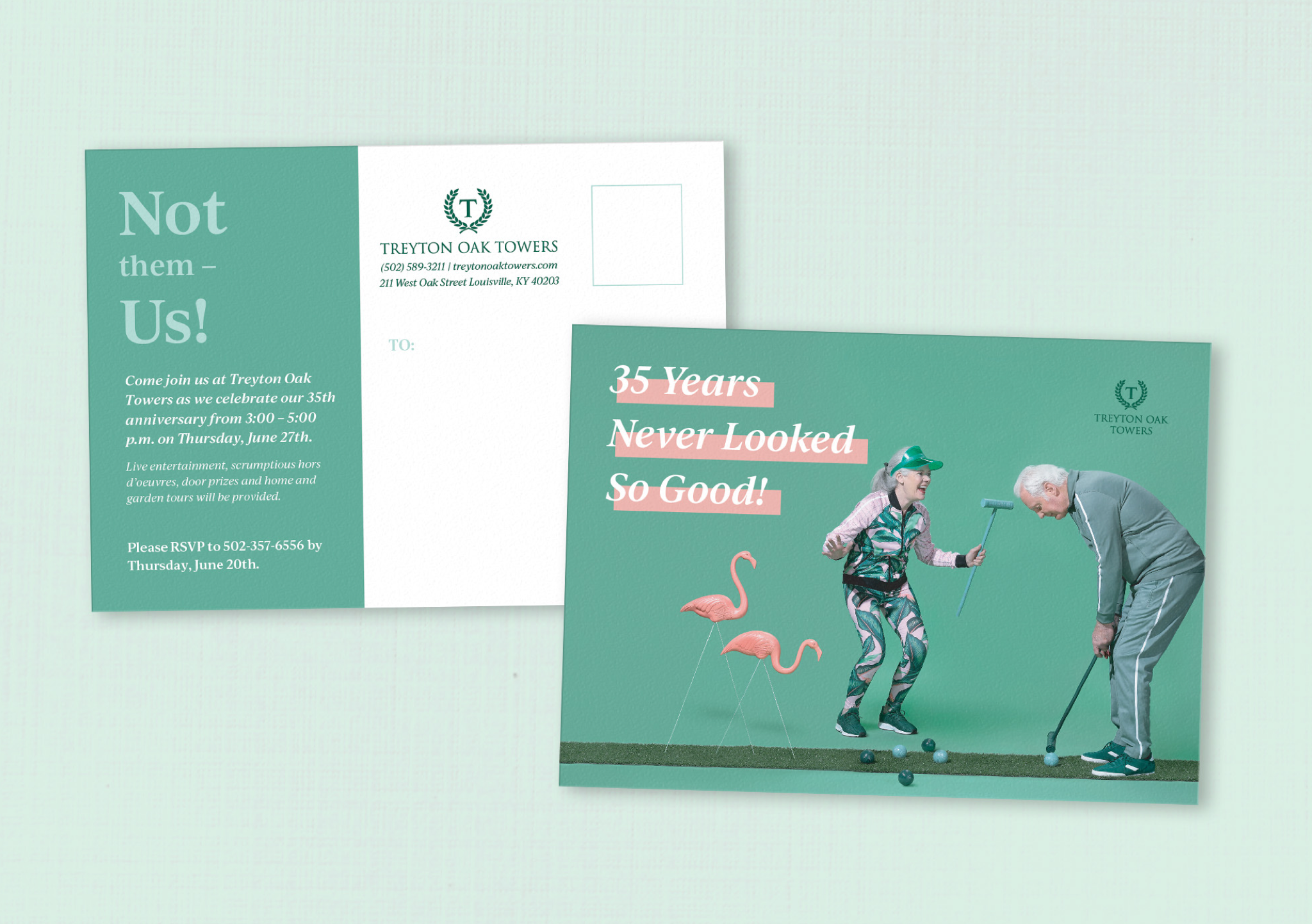
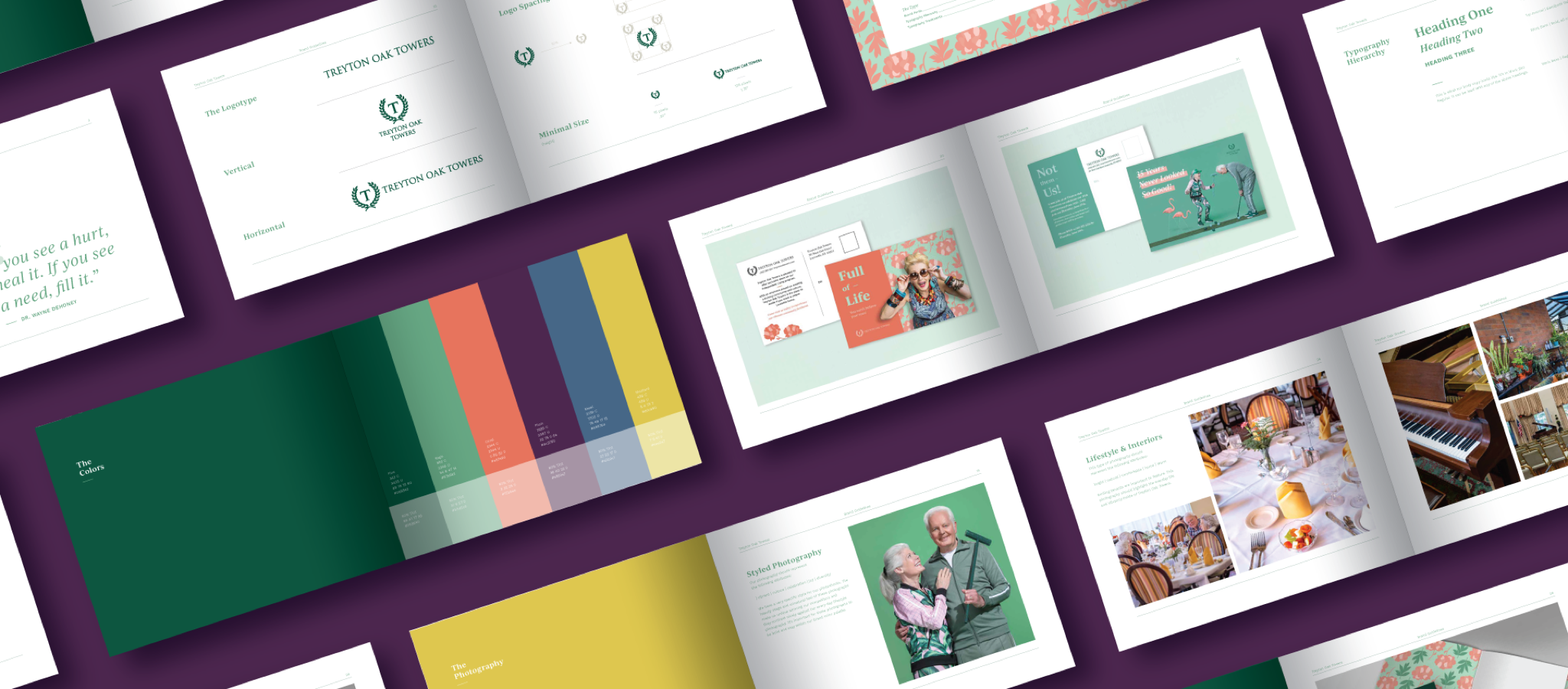
Treyton Oak Towers and the seniors who reside there are unique and special, and their branding needed to communicate that. They needed lively and original visuals to support their focus on the arts and commitment to cultivating a rich, diverse culture.
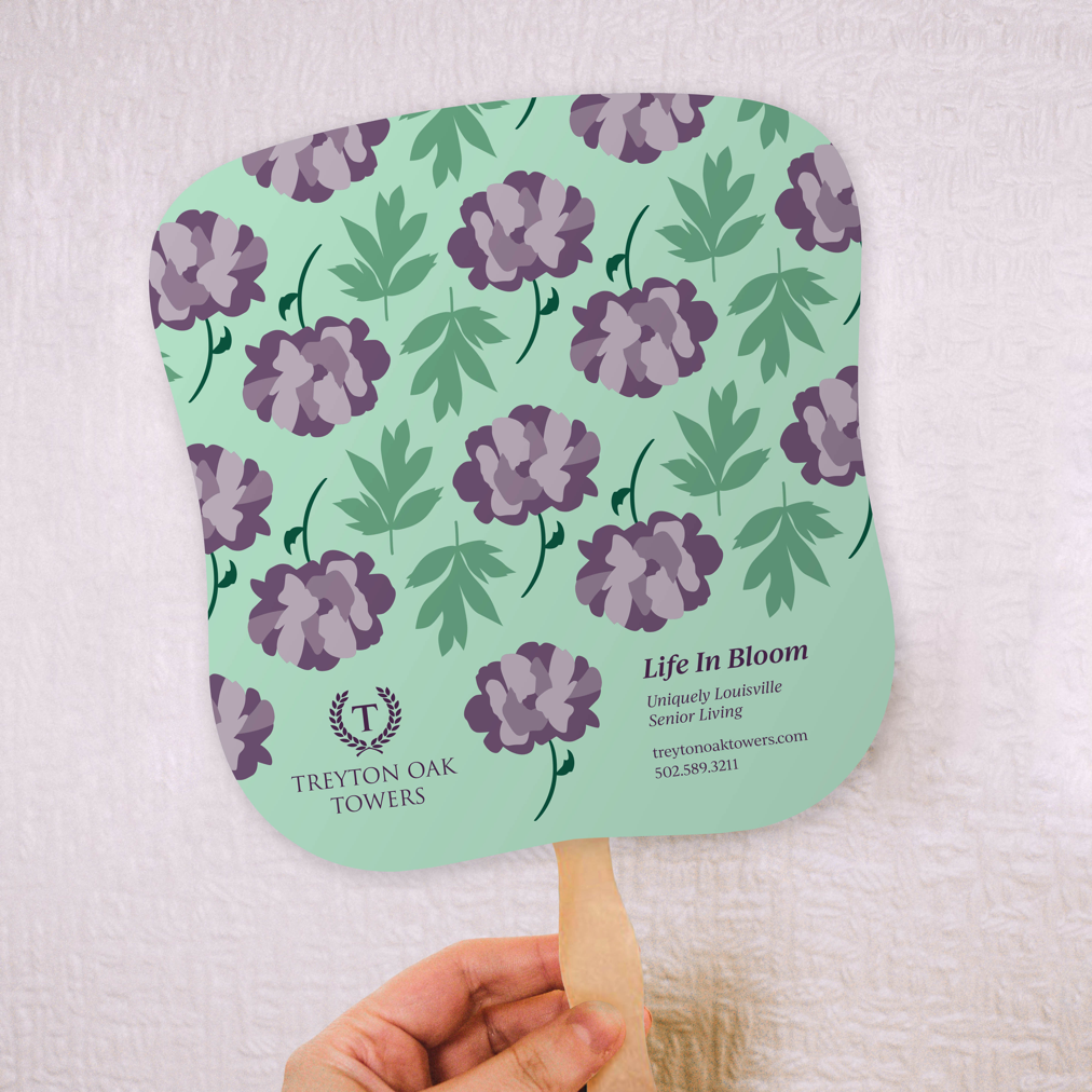
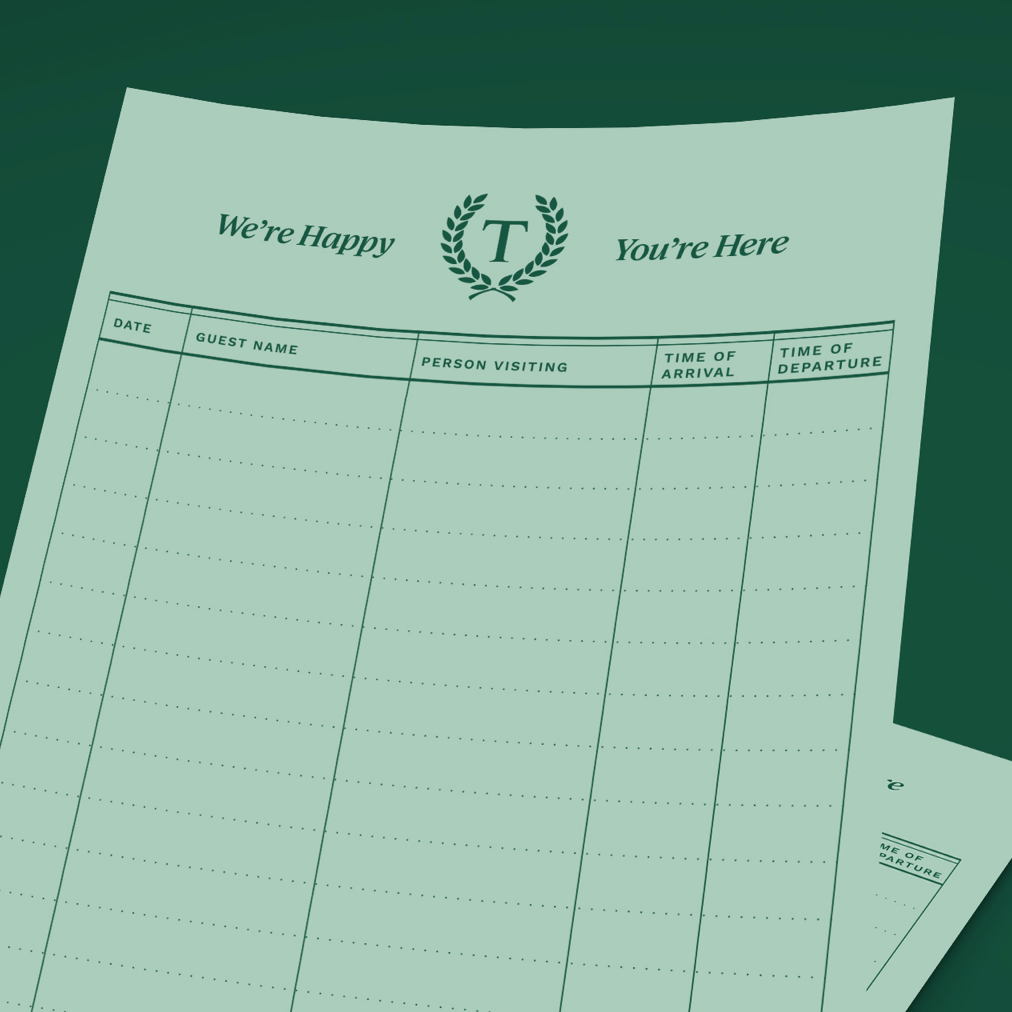
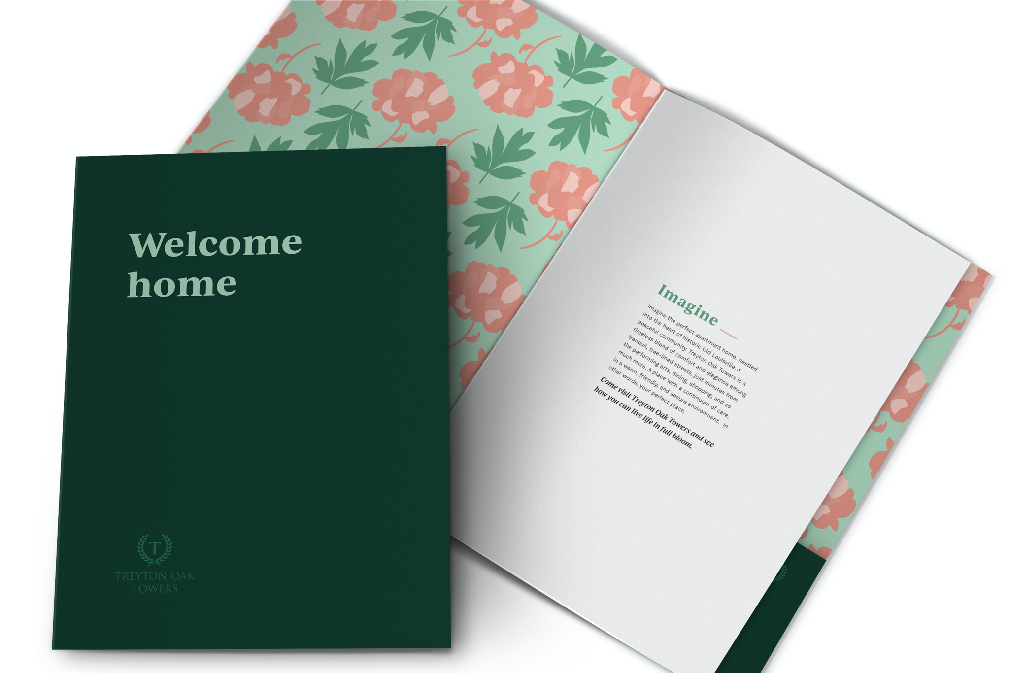
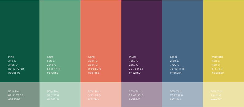
Centered around their iconic logo, we elevated their brand by breathing new life into the supporting brand component. We expanded their color palette, assigned them new fonts and typography treatments, crafted custom patterns, and produced unique, memorable, TOT-owned photography. Treyton Oak Towers’ culture is not “stock”, and neither should their photography be.
By channeling the energy that radiates throughout their building, we enlivened their brand with vibrancy, excitement, and a hint of luxury.


The Website
Not only did Treyton Oak Towers’ website need a makeover to match their elevated brand, but the overall user experience needed improvement. Websites are one of the greatest sales tools, and theirs had been lacking. We approached the website build with the following goals in mind:
- Mobile-first approach – initial research showed that the majority of our demographic was visiting the website from a mobile device
- High level of accessibility
- Design must align with the new brand positioning – Vibrant & Luxurious
- Focus user paths on conversions
- Must support on-going marketing efforts
A New Direction
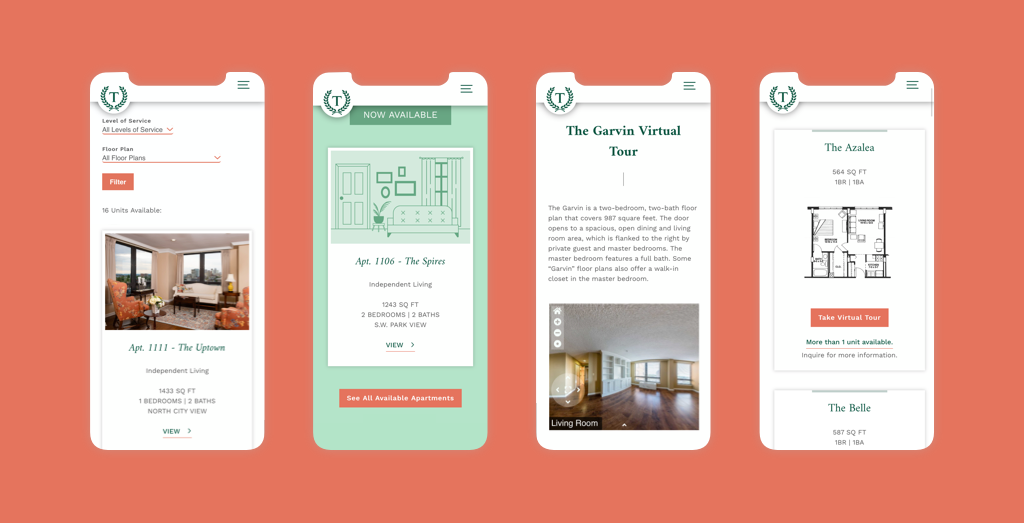
While the Treyton Oak Towers website was jam-packed with information, it did not directly support their number one goal: selling apartments to independent seniors. They were not adequately showcasing the amazing apartment homes, amenities, and the rich community that TOT provides, all under one roof. Through our collaborative design and development process, we helped our friends at Treyton Oak Towers redefine the priorities that their website must achieve, and we built them a website that allows them to help prospective residents “see themselves living at TOT." Included in this is a robust apartment listing system, floor plan visualizations, virtual tours using the latest panoramic technology, and a tour scheduling system, all built upon an easy-to-maintain content management with WordPress.
What was once just an informational website is now an accurate representation of the community, luxury, and vibrancy that they provide – and is a living and breathing sales tool that their internal team is able to use and update on their own terms. And to top it off, it’s 100% responsive for all devices and meets the WCAG accessibility standards.

A Vibrant Future Ahead
By focusing on the deep, unique truths and the aspirational promise that vibrant, supportive, continuing care provides – we’ve elevated Treyton Oak Towers’ brand to something that is both authentic and incredibly motivating for residents, staff, and the wider community.
