Flavorman Websites
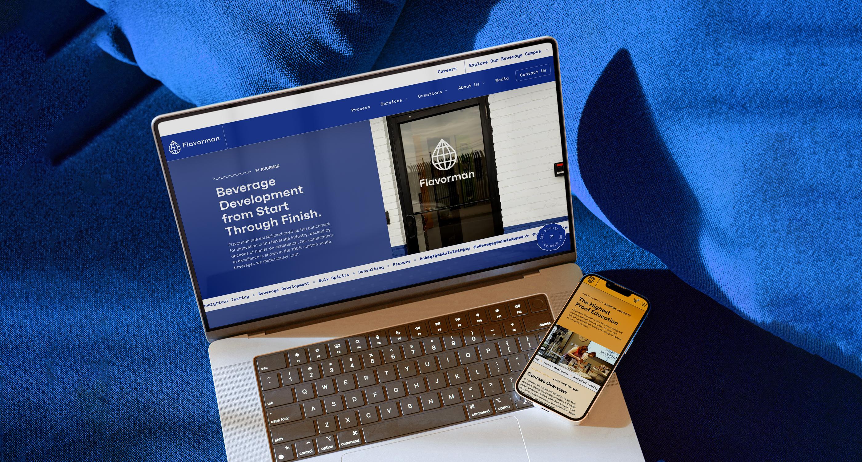
Formulating exquisite digital presences for Flavorman's suite of brands through a unified design language, user experience and content management.
The Challenge
We worked with Flavorman to create a fresh new collection of their brands, collectively known as "The Beverage Campus." With a unified design system in hand, the next step was to design, develop, and deploy deliciously easy-to-use and easy-to-manage websites.
Our Goals
- Build a design system to be shared across the sites
- Centralize the organization's content and data
- Create an engaging user experience with a cutting-edge toolset
- Integrate Salesforce as the back-end CRM
The Solution
Using our successful design and development processes, we created a consistent and ownable design system, paired with user-focused, goal-driven content design and organization, managed with a robust and extensible content management system, and presented to the user with state-of-the-art UI development.
Below, we break down the ingredients that form the Flavorman's new suite of branded websites: "The Beverage Campus."
Design System
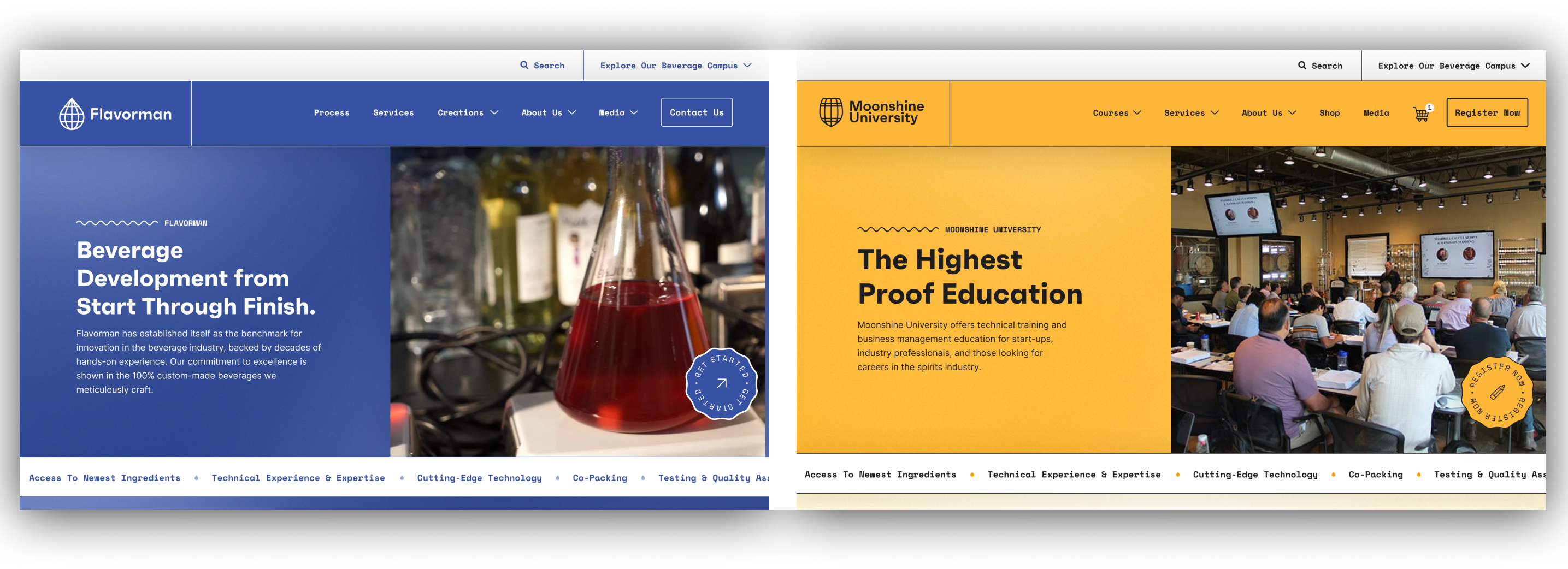
With the primary goal of sharing a visual language across multiple sites, a design system was a must. Our Design and Development teams worked in tandem between Figma and Storybook to create a library of React components, global styles, and color themes to share between the sites.
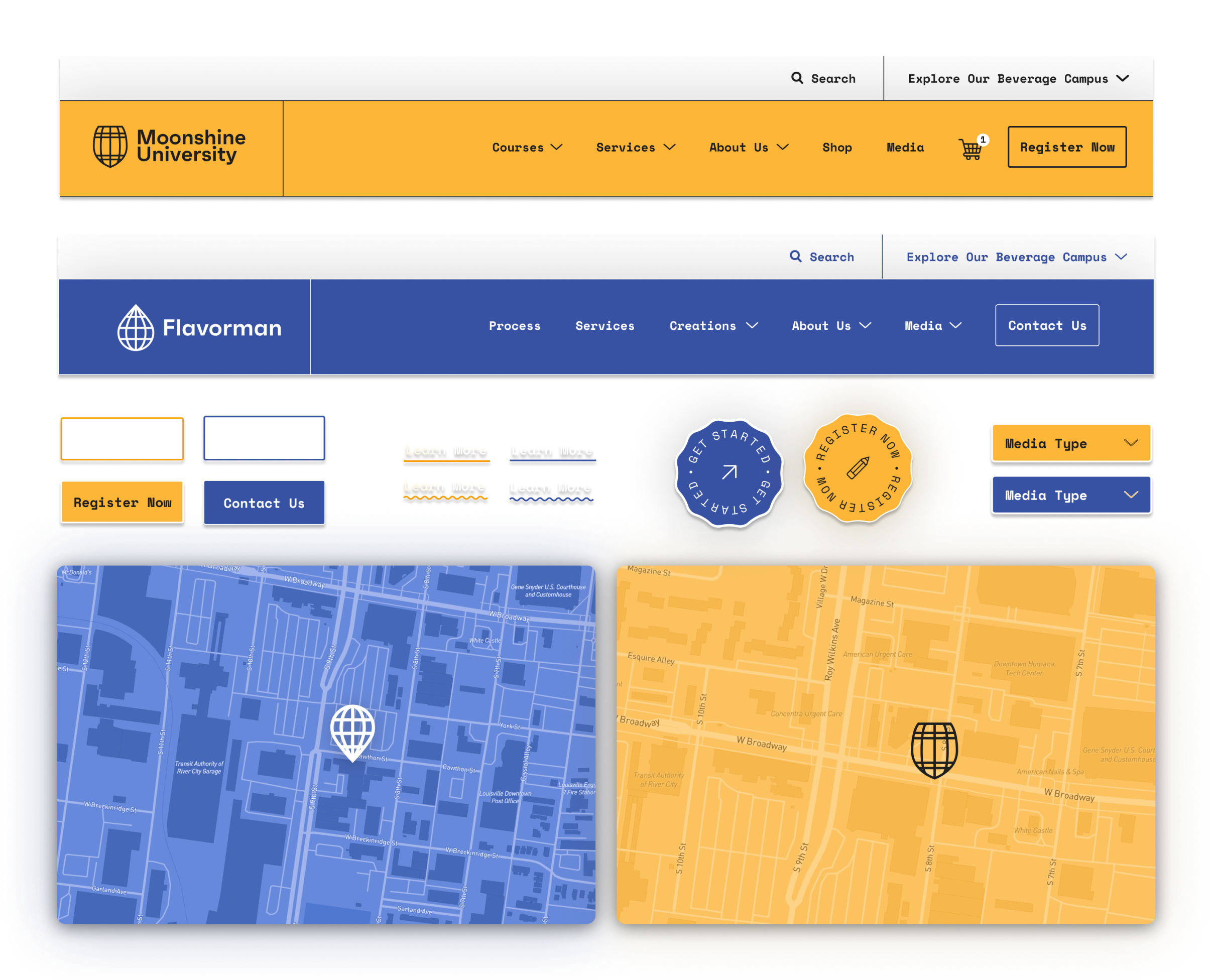
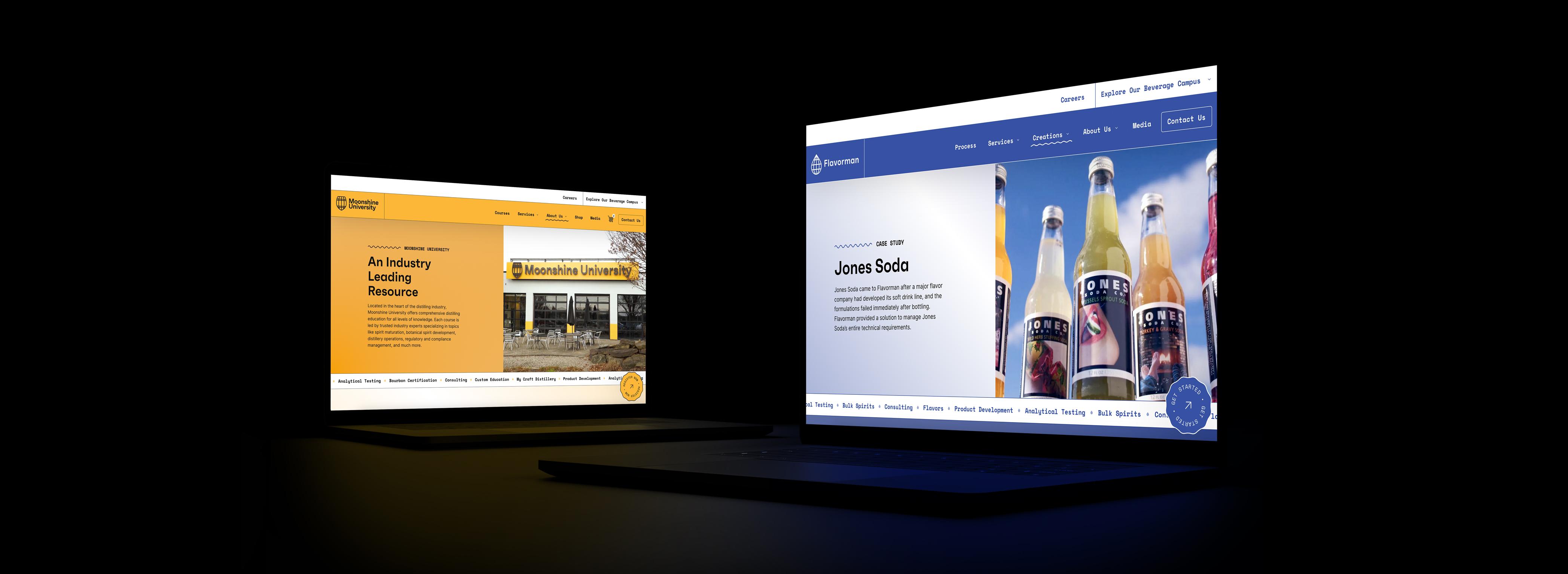
With this in place, we built both flavorman.com and moonshineuniversity.com with the same components, avoiding the need to replicate styling in multiple projects and ensuring brand consistency and worry-free maintenance.
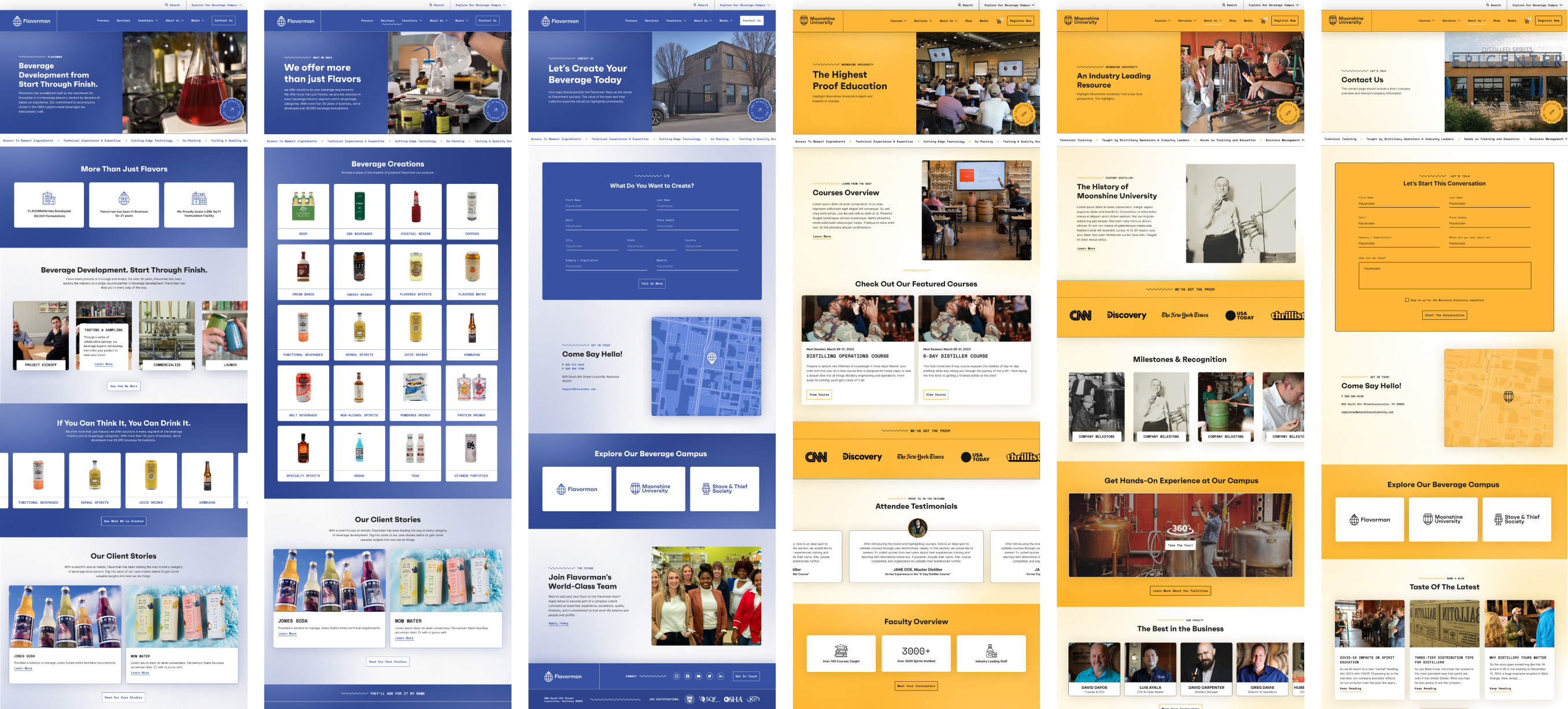
Flavorman's Process
Flavorman's product is its highly sophisticated process and its robust service list. This content needs an engaging, organized presentation to be understood and retained.
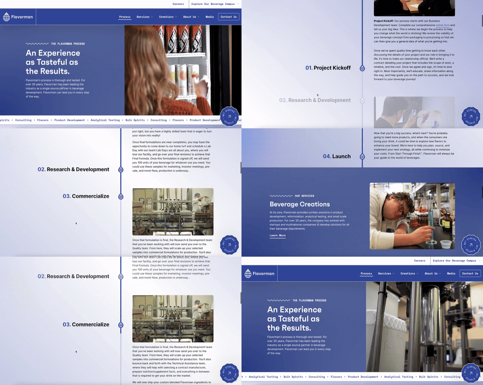
Moonshine University Courses + Shop
Moonshine University's key goal is to register attendees for their industry-leading courses and workshops, and they also sell Moonshine U merchandise. Offering course registrations and straight-ahead merchandise e-commerce meant we had to extend the design system to create shop/commerce-specific components and patterns that felt like a natural extension of the established system.

Managing Content
Previously, content for Flavorman's multiple brands was spread across three WordPress sites, requiring them to cross-publish content by copy-pasting posts from one site to another.
A content management system should be able to structure the content of your entire organization in an engaging user experience - rather than limiting content to the structure of a website. This is achieved by decoupling the content from the website and migrating to a headless CMS — Sanity — which can house the content for the entire Flavorman organization.
With Sanity, the headless content management system in place, it could now be one of many data sources for the websites.

Developing the New via.studio
From WordPress to Next.js and SanityLearn more about headless architecture, migrating a WordPress site and our tools for building modern websites in our retrospective on the development of this very site.
Read Developing the New via.studioAnother piece of required data was e-commerce. Previously maintained across multiple WordPress/WooCommerce sites, Flavorman's product information, inventory, and orders needed to be consolidated to be manageable.
We selected Shopify as our headless e-commerce platform. With its powerful API, we utilized it as another decoupled data source after migrating Flavorman's courses and products.
To manage and extend products beyond what Shopify offers, we utilized Sanity's Shopify integration, which allows us to manage product info and add additional content fields.
With Shopify's headless system as the backend, we built a fully custom front-end on our new site, ensuring a fully branded experience while leaning on a reliable platform for product management, checkout, and fulfillment functionality.
User Experience
Key to Flavorman's brand is their rich experience for their clients, customers, and consumers. The user experience for their websites had to meet that.
The UI Gold Standard: React + Next.js
To provide a modern, best-in-class user experience, we utilize React and Next.js - the current gold standard of UI frameworks. Building using this setup provides critical user-side performance boosts, like client-side routing (when clicking a link, only load the piece of the page that will change), link prefetching (downloading the content of each link on the page in advance of the user clicking it) and incremental static regeneration (generate each page as static, cached HTML and update it in the background whenever data changes).
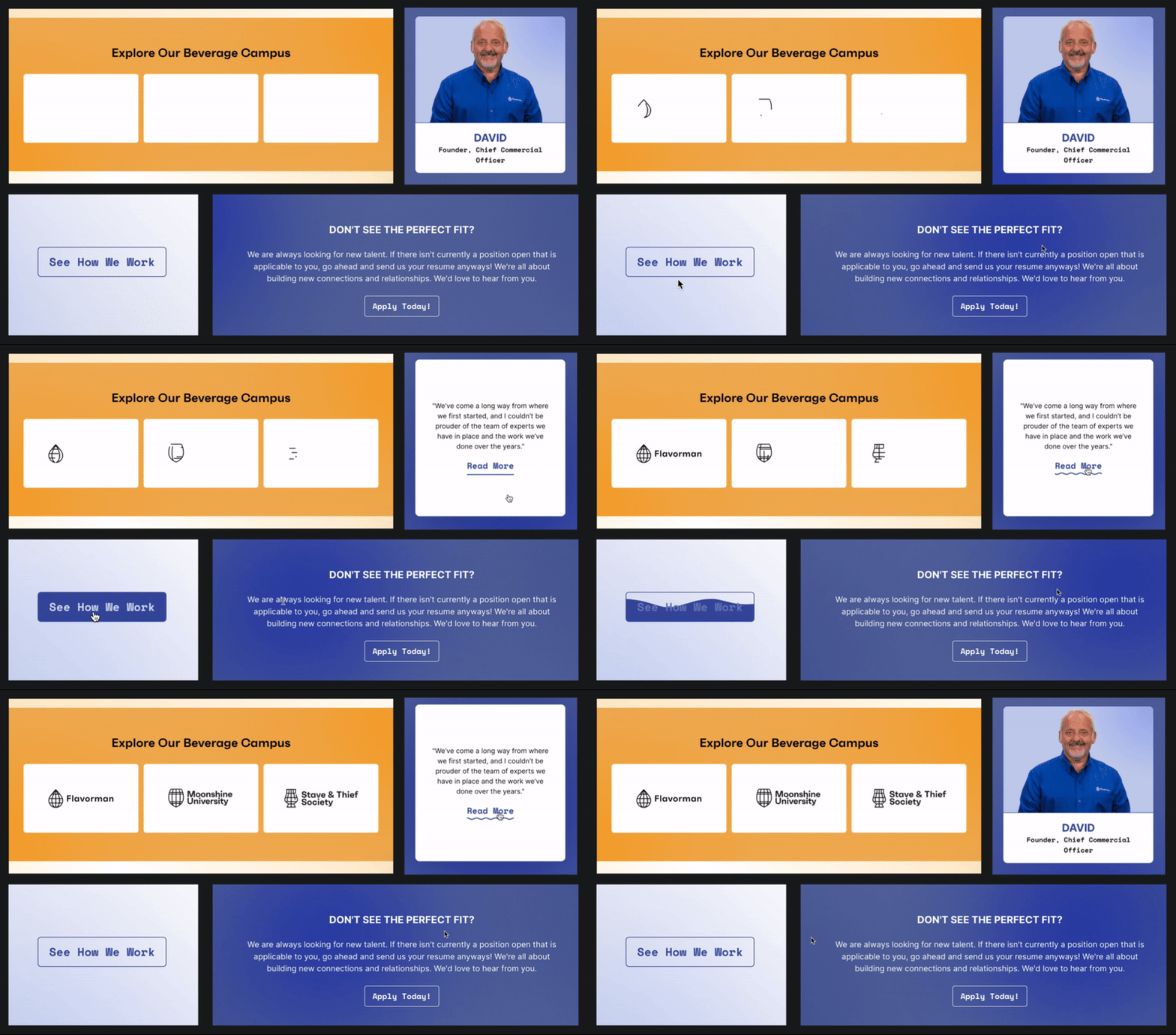
Practically speaking - this focus on technology and performance means that we get a fast and responsive site for our users while also enabling us to use exciting physics-based animations and cursor tracking.
Animations + Movement
The Result
Like building complex flavors, the components and the process matter.
Starting with branding, we established a consistent, robust design language. We created a new, easily managed unified content platform and used state-of-the-art user interface frameworks to build the front end.
As a finishing note, we prioritized high-design and visual flourishes that elevated the sites aesthetically and made things more engaging and interactive for users.
The result is a balance of consistent and confident brand identity with coherent content management, accessibility, performance, and scalability.
Two beautiful websites on one shared platform.
“I've been dreaming of bringing our 3 brands to this level ever since I started here over 7 years ago. I can't express how excited I am to finally see that dream come to life. What an incredible team — I couldn't be more proud or more excited for what we've achieved and built together. This journey has just begun, and I'm truly grateful that it started with the amazing group of individuals at VIA.”
— Jordan Plappert, Marketing Manager

The Beverage Campus Identity
Crafting a New Brand Strategy & IdentityFlavorman's existing brand structure and identity did not represent their stature and could not contain their growth, so they came to us to craft a new brand strategy and identity.
See case study