Bernheim Forest Website
Elevating Bernheim Forest’s digital presence to meet an inspiring and bold new brand

The Objective
Bernheim Forest has always been a treasured escape for area locals, but recent growth has led them to larger goals and aspirations: To become a regional destination. With this in mind, Bernheim's leadership team approached us to elevate their identity to help lead the way.
Before & After - Logo:

Equipped with a fresh new look and design language, our next challenge was to design and develop a website that captured the same creativity and energy of the updated brand while prioritizing a top-notch user experience. Our Goal: To create a digital experience that would inspire and encourage visitors to close their browsers and visit Bernheim Forest.
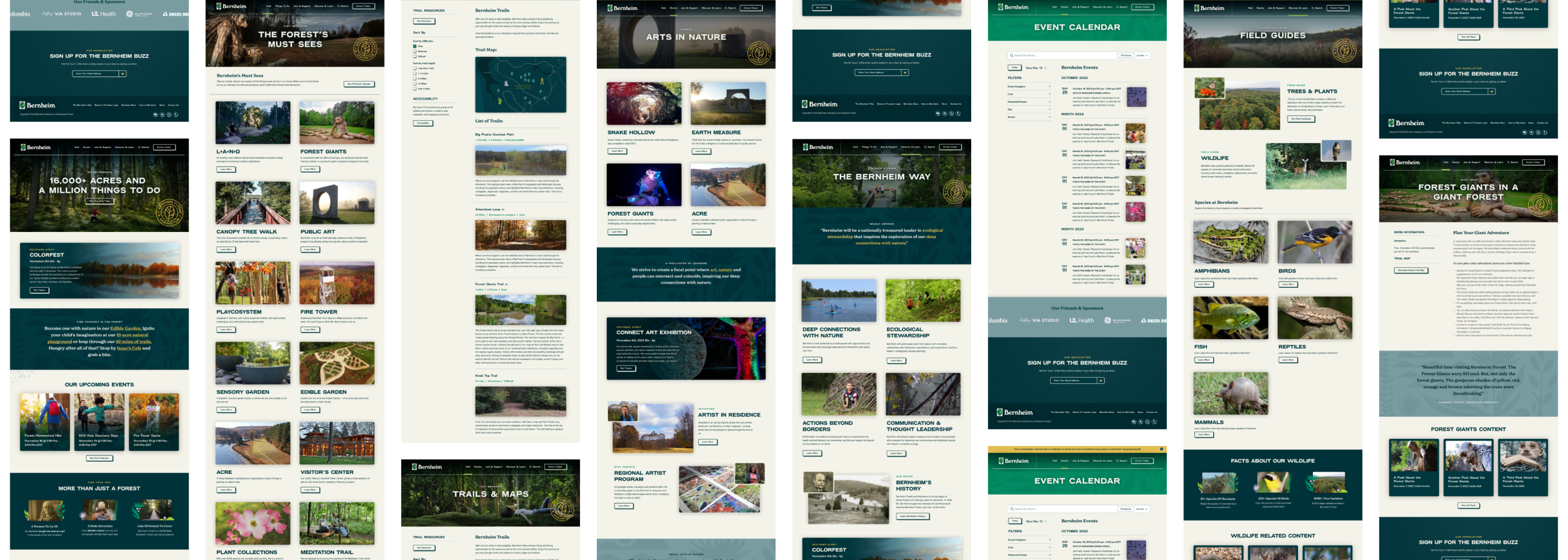
Before & After - Website:

The needs for the website:
- Ensure the new brand is reflected and celebrated throughout.
- A design system comprised of a core set of components that are flexible enough to be shared across the site without getting boring or stale.
- Emphasis on user experience, increased engagement, and interactivity. It had to be helpful and guiding while leaving room for interpretation and intrigue.
- A user-friendly backend that empowered the client to own, manage, and grow the website over time.
- Make everything feel connected. Supporting visuals, third-party integrations, and historical content migrated—everything had to come together, be cohesive, and feel balanced.
How we did this:
- Content Strategy: We pruned and trimmed to create audience-focused, goal-driven content.
- User-Focused Design: We prioritized ease of use, accessibility, and usability while focusing on making everything easy to find, interact with, and manage.
- Design System: We created a unified design language that embraced the new brand and pushed its digital presence to feel consistent, cohesive, and trustworthy.
- Flexible Content Editing: We built a flexible layout system that provided editors with the flexibility of a page builder combined with the consistency of a design system.
- Saving Room for Play: We took advantage of opportunities to incorporate unique brand enhancements that enhanced the user experience and further promoted the new brand.
Process
Understanding Our User
Our brand strategy phase gave us key insights to consider during website design and development. Bernheim is colorful, bold, and energetic. Illustration and visual assets needed to be used playfully while still supporting the content. The website needed to embody the fusion of art and nature in a tangible way.
High-quality photography was essential for capturing visitor emotions and showcasing Bernheim's grandeur and scale. We had to show the forest and everything it had to offer.
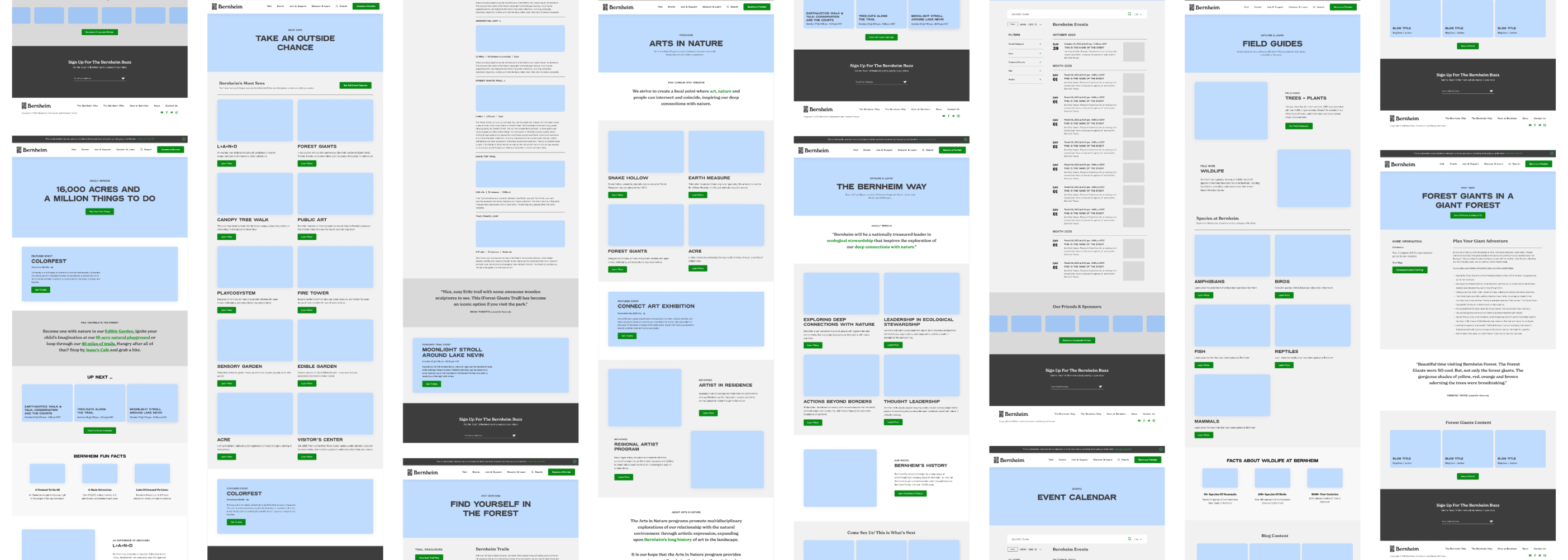
We worked collaboratively and thoughtfully with Bernheim’s team to create a flexible framework that felt right and acted as our blueprint moving into design.
Site Identity
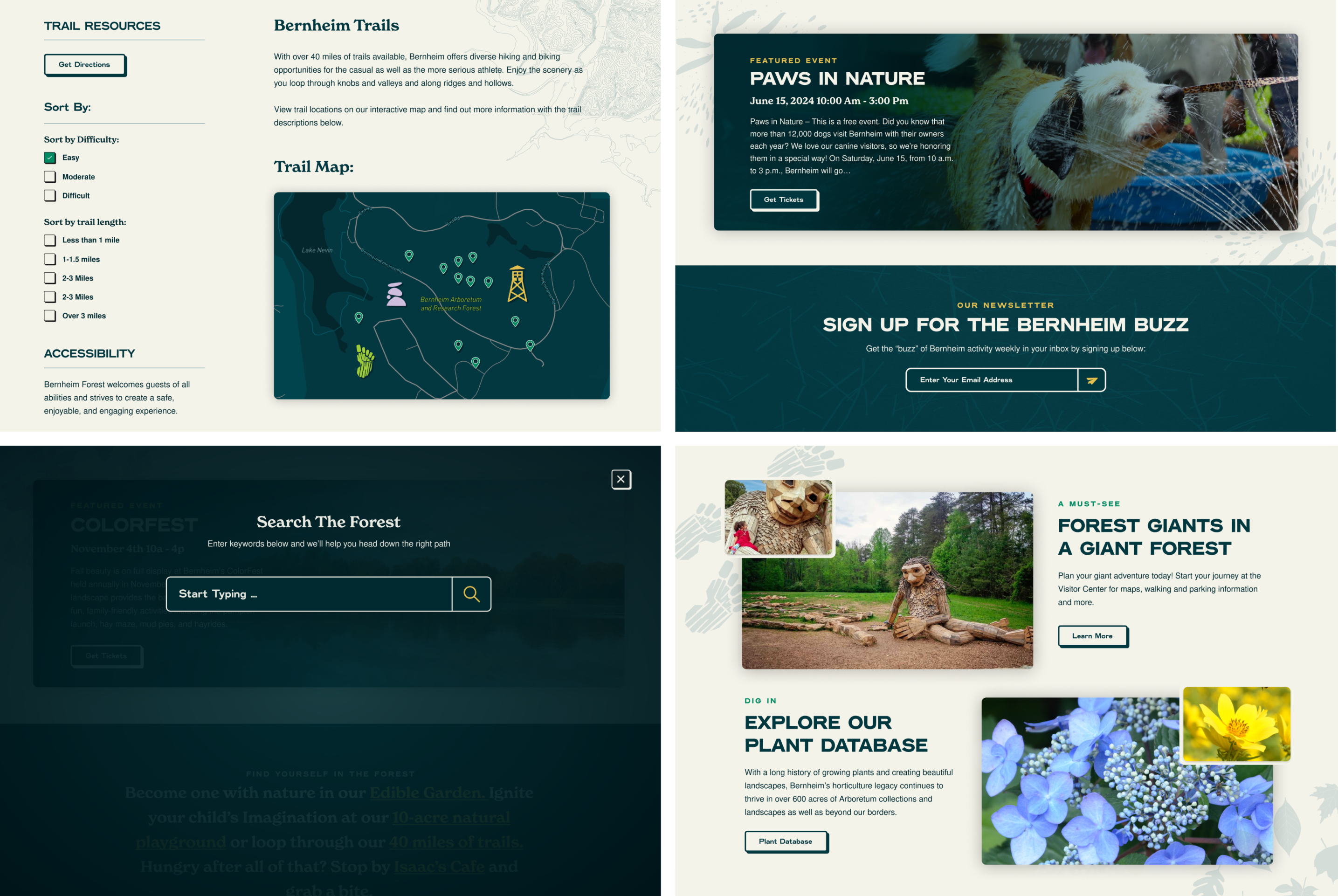
Once everyone felt comfortable with the wireframes, we dove into design. First, we extracted all common components into a library and worked the visual language into each piece, one by one. This built a shared foundation for efficient design, future scalability, and an easy-to-manage product moving forward.

Balancing Form and Function
Goal number 1 was a unified design experience that focused on our users' needs and built a familiar, trustworthy, brand-forward platform. However, we couldn’t lose sight of Bernheim's quirkiness, personality, and unique nature. The site had to present content thoughtfully, tell the correct story, and encourage exploration—but it also had to delight.

Every design decision considered the updated brand's texture, details, and creativity. Bernheim Forest is an established leader who is to be taken seriously, but that doesn’t mean they don’t have a big personality.

Flexible Content Editing
With years worth of content accumulated and so many offerings to share with users, creating unique layouts for each page would've been a budget-buster, but we also didn't want to limit the client to a set of strict page templates. Instead, we created a collection of custom-branded layout blocks, allowing them to design each page based on the content requirements. These layout blocks provided content editors with the flexibility of a page builder tool, plus the consistency of a design system.
The Results
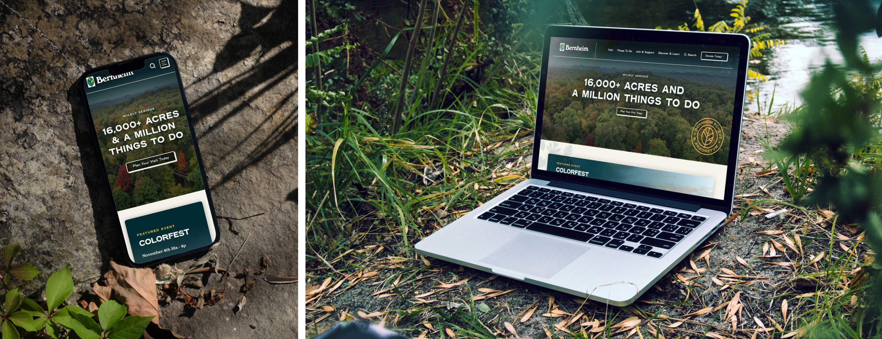
The website was transformed into a true representation of the updated brand, able to adapt and grow using the flexible architecture and brand system we baked in. In fact, we’re already working on some enhancements 😉.
A digital presence that is inspiring in its vision and cohesive in its expression, inviting and trustworthy to prospective visitors, donors, and students alike. We redesigned Bernheim.org to not only tell the story but also create a user experience that was as useful as it was beautiful.

"The Website Team at VIA Studio did their homework. They have given us the keys to a Lamborghini that we have only begun to learn to drive — yet we know it looks so good on the road. With VIA on our side, we know we will see the results we expect in terms of engagement, and the opportunity to allow our internal team to express their expertise in a whole new way that captures audiences and brings them to Bernheim Forest."
— Rebecca Brady, Chief Operating Officer

Bernheim Forest Rebrand
A new brand for the next century of Bernheim Forest.With this bold new vision pointing the way, we worked step by step with Bernheim to craft a new brand that equipped them for this new journey.
Read the Rebrand Case Study