Developing the New via.studio
The Challenge
The old viastudio.com website launched nearly a decade ago atop of Wordpress - our go-to custom website development platform.
But much has changed in those ten years in web development - and the goals we had for the new via.studio were pushing us to branch out.
We wanted something that would create a unique, elegant, interesting user experience, delivered "scary fast" - that was also easy to develop and maintain.
Here's how we did it:
From WordPress to the JAMStack
We love Wordpress - it has been and remains our go-to for custom website development. In order to achieve our user experience and development goals for the new via.studio, we found that they aligned closely to the offerings of the JAMstack: static markup, delivered fast and enhanced with Javascript. This is commonly known as a "headless" content management system (CMS).
There are many JAMstack CMS options- including using Wordpress in a "headless" mode. But would that fit our needs?
Ultimately, we decided to use Sanity as our CMS, use NextJS for our frontend and host them both on Vercel.
Restoring our Sanity
The main argument for keeping our content in WordPress was that we wouldn’t have to deal with migrating its data anywhere else. But while its API allows it to be used as a headless CMS, its power lies in its rich plugin ecosystem and theme integrations. With so many options available built solely to be used as APIs, we felt it would be best to find a new CMS that would be simpler for our content editors to use and more customizable by our development team.
While we could go on about the feature sets of the different CMS options on the market, we went with Sanity because it is customizable, built in React, well-documented and reasonably priced.
Because in addition to being well-documented and reasonably priced, it is also a customizable React application that provided us with a blank canvas for creating a great editing experience for our team.
Customizing Sanity
Sanity provides a great out-of-the-box editing experience, but it also provides a toolset for endless customization. You can create custom inputs for schemas, custom components to be rendered in content and even build entire custom workflows, like an editor review process.
Migrating Data
The biggest challenge was moving our data from WordPress to Sanity, mainly our blog posts going back years. Fortunately, we were able to write a tool using PHP and Node to convert all of our WordPress data into a format that we could import into Sanity.
Our Next Frontend
For a framework, we had two main options: Gatsby and Next. For me, the choice was easy. While Gatsby offers a theme and plugin ecosystem that resembles Wordpress’s in some ways, Next’s ability to dynamically work as a static site generator or a server side rendering framework on a page-by-page basis is a huge win. We had recently tested it out on our Star Chart project and were immediately impressed. In the time since that project, Next has rolled out features like the incremental static regeneration which means that we can generate our featured case studies at build time, generate additional case studies at runtime when they are requested and also create server-rendered landing pages that can take advantage of A/B testing, cookies, etc.
Next also introduced API routes, which means instead of relying on a full custom server for things like form handling, we can just create a file at “api/form,” and Next will generate an API endpoint for us where we can run server-side code while doing everything else on the client.
Using a React framework also enabled us to take advantage of libraries like Framer Motion, which provides physics-based animations that give layout changes a more natural, playful feeling than duration-based CSS animations.
A Host of Improvements
Vercel was our first choice for hosting because it supports Next out of the box as it is built by the same team. But more than that, they provide a great development experience. We have our project set up as a monorepo, for which Vercel recently rolled out support, which means our CMS and frontend are two separate packages that we host in one repository, and they each have their own project in Vercel with continuous integration through Github. Any time we open a PR for one of the projects, Vercel creates a preview deployment where we can view all the changes just how they will appear in production, and when we merge it into our “main” branch, a new production deployment is created. And if anything goes wrong, we can easily roll back to a previous deployment.
Implementing the Design
While we always work closely with the design team throughout the development process on a project, we often don’t get involved until fairly late in the design process. For this project, the goal was for design and development to collaborate on the design system and build it from the ground up, with an emphasis on componentization, since we knew we would be building the site with React.
Layout Components
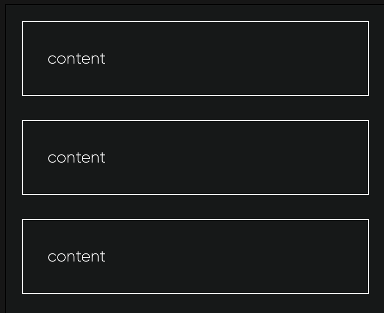
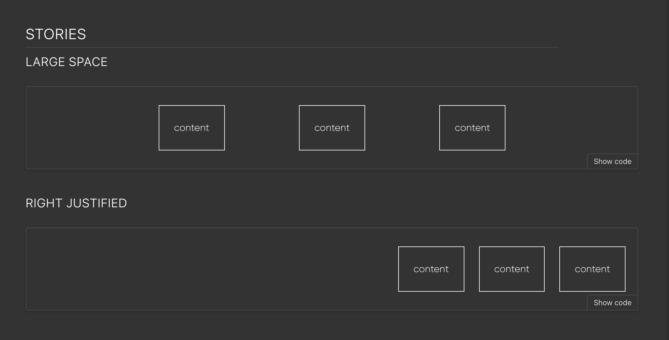
Before design even got started, we got to work on the foundation of the design system. Inspired by the layout primitives in Andy Bell and Heydon Pickering’s Every Layout, we created React components for basic layouts that can be truly modular and intrinsically responsive, so we could use them all throughout the site. My favorite is The Switcher, which switches directly from a row to column layout with no breakpoint and no awkward in-between wrapping states with orphaned items.
Storybook
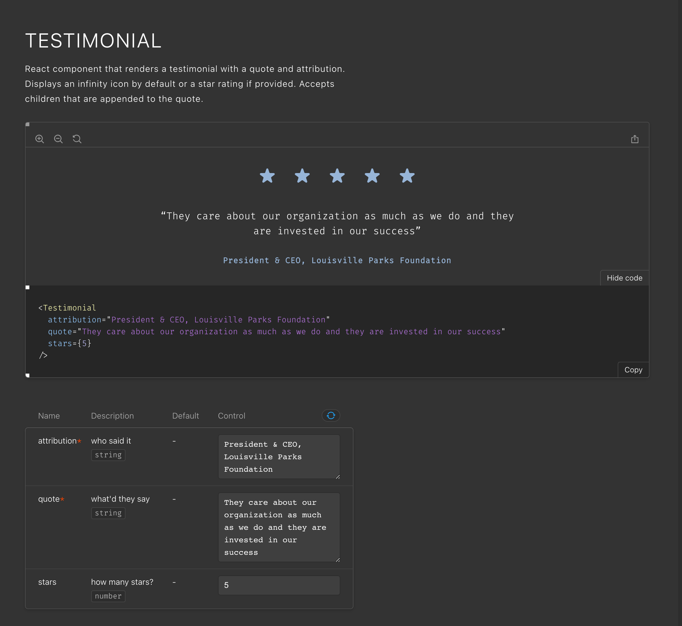
To help with testing these primitives and collaborating with design, we built our components in Storybook, which enabled us to isolate components, visualize variants, and test responsiveness and accessibility. With this workflow we could develop layout primitives individually and share them with design; then design could construct layouts with these primitives in mind and hand back components, we could build those in Storybook and have them reviewed and incorporated into full page layouts, which we could then build in our Next.js app. This workflow brought design and development much more in sync and enabled a more efficient back-and-forth compared to a more standard hand-off where development begins after design has already completed the full page layouts.
Moving Forward
The most exciting thing about our new site is what’s yet to come. Moving to a modern stack has opened the doors to all kinds of new ideas and experimentation. We’re only restricted by our imaginations.
We are extremely proud of what we were able to build and are excited to continue work on improving the site for our employees, clients and friends over the coming years.
Related Posts
Wordpress to Sanity Data Script
By:Nick Stewart on 3/11/2021
One of the biggest challenges of moving from one CMS to another is getting your existing data to the new platform. In our case, we were moving our existing WordPress platform, which had been around for years, over to the Sanity.io platform.
Read More »Interactions with SharpSpring
By:Nick Stewart on 3/29/2023
Integrating SharpSpring into a website is fairly simple with the SharpSpring API, which offers many methods/endpoints with a standard REST API. Learn more from VIA's Senior Developer.
Read More »