Waterfront Park
Telling an important brand story through people, community and experiences.
Waterfront Park approached us about a redesign of their existing website. Soon it was obvious that a brand and communication strategy would be essential. Together we embarked on a journey that resulted in an outcome that was exponentially more effective.
Waterfront Development Corporation, the entity that manages Waterfront Park, had never been through a branding program before. We used our Personifying Design branding program to identify our audience, brand pillars, and other exercises to develop a brand statement and voice & tone that truly reflected the Waterfront Park brand.
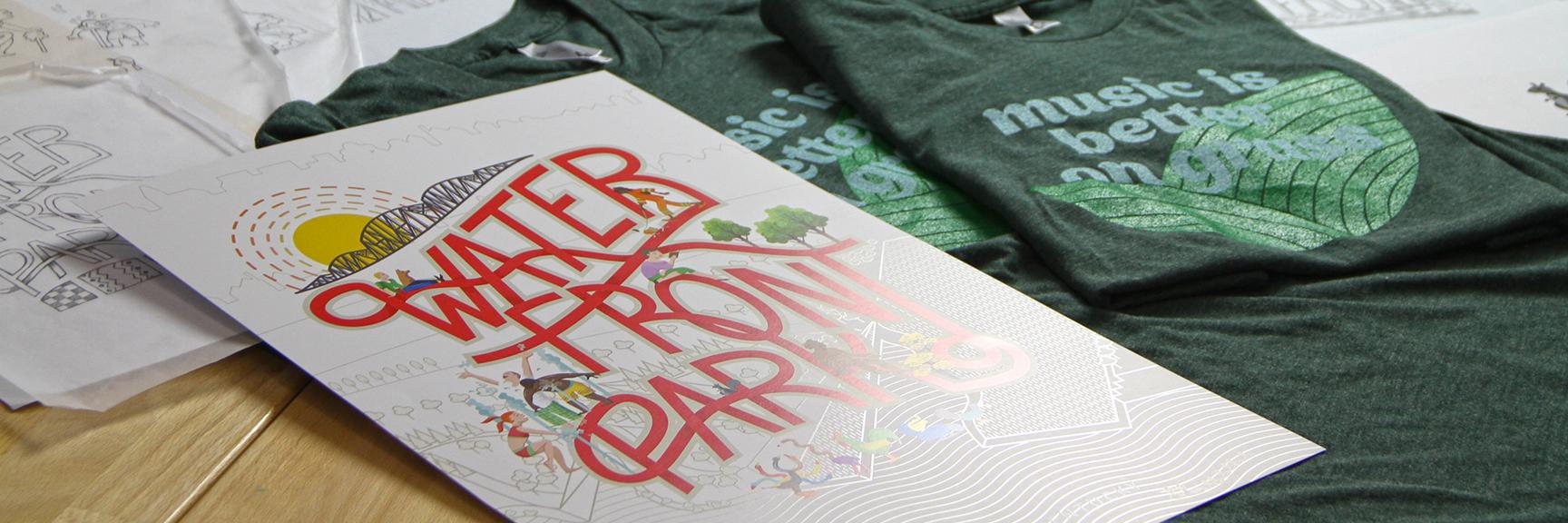
We then created a design system that incorporates all the visual elements needed to build the website, but could also be used for any identity materials needed. Shirts, posters, signage, etc could all pull from the design system for consistency and reinforcement of the brand.
Brand Positioning:
The Waterfront isn’t just a place, it’s an experience. An experience that’s different for everyone. We’re a peaceful oasis in the heart of the city. We’re a natural haven for quiet reflection. We’re an ongoing festival of sounds and sights. We’re your favorite band blasting into the night sky. And we’re right here, accessible to all.
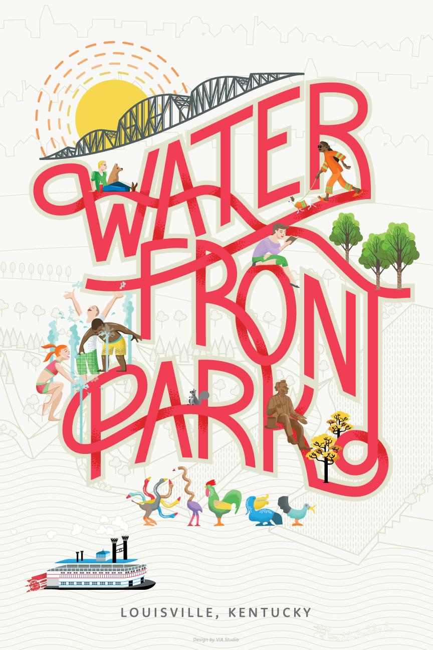
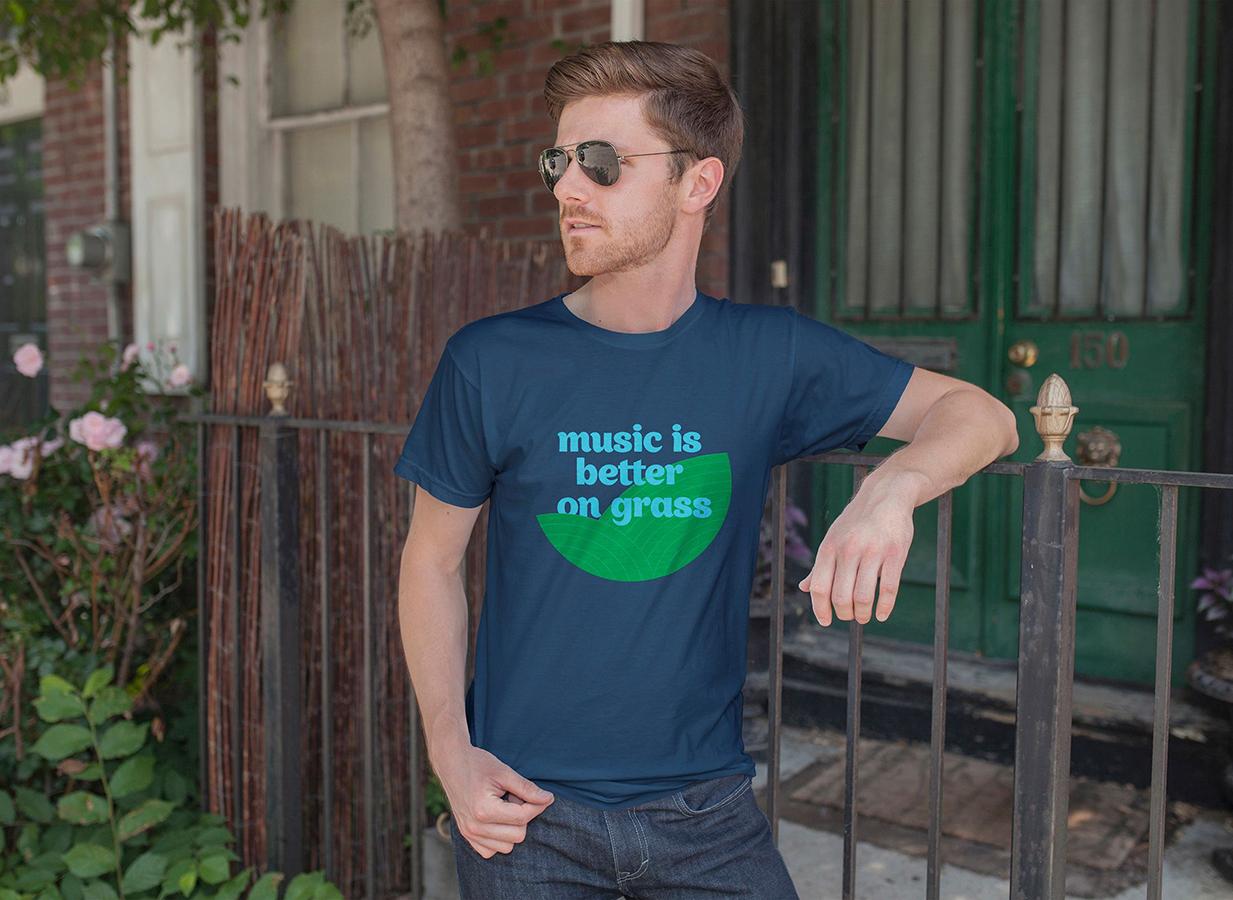
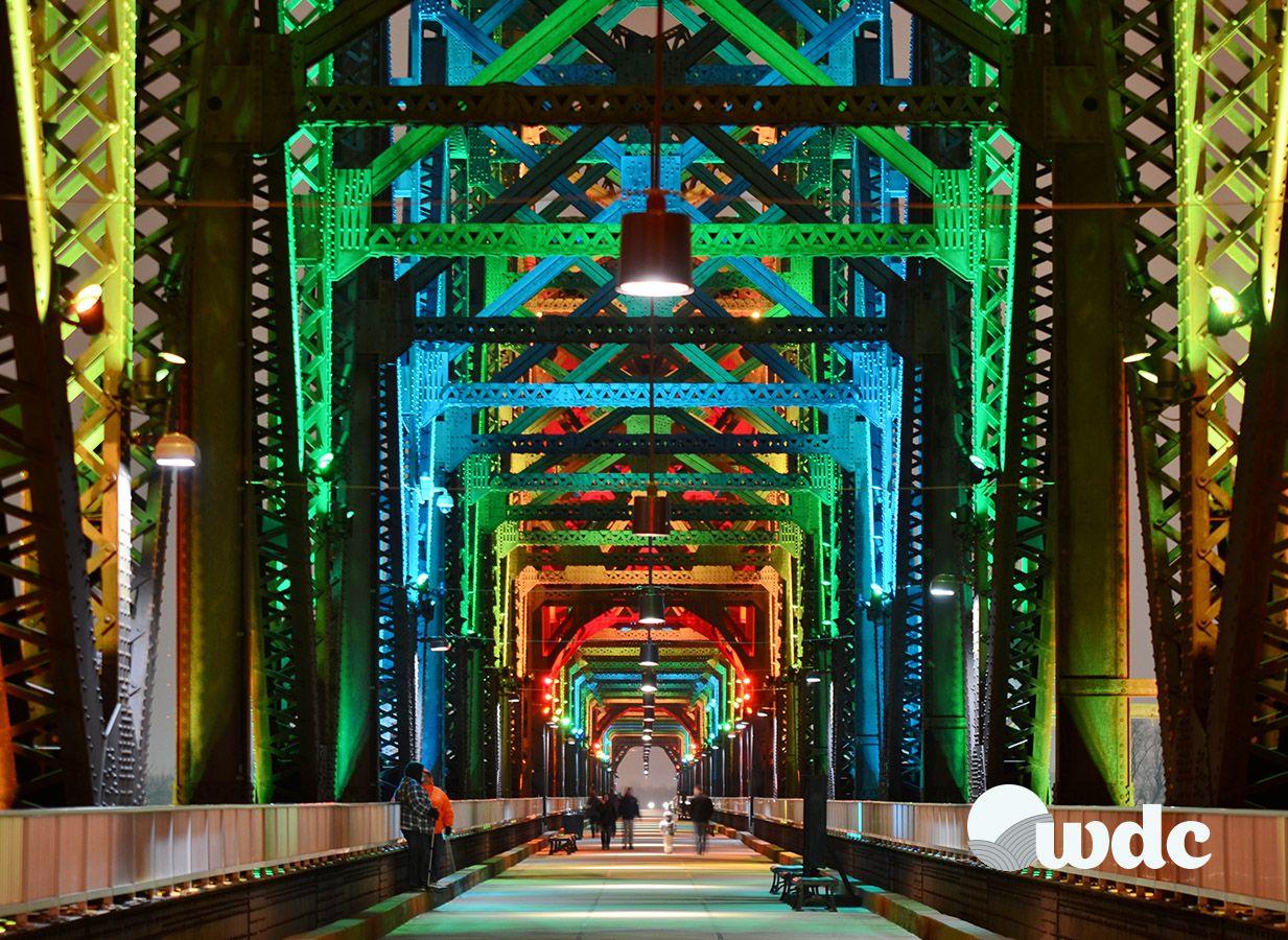
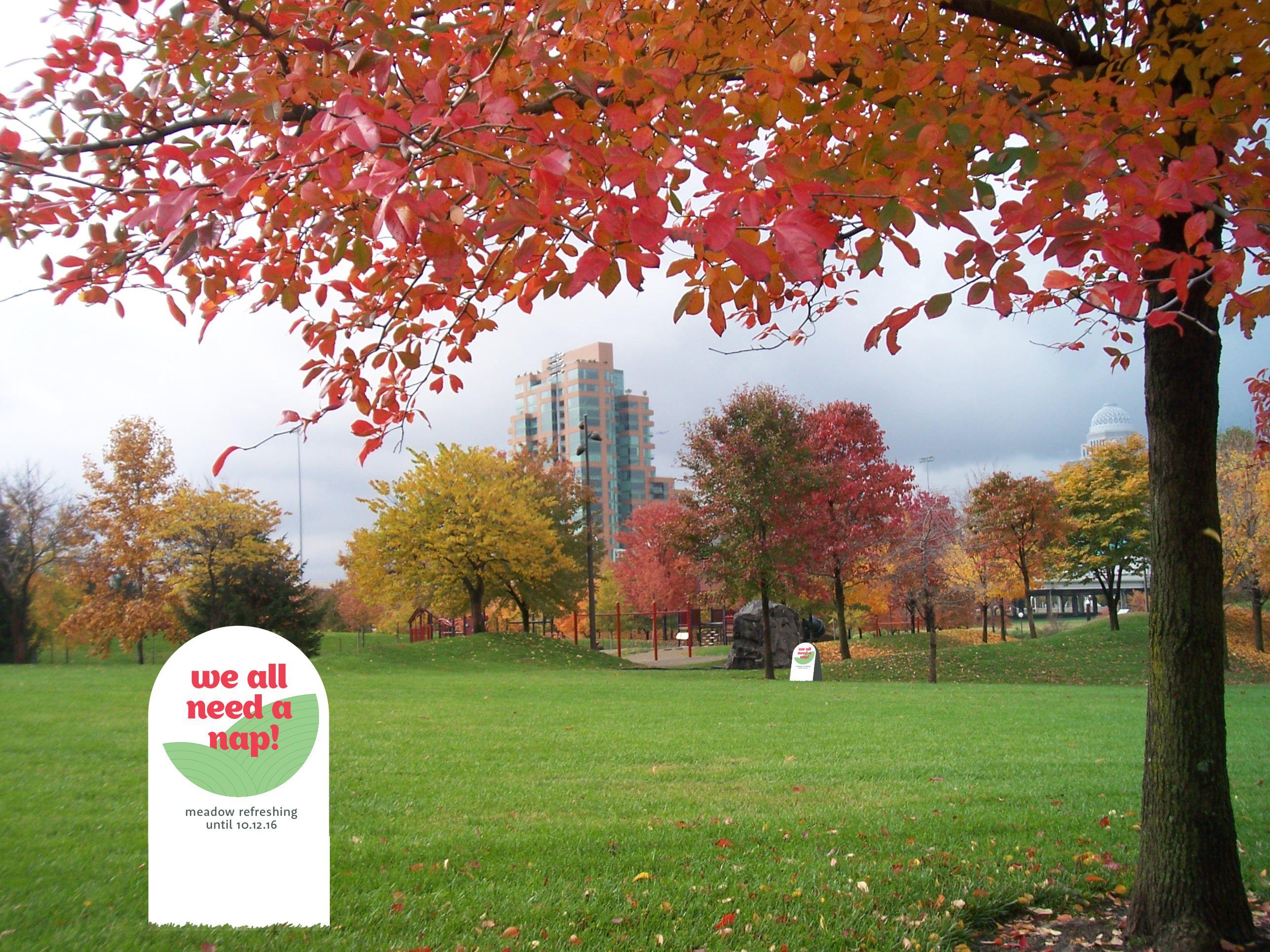

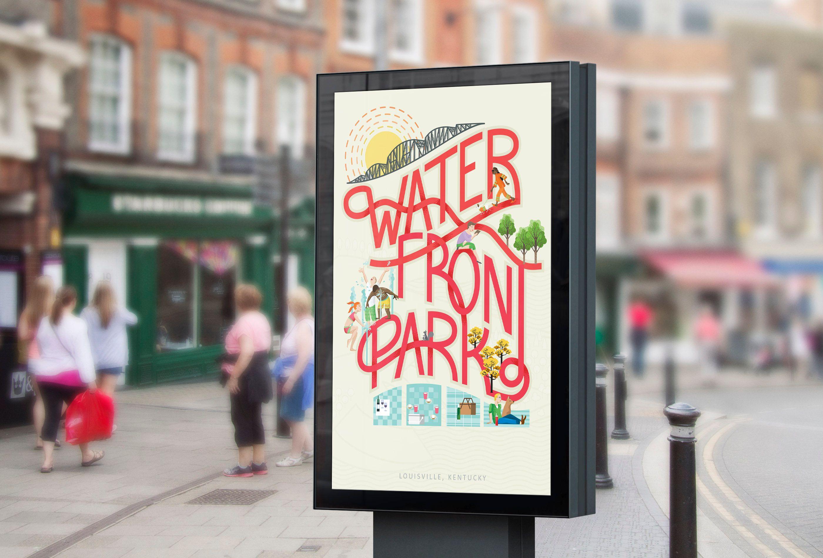
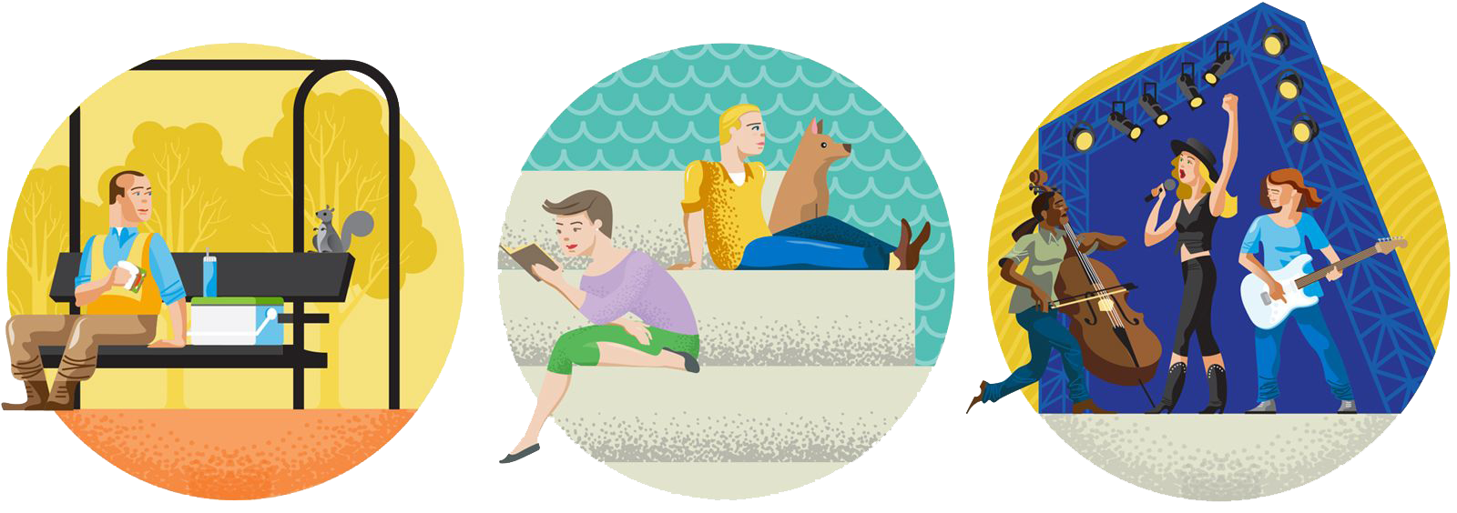
We developed a style that was colorful and simple but the best thing was no matter what the season the park site is always fresh and beautiful. We didn’t have to depend on photography as the only asset but would add it as content becomes available. “Mini-parks” would highlight the distinct features of the park. For voice and tone, we relied on the wonderful Maggie Walker at Waterfront. Her writing is a trademark of the park itself and embodies the joyous nature of the park's founders.
We like to empower our clients to use their sites to their fullest potential, allowing for content to be customized to their liking. For the map, we did this by allowing our clients full access to adding, editing, and deleting pinpoints. Animation also played a large part in our interaction design. Natalie brought her skills to bare, using a series of CSS keyframe animations to make the site fun. It also makes the user’s experience cohesive with the look and feel of the new Waterfront Park brand.
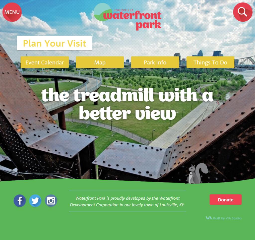
After a fun and rewarding branding process, we were able to get to building a new website for the park. We were able to bring true energy and excitement into the web experience because we were fully invested in the brand, and we had the assets we needed to execute. Some of the features of the site we were able to build easily, with the trust of the WDC team:
Animated, full-page menu
Fun, animated gifs around the site
Interactive map with tons of cool features
Engaging copy and content
Event Calendar
