Our Challenge
We’re not the same agency we were 10 years ago. And that’s by design.
Through clear-eyed observation, honest conversation, and a dedication to merit, we've shaped ourselves into a business that exists owing not to its past successes, but its future value. Our core values of dedication, partnership, and connection to the community have not changed, but how we act on those values has.
Today, we are an agency focused on transforming brands through strategy, design, development & marketing. Internally we are a different agency, but externally our brand no longer mirrored who we now are and where we’re headed. It was time for a change.
A Peek Into Our Process
Collaboration and agile thinking have become cornerstones of how we work. We applied that to our branding process by giving every cross-section of our team an opportunity to have input in the process. New employees with their fresh, outside perspectives had the same weight as those of long-standing team members. With a tight, connected team, everyone has a voice. That is our strength.
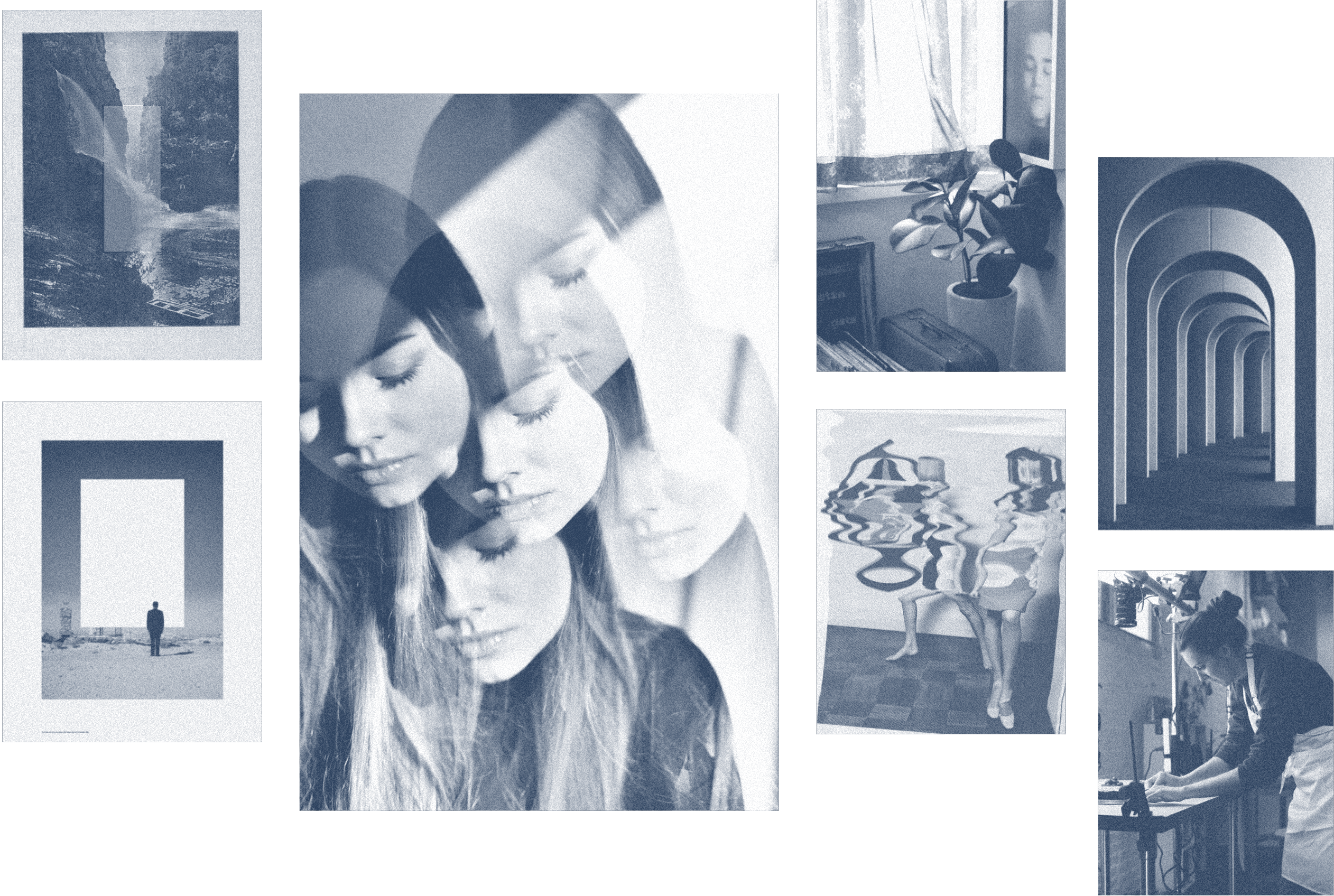
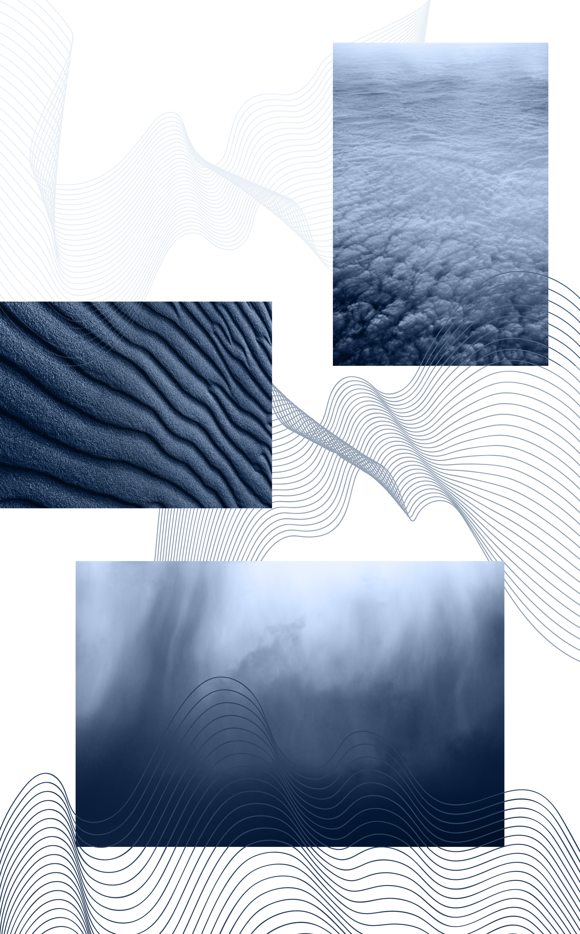
*Moodboard assembled with found images
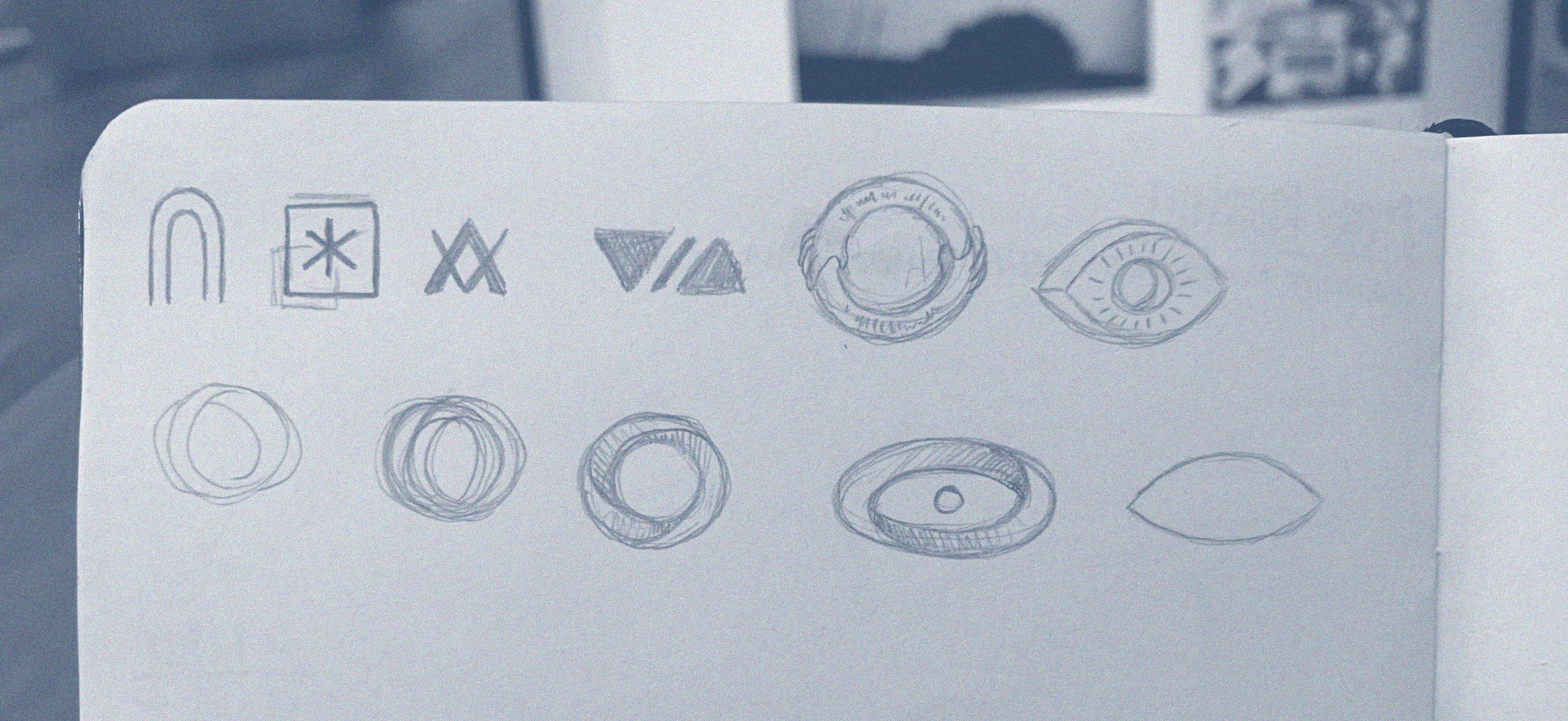
A core, cross-disciplined team took the critical insights from the team and, working off-site, organizing, debating, sketching, mood boarding, and riffing, we formed the foundation of a brand.
Approaching the problem from differing perspectives members of the strategy and design teams each worked a concept out of this foundation. Each a different approach, born from the same basic truths. Through collaboration and honest review, we then rallied around one concept:
The Portal
VIA is your gateway to a world unimagined. Open to the hardworking, the brave, the curious, and the bold. A place filled with new perspectives, unbounded creativity, and outstanding capabilities. With the wind at our backs, the world is ours to create.

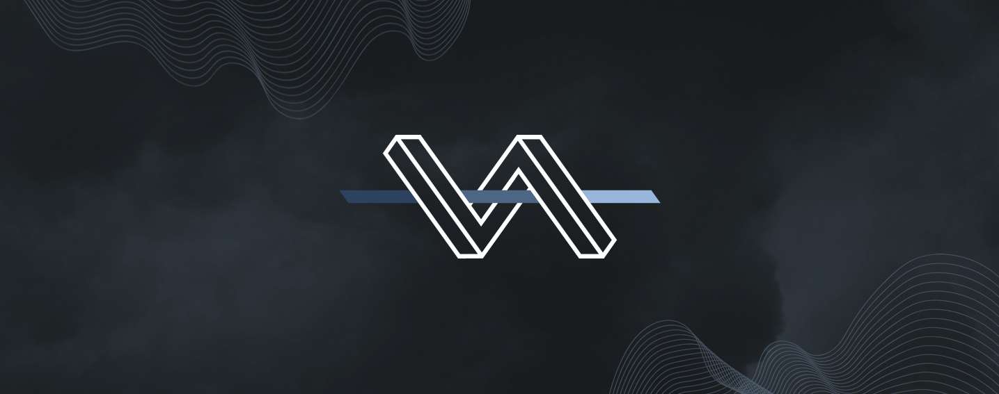
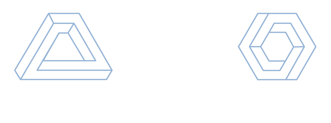
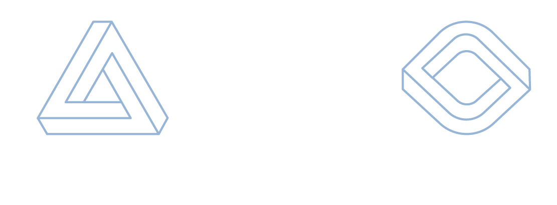
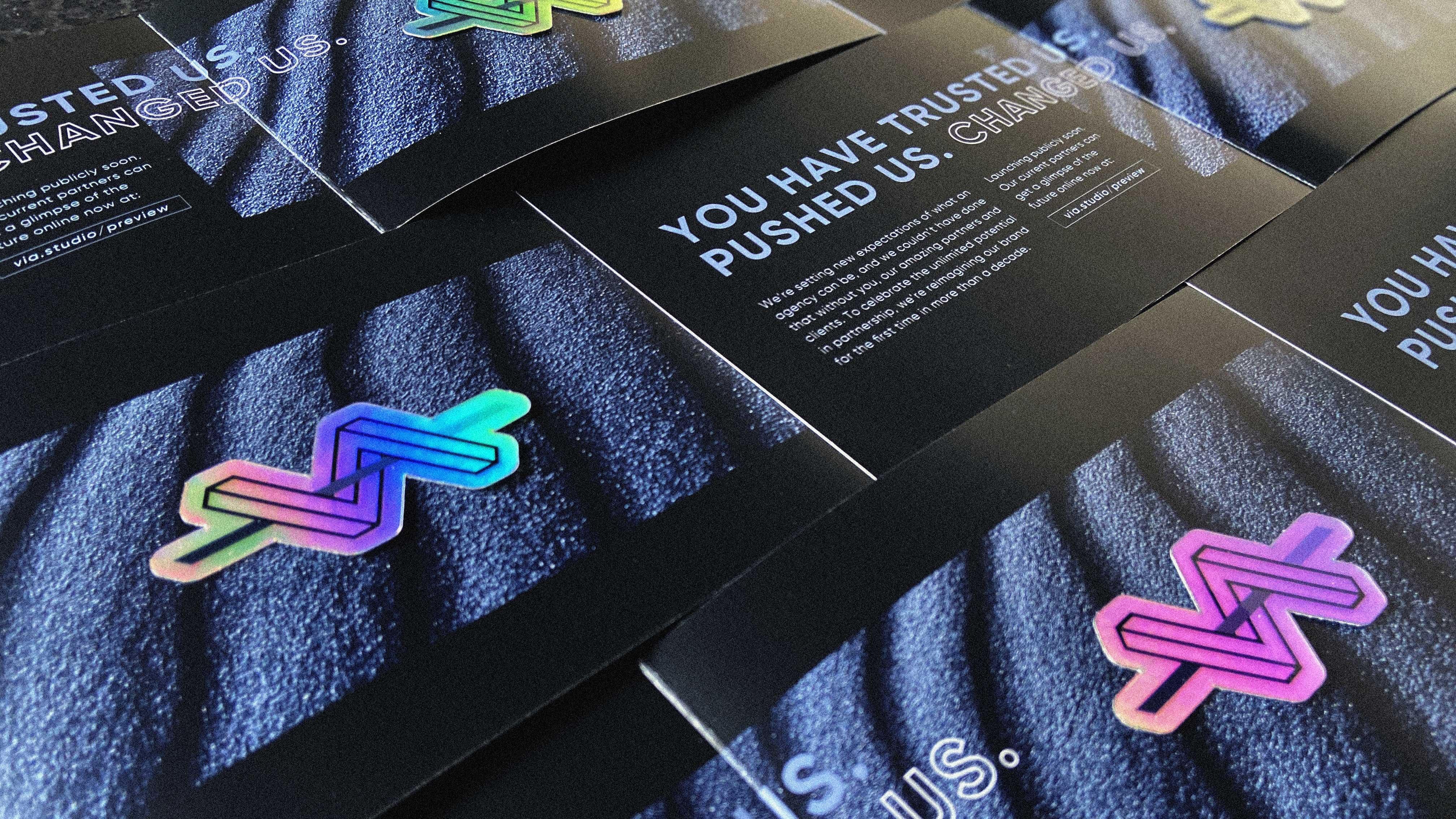
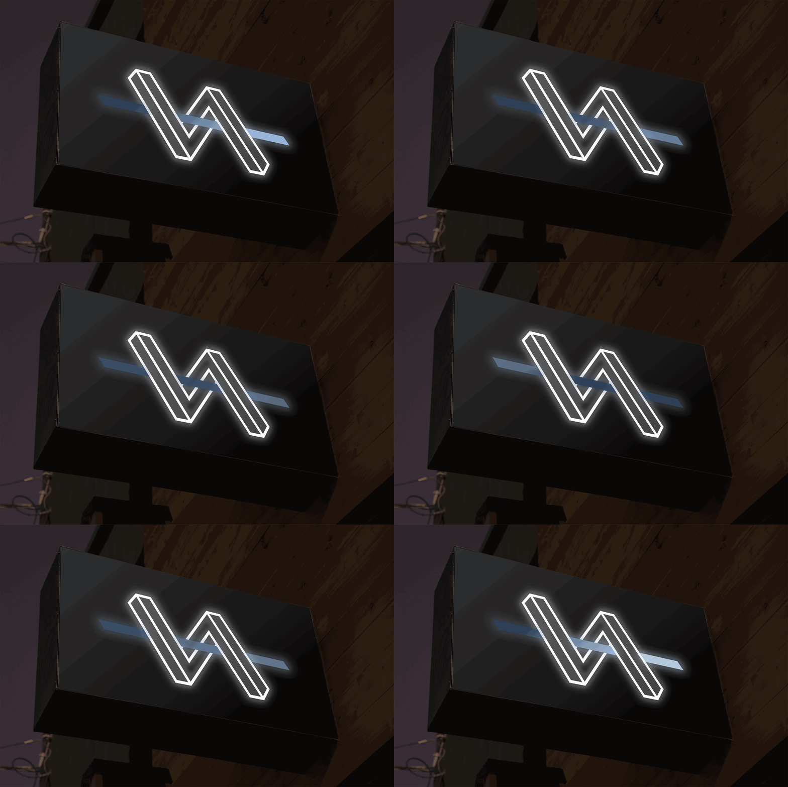
Playing with perspective, the mark creates an impossible shape that’s an intriguing mix of real and imaginary. The overall composition is a nod to our previous logo but with an abstract approach.
A single gradient bar runs through the center, changing along the way. This represents our growth as an agency as well as the journey we take those who partner with us on.
Color & Type
Our color palette evokes feelings of mystery and curiosity. The colors of a cloudless night, stormy skies, lifting fog, and silver linings.
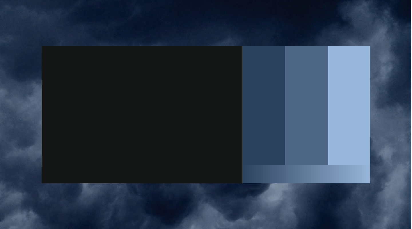
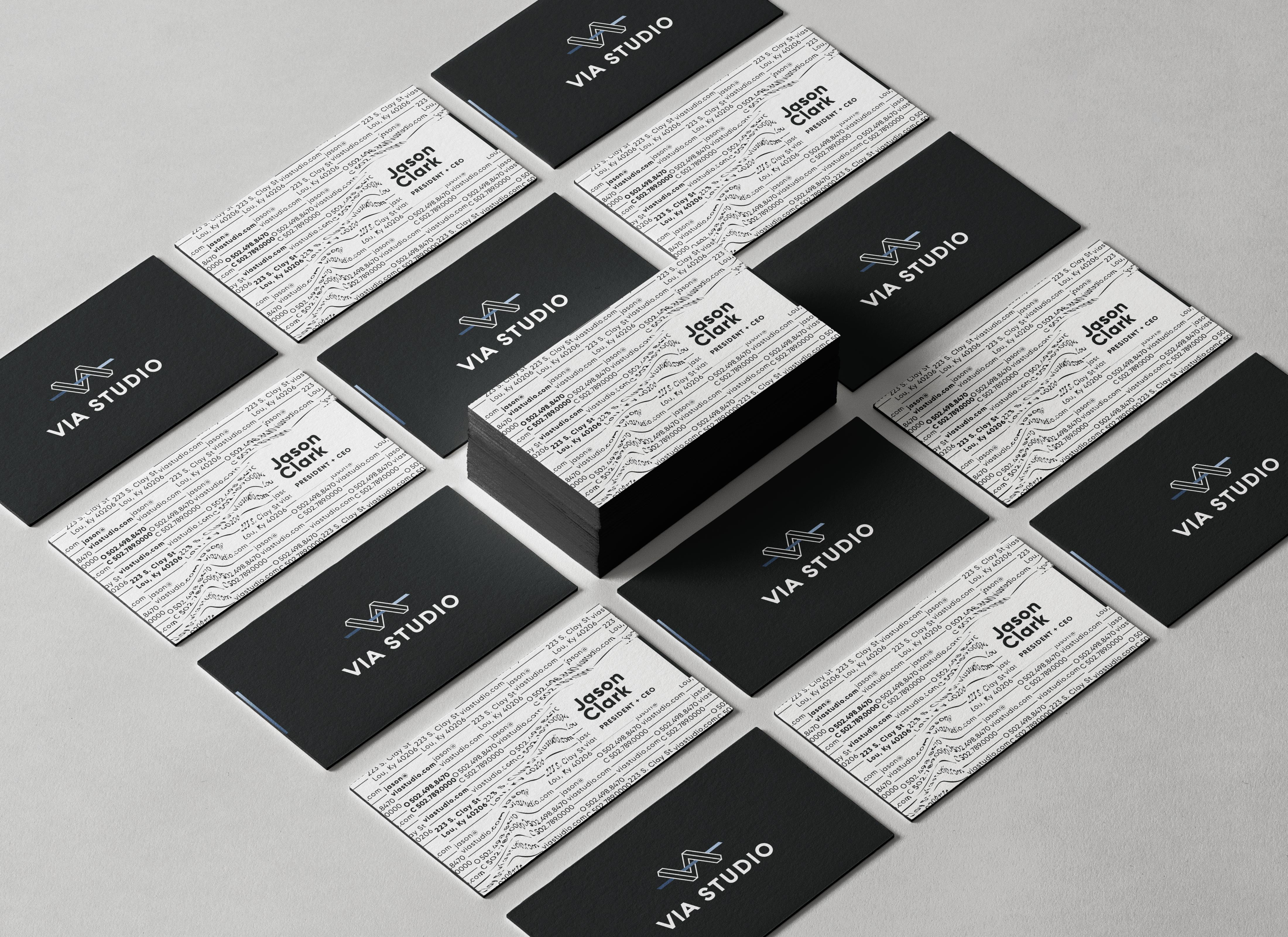
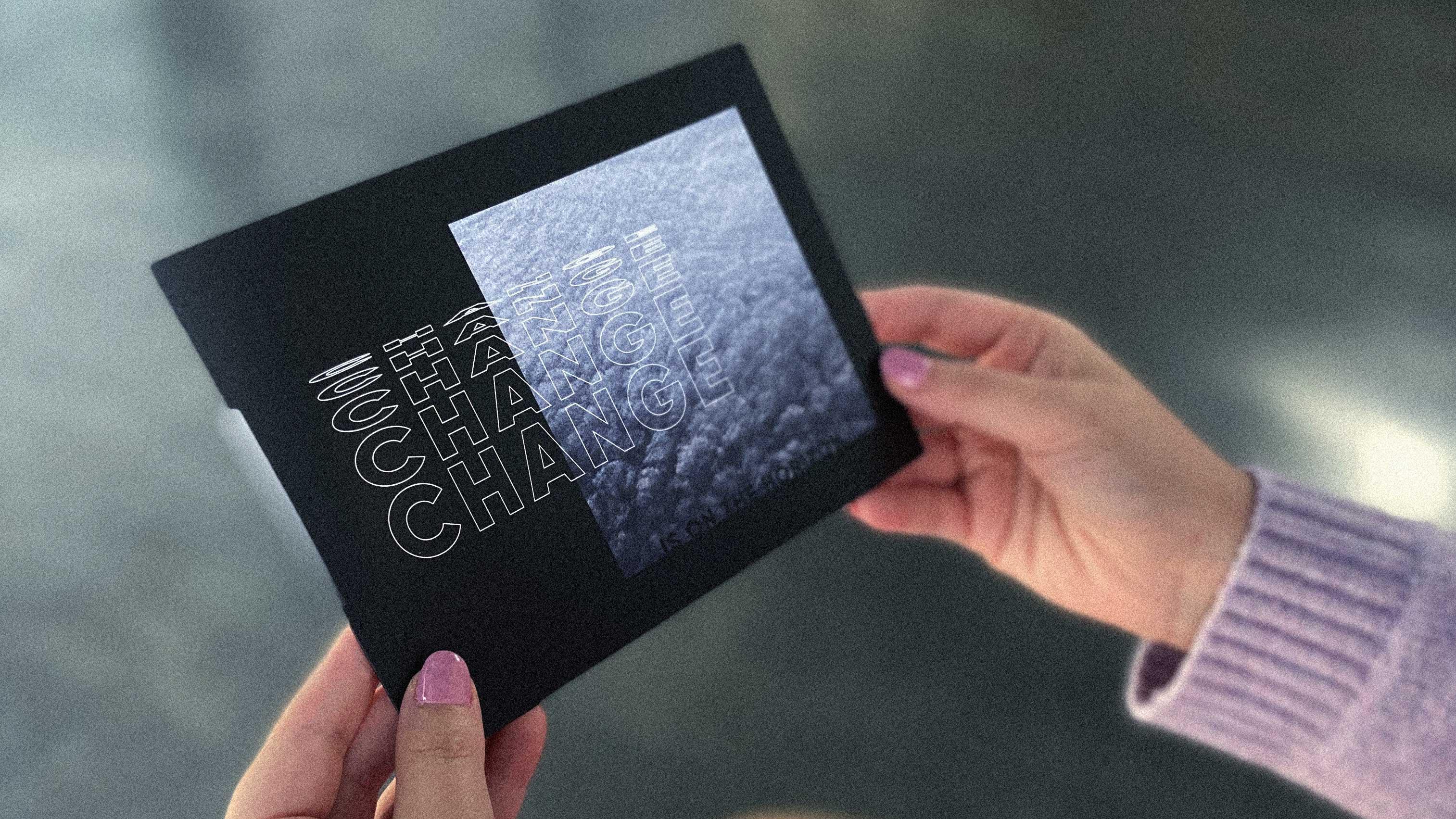
Our type style is bold and authoritative. Creatively altered or distorted. Negative space is our friend.


Supporting Branded Elements
Because our brand concept focuses on change, we needed supporting visuals that portray this sense of growth in a subtle way. We've developed concentric line patterns to use on print and digital assets to give that feeling of movement, as well as a library of gradients and movement found in nature. This transition from literal to abstract is a big departure from our previous brand, which was a little more on the nose and literal.
Moving Forward
If our past brand was about staking out a style, an attitude, and a culture - our new brand is focused on balancing the weight of our history with the potential of our future. Never satisfied, but confident in our capabilities. Strength, humility, and wonder in equal parts.
"Over the last decade, VIA Studio has developed and codified processes in every service offering, which allows us to approach challenges with consistency and expertise. The rebrand reflects the essence of our value to you, our clients and agency partners, and our confidence that collaboration with our team opens doors for your organization's branding, marketing, and digital efforts."
— Jason Clark, CEO
