Dr. Marcum’s Nutraceuticals
Building a reliable brand for a powerful little supplement

The Challenge
Building trust & interest around a new product
Dr. Brian Marcum came to us with a solid product, big ideas, and an aggressive timeline. After spending years developing his virus-fighting supplement, Dr. Marcum needed help getting this product into the hands of homemakers, 9-5ers, and anyone else who can’t afford to take a sick day — and fast! By accelerating our Brand Strategy and Identity process, we gave the product a complete rebrand, built an eCommerce website, and developed and implemented a marketing strategy all before the end of cold & flu season.

The Concept
A Natural Supplement — Doctor made. Doctor used. Doctor Recommended.
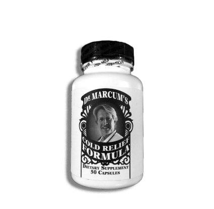
By following our tried and true brand strategy process, we worked hand-in-hand with Doctor Marcum to best position his product in a crowded marketplace. So what truly sets this product apart? It all boils down to how to use it and what’s in it. Unlike other supplements, you only take this product during the onset of symptoms. Right when you feel that first tickle in your throat or aches in your muscles, pop Dr. Marcum’s Advanced Immune Prodrome Formula and BAM… no sick days! The supplement is packed with a nutraceutical strength herbal blend, allowing for a speedy recovery.
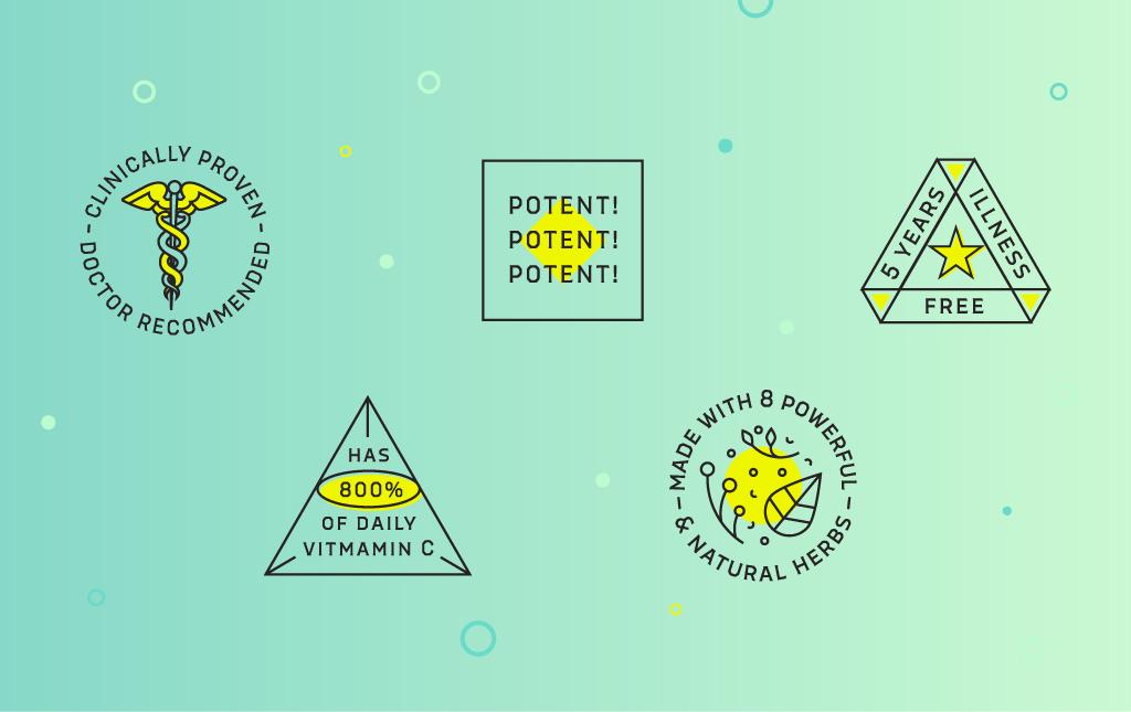
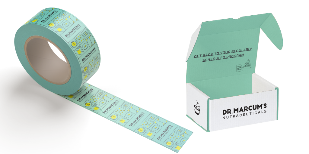
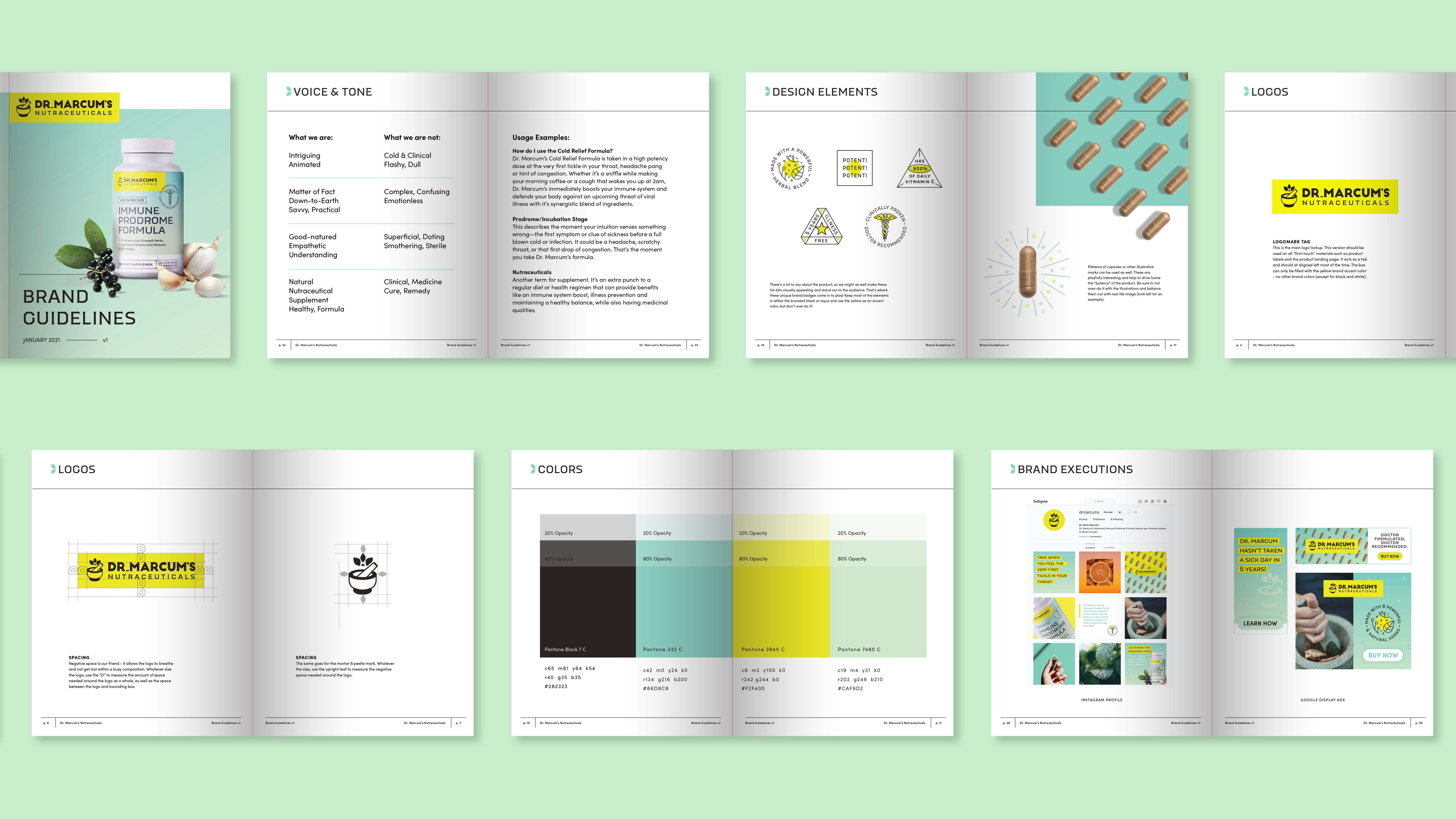
The creative had to feel fresh, natural, and trustworthy while at the same time educate the audience on how to use the product. We did this with a refreshing color palette filled with green to blue gradients and a spry yellow accent, custom icons that are not only eye-catching but informative, and messaging that is approachable, warm, and non-clinical. These creative and strategic goals set the foundation for package design, landing page development, and marketing.

Digital Marketing
Introducing the Brand and Convincing Users to Purchase
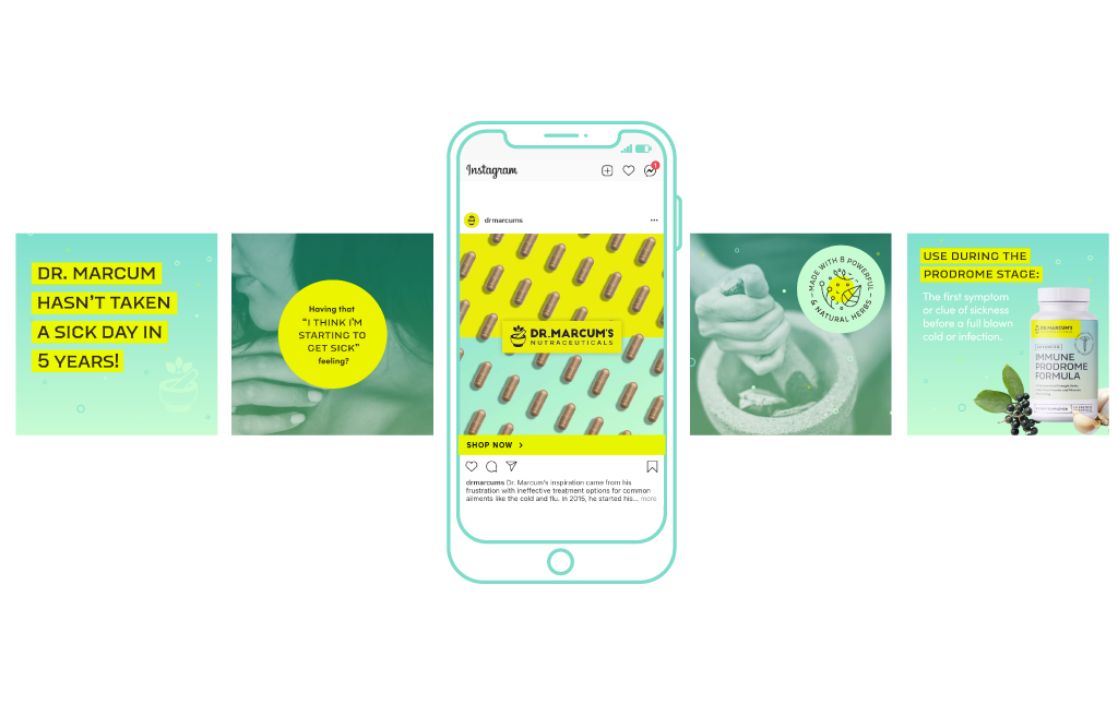
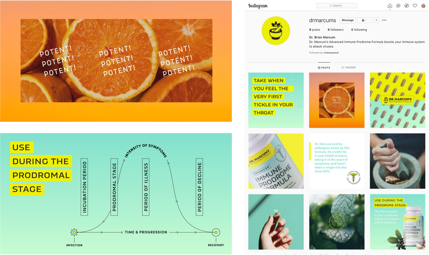
The digital marketing campaign had to achieve two objectives; introduce and validate this new brand and product AND convince users to purchase. We launched an aggressive awareness display campaign targeting users by their interests with vibrant, colorful display ads that would stand out on a website or a crowded newsfeed. These display ads leveraged various messages, including family protection, avoiding sick days for professionals, and highlighting the product’s natural and safe ingredients.
In addition to the awareness tactics, we knew users would also need additional motivations before purchasing. VIA Studio partnered with The Business Journals to publish sponsored content articles that offered users more information about the product and the man behind it, Dr. Marcum. In two articles, we provided a personal testimony from Dr. Marcum about how he has avoided taking a sick day for the past five years with his product and positioned it as a more targeted and effective alternative to daily immune-boosting supplements.
Finally, to drive sales, we leveraged a variety of sales focused tactics. First, remarketing campaigns targeting users who viewed the website but didn’t convert. Knowing that users were unlikely to purchase during their first interaction, we had to keep users engaged with the brand and product to drive conversions during additional interactions. Second, we launched a paid search campaign that targets search queries from users looking to avoid illness or looking for therapeutics to help with the onset of illness.
The Website
Educating and Convincing Users Along the Purchase Path
Like the marketing plan, the website also had to achieve two objectives at once; introduce and validate the brand/product and convince users to make a purchase. In this regard, content planning and hierarchy were paramount in the initial website development stages.
As part of this planning process, we broke the site into distinct sections and set an objective for each one. First, we had to introduce and validate Dr. Marcum and the product. We started with an introduction and bio for Dr. Marcum, explaining how the product works. We wanted to validate Dr. Marcum’s qualifications to develop a product such as this and what made the product safe and effective.
Next, we had to educate users on how to use the product. This product differs from daily immune boosters in that it is not intended for everyday use. Instead, this is a therapeutic product designed to be taken at the first sign of symptoms to help give your immune system a boost to fight off infections naturally. This is a crucial component of the product and differentiates it from competitors.
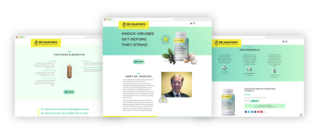
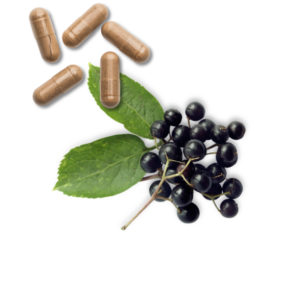
Next, we had to convince users to purchase the product. We achieved this using an attractive features and benefits section that displayed the actual capsule and information about its efficacy, natural ingredients, and safety. We followed the features and benefits section with testimonials from hospital staff who had the opportunity to test the product.
Throughout these sections of the website, we included call-to-action buttons that allow the user to jump to the product section at any time. These CTAs sprinkled throughout the page offer a user to quickly act and purchase once they are convinced that the product is right for them.
The product section offers users the opportunity to purchase the product while reiterating the critical content points that were highlighted previously on the user’s path. It also included the ingredients and high-res product images, so users know EXACTLY what they will be receiving with their order.
