Buffalo Construction Website
We repositioned Buffalo's brand to better reflect a modern construction approach. With a shifted focus towards efficiency and sustainability, we built a website that was lean, cutting-edge, and performant.

The Objective
Buffalo has always had a blue-collar reputation—a hard-working, hammer-and-nails type of company—and the brand spoke to that. Meanwhile, Buffalo’s EOS process/branding was moving towards more LEAN methodologies—the efficient, smarter way of doing things.
It was important for Buffalo to shift their brand towards a work smarter perspective, but we couldn’t compromise the work ethic, values and culture that the existing brand was built on.
Before & After - Logo:

The needs for the website:
- Communicate a new brand with new goals: From rustic to refined had to feel like a natural progression.
- Strategically-driven content overhaul. Page by page, we had to guide and engage each user with a clear and concise focus on their specific needs.
- Aesthetically driven, the site had to feel as fresh, modern, new, and clean as the newly established identity work.
- Make the site easier to maintain for both developers and content editors.
- CRM Integration.
How we did this:
- User paths based on all user personas, focusing on driving users to Buffalo’s expanded scope of services.
- Page-by-page content outlines to ensure content and copy decisions felt appropriately placed and accurately weighted.
- Mood boards to align our visual language and definition of sophisticated design.
- Competitive landscape analysis to ensure we stood out amongst competition both locally and nationally.
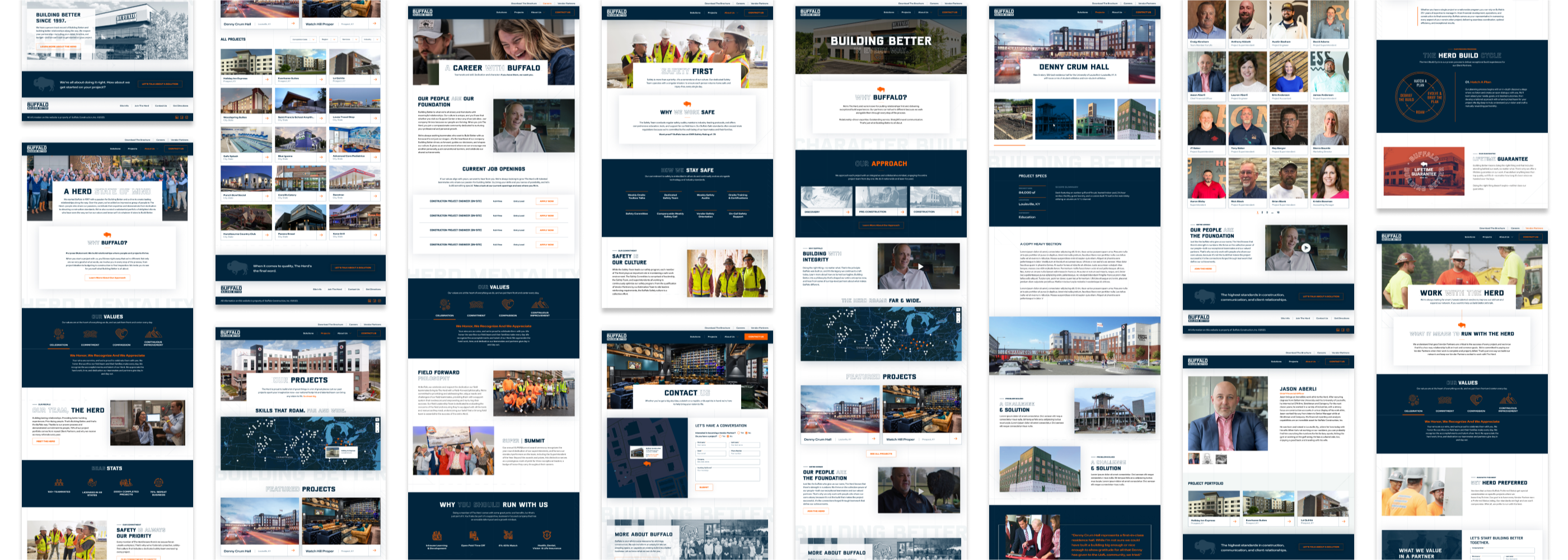
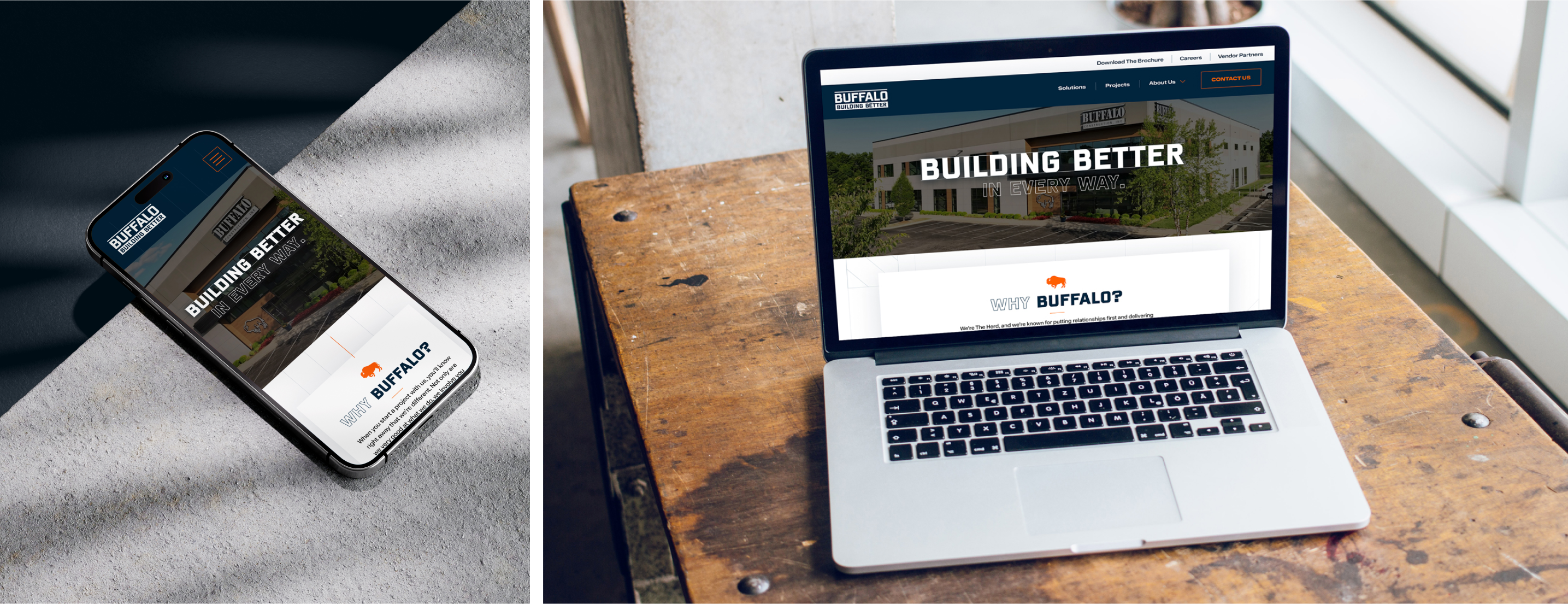
Before & After - Website:

How We Built Better, Together
We leaned heavily on our brand strategy, messaging, and positioning work to cater content to priority website users, lead them on paths to conversion and engagement funnels, and used content architecture to prioritize the website content itself.
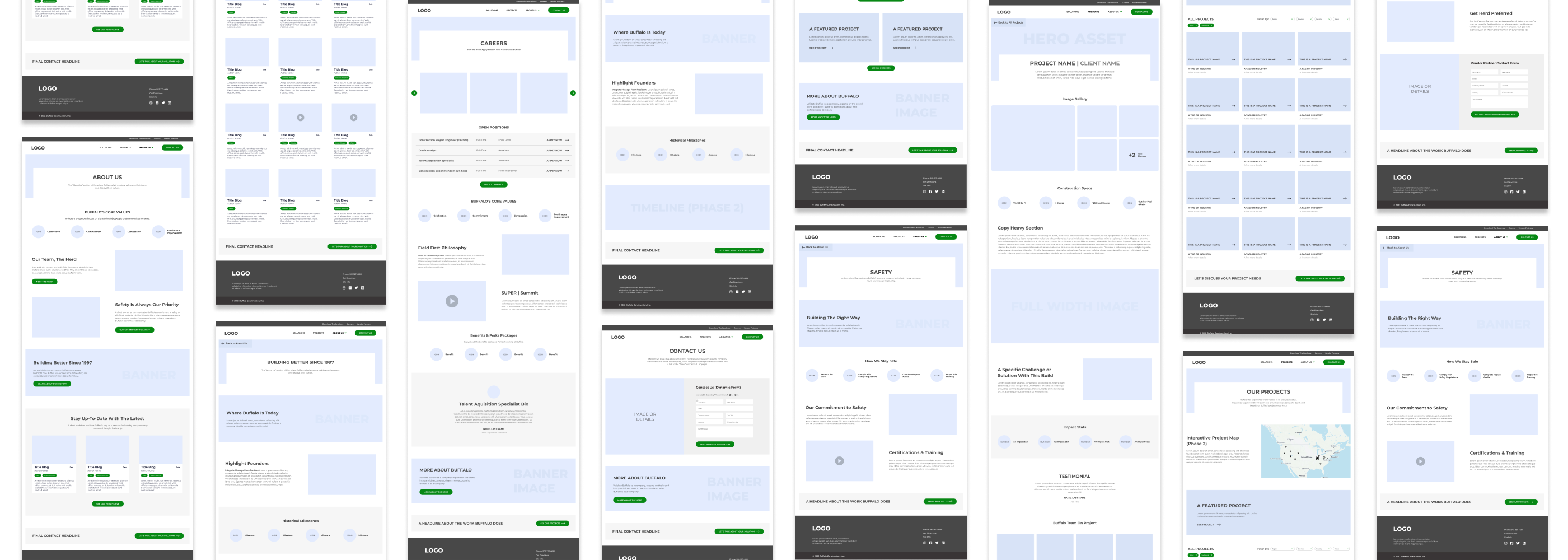
With detailed, high-fidelity wireframes and prototypes we were able to align with Buffalo stakeholders on decisions made and ensure that our strategy work was being thoughtfully and accurately translated.
A Sound Structure with Strong Support
We utilized content modeling to define the website’s structure at a granular level. We started by analyzing what kind of content the website needed. We identified its structure and decided how it should be presented in content outlines. We then developed new content, including defining the required content types and fields.
To be as efficient with our time as possible, we identified a high-priority subset of editable content types for the first phase. In future phases, we hope to build on this foundation and expand this remote customizability to every page on the site. We can take a variety of approaches to editable content to keep projects within scope while delivering high-quality work.

User experience
Buffalo's new brand needed to shine through on the web, so we knew the site had to have a big personality and uniqueness to support Buffalo's innovation and vision. Outside of our core component library, we put extra love and attention into the surrounding environment by adding blueprint-inspired background elements, subtle, user-initiated animations, and more!

Seeing is Believing
We had to do a better job of selling what Buffalo does by showing what they build and where they build it. Licensed in 48 states, with over 2,000 projects completed, the breadth of work and national footprint had to be emphasized.
Priorities for project content:
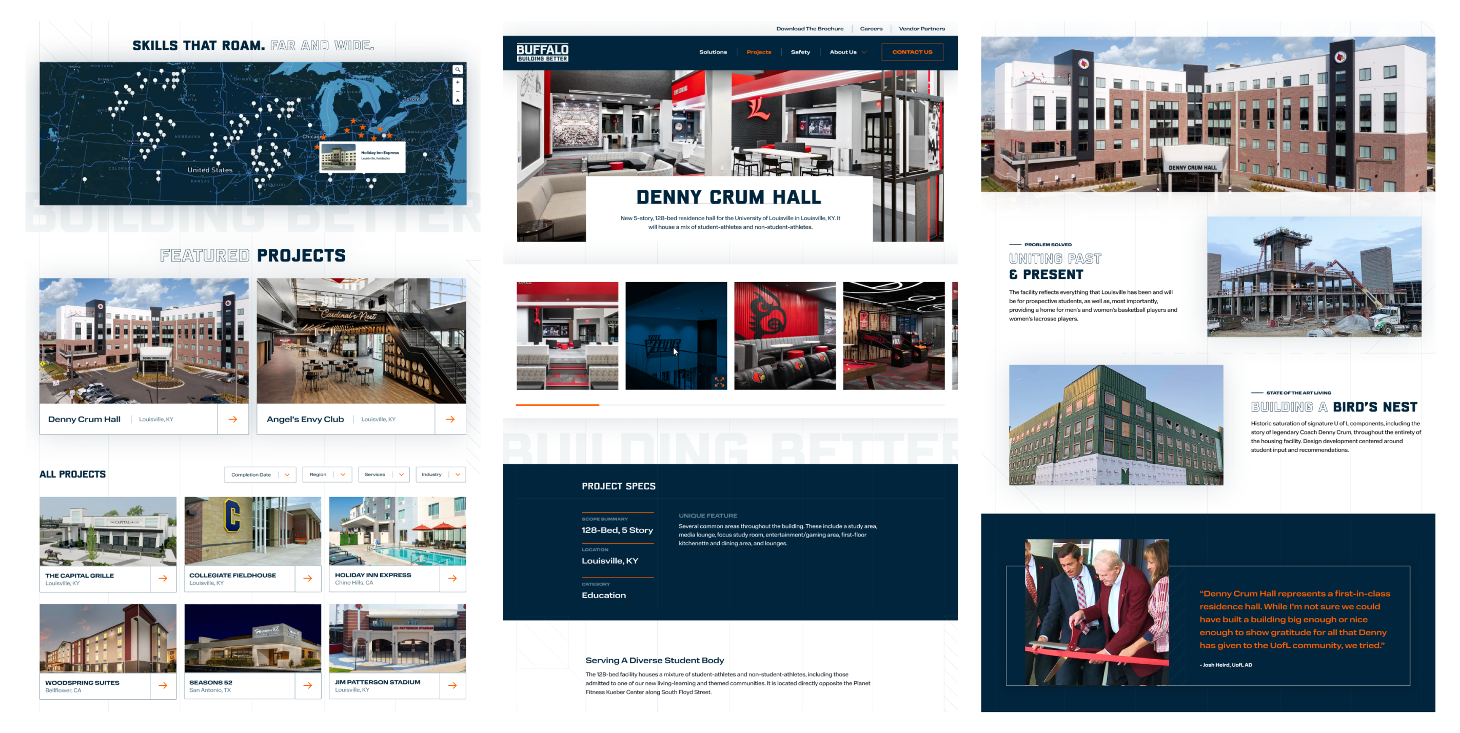
- Showing Buffalo is national, not just local, we used Mapbox to create an interactive, custom, branded project map.
- Better photography and video integration - Show, don’t just tell.
- Robust case studies. We built a modular, flexible case study page template that formulated a story for each project and allowed Buffalo to showcase each project's unique aspects.
Building a New Foundation
The previous iteration of buffaloconstruction.com was built on top of another agency's fully custom PHP framework. This added significant maintenance overhead for our development team and restricted the client's ability to edit content as they would with a dedicated CMS.
For the new site, we took the opposite approach and decoupled the web framework from the content management platform. For more about this process, read our case study for this very site.
Developing the New via.studio
From WordPress to Next.js and SanityLearn more about headless architecture, migrating a WordPress site and our tools for building modern websites in our retrospective on the development of this very site.
Read Developing the New via.studioCRM Integration For Future Marketing Success
A final component of this project was integrating the new website with their CRM platform, Zoho. Website components like lead forms and email signups had to share data with the platform to set Buffalo up for future marketing efforts.
Whether it's Mailchimp, Salesforce, Zoho, or something else, VIA Studio understands that for many clients, a website build cannot be a success without CRM integrations.
The Results
We approached this project similarly to how Buffalo approaches every one of their builds. From the napkin sketch to the final product, we took a strategy-driven approach to achieve an exceptional build experience from the ground up.
We started with a thorough brand strategy phase that led us to a brand concept, revamped brand identity, and, eventually, a unified visual language to follow.
The final site is the culmination of a partnership steeped in collaboration and strategy, which nailed the end goal of a facelift for Roman and a website to support all of the future growth and expansion of the Buffalo brand.

"VIA Studio’s team has been an absolute pleasure to work with from day one of our partnership. They’ve expertly guided us through the strategy and execution of our brand update and new website, ensuring a seamless process. Their deep understanding of our brand vision not only helped us reposition ourselves in the market, but significantly enhanced both our digital and physical brand presence. I can’t imagine having done this with any other team!"
— Sierra Baumle, Marketing Director – Buffalo Construction

Buffalo Construction Website
We delivered a fresh, performant website built using a state-of-the-art, modern framework on the front end. We emphasized high-quality design and incorporated things like animation, video, and interactivity to engage users.
Check out the new website