Email @ 50: The Art of Email Design

I remember when I first started out as a designer (professionally), having to play Photoshop Tetris with cut up image blocks to piece together a full email layout. As a UX designer, we are taught that nothing is more important than usability and utility … and let’s just say, nothing puts those things to the test quite like Photoshop Tetris. Thankfully we have more sensible solutions now, but email design still comes with its added constraints and limitations. Luckily, I’ve had enough time and practice to be able to share a bit of knowledge, tips & tricks with you fine folks. So, let’s cut it up:
The Biggest Challenge
Lack of standardization. That’s the main thing. What works for one browser/client combo, may break for another.
There exists a sea of inconsistencies across browsers and platforms that you must be aware of in order to make sure an email functions cross-platform … Which makes designing for email uniquely challenging. Email forces designers to simplify, limit chaos of content and reduce cognitive load for the user. You don’t have a lot of space and you don’t have a lot of time, so using both wisely becomes immensely important.
Glass Half Full Outlook
Overcomplicating with tons of drop shadows, too many grid alignments, massive visual assets, or fancy fonts (which usually means image-based text *gross*) may break an email entirely (in Outlook but not in Gmail, *sigh*). While that forces us to pay closer attention to decisions being made, it’s also making us more thoughtful designers. In designing for email you have to prioritize and strategically solve the challenge at hand.
It’s a balancing act between performance and design. An email can look beautiful, but not be effective, in which case it’s not a successful email. Emails are not meant to be a piece of art, they are measured by specific metrics that dictate good vs bad. Design works as an addendum to the customer experience of the email’s content and messaging. It’s used as an aid to the overall strategy and as a line item on the grading rubric of performance for the success or failure of a campaign.
Mistakes are made
The biggest mistake that is consistently made in designing emails is simple – complexity *badum-tss*. We try to limit that desire to overcomplicate in our own process at VIA by collaborating early and often with the development team. When designing an email, a designer and developer get together and go over the goals at hand and constraints within our email editor of choice. This helps eliminate future issues and aligns our priorities before any design work is done. It ends up being a huge time-saver and efficiency boost.
After eliminating complexity in handoff and process, you then must focus on the design itself. Remember, it’s about serving the person you're sending the email to, not your personal design vision or preferences. Email isn’t the place to test out complicated layouts and fancy designs. Use that energy on the consumer, their needs, and the effectiveness of having a focused message.
Tip: If you are really looking to get cute, throw in some fun or engaging copywriting. Copy can go a long way with holding your audience’s attention. BUT, keep it short and sweet. Most people spend less than 15 seconds reading marketing emails, so prioritizing is key.
Tips & Tricks
So, going back to the constraints and limitations that I keep referring to. You must be asking – “Are there specific rules I can follow?” It’s a loaded question but a valid one. My answer is – There isn’t really a single checklist to follow. Rules are ever-changing, BUT there are guidelines and standards to keep top of mind to improve your chances of success. Let’s run through some.
The first is simple and it’s that you need to prioritize mobile. A common example of what not to do here (it’s one that I see often) is having an image with a block of text or headline in it. It looks PERFECT on desktop. It’s large and in charge, eye-catching and memorable. But when you go to open it on your phone, you need a magnifying glass. People utilize mobile email. Cater to them.
Follow the rules of accessibility. Use trends that lend to legibility like high contrast and large body copy. Make it scannable and quick hitting. A tried-and-true layout doesn’t have to be boring – It can be adapted for any brand and made unique.
Now, let’s get into some specifics.
(Ok, Fine. Here’s your checklist)
- To ensure email renders for every client, don't go beyond 640px wide for your design. I personally keep designs to 600px wide.
- If you are using visuals in your email, be sure to optimize the image files before uploading. Especially on mobile, large images take large amounts of loading time. I find that TinyPNG is incredibly helpful for sizing down images without compromising quality. You’ll also want to save images out 2x the intended size to ensure that they are nice and crisp. Then, you can adjust the image attributes or CSS to scale down
- Include <Alt text> for images. This will make your email more accessible. If your image doesn’t load, the text will still be shown (or read for screen readers), so the message isn’t entirely lost.
- Avoid stock photography. Personalization has been linked to success in emails. Whether that’s using the person’s name in the email subject (personalized subject lines are 26% more likely to be opened), catering content to specific audiences, or using relatable, custom photography that speaks to your brand.
- This one is a bummer, but it’s important. Use web safe fonts. Email-safe fonts have the highest likelihood of being downloaded on your audience’s computer, thus rendering in the email without altering the design. Here is a list of the fonts considered most bullet proof:
- Arial
- Courier New
- Georgia
- Lucida Sans Unicode
- Tahoma
- Times New Roman
- Trebuchet MS
- Verdana
- Use lots of white space. Make your email design digestible and give each section its own space to live. This helps guide your user along a curated path, without being overwhelmed by content and calls to action. It limits cognitive dissonance and increases likelihood of conversion. Win, win.
- When designing for mobile first, I tend to stick to 1 column layouts, at least 16px font size for body copy, and keep said copy short and focused.
- Large buttons (easy to click) with not a lot of copy (easy to scan). Typically, I go 50px tall for CTAs and for the button-copy, I use a verb or action word to reiterate the call for the user to complete an action (EX: read, visit, learn, explore).
- Make sure your images are large enough and have a central focus. If they are tiny and busy, the message can easily get lost when scaled down.
- Video. Don’t do it! There are technically ways of including video in an email, but the success rate is low. Almost half of all email clients don’t support the technical requirements required to play a video in an email. You’re better off converting that mov or mp4 to an animated gif. Shorter load time, higher success rate and auto-plays.
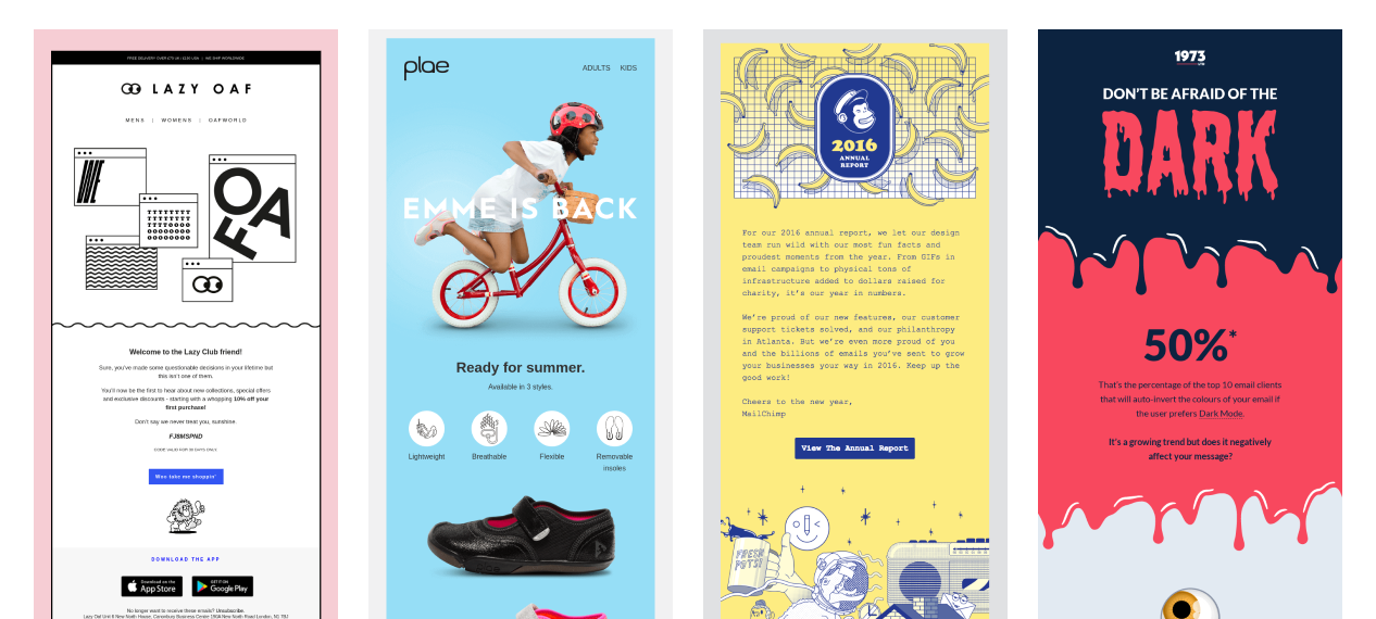
Learn From The Best
Here are some examples of successful results following the above criteria by brands that consistently put out engaging, successful email campaigns.
The future
I’ll leave you with a bit of confidence in where I see email design going and our current process here at VIA.
Clean code supported by a modular based design. THAT’S IT, THAT’S THE TWEET.
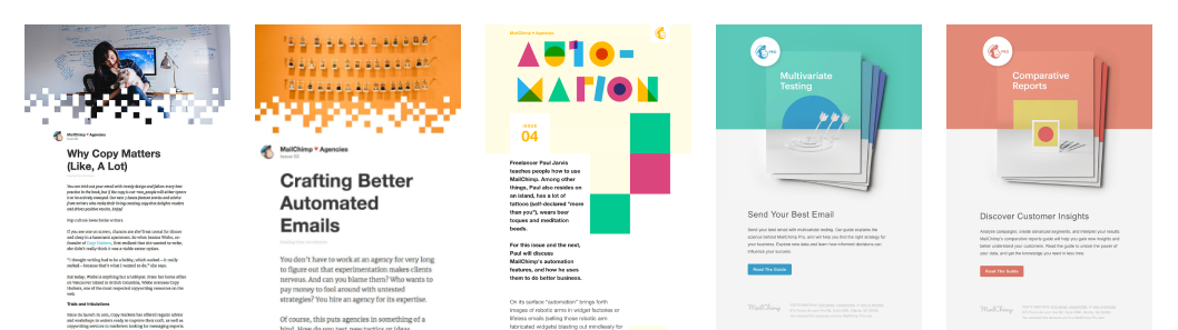
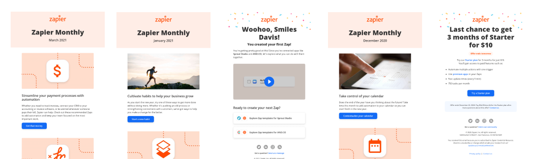
Component based design allows you to mix and match to create unique templates that feel consistent but different at the same time. Rather than 1 restrictive template design, you have 9 or 10 modules to pull from for different instances or content types. It makes the design more flexible. I’m a strong advocate for creating patterns or building a visual design language and emails are just another outlet where I find that to be a successful approach. Here are a couple of examples of companies reusing components / establishing a design language to come across as consistent, but unique each time they send something out.
Mailchimp
Zapier
There's a lot to keep in mind when designing for email, but I hope the tips and tricks provided in this article help give you a solid foundation to build on.
Email can be a beast and each discipline has their own set of principles and rules that they need to follow (which is why we did this series ☺). Be on the lookout for more posts on email in the future!
Reach out if you have any questions! Unless it’s about Photoshop Tetris. Can’t help you there. I’m retired.
View All Entries in the Email @ 50 Series:
Intro: Email @ 50: A Brief History
Part I: Email @ 50: Email Marketing Still Works... Half a Century Later
Related Posts
Email @ 50: Email Development
By:Nick Stewart on 8/6/2021
Email development has always been the bane of a web developer's existence. You have to use outdated methods and don't have access to the full modern web to create a nice looking email that thousands of people will see. It's like asking a Nascar mechanic to create a car using only tools from the 90s - it can be done but its more than a pain.
Read More »
Email @ 50: Retrospective + The Future of Email
By: Nick Wunderlin on 11/19/2021
Welcome to the final installment of our Email @ 50 series. In this last article, Email @ 50 contributors review what they learned from writing this series and look ahead to the future of email.
Read More »