More brains are better than one
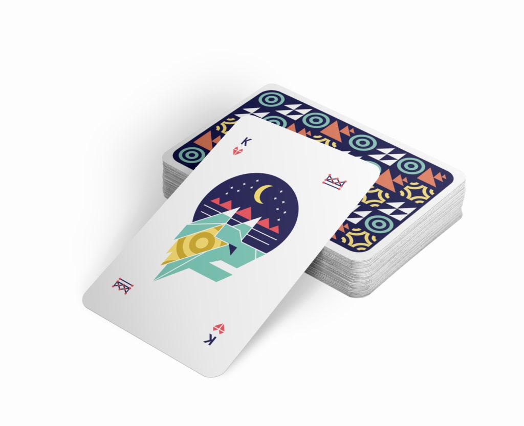
Collaboration is essential in design. It’s important to inherit, in some form or fashion, an adaptive, and collective attitude if you want to reach the best possible end product. Our holiday gift every year is the perfect reminder for being able to eliminate ego and work as a team. For this project specifically, we wanted an equally-inclusive outlet for everyone on the design team to create one shared vision. We went through a plethora of potential ideas including plant-holders and Kris Jenner socks. However, once we nailed down our concept of fate and change, we landed on playing cards – with each member designing their own unique, yet cohesive face card. Sound simple? … Nah.
Nailing a design style
We wanted these cards to be a truly collaborative piece, but we also wanted them to look cohesive. We chose a design direction that made use of geometric shapes, to keep things simple. What wasn’t so simple: trying to encourage creativity while keeping the look and feel visually unified.
We created an underlying grid for everyone to use when creating the face cards. We also created a color palette and a couple of patterns to use throughout. All of this grid, color palette, and pattern creation required at least a few rounds of revisions before we could even start on the illustrations. We’d meet in our conference room and project our work on the screen, or at our standing table and hammer out any nuances. Once we had the system and our face cards designed, we each tackled different pieces to help pull everything together.
V.I.A.
Now, VIA has an alter-ego called Violent Imaginary Animals. This consists of a group of mythical creatures that have their own year-association and persona, much like Chinese Astrology. We each designed a face card with a creature based on our birth year. Our Marketing Strategist chimed in as well to write some killer copy that connected the cards back to our concept.
Ryson
There are a lot of things you can do when you’re writing clever copy for a deck of cards that is mythical creature/constellation themed. I mean a LOT of things.
Face cards.
Royalty.
Stars.
Constellations.
Gambling.
Fantasy.
Shuffling the deck.
We wanted to tell a very short story about VIA Studio. A three sentence story about change, consistency, and spirit. So I worked up a lot of variations using the themes above.
Some early concepts:
Shuffle the deck.
The order will be unique.
But the stars continue to align.
Look at the stars & shuffle the cards.
If you look long enough, you can always see new things in them, but the essence remains the same.
VIA Studio is new. VIA Studio is steadfast.
The final product- Mail packaging: Stars always align.
Things change. Even when you look up at the stars, you can always see new shapes, designs, and imagine new worlds, but the spirit of them, remains the same. The constellations will always be there, steadfast. VIA Studio is new. VIA Studio is steadfast.
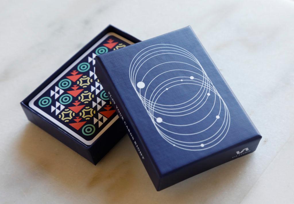
Outside of card box: Play your cards right.
You have to play to win, and partnering with VIA Studio is the right play. There is no secret message here. ?
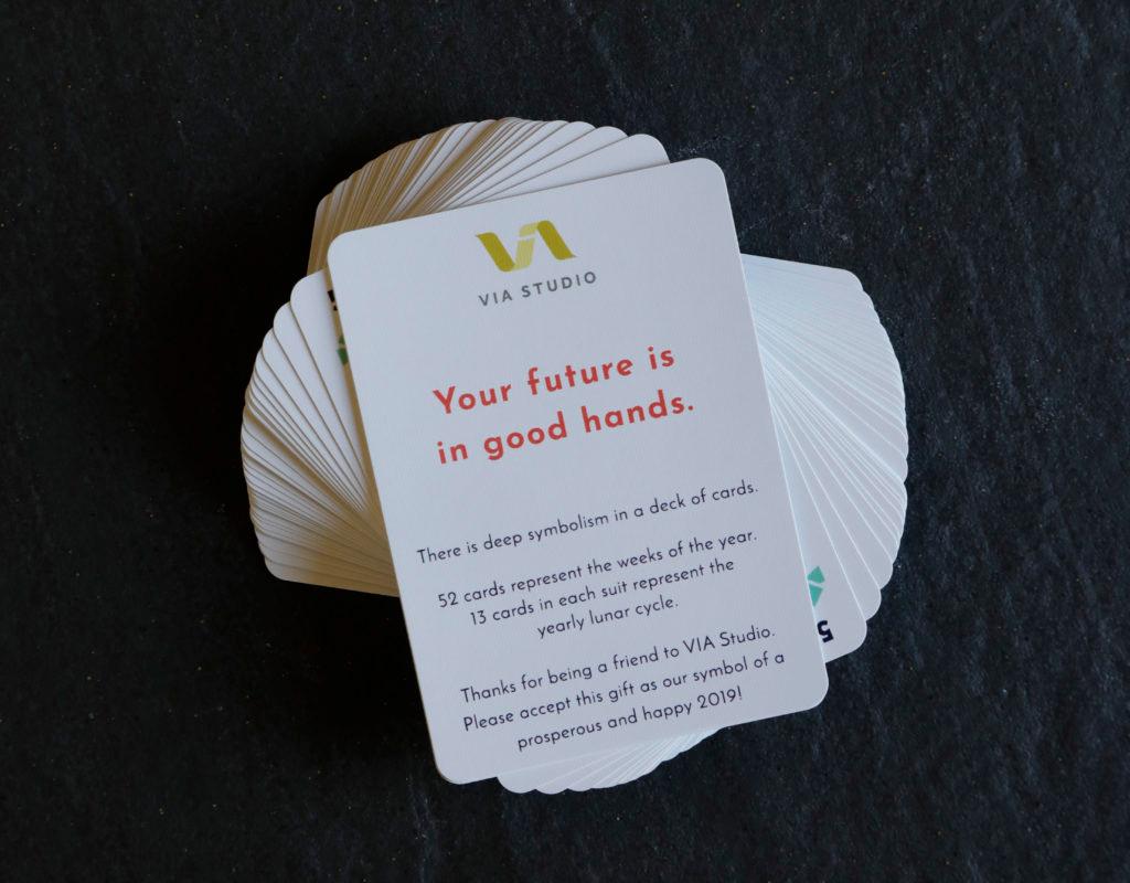
Deck of cards: Your future is in good hands.
VIA Studio views working with our clients as a partnership. We do not work in a silo. As our partners hold this deck of cards, they will see that their future is in good hands: both literally and metaphorically. We will work together to build a bright and fantastical future.
Morgan
Delegating responsibilities
My first task was researching and deciding on a style that we could all follow as inspiration. The trick here was not to design for novelty’s sake, but to find a flexible style that everyone could use as a tweakable recipe for their design.
Cue, Dribbble.

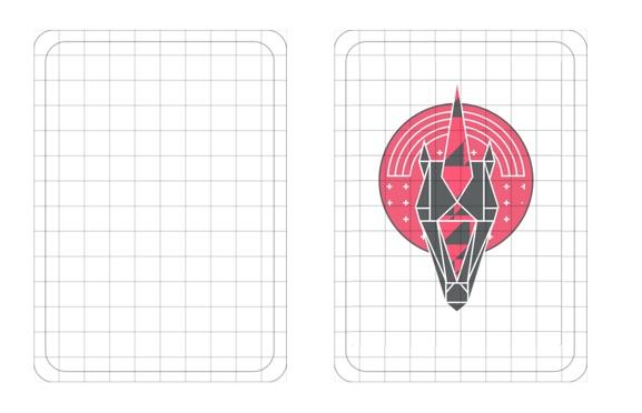
Once we landed on a style we wanted to follow, it was time to lay the foundation. We needed an underlying grid (thanks Em!) with rules and guidelines around it so that all of our designs came together as one cohesive unit. This is much easier said than done. We learned that through trial and error (not using the same angles, border radius, stroke weight, rounded corners … the list goes on)
See, this wasn’t one person taking the lead or putting down every one else’s work. We came together as a team and subjected our concepts and selves to multiple perspectives and opinions in order to reach an improved final result. That improved result wasn’t the first go-round, or second or even third. And that’s okay. I loved this project because we we’re all open to criticism and change in order to get this guy to be the best it could be.

It’s instinctual to feel uncomfortable about sharing work before you are 100% satisfied with it (RIP thriller werewolf). It’s common to want your design to shine and be “the chosen one”. But these traits hinder true collaboration. Overcoming that mindset is being willing to subject your work to critical feedback or identifying, accepting and embracing that someone else’s idea is a better fit than your own. AND AGAIN, THAT. IS. OKAY. It’s an essential part of growing in our field. And this project was a perfect reminder of We > Me.
Ann
Being the baby and having my birth year in 1995, my violent imaginary animal was the cerberus. (You’re also a cerberus if you’re born in the years 1959, 1971, 1983, 1995, or 2007.)
Along with the illustration creation of the cerberus, I wanted to step up and take on more of a leadership role. I worked with our creative director to nail down anything we’d need to tackle, and I wrote up a creative brief. I got us all together for those many collab sessions, and we were able to make decisions quickly and efficiently. I helped create the patterns and suit icons, and made sure all the assets were accessible for the team.
This holiday gift really showed me how incredible our work can be when we collaborate. No egos were involved; we wanted to make the best work we possibly could, and that meant compromise but also boosting each other’s work needed to go into these. All the good vibes were exchanged throughout these card creations.
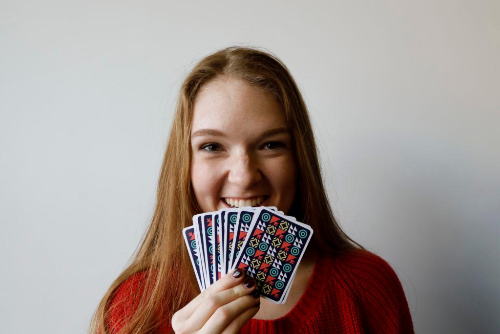
Emily
My card was the Ace, and my V.I.A. was the Unicorn!
(You are a Unicorn if you were born in: 1954, 1966, 1978, 1990, 2002, or 2014.)
Along with the super-fun project of designing a unicorn, I also got to handle the box and poly-mailer design. After sketching out a few ideas, the team agreed on a minimal approach to the packaging. Here, we wanted to focus on the cosmos aspect of our theme, so we decided on this deconstructed planetary alignment design.
Printing
My main hurdle in this process was the printing. Since I have a background in designing-for-print, I was in charge of the final setup of creating our beautiful deck. Now, I don’t know if you’ve ever set up 54 different cards and a box to be printed hundreds of times, but it’s pretty scary. The collective team must have proofed the contents and positioning at least fifty times. Once everyone approved after those fifty look-overs, I sent them off to print.
About two weeks later, the mailman delivered our cards. We all rushed to the door jumping around and chomping at the bit for the first reveal. Our CD opened one, and my goodness. They. Were. Gorgeous! The colors were vibrant, the alignment was great, and everything was right in the world! What more could you ask for? Our vision of this deck came to life in the most awesome way, and now we have a permanent reminder that:
life is ever-changing
everything happens in it’s own time
& always play your cards right.
Related Posts
Trade Show Videos for RSCS
By:Jason Clark on 10/1/2025
With multiple brands to represent, RSCS needed a smart, flexible way to swap in franchise-specific content without losing their own identity. The solution: We partnered with them to create a modular video template that is built once, branded always, and easy to replace with assets for any vertical.
Read More »Reel Stories: A Photography Project Exploring Inclusivity in Fishing
By: Zoe Cope on 7/14/2023
Find out how we captured diverse fishing experiences across Florida and Kentucky with a mighty team of five.
Read More »