Valiant
Two process-focused partners combined to build a new brand to reflect an exceptional future.

The Challenge
Building A Brand for a Brand That Builds
Whatever you think when you think “construction” - Valiant Construction isn’t it. Through a progressive, entrepreneurial outlook and a commitment to process to get there, they’ve built a uniquely exceptional business in their first 10 years.
Deep partnership and straightforward feedback from Valiant, their subcontractors and clients led to amazing, efficient and groundbreaking branding work for their industry.
The Concept
Modern Solutions for State-of-the-Art Structures
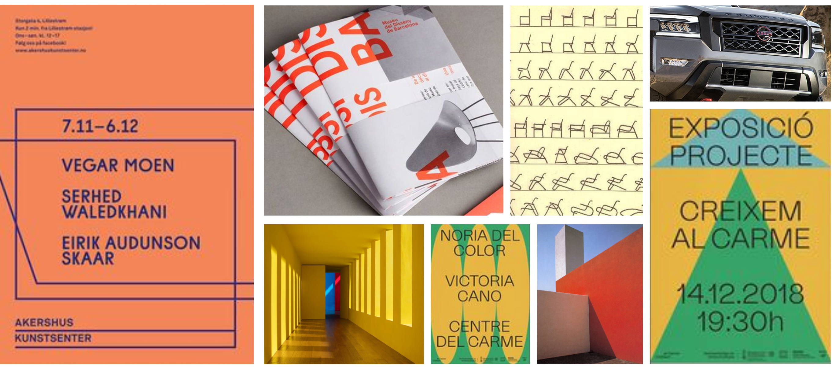
We presented three concepts to VALIANT, along a range from most conservative to most forward-looking. In the middle was “Modern Solutions” - a mixture of geometric shapes and colors with nods to both the foundational elements of construction and the future-looking elements of architecture and modern art.
VALIANT’s decision makers saw themselves reflected in this concept. A construction company, but an exceptional and forward-looking one.
Visual Identity
Forward as a Foundation
A forward-thinking construction company needs both a solid foundation and a bold vibe. An identity that sets them completely apart from their competition while reflecting their unique qualities.
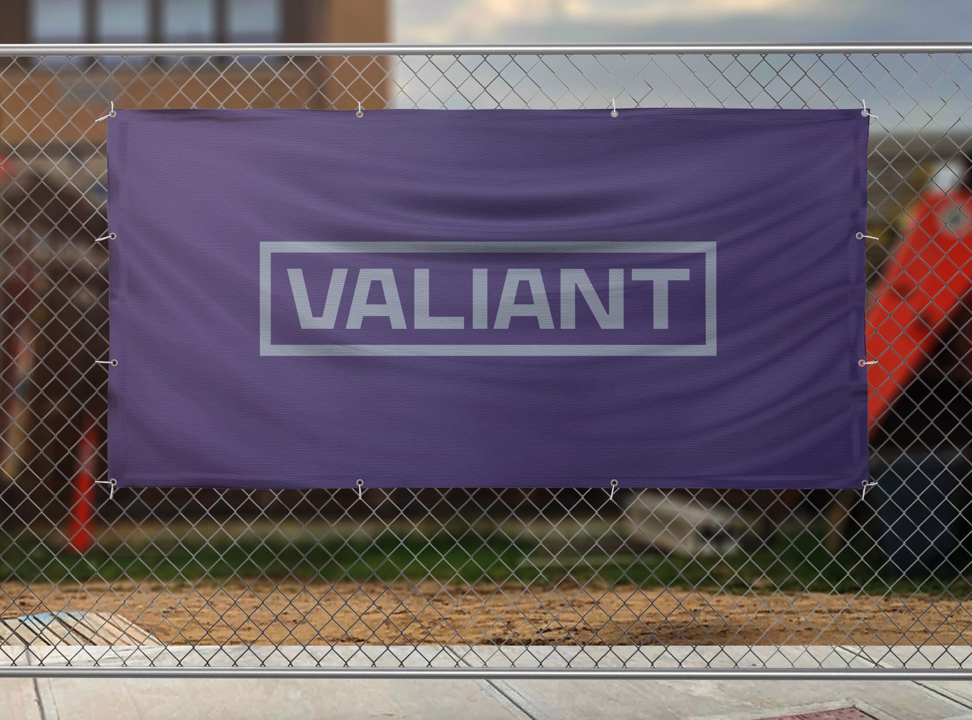
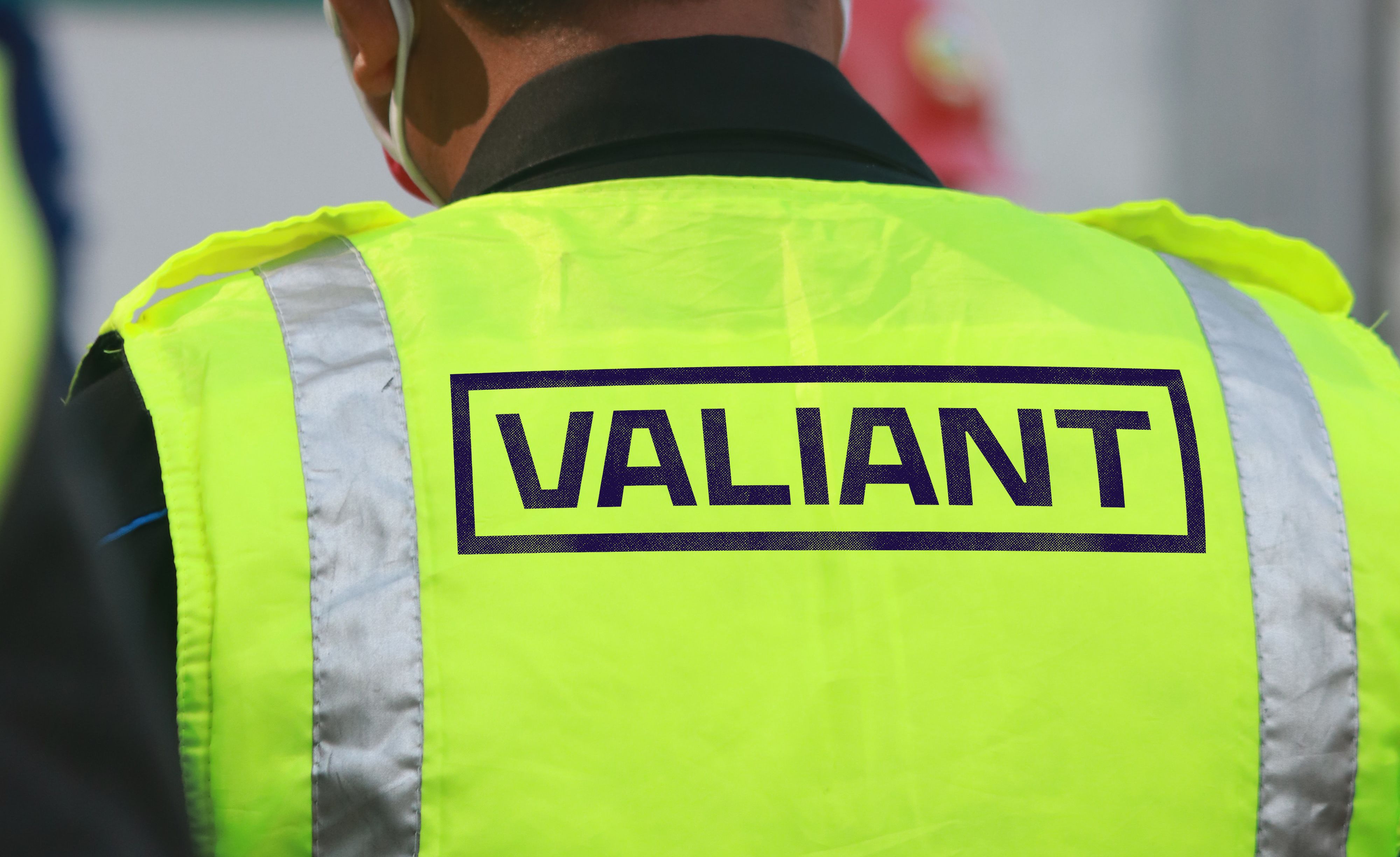
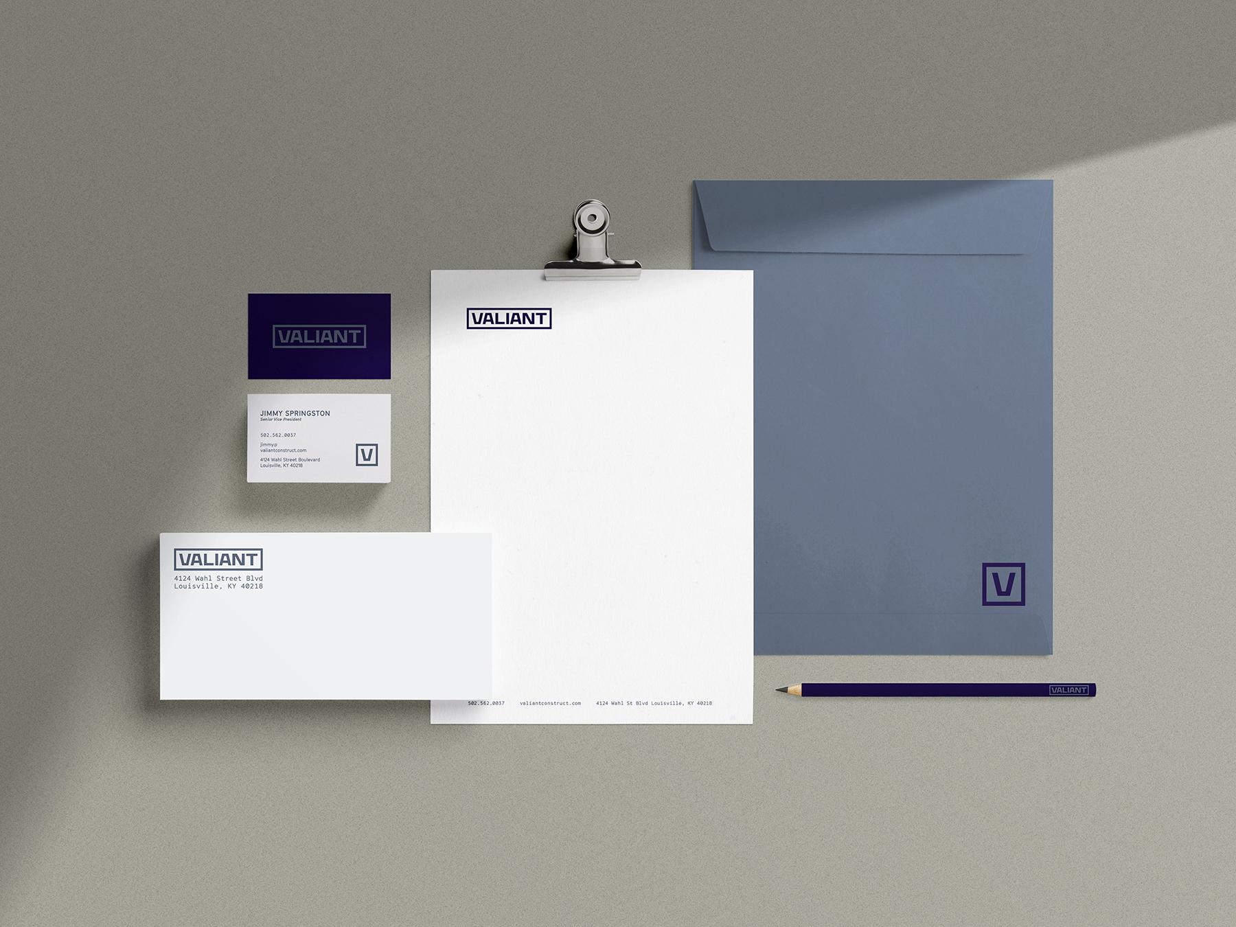
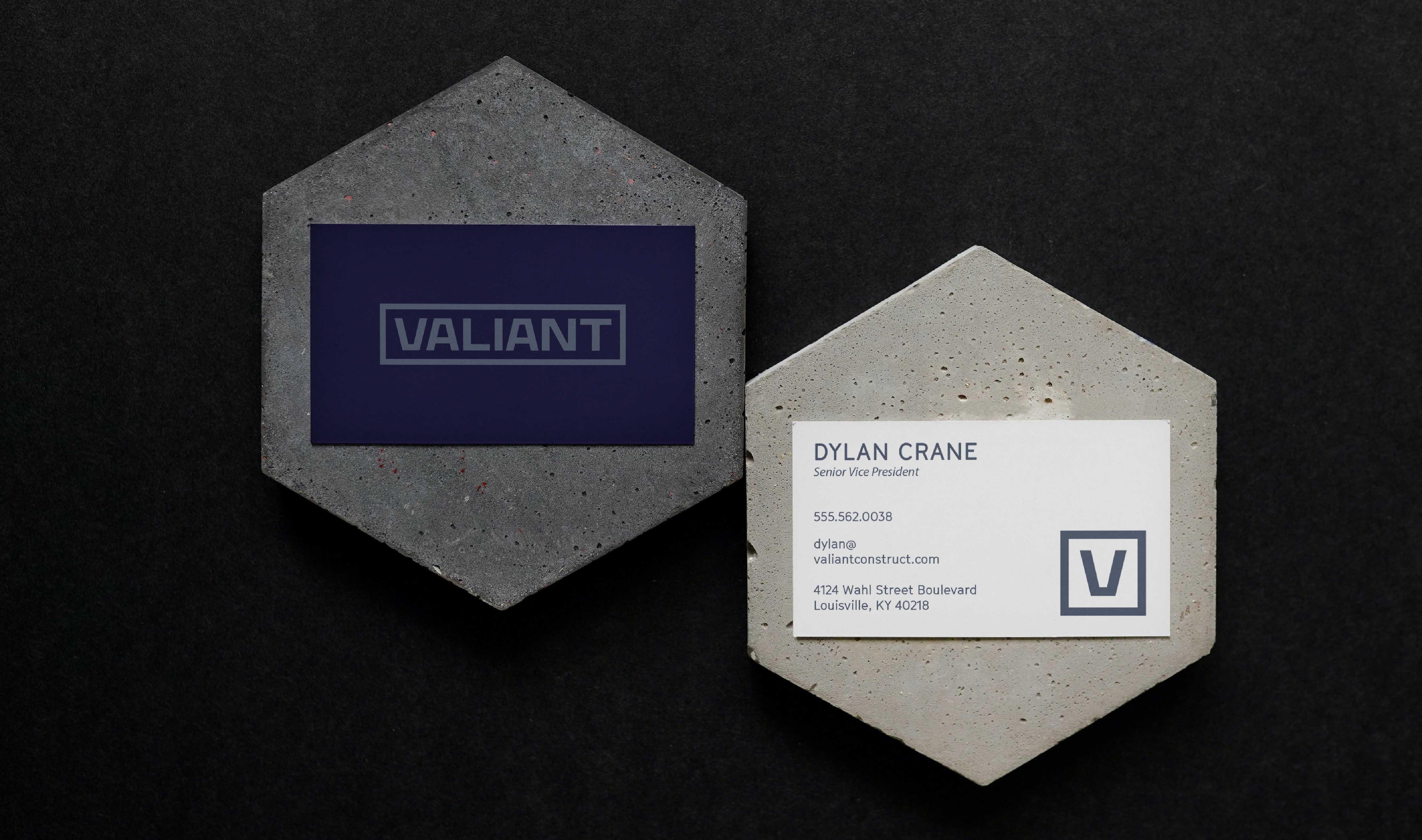
We eliminated the shield and chose not to replace it with another mark. Instead we crafted a custom typographic treatment designed to communicate their strength with heavy, geometric letterforms and convey their stability by using Vs and As with flat bottoms and tops, respectively.
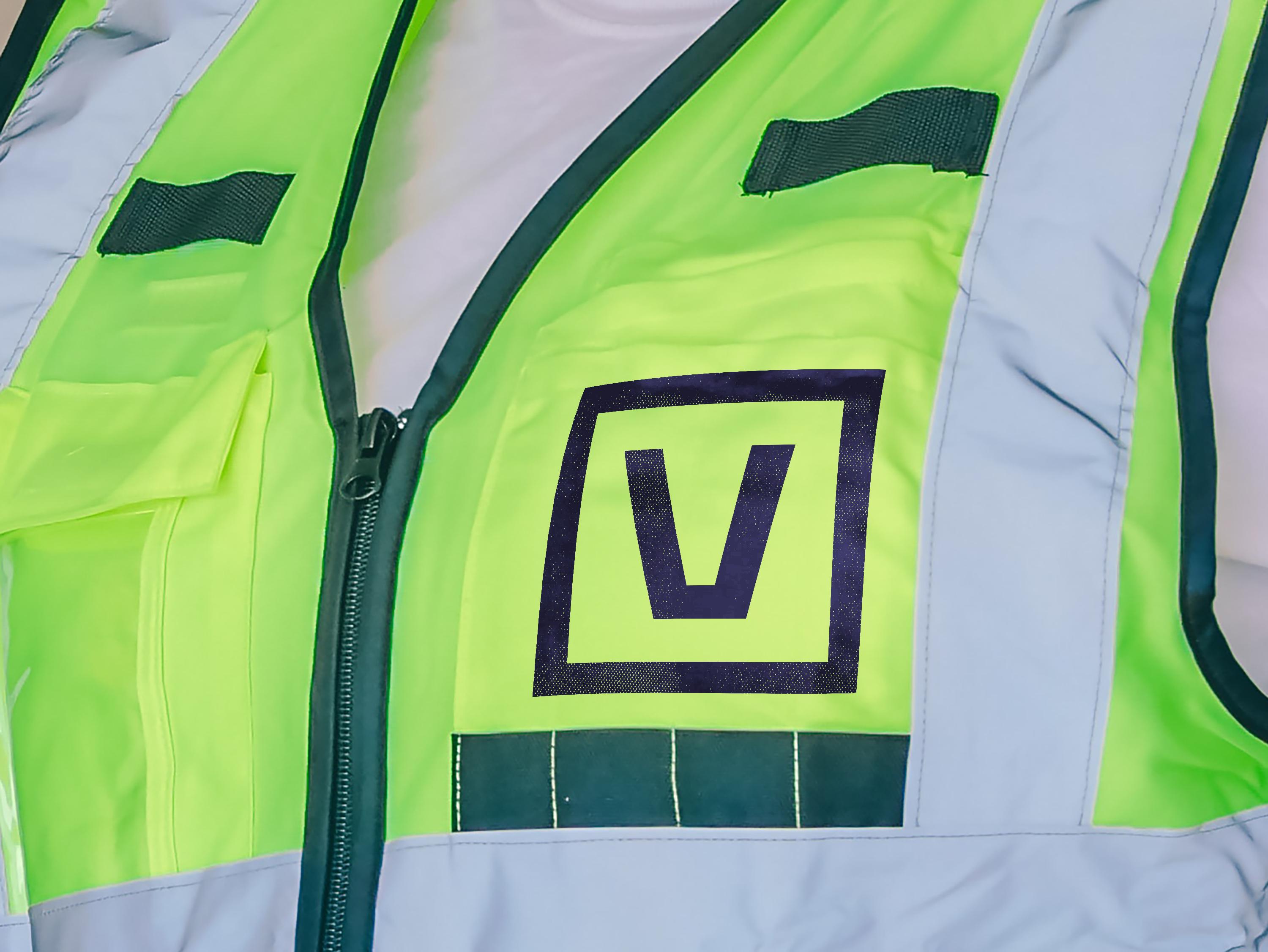
We also included a versatile "box" that works with the wordmark in its various forms to illustrate Valiant's outside the box thinking and process.

For headlines and body copy - we utilized the GT Cinetype typeface. The curves of the typeface are not curves at all, but plotter-style angled vectors. These sharp corners disappear at small sizes, yet add an element of intrigue to the type at large sizes. This subtle nod to the history of architecture underscores VALIANT’s commitment and history.

The bold color palette is radically different from any other in their industry, but still functions within the job site. You will know VALIANT when you see it - and safety dictates you must see it!

Finally - we made the decision to drop “Construction” from their main mark. Not only does this lend strength, but it has a practical reason, too: the majority of the time you will see VALIANT’s branding, you’ll be on a jobsite or will already be in the industry. Simplicity, strength and confidence.
What's Next
Building Ahead.
We are actively working with VALIANT to roll out their new brand through their partners, collateral and website. To do this, we’ve collaborated with their marketing team and have developed a comprehensive roadmap and rollout schedule that mirrors what VALIANT does for their projects.
