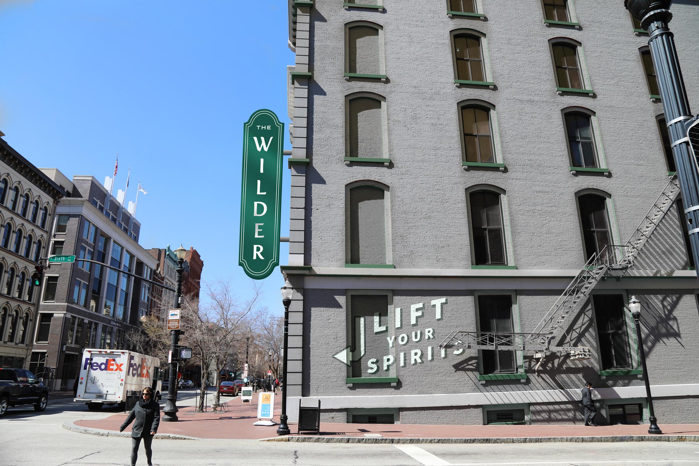
The Grady Hotel (formerly The Wilder)
Finding the soul of Louisville in its hospitality.

Vision Hospitality Group is known for going above-and-beyond with their hospitality, service, and innovation. So when they chose Louisville to step into the boutique hotel market, we were happy to have the chance to tell the stories of our city.
We worked closely to establish a story that made sense to personas in and out of Louisville. We also collaborated closely with the interior design firm on the elements and collateral inside of each room and the lobby.
Note: Due to unforeseen circumstances the name was changed from "The Wilder" to "The Grady Hotel" during construction.
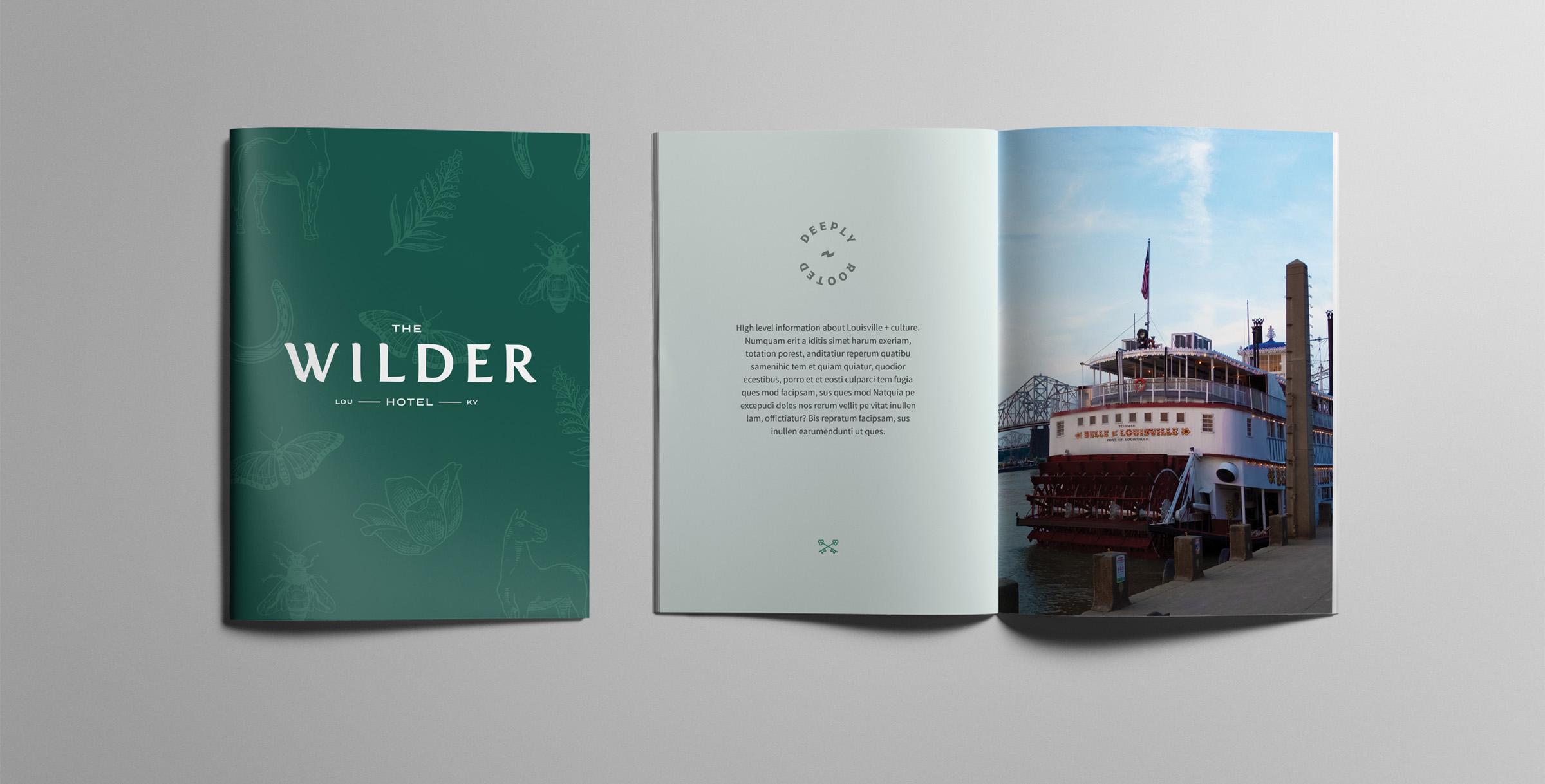
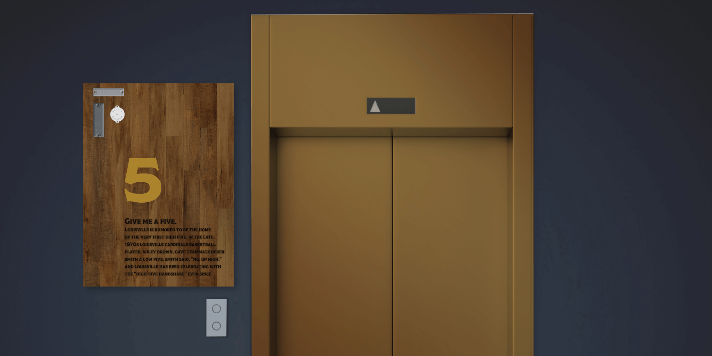
Our client needed this hotel to capture Louisville’s essence. And not the bourbon barrels or horses, but what it actually feels like to live in this historic city with the warm souls and progressive spirit that started it all to begin with. We visited the Filson Historical Society. We scoured antique stores. We interviewed proud Louisvillians from all influences. This started with a whole gamut of deliverables from our Branding Program including a competitive analysis, feature comparison, semantic differential, and voice & tone. We came up with a plan for execution that was direct, apparent, and layered in every element.
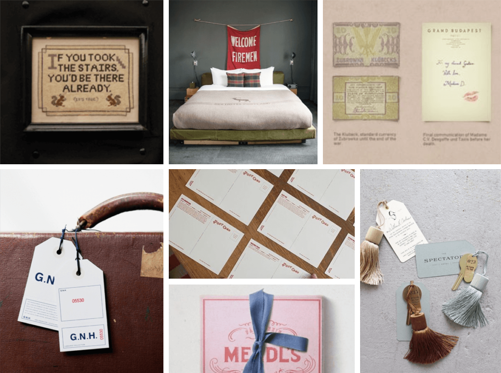


One may feel they can barely afford to look at this color palette it is so luxurious. It is that expertly crafted pair of leather shoes in the window that you can’t help but admire. The greens support a freshness that requires a high level of polish. Imagine this paired with patinated metals and smooth dark textures. The light this welcomes is natural lighting from large windows. The earth tones of this palette also bring forth our bourbon culture (through the barrels), and the greens bring forth our city of parks and the outdoors.
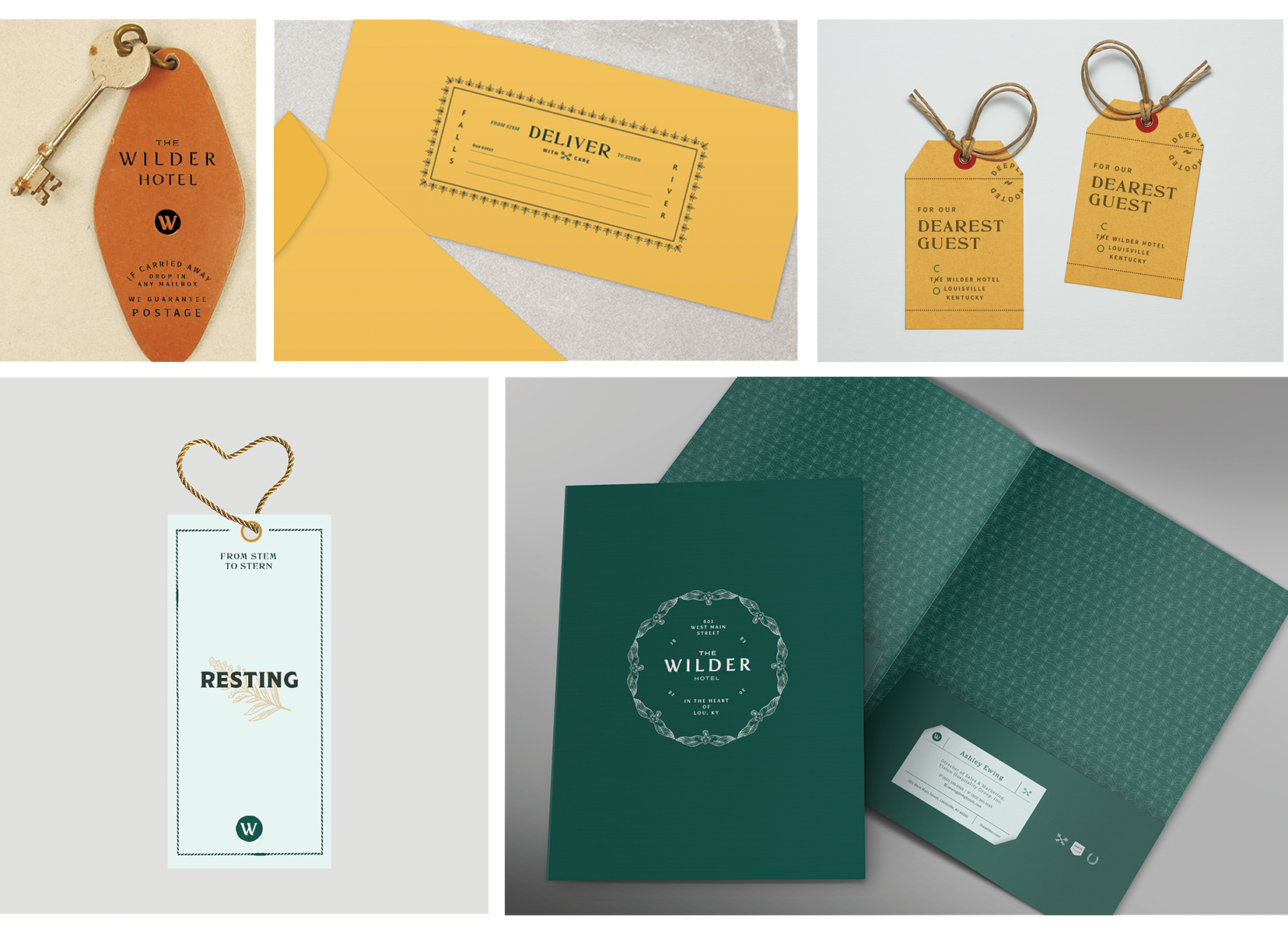

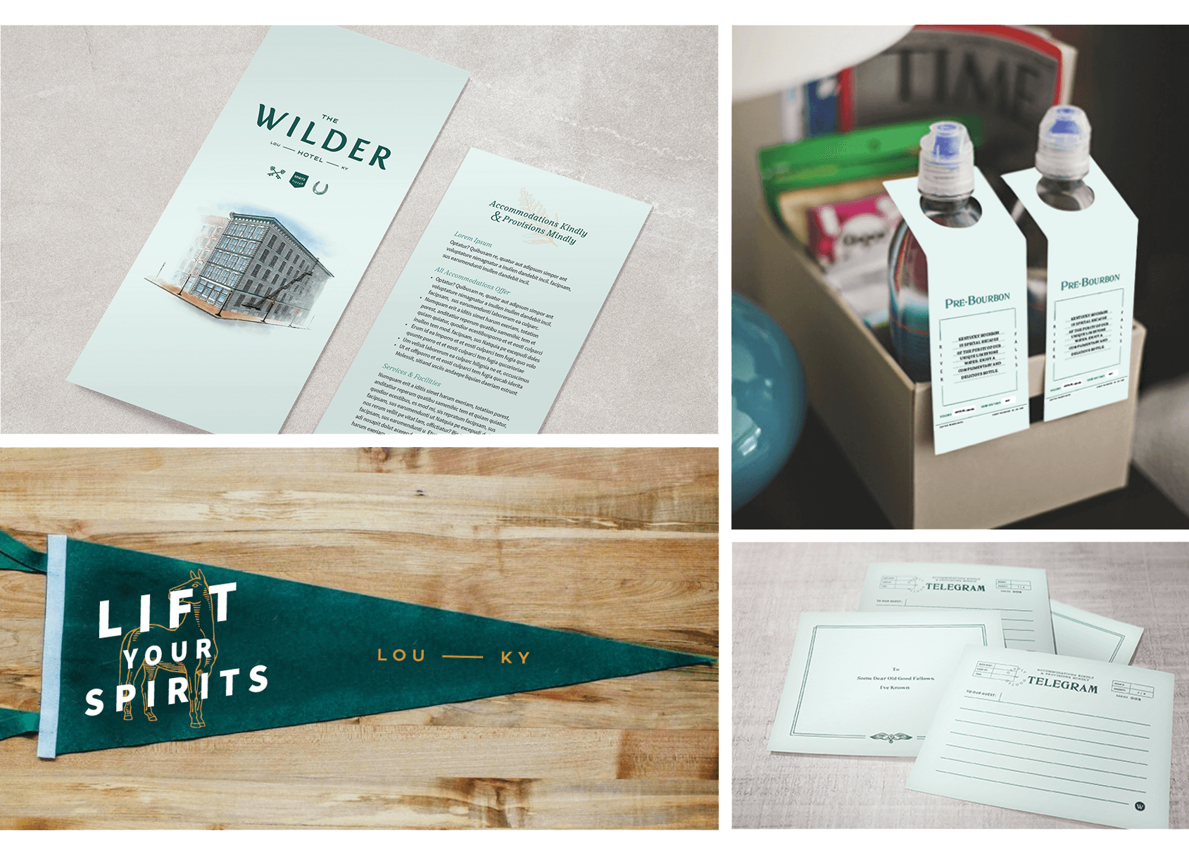

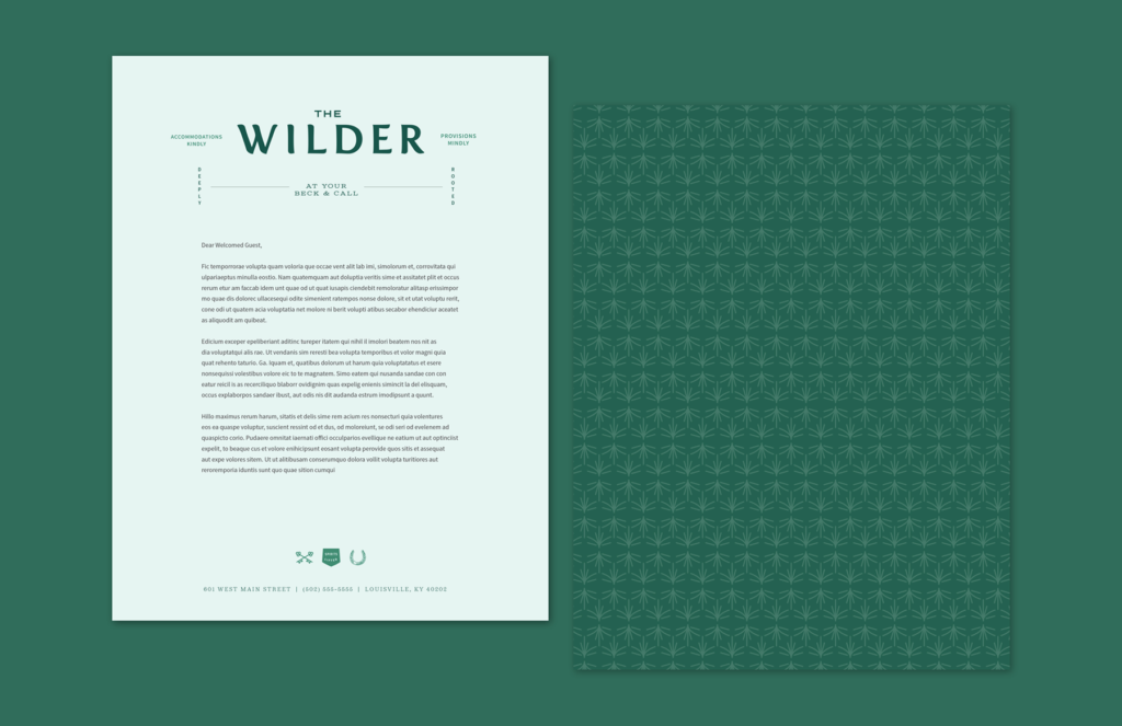
After the voice and tone was established, we broke our copywriting out into several different sections: headlines, tagline, service lines, and maker’s marks. We wanted a layered approach from corporate-focused to guest-welcoming. The best way to establish this was to create a clear system on where each user would interact with each type of copy– some going deeper into the warm, antiqued tone more than others. At the heart of our brand was the descriptor: “Accommodations Kindly, Provisions Mindly.”