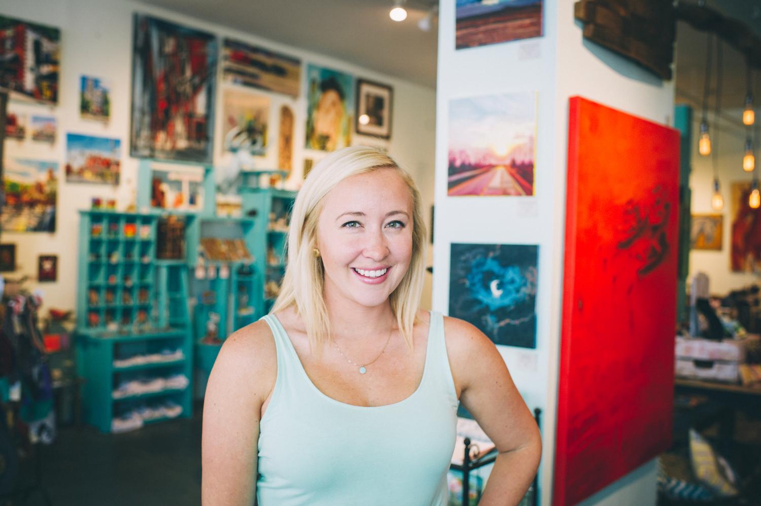
Revelry Boutique + Gallery
After a decade of growing from a boutique to a cornerstone of the Louisville art community, Revelry was in need of a rebrand to reflect their mission and values.

The Challenge
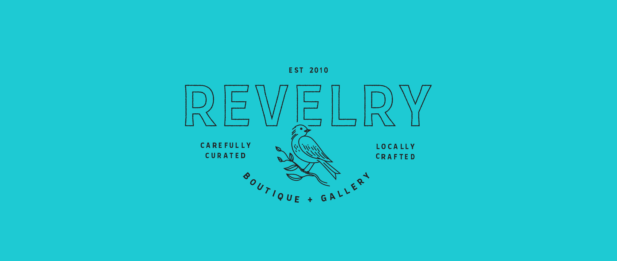
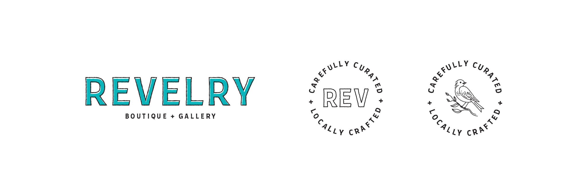
Since its beginnings in 2010, Revelry Boutique + Gallery has lived with the same vibrant, youthful logo and throughout the years have honed in on their mission: To provide accessibility to art, for both artists and customers. There was only one issue: their mission was not ingrained in their branding. Along with infusing their values within their brand, they wanted a more serious and prideful look and feel.
The Concept
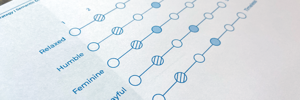
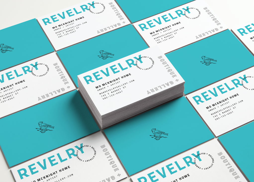
By following our tried and true brand strategy process, we were able to work hand-in-hand with the passionate team at Revelry to uncover their truth, values, and voice. It didn’t take us long to realize that Revelry is the cornerstone of Louisville’s art community. We provided them with an elevated brand identity, complete with language that supports their mission.
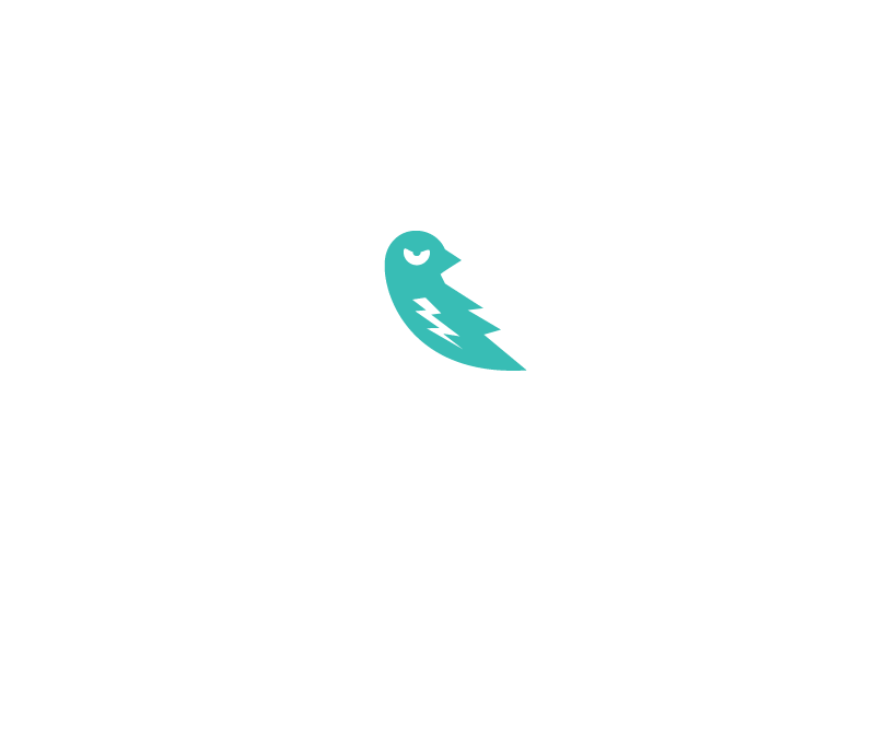
The Bird
When beginning the brand identity phase, one thing became crystal clear:
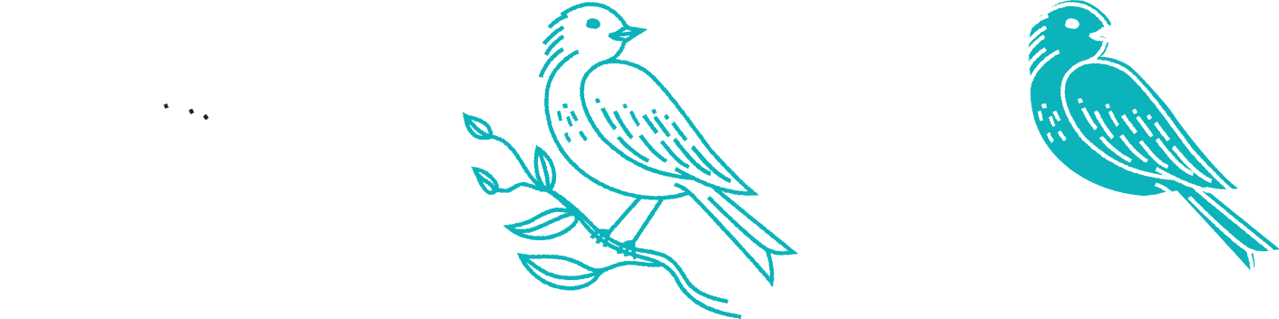
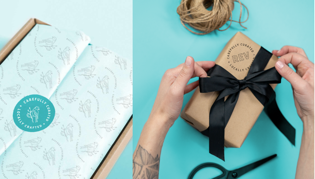
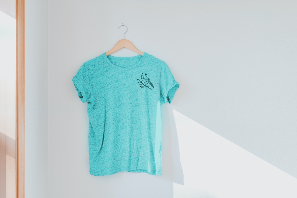
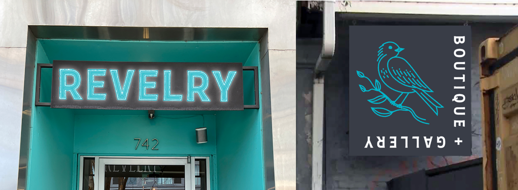
The bird stays: Bluebirds symbolize joy, which is the root of Revelry’s name. We had to keep that symbolism alive in the new branding.
Some of the Revelry team was wary at first when it came to switching up the design of the bird, but they put their trust in our team and ended up loving the final outcome. The new design feels mature, elegant, and proud. Not only does the joyous symbolism remain, but the addition of the branch represents the support Revelry gives to the art community. The bird’s gaze was switched from left to right, representing forward-thinking and optimism.
The Results
Revelry now has a thoughtful and inspiring brand that goes deeper than just a new logo. We’ve given them the tools they need to create branded materials that truly represent who they are and what they stand for and will guide them through another successful decade.
"I felt all of the logos and options that they presented to me were all incredible and also very diverse. They obviously had multiple people that took a shot at our logo and branding. That presentation was my favorite because I am a visual person and that was the exciting part. I was really impressed with what they delivered to us and so much so that it was hard to choose just one."
- Mo Mcknight Howe, Owner & Artist