Mayan Cafe
Highlighting indigenously-inspired authentic Mayan cuisine.

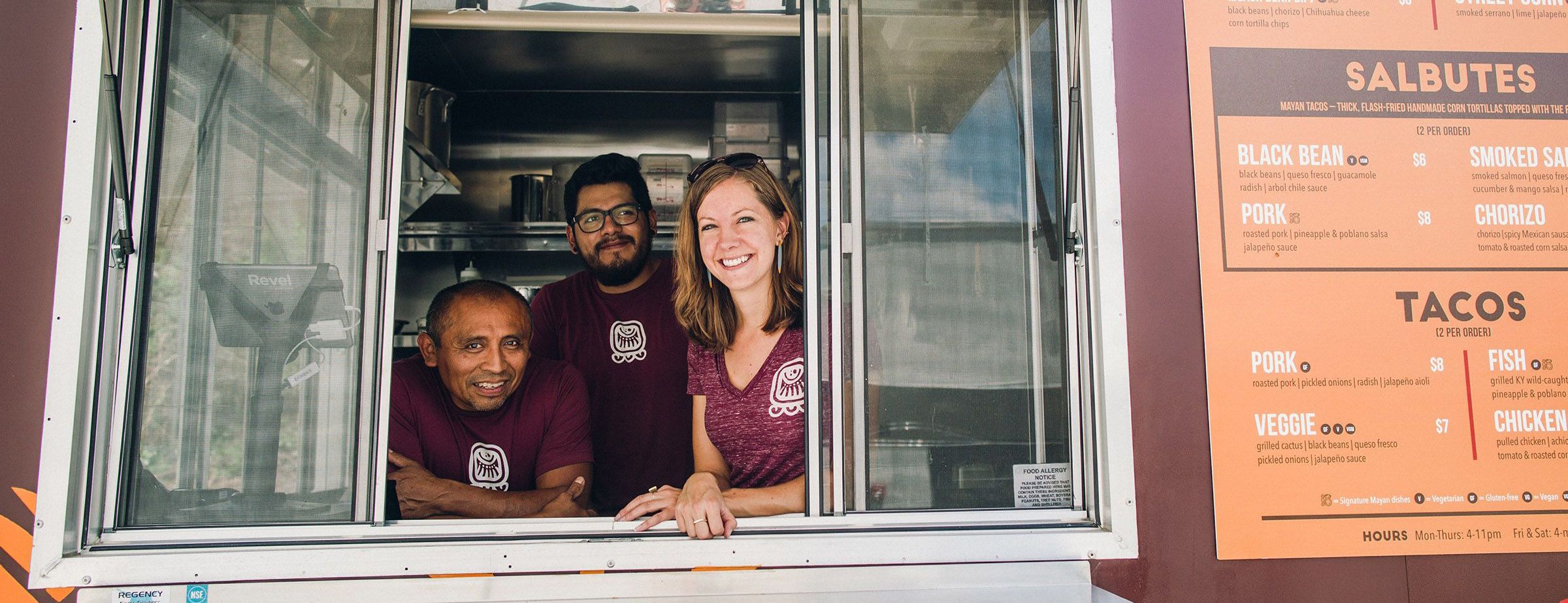
Since joining forces in 2010, the Mayan Cafe has become one of our most integrated partners. We love highlighting the passions of Chef Bruce Ucan and General Manager, Anne Shadle. Our continued alliance has included interior design consultation, branding, digital strategy, and most recently, a kickass food truck and updated web presence.
Expanding Verticals
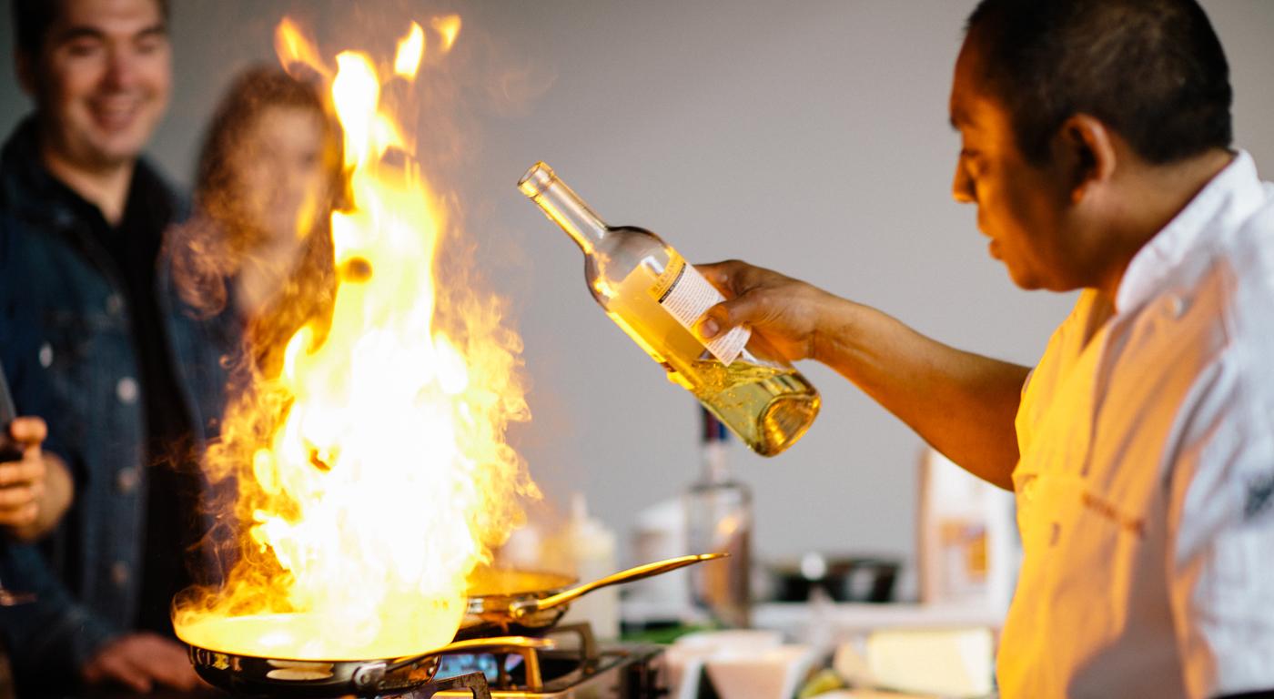
Bruce and Anne have bravely traveled into expanding their delicious brand beyond a typical restaurant’s reach. They have grown their catering presence and dove headfirst into street food, all while keeping their menus creative, local, and true to their vision. This growth called for a structuring of their brand verticals. These verticals will allow for strength in creativity and increased communication of the brand’s promise to its consumers.


Mayan Street Food
It would be an understatement to say we were excited to see Chef Bruce Ucan’s food take to the streets.
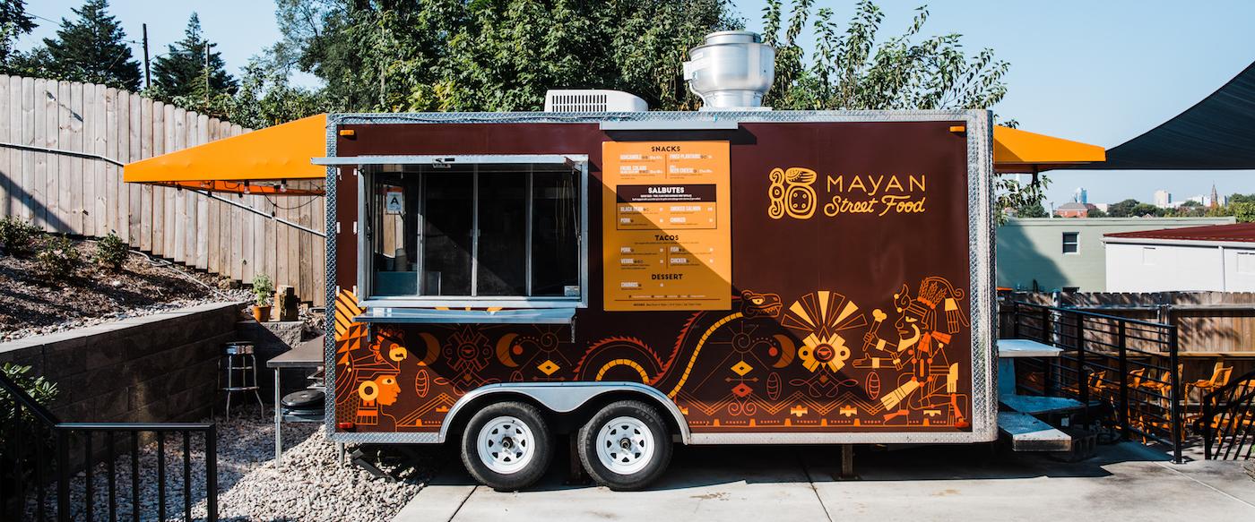
We met with Anne and Bruce to make sure we were able to embody the essence and identify the story of Mayan cuisine in a design. That process started with implementing Personifying Design by the way of our Semantic Differential exercise. Through this, we were able to pull out the color strategy, styling preferences, and overall brand story from the team. A few sketch iterations, mood boards (and Alice cameos) later, we had a general direction for the truck design.
This project won a design award at the 2017 AAF Awards Show.


A Branding Reformation Lives On
We wanted to mimic the coloring of Mayan pottery. The hieroglyphs were chosen and styled for their meaning of celebration and imbibing. It was important to add some stylistic hero images to the design, so we used inspiration from Bruce’s tattoo of the Mayan God of Food and Agriculture. Kelly implemented characters from other notable Mayan designs and illustrations to create an energetic, but stylistically accurate portrayal of food’s origin, life, and story.
Pat Sheehan, our resident muralist, created a template for Kelly’s design implementation with precise measurements of the truck. We were lucky enough to have the food truck stored in our parking lot for all of our “What does that thing do when it’s unfolded?” line of questioning. Once the wrap was established, the food truck was moved to its semi-permanent location at the new Gravely Brewing venue. A carbon paper transfer was used to outline the artwork after a base background color had been painted. We used 1 Shot Lettering Enamel to brush paint each line and stood in awe of the steady handiwork. Check out the truck for yourself at Gravely’s location on Barret Avenue. And I dare you to not order the whole menu.

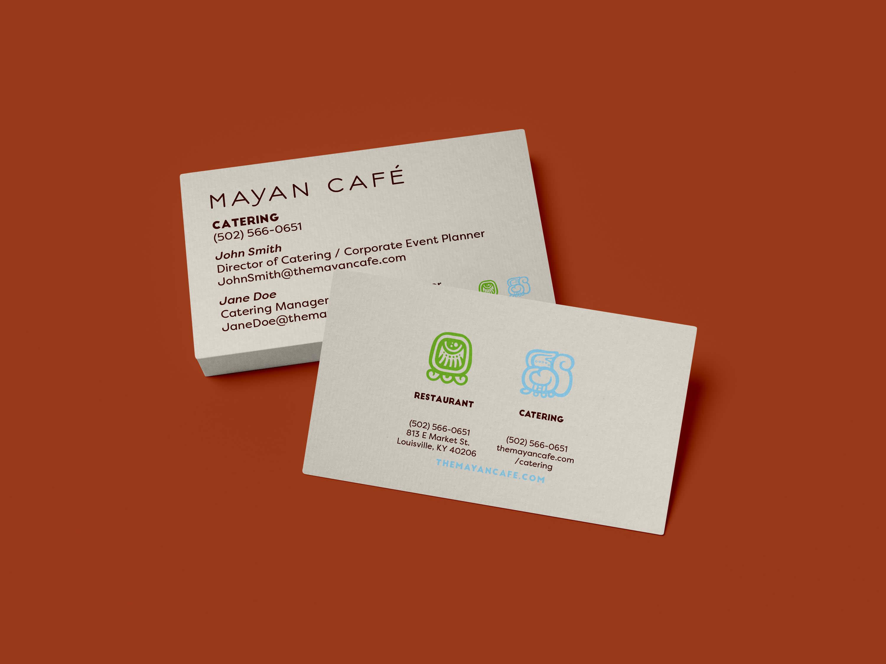
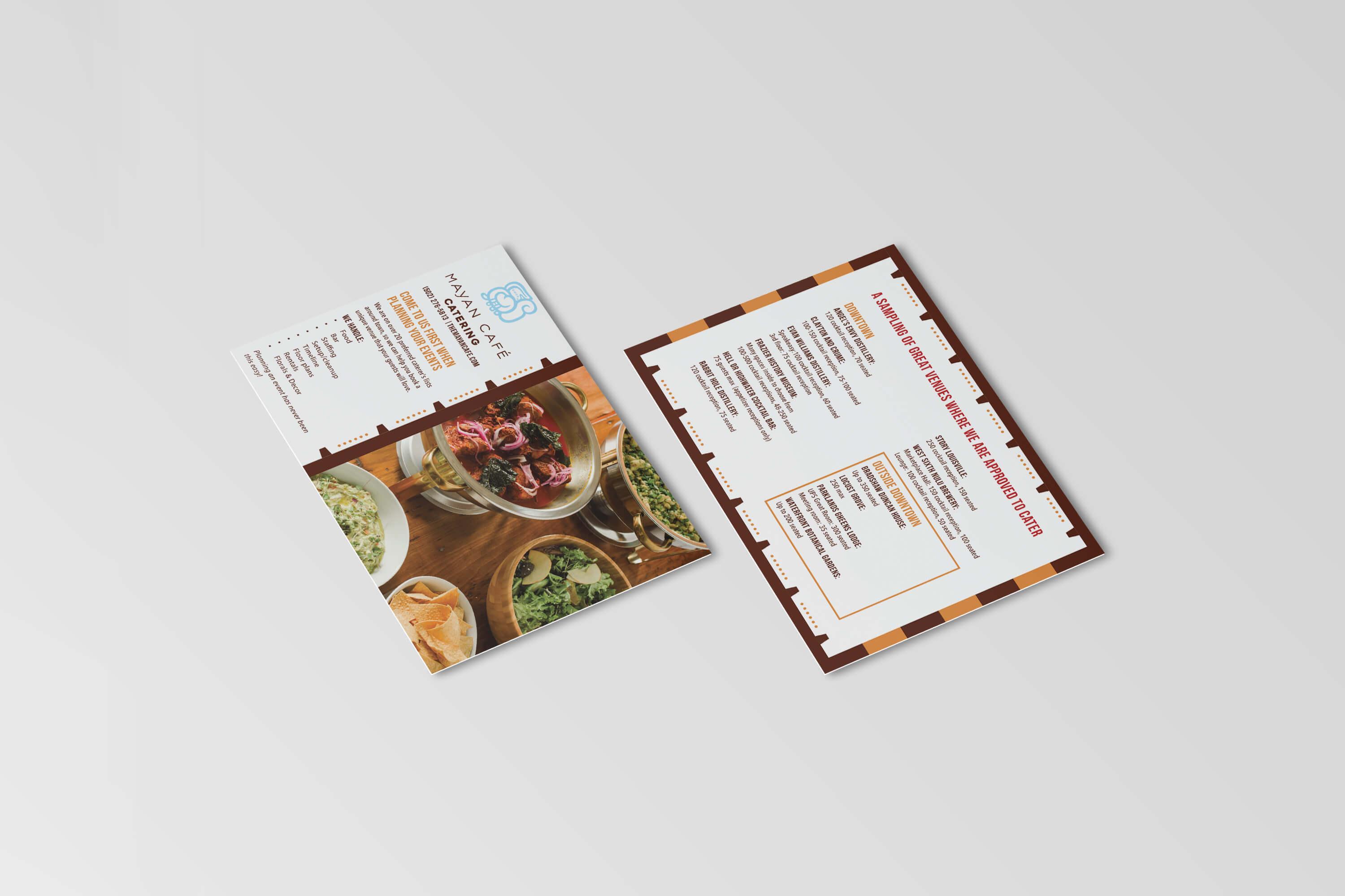

In 2010, we began adjusting the brand elements to give longevity and separate them from trends. As our friends at Mayan Cafe continue to grow, we’re by their side to keep their digital space up-to-date. In 2017, we did just that by giving the site a redesign. We wanted to incorporate design elements that reflected the idea of multiple things coming together into one cohesive unit.


The Space
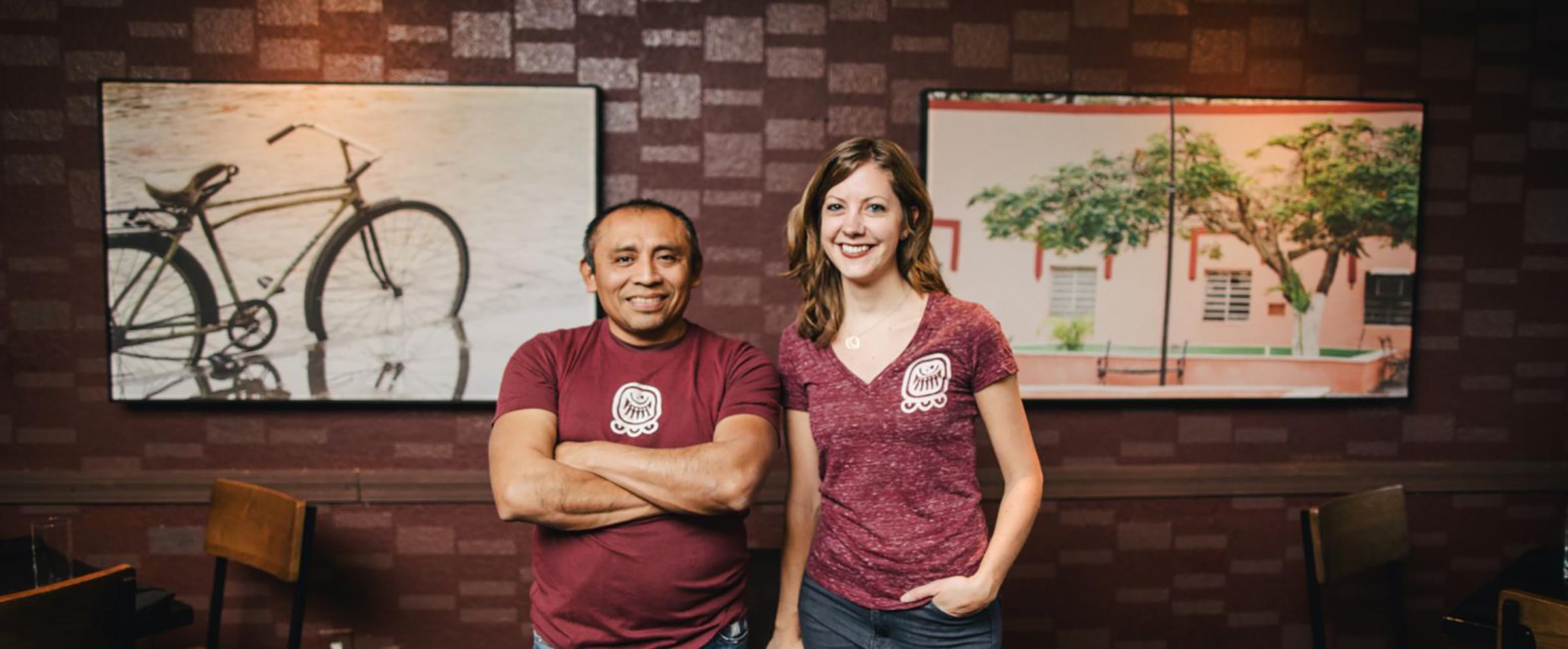
When the restaurant location started renovations, we worked with De Leon & Primmer to develop a color palette of browns and reds to complement the cuisine. The rich colors speak of roasted peppers and sauces and are intended to complement the food on the table. The interior of the restaurant was repainted in these colors with a light-catching design pattern on the walls. Weathered wooden chairs were added to lend a rustic feel to the space. After a trip to Ucan’s hometown, photographer Kriech-Higdon shot several large-format photographs featuring local cooking. These images hang in the dining room, displaying the art of Mayan cuisine.
If you think our approach is a match for your needs, fill out our contact form today and we'll get back to you soon.
