Kentucky Refugee Ministries
By establishing a true partnership, we created a brand that is reflective of its vibrant community.
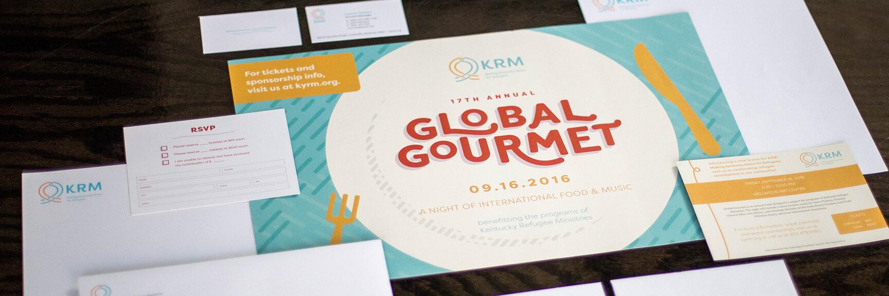
Rebranding KRM
Our goal for this project was to create cohesion in Kentucky Refugee Ministries’ marketing and communication strategy, beginning with a new brand identity. Working very closely with KRM, we went down a path of learning and discovery in order to craft a brand that not only represents who they are, but who their clients and community are as well.
This project won Culturally Legit and Silver in Art Direction at the 2017 AAF Awards Show.
BRAND CONCEPT
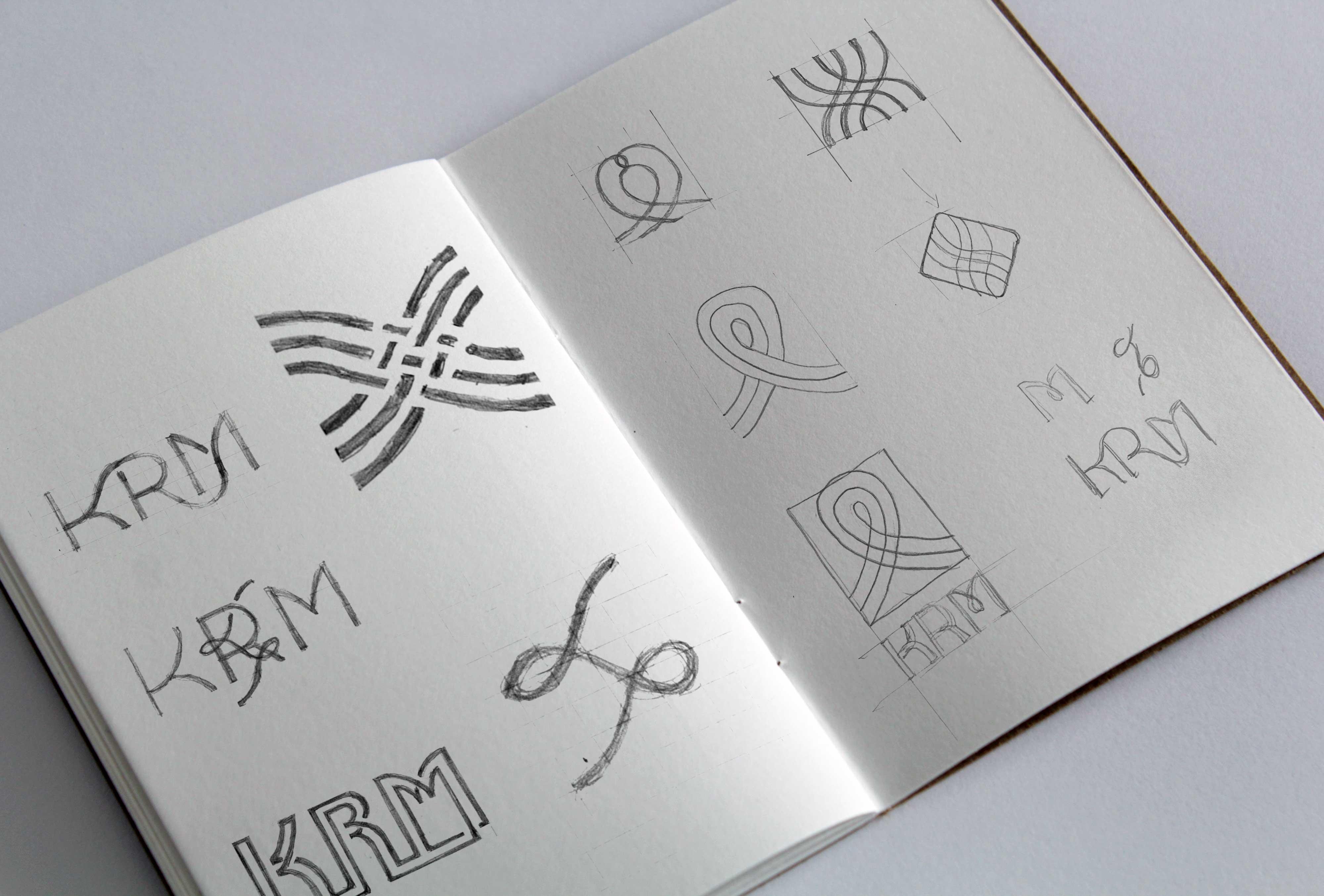
After a few exercises with the client, we knew we wanted to celebrate our cultural differences while also focusing on what fundamentally makes us the same. A handful of TedTalks and a couple of brainstorming walks later, we landed on a concept that fit them perfectly.

Things aren’t always black and white. Being a citizen, a non-citizen, a refugee or an American citizen. It doesn’t matter who you are, where you’re from, or where you’re going; there is a wonderful, transient point in-between where a refugee’s life becomes intertwined with KRM.
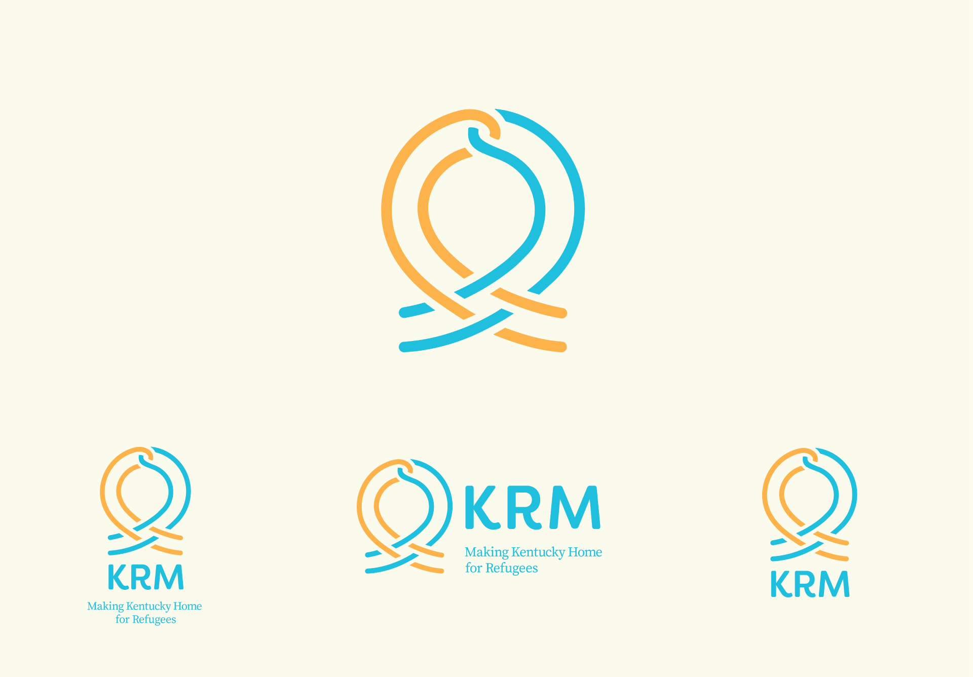
With our concept, we crafted a brand that was not only compassionate and trustworthy, but welcoming and celebratory! The two pieces of the logo, coming from separate directions represent the path of both refugees and KRM. The point where the two paths intertwine is the tie that binds the newly immigrated refugee to KRM. They are locked together, interlaced with each other, forming a lasting relationship.
“As an agency that welcomes people from around the world, it was vital for us to showcase this diversity of KRM clients and stories. VIA’s design echoes that global tapestry through the inviting color palette, the looping threads in our logo mark, and the focus on the faces of refugee resettlement.”
–Christine Gosney, Grants & Communications Manage
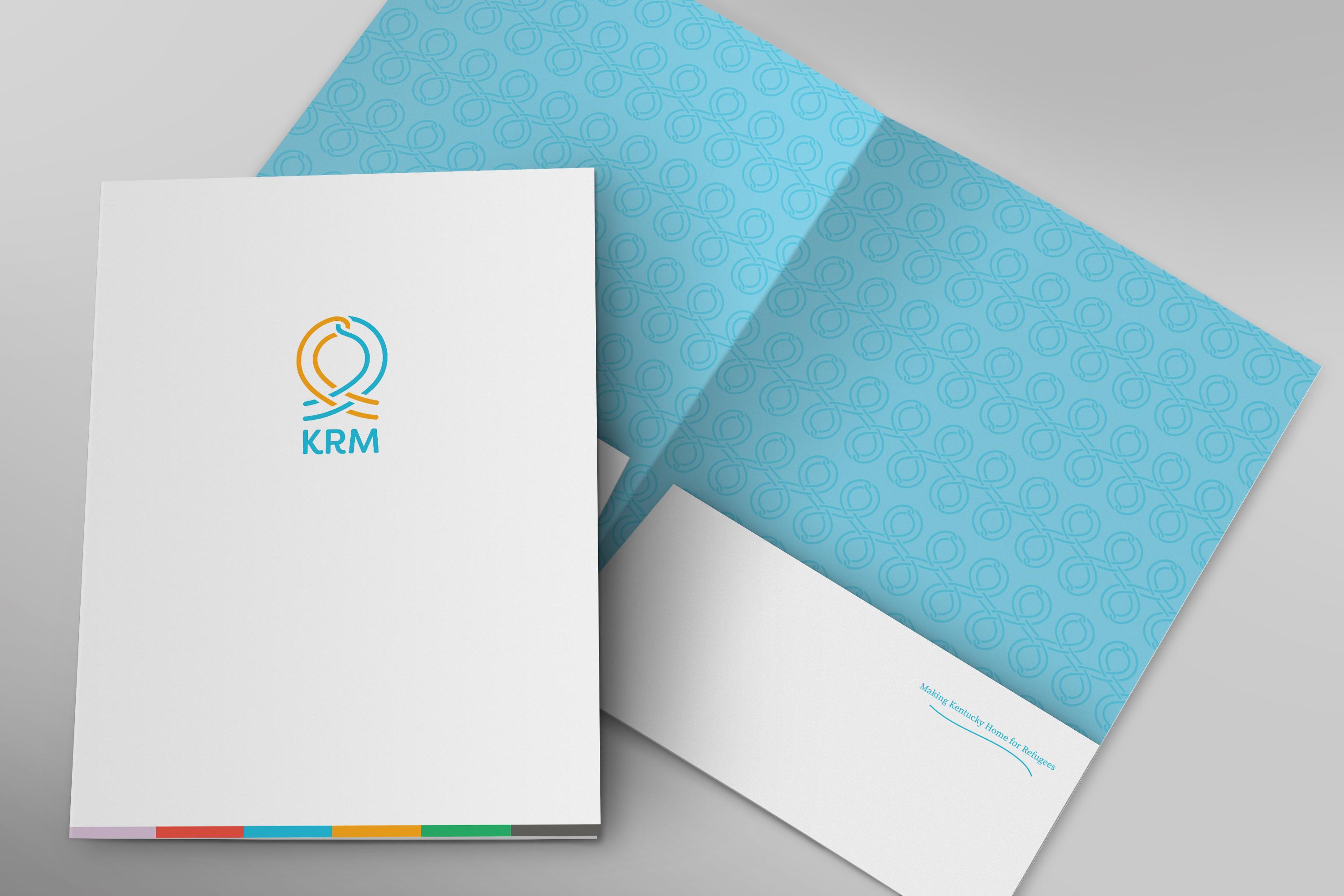
Branded Color Palette & Illustrations
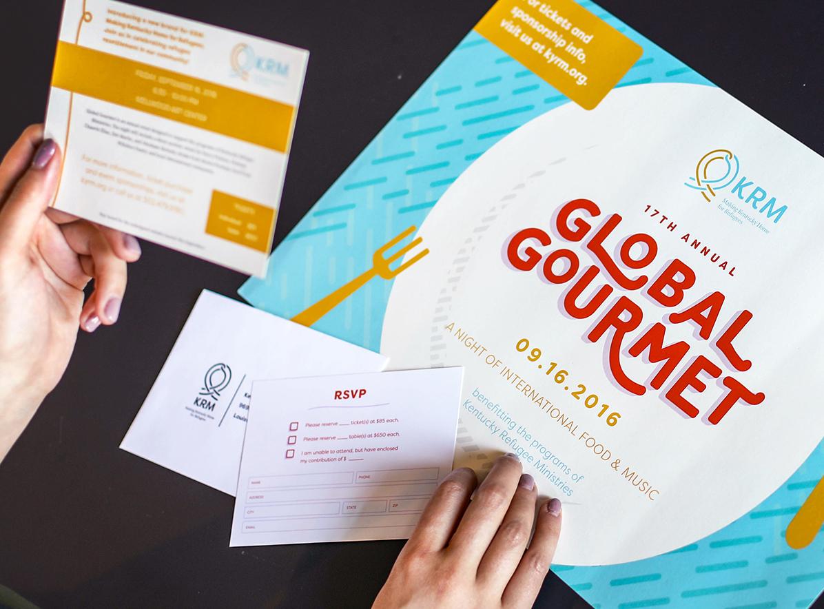
It’s not often when our client lets us get this colorful. We wanted our users to feel excited and energized when they landed on the site. The bright, celebratory hues echo the vibrant community that KRM cultivates.


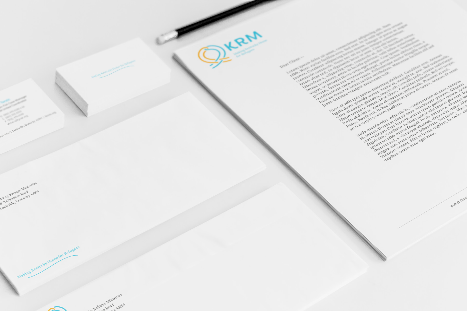
Marketing + Collateral

Website
Along with the rebrand came a new website! KRM’s old site was not mobile friendly, so a new mobile-responsive theme was a step in the right direction.
We knew from the beginning that we wanted to showcase KRM’s clients and all of the faces that make up who they are. Fortunately, we had a variety of gorgeous photography to choose from and featured a big, beautiful header photo on each page. Nerd-out and read more about how we developed the featured images in Joe’s development blog post, here.
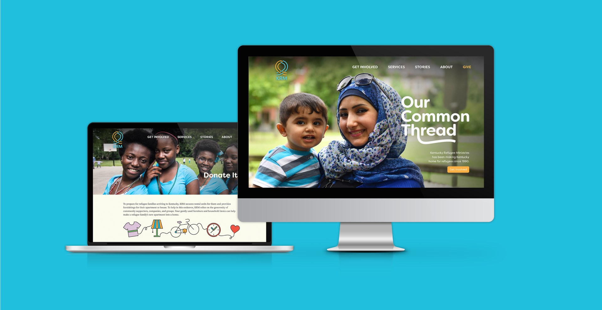
*Website has been updated since VIA's launch in 2016
"[KRM is] a client-centered agency. Our staff is hugely proud of the resilience and achievements of the refugees we serve. VIA’s work beautifully captures our clients’ dignity and cultural vibrancy.”
–John Koehlinger, Executive Director of KRM

