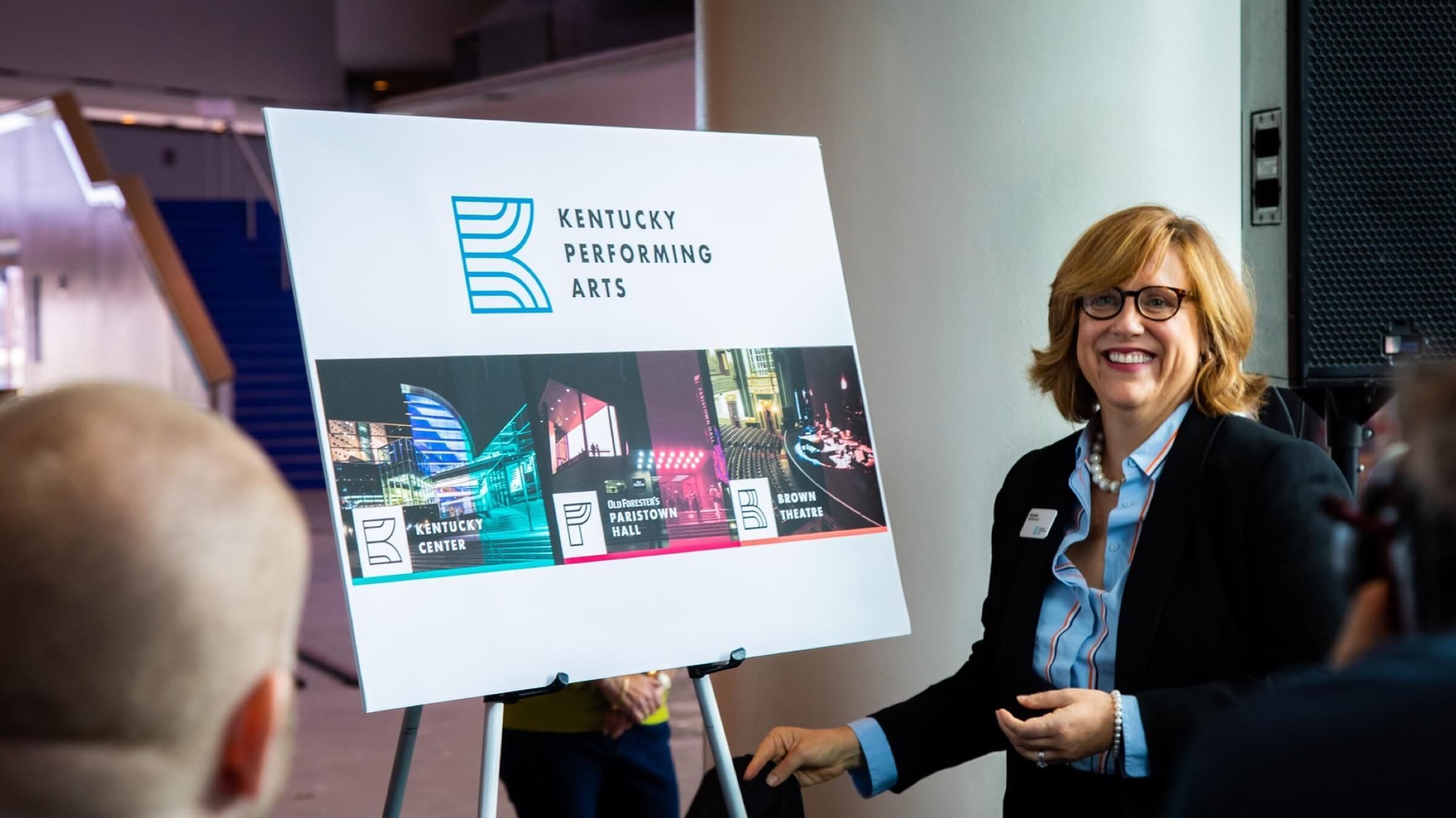
Kentucky Performing Arts
After 40 years of serving Kentucky with unrivaled entertainment – Kentucky Performing Arts had bigger plans.
The Challenge
With a new strategic plan, record-setting Broadway smashes on the way and the region’s most anticipated new venue set to open, they wanted to show Kentucky that they were bigger than their iconic building on Main Street in Downtown Louisville. But their website and brand couldn’t support where they were going.
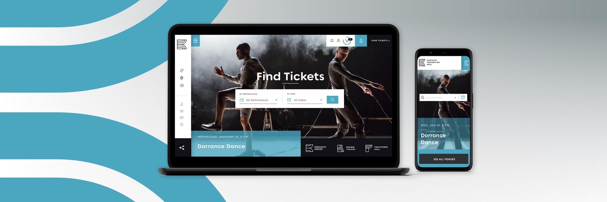
First, Kentucky Center partnered with VIA Studio to reimagine their brand and rename themselves to Kentucky Performing Arts. And then we started on the project at hand: designing and developing a website that not only tells their growing story, but provides a best-in-class ticketing experience for all users.
Aside from setting a visual identity for KPA, kentuckyperformingarts.org has very discrete needs: functionally serving their audiences. This required a design system that serves the brand and works for everyone.
In creating a design system, and to provide venue-specific visual cues, the UI reflected the venue color system if the user is interacting with something venue specific, the UI would follow that look and feel. Cohesive, yet able to stand alone.
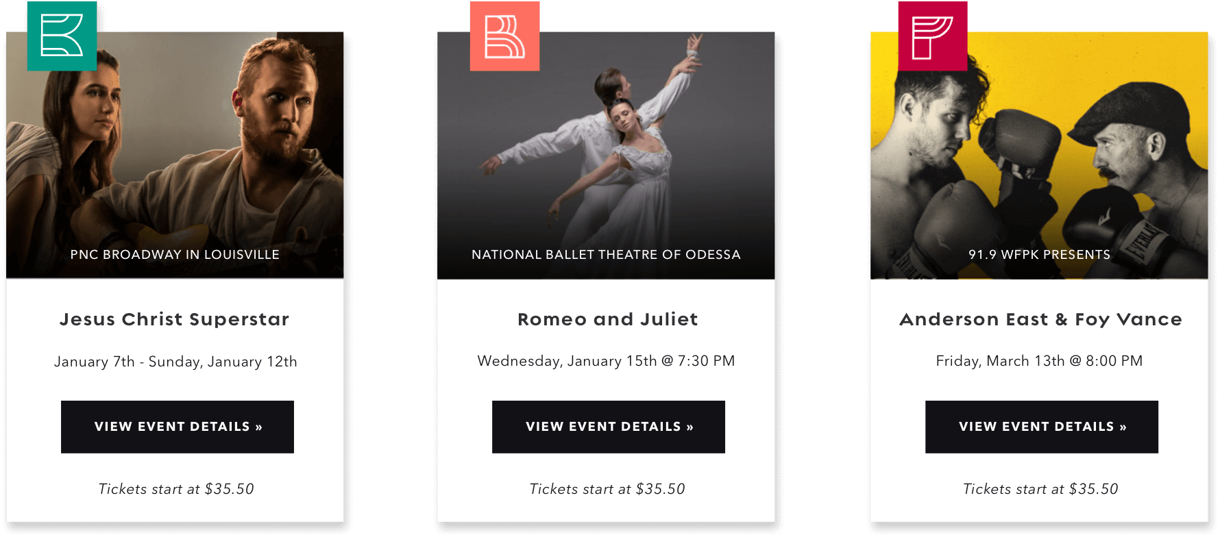


Kentucky Performing Arts is constantly in motion - adding new shows and programs - and they needed a content design system that allowed them to easily add new content while maintaining the mobile-first attitude that their audience demands.
To achieve this, we designed a material-design-inspired UI system of cards and containers that provided the building blocks for any content and structure KPA would need now and into the future.
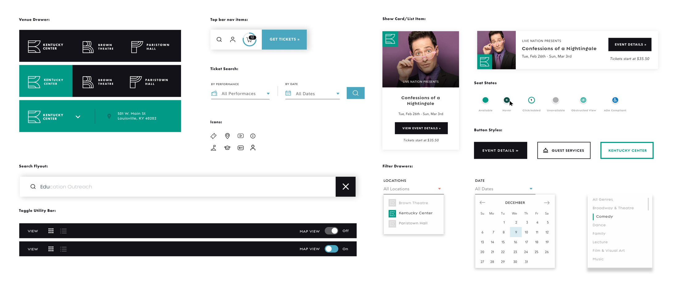

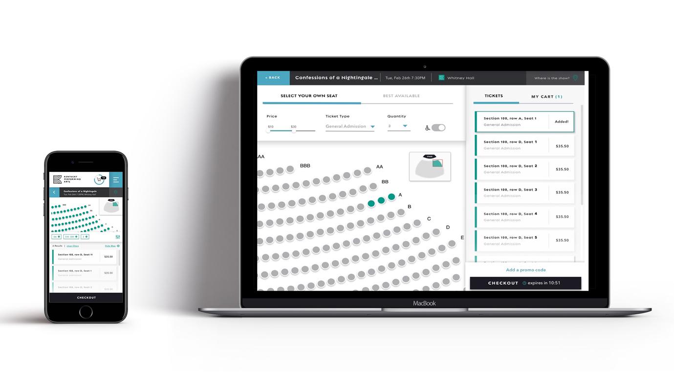
The primary goal of kentuckyperformingarts.org is to sell tickets to performances. Ticket purchasing on its face is a relatively straightforward challenge - however, there have been recent and dramatic shifts in consumer expectations and behavior. Most notably the expectation to be able to “Select Your Own Seat” (SYOS) and the rapidly increasing percentage of consumers who use a mobile device to complete their purchase.
Working in deep partnership with KPA’s ticketing team, we analyzed the competitive market and best-in-class ticketing experiences to design and develop a ticket selection system that met KPA’s status as a top-tier arts organization.

Choosing the right tools
The Ticketing App + ReactJSEnsuring a quick, responsive user experience is a critical component to accessibility and good design. To achieve this, we needed a technology stack that was going to be developer-friendly while letting us build an application that was highly responsive to user interactions. After careful consideration, we landed on ReactJS to build out the ticketing applications.
See The Journal Entry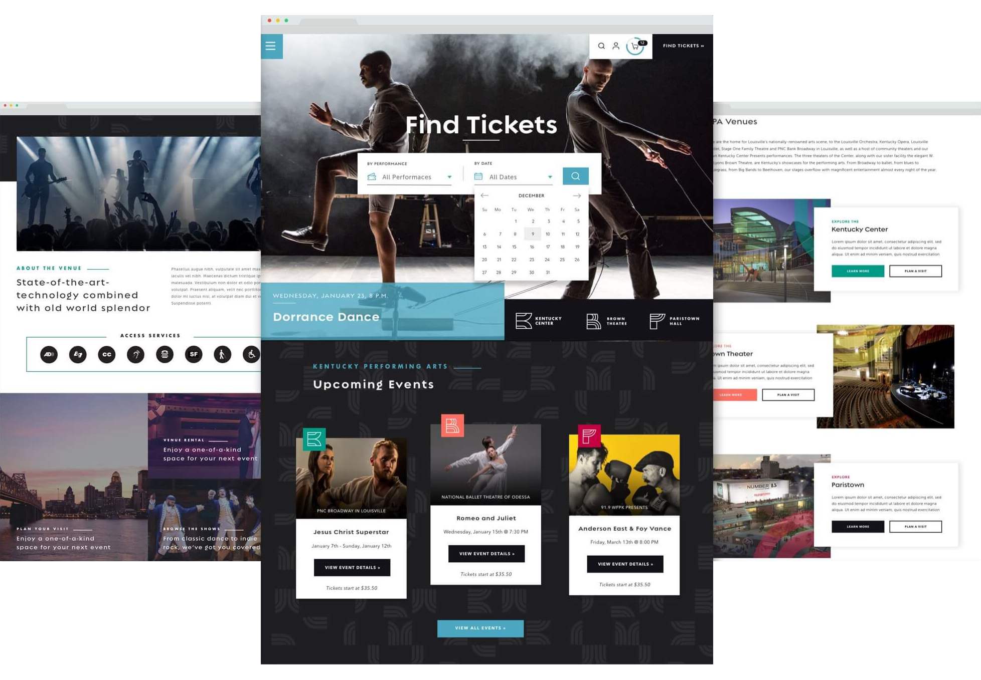
"[VIA Studio] had a number of outstanding professionals that really cared about our organization, their work, and what this could mean for the future of our community."
