Decca Lounge & Restaurant
After closing down at the start of Covid-19, Decca needed a refreshed look and feel for their grand reopening.

The Challenge
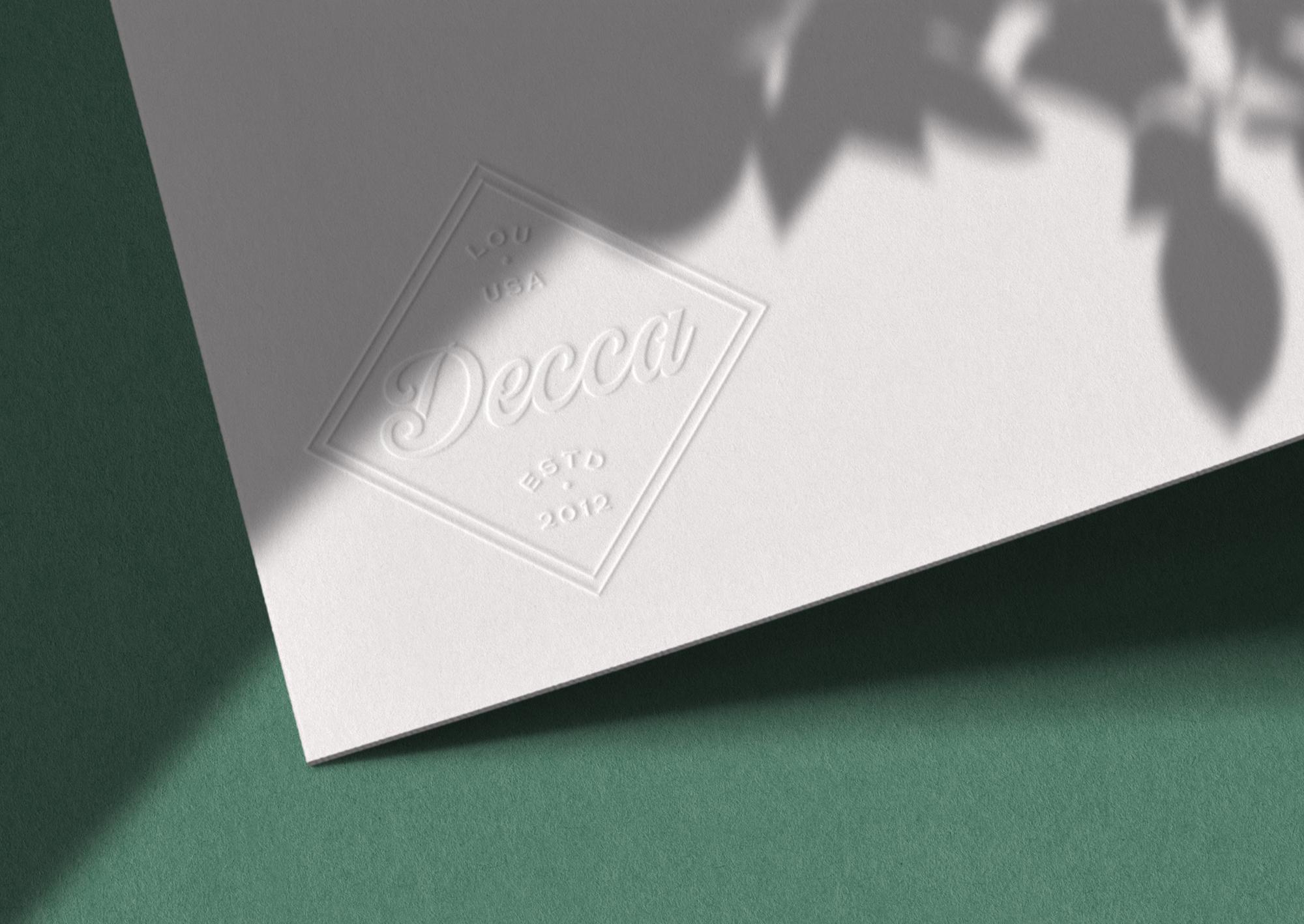
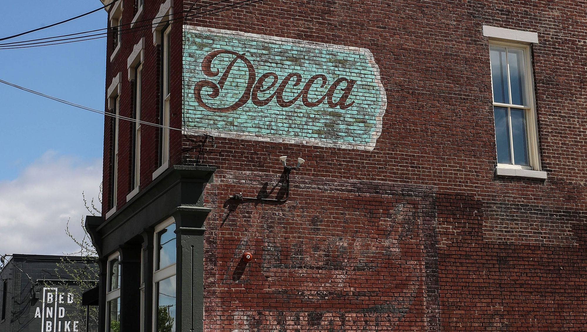
As evidenced by the beautiful ghost sign on the side of their building, they are a longstanding community staple, known for providing excellent food and great music out of their storied space, which is comprised of a cellar, multiple dining rooms, and a patio lounge. They needed a brand refresh that would not only showcase their original logo, proudly emblazoned on the side of their building, but also be extensive and variable enough to meet all their print and digital needs.
The Concept
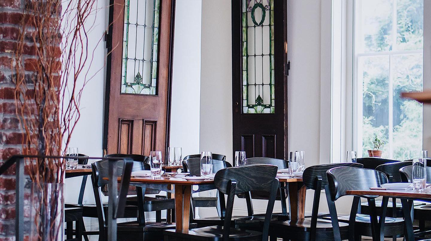
We were deeply inspired by Decca's space – luxurious yet welcoming, and rooted in the past with the right amount of modern touches, their architecturally captivating building was integral to the creation of their new brand.
Visual Identity
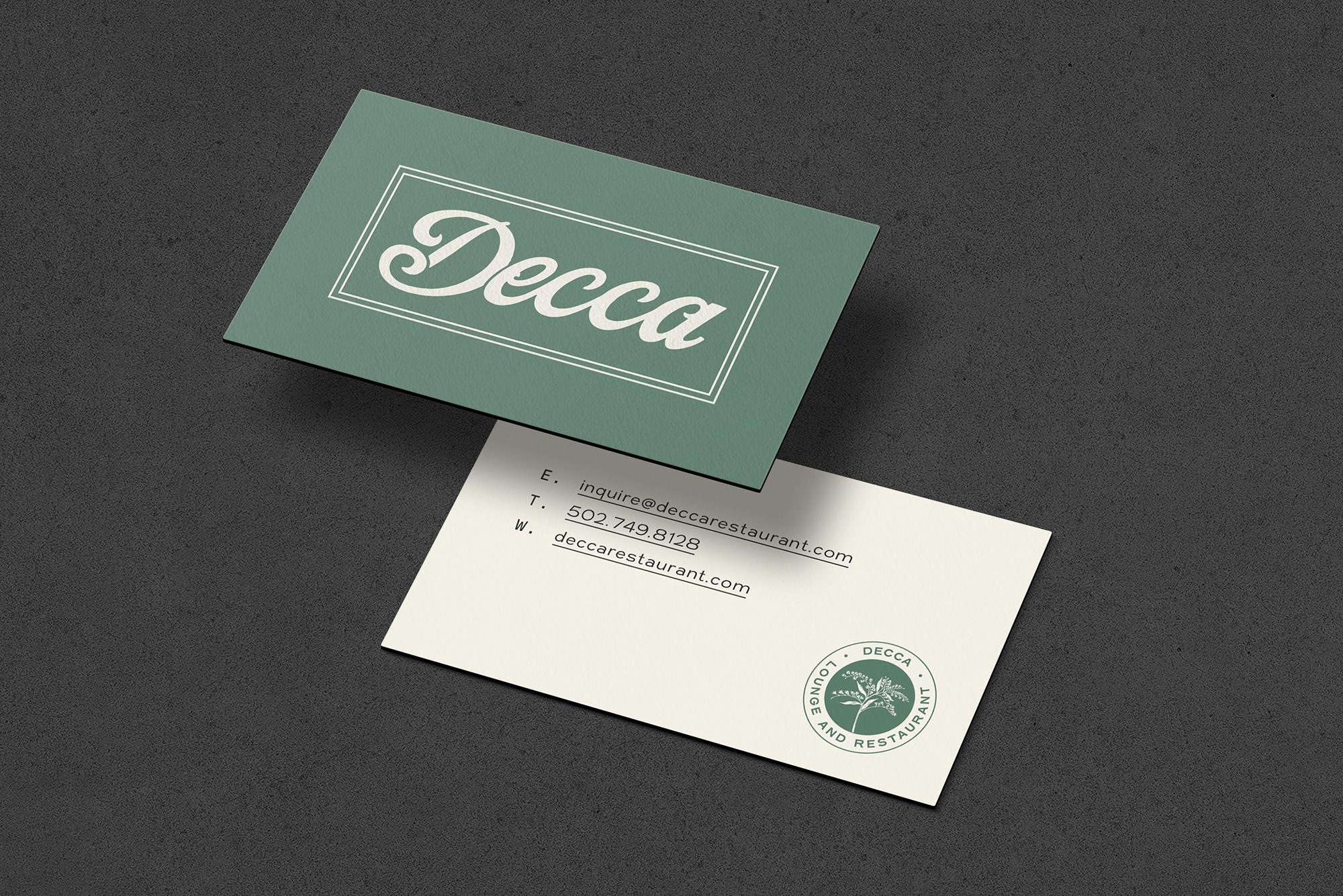
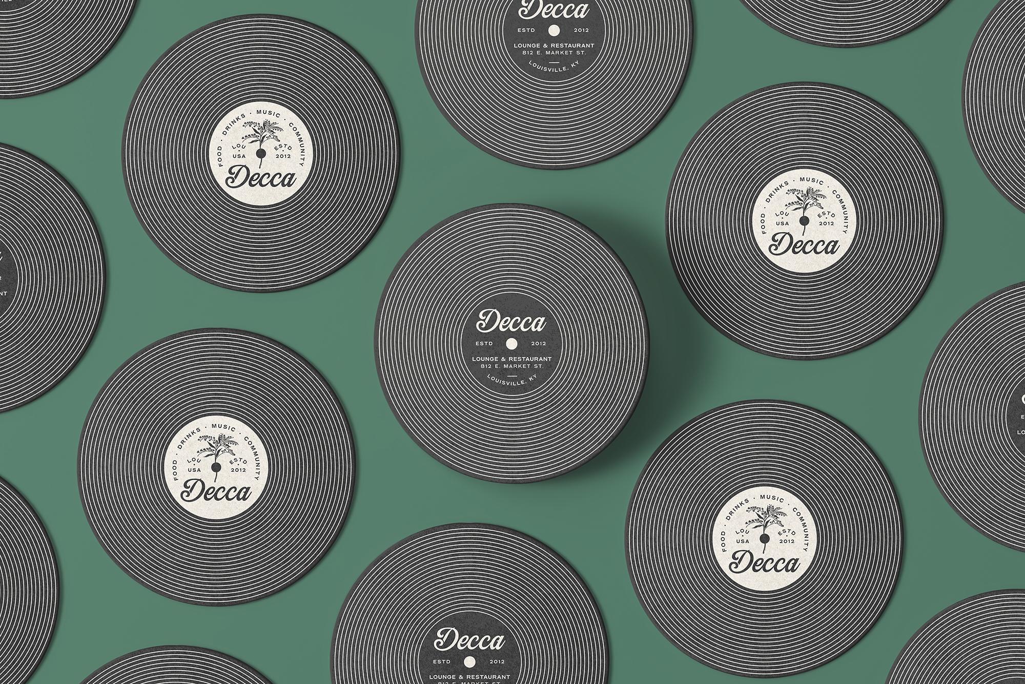
We chose to pair Decca's existing logo with a hand drawn, sans serif typeface to strike a nice balance of handcrafted & hip and simple & modern. We also added a mark to their library of assets; a goldenrod icon that we meticulously illustrated so it would look great at just about any size. In addition to being Kentucky's state flower, goldenrod is also one of the many flora that can be found in Decca's patio lounge. We finished off this identity with a simple-yet-ownable color palette inspired by their building's interior.
