MOWE Studio Rebrand
The Challenge
MOWE Studio is an international motion design studio with more than a decade of experience putting vibes into motion across a range of industries.
Over the past year, they made a big pivot to focus on the health technology space, and their brand needed to reflect that evolution. We partnered closely with them to get to the heart of their brand, then crafted a brand strategy and visual identity that transcends language barriers and gives health tech the feels.
The Big Idea
We kicked things off by running their team through an in-depth strategy and brand workshop. It was clear right away: MOWE was ready to leave the old behind and fully own this new health tech niche. They’d done their homework and knew exactly what they wanted to stand for.
Their insight? In health tech, products get perfected and approvals get cleared, but the human connection often gets lost. MOWE changes that by blending technology with empathy, creating motion design that goes beyond function to truly connect.
“Making Health Tech Feel Better” became the new brand’s lifeblood. Through storytelling that resonates and visuals that simplify the complex, MOWE helps health brands feel more relatable, supportive, and human. They've been around long enough to know it’s not just about being seen, it’s about being felt.
The Visual Identity
With this Big Idea as our guide, we explored unique attributes and differentiators that could come together in a fresh, fitting way for a global animation studio. The goal: capture MOWE’s knack for making the complex feel simple — no small feat, but exactly what sets them apart.
The Logo(s)
Language is universal — spoken, signed, or felt — and MOWE’s a team of storytellers at heart. So their new brand needed to spark conversation and connection.
One thing kept coming up: How do you say MOWE? Is it MO-WE or MO-WAY? Sometimes the problem is the solution. We saw that confusion as a chance to solve two problems at once.
Introducing The Speech Bubble: A simple but effective symbol of how MOWE makes health tech feel more human by giving it a voice and a story. The stacked wordmark and two-color break didn’t just help with pronunciation; they were decisions that also added energy and built-in opportunities for motion, which is perfect for a studio that lives and breathes animation.
The Type
Another universal truth? Imperfection. We’re all a little uneven — and that idea inspired the details in MOWE’s wordmark.
We subtly adjusted the letterforms so no terminal, apex, spur, curve, or line is perfectly straight or perfectly round. There’s no such thing as a straight line in life, and this small touch shows MOWE’s understanding of what it means to be human in a way that’s felt more than seen.
Building on that, we chose a typeface with just the right balance: full of personality but still polished, with a hint of “techy” while staying warm and human. This approach carries through headlines and messaging too — always reinforcing that imperfection is at the heart of what MOWE does: making health tech feel human.
;) Because MOWE works with clients around the world, it was important to ensure their messages and visuals translate across borders. We made punctuation — semicolons, exclamation points, asterisks — the hero. These simple, energetic marks add motion, personality, and universal clarity to every message MOWE shares. Instantly recognizable and easy to understand, they help the brand connect with anyone, anywhere.
Bringing It All Together
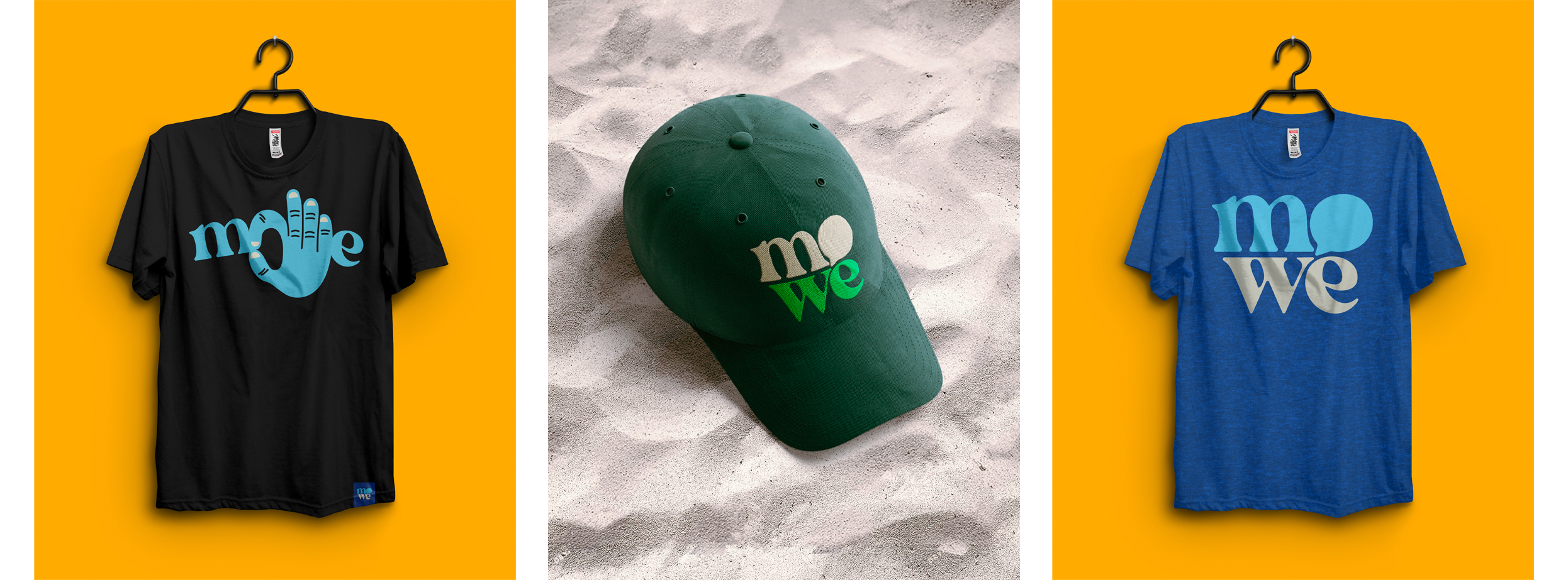
To wrap it all up, we delivered a set of brand guidelines to help MOWE hit the ground running, complete with color palettes, logo usage, secondary marks, and brand extensions that show how the system flexes across executions. And, as always, we included real-world examples and swag ideas to spark inspiration and keep the energy going as they bring the new MOWE brand to life.
The End
In the end, we provided a foundational strategy and a brand that the client loved, was excited to launch, and would take them into the future. But don’t take our word for it, here’s what they had to say...
"After attempting an internal rebrand for more than a year, VIA led us through their process and not only helped us finally understand who we are as a brand, but gave us a visual identity that actually reflects it. Their strategic exercises delivered clarity we couldn't achieve on our own. Honestly, If you feel lost with your brand, trust their process and jump blindly. You’ll be surprised."
Let’s work together!
If you have a brand looking for new horizons, contact us today to schedule a consultation.