Vendetta Against Words

Let’s just call it what it is
Call me by my name – not my icon
Say my name, say my name
Historically, icons and images were the most effective way to communicate to the masses, but times are changing. Earlier this week I was working within a CMS (which will not be named, alright, I’ll call it Voldemort), and attempting to edit text, add pictures, etc. etc. Like most text editing software there were a lot of formatting options. For this reason, icons are used in order to fit more options into one space.
However, the thing that makes icons work (at least, in a narrow scope of a certain culture), is that we use the same icons to mean the same things in all places. When you decide to make up new icons, as Voldemort did, or use the same icon to do different things (lookin’ at you, Adobe), it can be really confusing.
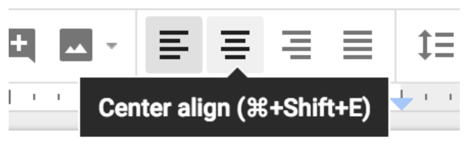
The fallback when icons fail is text. In Google Docs, for example, hovering over an icon will quickly display text to let you know what the icon does. In the case of Voldemort, it took upwards of three seconds to display this help text, which slowed me down quite a bit.
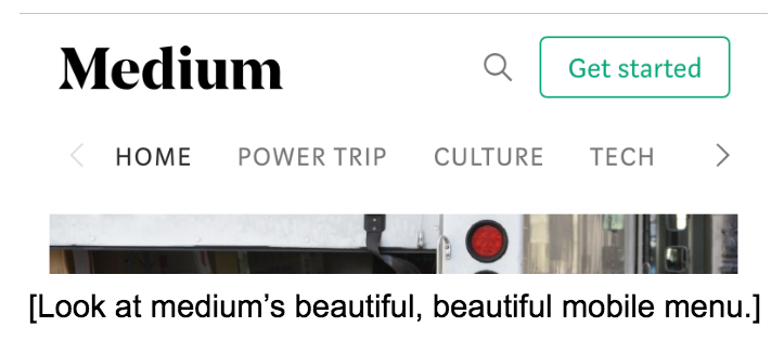
More and more I’m seeing a plethora of unexplained icons. In a mobile experience, when you don’t have the luxury of hovering, this can be even more confusing. I recently ran across a site that had two hamburger menus, one on each side, that opened completely different menus.
I’ll go ahead and pose this question: why icons instead of words? In the case of a text editor, or design software, I get it, there’s just too much to be done. But in the case of a complex set of menus, I’d rather just strap on my readin’ boots and know what I’m getting into before I click on all of your hamburgers and then throw my phone through a window.
Sometimes designers may opt for icons for aesthetic reasons, but it is vital to consider the user experience. Yes, a nice illustration may provide some delight, but if it comes at the expense of ease of use it may not be the way to go. As a general rule of thumb, use icons when they’re common knowledge. This might be specific to your specific user, so be careful of assumptions. When in doubt, just remember to do some user testing!
Related Posts
4 AI Resources To Add To Your UX Design Toolbox
By:Morgan Plappert on 7/18/2023
These AI-powered tools can help you streamline your workflow and empower you to take your designs to the next level.
Read More »
Component-Based Web Design
By:Morgan Plappert on 8/9/2024
Designers and developers are always looking for ways to make handoff easier, collaboration more seamless and our processes better aligned. Automation, consistency and efficiency, without compromising creativity. It’s a constant battle and often times, a balancing act.
Read More »