Trustworthiness in Design
By:
Emilee Dover
on 7/10/2019
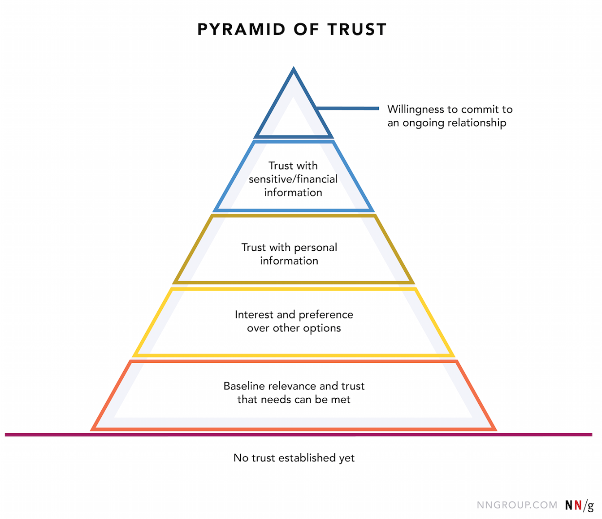
Establishing trust is a journey. It takes a bit of work on your part to allow users to fully trust and commit to your business. Below is the Pyramid of Trust established by the Neilson Norman Group. This gives you a representation of the stages of trust people go through with any relationship, including the relationship with your business. In order to successfully guide someone up this pyramid, you must be consistent and genuine. There are a few attributes a website must have in order to kick off the journey up the pyramid. Let’s start with the most obvious one.

Visual Design
Typically, our brains react the quickest to the visual information. Like when meeting someone in person the first time. We judge quickly. When the user is at the “no trust established yet” phase, the design must be high quality enough to keep the user engaged. There’s nothing worse than someone leaving your page immediately due to low quality design; not giving your business a chance. How can we prevent this from happening?
KICC – Keep it Clean, Carol.
Clean, minimal design passes the test. Now, you don’t have to go full-on minimalist with it, but giving each item it’s own elbow room is essential. Designing with too much cluttered information creates confusion, overwhelm, and maybe even the sense that your business is cluttered and unorganized. On the other hand, too little (or withheld) information seems sketchy and untrustworthy.
High Quality Photography & Graphics
Typically we see a “hero” image at the top of a page.If you have a low quality or dated image, users will be focused on that instead of the content of your website. Investing in quality assets is essential. If you can get photography of your employees/culture, even better!
Unity & Harmony
This is Art 101. Unity and harmony within the site create a cohesion that makes sense and flows together. Staying true to your brand through cohesive colors, typography, and tone helps solidify your authenticity. Too much deviation from this brand will cause users to think you’re inauthentic.

Here, we see Louisville Collegiate School’s landing page. It is equipped with a genuine, high-quality photograph, clear navigation, and unifying visual elements.
Showing Work
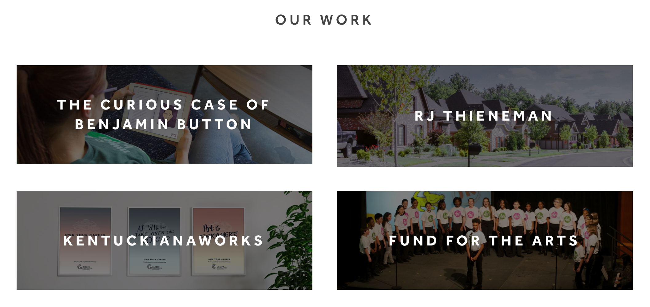
This one seems obvious, but it’s absolutely worth mentioning. We’re now up to the “baseline relevance and trust” phase. The user is looking to see if you can fulfill their needs. This is comparable to a first date. A website must display all of its best qualities and skills in order for the user to determine if you’re suitable. Displaying case studies also shows that other brands trust your expertise with their business.

Via Studio has a “Work” page showcasing top case studies so a potential client can see the team’s capabilities.
Humans are social creatures who generally rely heavily on the group to inform their decisions. Thus!â¦
Testimonials
Testimonials are your best friend! Almost every decision made on the internet is based on testimonials – on social media, yelp, google and so-on. Who doesn’t read the reviews?! (No one.) We have now entered the “interest and preference” phase. Think of this as the feedback from your friends and family after they’ve met your new beau. The user has checked you out and looked at your work. Now’s the test of the people. Users want un-biased opinions from the group so they can see why you’re a better option than your competitors. People go through a cycle of sources to cross-reference your trustworthiness. Therefore, when they circle back to your website and see your testimonials, they’ll know you’re legitimate.

Dailygem.com is a nutritious supplement subscription. They offer multiple testimonials to show credibility. Supplying this allows users to decide whether or not it’s worth the investment.
Transparency
In order to move into the real trust and commitment phases, you must be completely transparent. This comes in all forms – transparency about your process, your values, the price of the work, and what information they’ll need to give in order to do business with you. This is the moment of truth. This is the deep, honest conversation before really committing to a lasting relationship. Being honest and up-front presents the utmost trustworthiness and character. Even if your business isn’t what the user is looking for, they will at least respect your honesty. Being transparent saves everyone time, and people love nothing more than saving time.(Maybe saving money.)

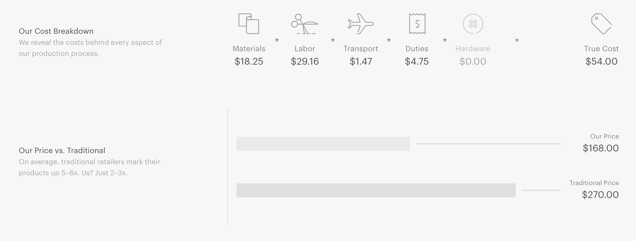
Everlane is well-known for their transparency. Here, they break down the cost of the creation and shipment of their clothing compared to traditional retail. This showcases why they’re different and displays upfront honesty.
The way to a trusting relationship is simple, but not always easy. If you keep the pyramid in mind when designing your site (and entire social media ecosystem), it will be much easier for trust to be established. Only when they trust you will they commit to working with you. Cheers to a long-lasting relationship! *tink*
Related Posts
4 AI Resources To Add To Your UX Design Toolbox
By:Morgan Plappert on 7/18/2023
These AI-powered tools can help you streamline your workflow and empower you to take your designs to the next level.
Read More »Component-Based Web Design
By:Morgan Plappert on 8/9/2024
Designers and developers are always looking for ways to make handoff easier, collaboration more seamless and our processes better aligned. Automation, consistency and efficiency, without compromising creativity. It’s a constant battle and often times, a balancing act.
Read More »
