Thoughtful Branding
By:
Ashley Trommler
on 12/13/2019
What inspires me?
This is a loaded question with so many possible answers. For the sake of a professional blog entry for my workplace, let’s take this route: Good Branding.
I usually start my morning with an iced coffee in one hand while the other scrolls through a branding case study while I think to myself “I wish I would have thought of that.” Good branding means being thoughtful. Thoughtful of every aspect of how someone will interact with a company.

Logos are important, but they’re just the corner pieces to a 1,000-piece puzzle.
Oh, I liked that metaphor… let’s try another one.
Your Bumble date is a brand, with their name as the logo. How are they presenting themselves? Is their look polished and pristine, or do they look effortless and approachable. Are they smiling and waving while they walk towards you, or are they calm, cool, and collected? By the time you shake hands, you’ve already learned so much about this person before you’ve even met them.
Branding is the reason you feel any certain way about a company. It’s how the company presents itself. It’s their voice and how they speak to you. It’s what they stand for and believe in. It’s what they look like, and sometimes it’s even how they smell! All of this is vital to building something you want people to interact with and trust. When companies do this well, they are unstoppable.
Enough reading. Let’s take a look at one of my favorite brands and dive into why they are so successful.
Their logo says it all, and nothing more. Lush is unlike any cosmetic company out there because they stand for so much more than what they are selling.
Someone who is unfamiliar with Lush may describe this as a boring logo. Little do they know that it aligns perfectly with their brand values and what they stand for – which is anything but boring, and anything but ‘frilly’. Lush lives and breathes these six values:
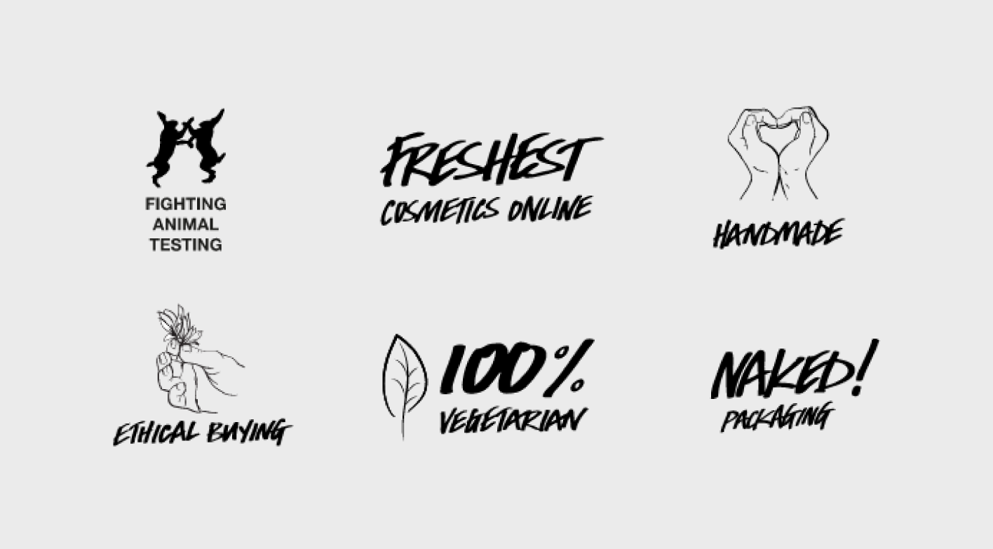
Yeah, these may be plastered on the website, but do these values support their brand? The answer is a big fat yes, and here’s how:
In-store Experience
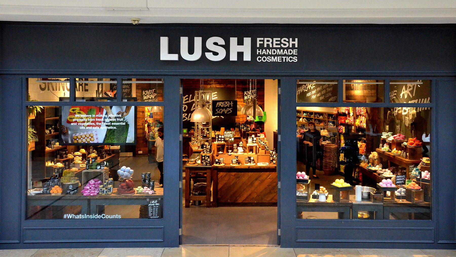
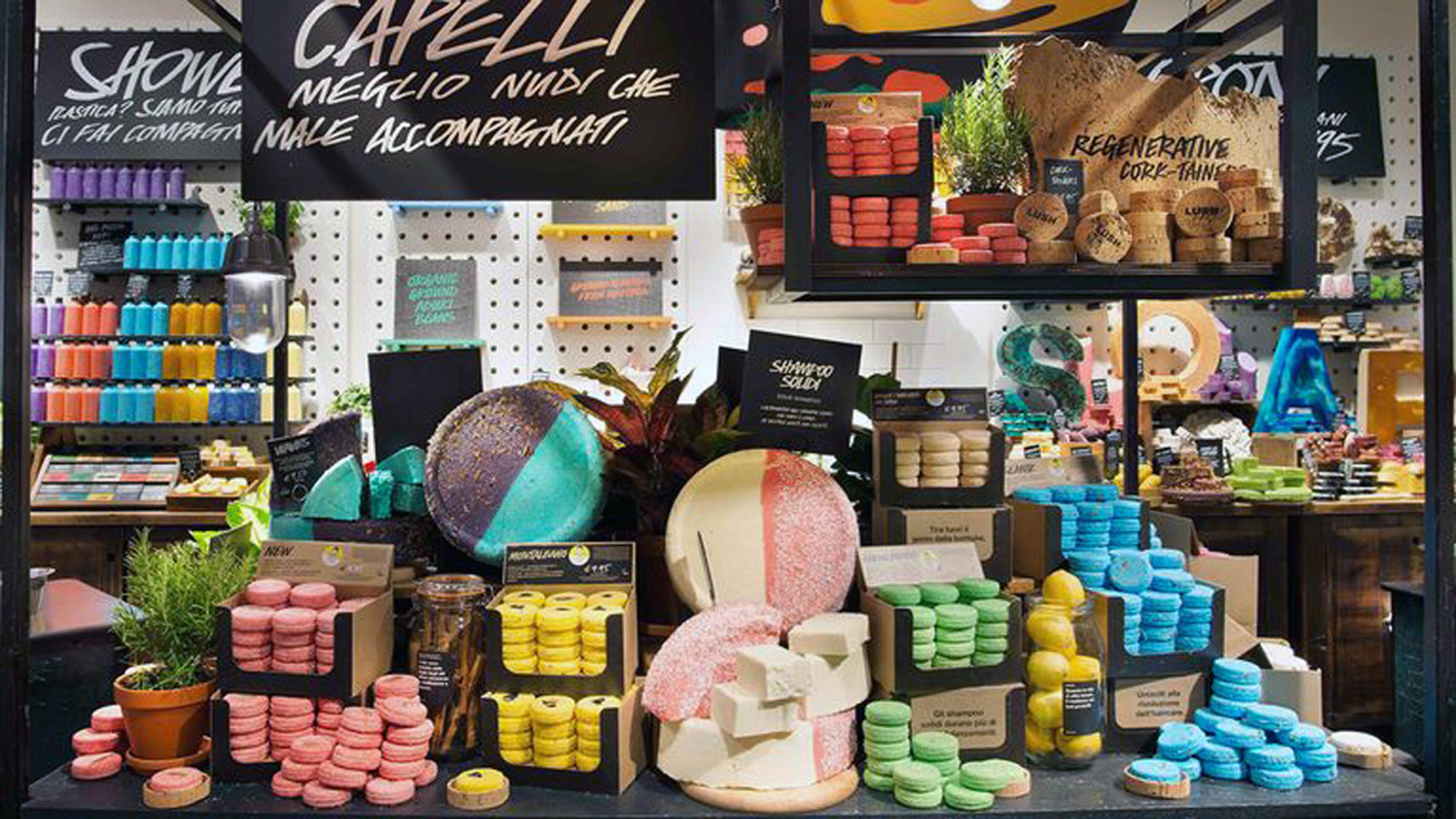
If you’ve never stepped foot in a Lush brick and mortar, what are you even doing? The entire store is one beautiful display highlighting their colorful and unique products. Not only is it a sight to see, it’s strategic down to the finest detail. Walking through the store may remind you of your latest trip to the farmers market or the grocery produce aisle. Soaps and bath bombs are stacked in crates accompanied by handwritten signs. That farmer’s market feeling is 100% intentional and nods to their fresh and handmade values.
NAKED Packaging
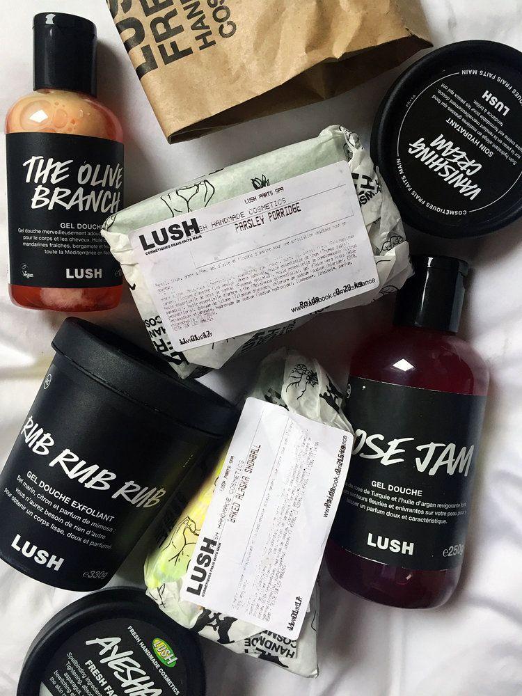
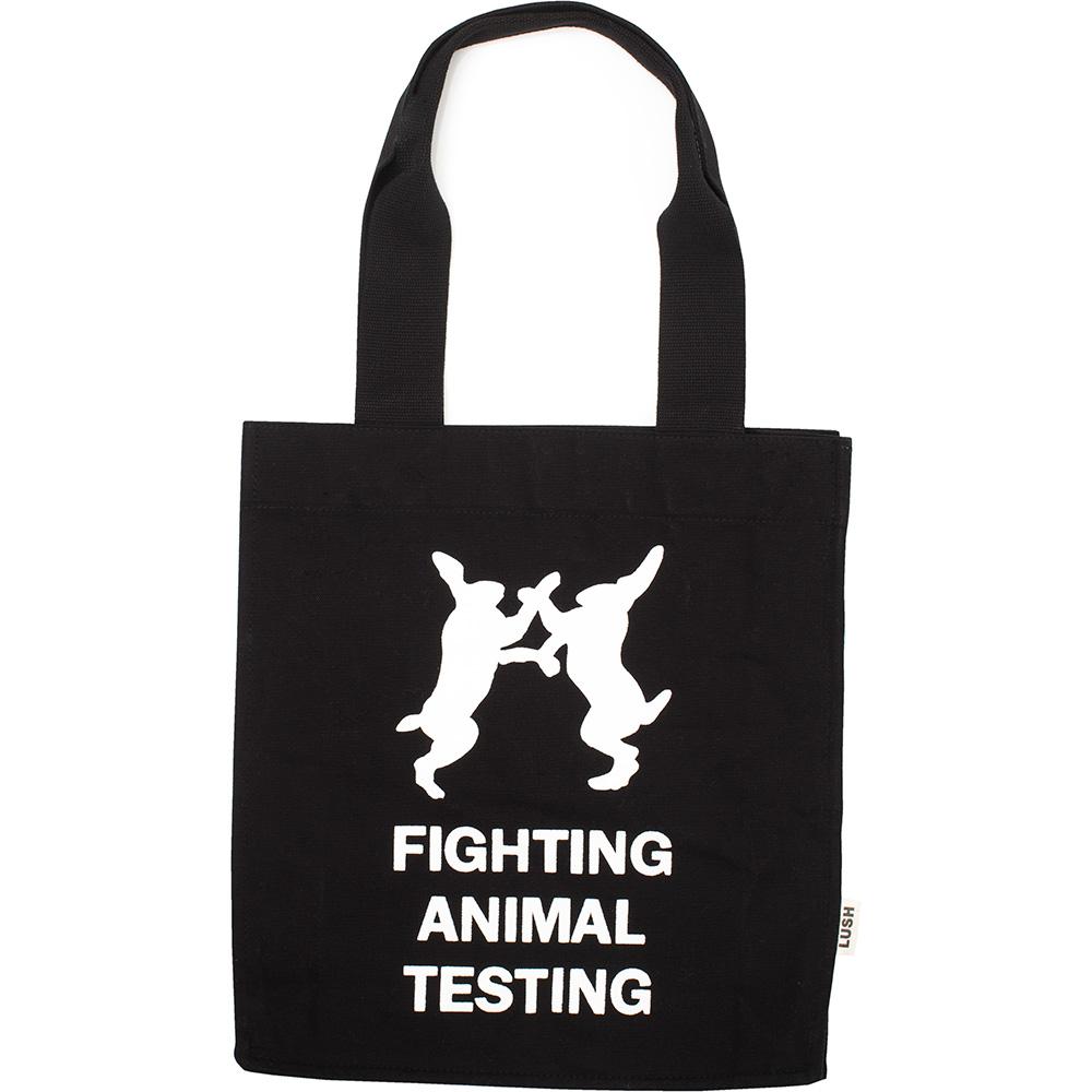
Let’s talk about their packaging… or lack there of. Just like you were visiting the butcher, soaps are carefully wrapped in wax paper patterned with their illustrated values. Handwritten labels cover black plastic tubs and bottles, all of which are a part of their recycle and reuse program. Each product features a sticker detailing who made the product and the date it was bottled as well as when to stop using – ensuring absolute handmade freshness! And after you drop an embarrassing amount of money at the register, it’s all placed in a brown paper bag with a large “Fighting Animal Testing” logo. A shopping bag is a companies #1 billboard, and Lush took this opportunity to represent a value they hold close to their hearts. I appreciate them for that.
[/row_images]
Online Experience
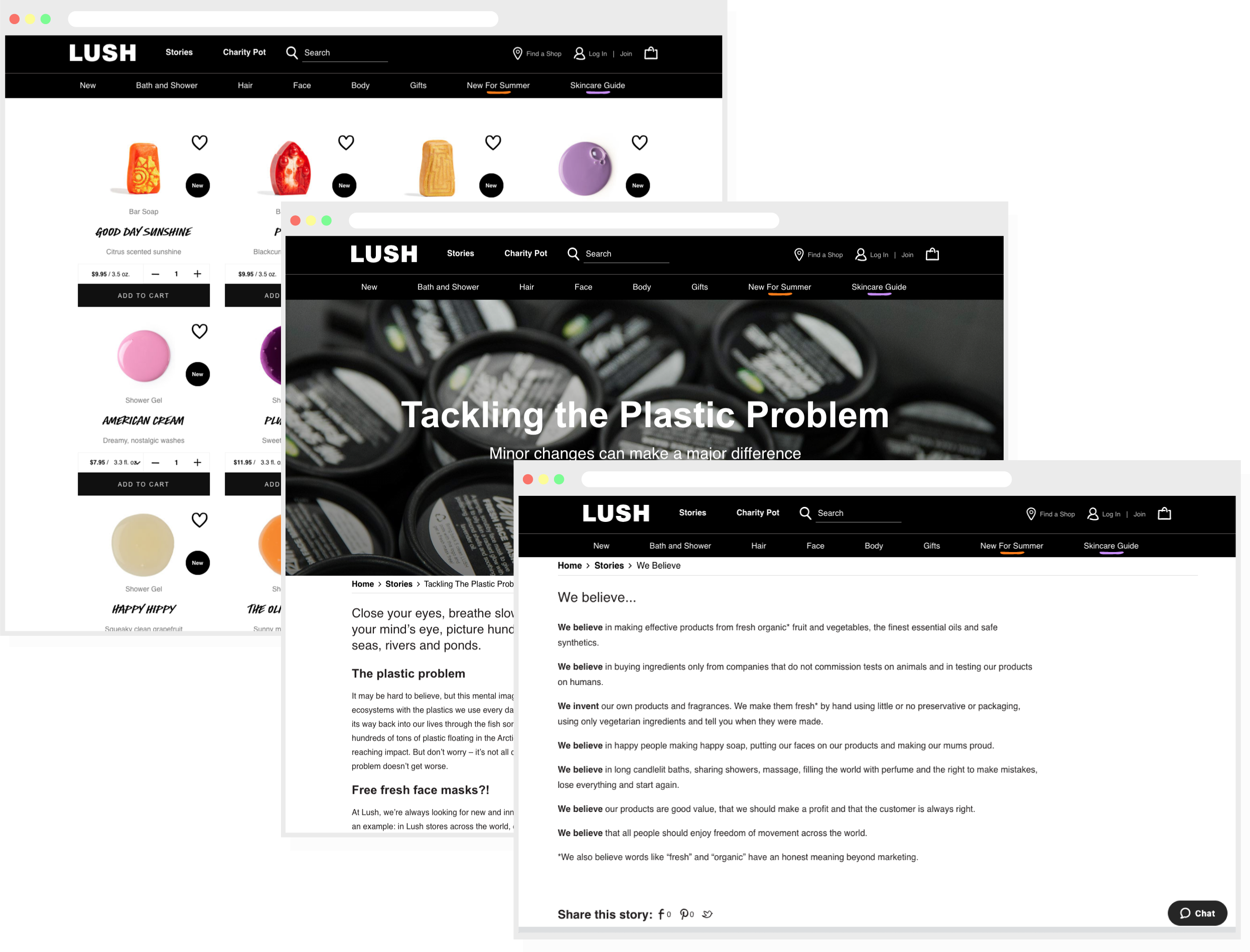
Lush uses their website to not only feature and sell their products, but as a platform to speak on their values. Each value is coupled with it’s own blog post! The visual layout of their product page is clean, simple, and contains no frills, much like the products themselves and their naked packaging. Branded elements such as their unique handwritten font are carried over onto the web in a subtle way that’s not over-the-top and doesn’t obstruct the user experience.
Voice & Tone
The way a brand speaks is just as important as it looks. When making connections with people, how you sound holds so much power. A brand like Nike falls in that inspirational, bold, powerful, and authoritative category. Lush’s website, social spaces, packaging, and in-store signage all have a consistent voice and tone that’s straight forward, yet friendly, warm, honest, conversational, and resourceful.
So, if you take anything away from my ramblings, let it be this: If you are starting a company, invest in branding – not just a logo. In fact, go ahead and hit that contact button because VIA has all of the tools and talent to help you craft a solid brand that’s unique to your company.
Related Posts
The best things in life are free… Except for good type.
By: Mitch Wiesen on 5/17/2021
Why you should budget for typefaces in your next creative project.
Read More »Positioning Your Company for Differentiation
By:Jason Clark on 5/26/2022
A well-positioned company is not afraid of its competition because they understand what makes them unique in the market. Learn the top six ways to successfully position your company.
Read More »