These icons are garbage
“I believe that good icons are more akin to road signs rather than illustrations, and ideally should present an idea in a clear, concise, and memorable way. I try to optimize for clarity and simplicity even as palette and resolution options have increased.” -Susan Kare

Even if you are not familiar with Susan Kare’s name, you are familiar with her work. She is responsible for designing many legendary icons and has a unique perspective on the balance of art and usability.
Historically, people used symbols and imagery to convey meaning, such as with hieroglyphics and stained glass windows. In today’s digital world, we use images to communicate in the form of icons. And like other imagery, icons have evolved along with style and technology.
Let’s take a look at the evolution of the trash icon.
In the beginning of the computer’s storied history the one thing that remained true across operating systems was the simplicity of the user interface. The lack of graphical content held strong for decades, but as time progressed, so did the addition of GUIs (Graphical User Interfaces) which included icons. Many icons imitate real-life objects, which instruct the user of that application’s capabilities. So, it makes sense that when you want to get rid of something on your screen, you send it to a virtual trash bin.
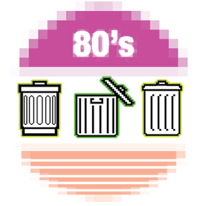
Icon design first surged onto the scene in the 80’s, introducing the world to flat, black and white, outlined shapes that were able to represent content with more than just words. These first-generation icons were heavily based off of a grid system, embracing simplicity and structure. In fact, the flat style, that everyone has fallen back in love with today, is heavily based off the humble beginnings of the icon. Trash cans were first designed in a simple, yet effective (and heavily pixelated) fashion, to convey the recognizable shape of the trash bin.

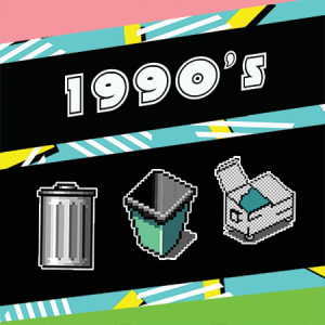
Fast forward to the late 80s and things start to, quite literally, explode. Three-dimensionality becomes all the rage, as file cabinets begin to spill out paperwork, folders fold open off of the screen, and trash cans overflow, spilling their content all over your desktop. The illusion of dimensionality and the portrayal of color took icon design by storm. Trash cans were now ⦠orange? and when full, would bulge from the sides. You know the phrase “less is more”? ⦠yeah, the 80s weren’t buying that, and this was just the beginning. Ahhh, the drop shadow. The 90s introduced a more expansive color palette and built upon the illusion of dimension. By the late 90s, every icon on your screen was afloat. This hovering element held true in the portrayal of the trash can, as some began to show raised lids, or were even replaced by dumpsters with legs and, of course, an accompanying drop shadow.

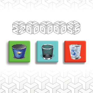
The 2000s brought realism. Icons took shape, dropped their stark outlines and began to look like realistic objects. Trash cans were now see through, with paper crumbled up within, or metal with reflective, shiny elements. This craze spread throughout the icon world and there was no holding it back. At this time, the digital trash bin was replaced by a recycling bin on some desktops; trends of the real world were translated into the digital world.

The Next Step.
Wait, so less really is more? When we look at the icons today, things have partially reverted to their primitive state. The craze of realism has become exhausted, and icons are, once again, embracing simplicity. We now live in a world of two-dimensional trash can icons, and we’re ok with that.

So, what’s next? What will your trash can icon look like in 10 years? Will it be anything like the robot trash can in our office? Your guess is as good as ours, but we can tell you one thing, we’re excited to find out.
This post was a collaborative effort by Casey LaRue, Morgan Plappert, and Corinne Resch
Related Posts
Component-Based Web Design
By:Morgan Plappert on 8/9/2024
Designers and developers are always looking for ways to make handoff easier, collaboration more seamless and our processes better aligned. Automation, consistency and efficiency, without compromising creativity. It’s a constant battle and often times, a balancing act.
Read More »Intro To Figma Dev Mode
By:Morgan Plappert on 7/1/2024
I’ve always loved Figma for the fact that every update is driven by a desire to ease handoff from design to development. But what if there was no handoff? What if developers become a part of the design process? Is Figma’s new Developer Mode the answer to this? I’m hopeful it’s a step in the right direction…
Read More »

