Organizing Web Styling
There are three people to keep in mind when writing code: the user, the client and your future self. For the user you need to build something accessible and intuitive, for the client something on time and under budget and for yourself something you can come back to in two months and easily update.
This last goal feels obvious, but when there are deadlines involved, organizing code is often the last thing on a developer’s mind. And when it comes to implementing a design as a front end developer, this usually means tacking more and more CSS rules into ever-growing files and more and more !importants littered throughout the codebase.
Here at VIA we often continue working on sites after launch. Clients may want to polish parts of the site, fix things that break (it happens!) or add new features as their needs change. So we want to write code that we can confidently dive back into, find what we need and add or update without fear of breaking anything.
Here are a few strategies to implement reusable and maintanable styling.
Use Components
In programming we have the DRY principle: Don’t Repeat Yourself. The idea being that, in order to both write less code and keep it maintainable, you should use functions or abstractions wherever code can be reused. The same mindset can be used in design. Rather than treating every page or section as a separate piece, designers can create reusable components to be used throughout the site.
For example, most design systems have a card component. In Google’s Material Design, this is a rounded box with a headline and some copy. And then variants can be chosen: elevated, outlined, with media, with buttons, etc.
When implementing a component-based design as a developer, this structure should be maintained as closely as possible. The simplest option to start with is to work with a Javascript framework or library like React, Vue or Svelte. (Or Angular, if you’re still into that!) These tools allow you to actually split your code into reusable components that you can drop anywhere in your code. This makes it extremely easy to mirror the design system structure in your code.
So we’ve organized our markup into components. Where should we put our CSS?
Choose a Methodology (and stick to it!)
BEM & ITCSS
BEM and ITCCS are two separate CSS methodologies; BEM focuses on naming and organizing selectors, while ITCSS covers the organization of files, roughly speaking, so they work best in tandem.
BEM stands for Block, Element and Modifier. To put it in the language of components that we’ve been using, a block is a component (e.g., card), an element is a piece of the component (e.g., card__header) and a modifier is a variant of the component (e.g., card--dark).
The main principles of BEM are to allow block styling to stand on its own and keep all of the styling at the root level, so we can prevent confusing cascades and specificity wars. It also helps visualize how the pieces of a component relate to each other, so code is more immediately understandable.
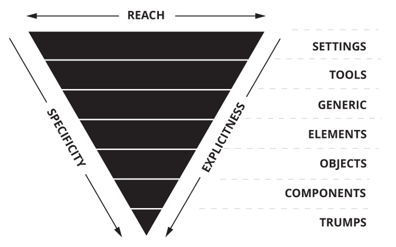
ITCSS, or Inverted Triangle CSS, is an approach for managing the cascade. The triangle is the one below, which establishes a hierarchy for your selectors.

Here’s an example of what the main CSS file might look like when using ITCSS:
This might look familiar to the way you might structure a large CSS file, with global selectors at the top, moving down to more specific ones. But by explicity organizing your code into files and folders this way and enqueuing them in this order â especially used in tandem with BEM â you can ensure that all of your styles are being applied in exactly the order you want them to be, and know exactly where you should make any updates down the road.
CSS-IN-JS
For projects built with a Javascript framework, including CSS within the actual components is a great way to keep your styles right next to the code they’re affecting so there’s no need to go hunting for the selectors you need. There are about 12,000 libraries for this: if you’re using React you could use Styled Components, Emotion, styled-jsx, JSS, etc. Any one you choose will get the job done, really, so don’t sweat it too much. The main benefit here is that the styling can have access to your component state and props. Here’s an example of a component using style-jsx to conditionally apply styling based on a prop:
TAILWIND
If you prefer your styling to be even more tightly coupled with your markup, consider Tailwind, a CSS framework that provides utility classes for styling your code without even writing CSS. While many may feel that styling with utility classes clutters up markup, it does help keep the styling right alongside the markup its affecting, and even moreso Tailwind allows you to work within the constraints of your design system. While you have the option to use custom CSS, having your designer work with the set colors and spacing available within the framework, or creating your own constraints, help you incorporate your actual design sytem into your code.
We used Tailwind on the recently launched Kentucky Performing Arts website and found the option to apply styling without having to leave the markup extremely useful when creating page templates. Here’s an example of a Laravel Blade template applying styling to a card group (and note the use of a partial view!):
In this case we’re applying styles like margin-bottom: 4rem; by just adding the class mb-16. This way we don’t have to make up a class name like “card-link-container” or use a selector like .card-carousel + p that could break if we reorder the markup.
Using Tailwind alongside a tool like PurgeCSS also allows you to remove all of the unused styling during the build process, so you don’t ship any of the framework’s styling that you don’t need.
Be Mindful
Ultimately no matter how you approach your coding, just remember to be kind to your future self. ❤️
Related Posts
Wordpress to Sanity Data Script
By:Nick Stewart on 3/11/2021
One of the biggest challenges of moving from one CMS to another is getting your existing data to the new platform. In our case, we were moving our existing WordPress platform, which had been around for years, over to the Sanity.io platform.
Read More »Developing the New via.studio
By:Alec Robertson on 6/14/2021
A deep dive into creating a fast, user-focused experience on the latest web technology stack for the new via.studio website.
Read More »

