How a Classically Trained Illustrator Made Besties with an FED
By:
Natalie Miller
on 11/8/2016
Here at VIA we all dig each other (right guys?), but sometimes working across departments can be a challenge. Like Liam Neeson we all have a very particular set of skills; at times, blending very different skill sets can be a challenge, but when done right it is sure to pay off.
…what I do have are a very particular set of skills, skills I have acquired over a very long career.
A Brave New World: Pat
I began my career in advertising art nearly 30 years ago. I was the guy who could control a pencil very well, liked to paint murals, do scratchboard and draw. I still am. How I ended up at a web development company is a continued mystery. The skills I have could be considered archaic compared to the disciplines sitting around me. FED, BED, CGI and UX people lounging in big comfy chairs with laptops replaced guys with handfuls of markers hunched over drafting tables.
And most of these men and women were just a gleam in their parents developmental eyes when I was laying out magazine ads. My future it seems, was “made” for me. Daily, I find myself surrounded by women and men who do not seem to notice a difference in age or gender. What they respond to is the value each person brings to the table – skill set, attitude, a thirst for continued growth and change.
Part of my future introduced me to Front End Development, or FED for short. Never privy to the “magical” workings of code, I just went about my merry way producing illustration and graphic assets that simply appeared on our sites. How they mysteriously appeared there = FED and FED = Natalie. A quiet person, focused and always looking as if she’s up to something. She is and it’s sure to make the site we are working on even more than hoped. Surely this “magic” that happens is something to do with logic and being craft spells, I think.
There’s always a gap to bridge when two people first meet. Uncertainty of skill set, communication and, most daunting, she may not like my polo shirt collection. What felt like insurmountable obstacles to me dissolved instantly when we began work on Waterfront Park together. I found it did not matter that I was not versed in code or understanding of the minutiae of how Natalie did what she does, just how to deliver art the way it was needed. The old and the new worked together exceptionally well to create something that made us each proud. Natalie was instrumental in teaching me the importance of svg files, the finer details of 1x vs 2x and I remain amazed at what is possible with static images. Our communication made each of us more efficient, ready for increasingly interesting challenges and just outright excited about the work we were producing together.
She also doesn’t seem to mind my polo shirts.
The Technical Bit: Natalie
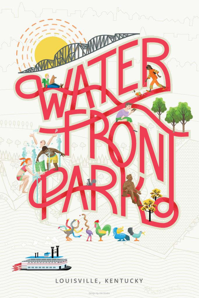
Our work with Waterfront Park began with a branding project, out of which we got a whole slew of assets we were excited to bring into a digital space. One of our favorite pieces was the Waterfront Park poster Pat designed.

We knew we wanted to bring this poster to life, scratch that, we needed to bring this poster to life, but how? Pat is a classically trained illustrator, which means he starts by hand with a sketch and then moves his work into his design software of choice. I am a front end developer, which means that I’m usually used to getting pngs, jpgs, or svgs ready to implement on the web.
In order to bridge this gap we started out by picking the pieces we wanted to animate: the sun’s rays, the water fountains, Lil’ Davey the squirrel (he ended up in the footer), and the Belle of Louisville. Based on how we wanted them to move, the next step was to prepare the assets.
First, as evident on their homepage, the poster design was simplified for the web. (This film has been modified from its original version. It has been formatted to fit this screen). I worked with Pat to break up the assets. We wanted to make the sun’s rays rotate around each other, so we made three separate layers:


I positioned the rays on top of each other and then used a CSS keyframe animation to rotate them in opposite directions, one clockwise and one counterclockwise. The sun was then added on top to mask the bottom of the rays where they descend behind the bridge. Similarly, the Belle was broken out into its own layer and animated to move across the screen.
Now for our fountains and our squirrel we wanted to do more than move a static image on the screen. This is where Pat and I really got creative with our assets. We wanted splashing, dancing fountains, and a squirrel that could wiggle his tail (we also made a fun surprise on the 404 page using the same technique).
To do this, I asked Pat to draw out each frame of the animation and save them out in the same size. Then, using my go-to sprite generator I stitched the images into a single sprite sheet. The animations themselves are also CSS keyframes. These animations use the steps() function, which controls exactly how many keyframes will render in the animation timeframe. Each fountain actually moves at a different rate, making them feel more random and realistic than if they moved in sync. Combining this technique with a cleverly created sprite sheet allows you to create dynamic animations that won’t slow your site down.

In the end, Pat and I both learned a lot about working together to make your assets work for you. Plus we created some fun animations to bring his art to life! (And I kind of like the polo shirts).
Learning: Pat
Michelangelo was right, “I am still learning.” I know a bit more about front end development because of Natalie. Most importantly, not to be afraid to ask questions. Age doesn’t matter to anyone here, regardless of role. Well… maybe me, a little. I’ve learned, the most unlikely people may be like-minded and with good old fashioned time and graciousness become besties.
Related Posts
Component-Based Web Design
By:Morgan Plappert on 8/9/2024
Designers and developers are always looking for ways to make handoff easier, collaboration more seamless and our processes better aligned. Automation, consistency and efficiency, without compromising creativity. It’s a constant battle and often times, a balancing act.
Read More »Dive into the Sanity Structure Builder
By: Mark Biek on 6/13/2021
Sanity is the super fast, super customizable CMS that we're using as the backend for the new via.studio website. One of the more powerful concepts that Sanity is the Structure Builder which gives you the ability to customize how content is presented in the Sanity admin.
Read More »
