Getting creative with Act-On | Marketing Automation Software
Here at VIA Studio, our work covers a broad spectrum; from websites to print advertising and everything in between. One of the many tasks that came through our doors was to create landing pages and email templates with Act-On, a “software-as-a-service, cloud-based marketing automation solution”. This platform, while powerful and full of useful features, also has many quirks, and is not super straightforward. With this in mind, we crafted creative solutions to get the best result for our client.
Landing Pages
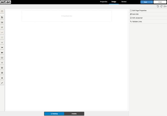
The most cumbersome items we built with Act-On were landing pages – small, one page templates that included a contact form. Out of the box, Act-On gives you an editor with the ability to add content “blocks” (text, images, etc) and custom CSS and javascript (it also gives you the option to upload a custom template, but you lose the ability to add content blocks). However, it doesn’t give you fine grain control that you may need to create a well-designed landing page. We had to figure out how to leverage the software to bend to our wishes.

The solution
Design templates like the web industry did in the early 2000s, slicing PSDs. A designer would create the template in Photoshop and slice it up into individual assets. From there, a developer would take those slices and position them correctly on a page.

With Act-On, we did this to a degree and we were even able to continue using the content blocks and other Act-On features, such as forms. The overall designs would take advantage of large, open sections for the content blocks and other times, such as buttons, would be cut up slices.
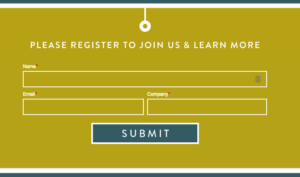
This all came together to form a beautifully crafted template, with custom text from the client and even a contact form (utilizing Act-On’s contact forms).
Tips with working with Act-On
- Try using the image blocks as much as possible. They are responsive out of the box and will save time.
- Features tend to be hidden and not documented well. For instance when choosing a font family for the page, you need to go to Edit Page Properties -> Styling -> Font Family and if you scroll down the list at the bottom there are Google Web Fonts (who would’ve known).
- The media library is different from the image library.
- Forms can be embedded (with an iframe) instead of using the form block. They also can be styled from the form editor.
- Form input buttons cannot be styled, however they can be replaced with an image.
- The polls feature is broken, use a form instead to achieve that effect.
- In the top right-hand corner of the editor there is an undo and redo button.
Related Posts
Wordpress to Sanity Data Script
By:Nick Stewart on 3/11/2021
One of the biggest challenges of moving from one CMS to another is getting your existing data to the new platform. In our case, we were moving our existing WordPress platform, which had been around for years, over to the Sanity.io platform.
Read More »Developing the New via.studio
By:Alec Robertson on 6/14/2021
A deep dive into creating a fast, user-focused experience on the latest web technology stack for the new via.studio website.
Read More »

