Fund For The Arts
Guiding the donation experience for a nonprofit committed to building a vibrant community.
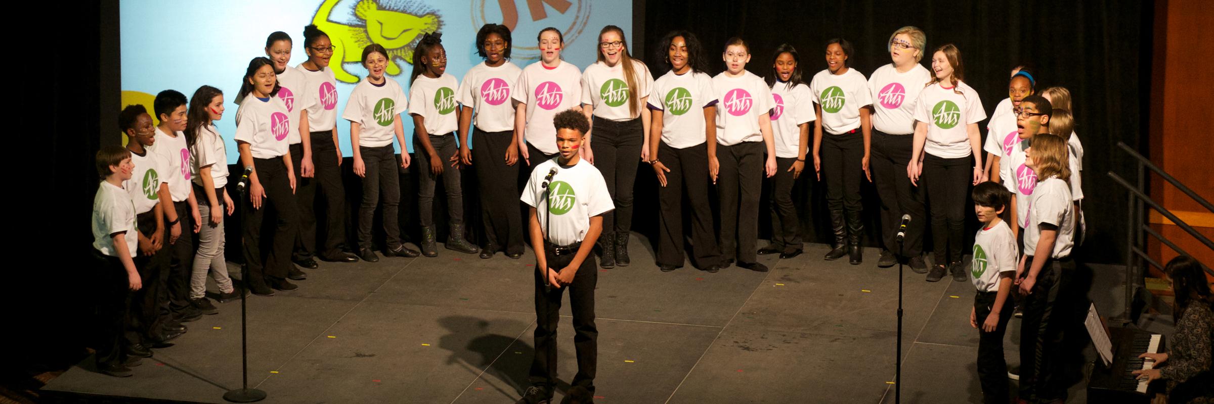
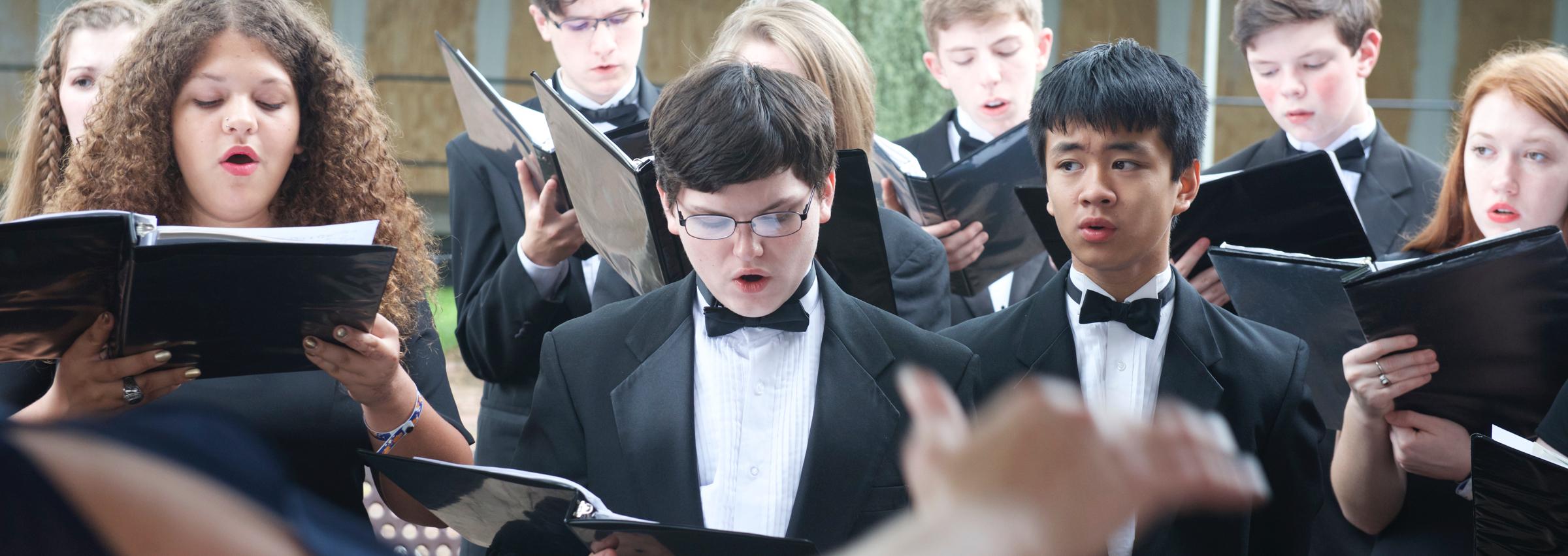
Fund for the Arts is a regional nonprofit committed to building a vibrant community through the power of the arts. With the help of nearly 20,000 donors, Fund for the Arts supports a range of arts organizations and drives accessibility across neighborhoods, schools, community centers and public spaces.
Fund for the Arts’ “E-campaign” system was built five years ago to manage donations coming from companies and corporations across the region. Unfortunately, the system had not been updated since it was built. Our goal was to maintain the current functionality of the system while improving user experience and incorporating a new brand.
FFTA came to us looking for an improved user experience not only for the donation process, but also for the management of the system. We developed a new campaign process that is simple to navigate, includes improved communication tools (sending/receiving emails) and has an easily manageable back-end for administrators.
While setting out to tackle all of the main objectives listed above, we also wanted to make donating enjoyable. Is giving money fun? Not always… but we can make it easy to do and maybe elicit a smile or two along the way.
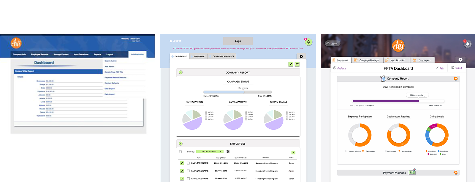
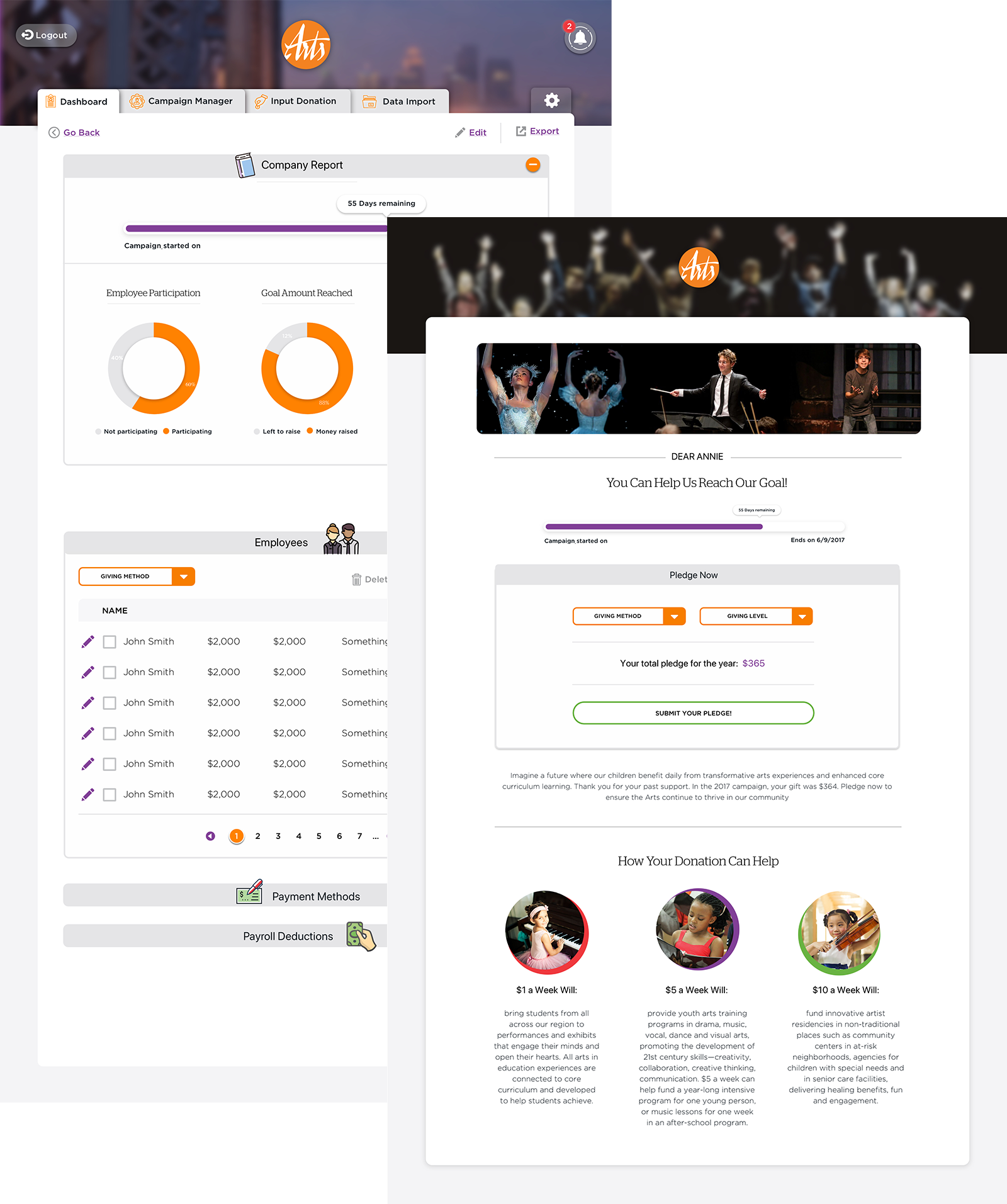
Example of data-visualization used on the admin dashboard
The original site used a traditional username/password scheme for employees to log in and enter donations. This led to forgotten passwords and other hassles, ultimately resulting in a large barrier to entry. We decided to simplify things by using a “magic-link” login mechanism. FFTA can now bulk-send emails to all employees in a company. That email contains a unique login link for each employee. Clicking that link from the email now automatically logs the employee into the site and takes them straight to the donation page. No need to remember anything!
Just click and donate!
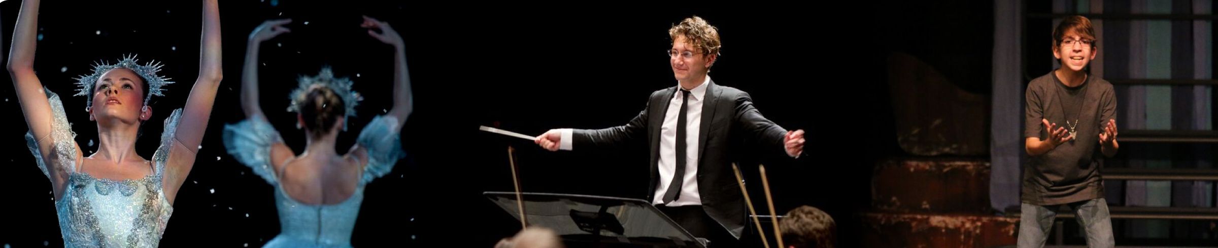
The old platform design was static and one dimensional. And Fund for the Arts as an organization is the exact opposite. We wanted to improve the user experience and overall interface by adding some guiding visuals (illustration and animation) and developing some micro-interactions that made the content more engaging and approachable. We wanted it to represent Fund for the Arts!
The goal was to go above and beyond in email messaging/marketing, to have fun with the design and use supporting visuals as a place to inject brand personality.

We developed a new system with a succinct/organized flow, improved usability through an updated UI, clean design and clear messaging, and increased flexibility. This project was both a development and UX challenge, but we’re happy to flex those muscles and come away with a product to be proud of.