Why Design Mobile First?
By:
Josie Flynn
on 7/28/2015
As web browsing increasingly moves to mobile and tablet devices, it’s important to consider your brand’s presence on mobile first instead of as an afterthought. At VIA, we consider and balance your user’s needs with your brand’s to best determine your mobile strategy.
Where usage is going
Before we start design, we have to take a few things into account, one of which are the users habits. We have to pay attention to how they are digesting the information and what they are using to consume that information. With our clients, we are finding that the trend of mobile-first does, in fact, follow the habits of the users.
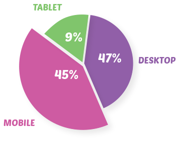
Mobile device usage has been on the rise since the iPhone’s debut in 2007, with ownership rates rising to 80% of all online adults. Your average mobile-optimized content site can see as much as 50-60% of page views coming from mobile users. This data from WFPL.org, which we redesigned responsively last year, shows more than half of their audience is using mobile or tablet devices to read news & listen to live radio.
Consider both brand and device constraints
After assessing user patterns, we dive in deeper. We pay attention to the content types that the user is consuming from device to device, while making sure to check in with our client’s overall goals. Often agencies pay attention to one (user’s needs) or the other (client’s goals) without taking the time to strike a balance, resulting in either a project that is divergent from the brand strategy or one that is ignorant to its constituents.
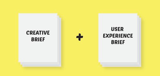
This can often present challenges to both the user and the client. It is up to us to guide both into an engaging understanding of as many goals as possible. One way we do that is through writing a Creative Brief and a UX Brief. Both of which keep the brand and user in mind with sections like “First Glance” and “User Paths.”
In addition to paying attention to the research we have acquired on device usage habits, we must also try to create a design that is resilient to the changing trends and technologies. So while “mobile-first” is a trending term you have likely heard of, it should extend beyond that ideal into “flexible design for our users.”
Graphics and contributing copy by Emilee Dover.
Related Posts
4 AI Resources To Add To Your UX Design Toolbox
By:Morgan Plappert on 7/18/2023
These AI-powered tools can help you streamline your workflow and empower you to take your designs to the next level.
Read More »
Component-Based Web Design
By:Morgan Plappert on 8/9/2024
Designers and developers are always looking for ways to make handoff easier, collaboration more seamless and our processes better aligned. Automation, consistency and efficiency, without compromising creativity. It’s a constant battle and often times, a balancing act.
Read More »