A Series of Right Turns: Using Arrows in Web Design
By:
Amber Glisson
on 8/5/2011
I’ve always thought that web design and wayfinding are congruous. Directing a user to easily navigate through a physical structure or the mesh of pages in your website often calls for similar tactics. While the use of arrows in a building are more often literal to the direction of movement, the use of arrows to incite action is frequently used on websites.

The most common uses of arrows on the web and mobile are:
- Pagination
- Indication of a link
- Video play buttons
- Calls to action
The right-facing arrow has grown to be the chosen symbol for “if you click here you will go somewhere”, usually referencing the copy preceding it or the image nearby, like a street sign. In the case of a play button of a online video, long before the internet was widely used, the right-facing triangle was a widely accepted as the symbol used on every VHS remote control, so it just made sense to continue its usage. I have no idea who decided the right-facing arrow next to a link was the way to go, but the logic works.
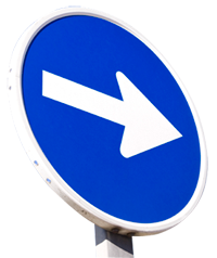
If you visualize the web as a series of crossroads that you select to head off down a path to get your destination (content), a sign with an arrow that indicates a turn makes sense to indicate how to get there. You may only be making right turns to get there, but direction is arbitrary when talking about the abstract idea of a web.
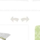
Another use case, arrows for pagination, allows a designer to replace words such as previous and next with visual interesting, easily comprehended symbols. These symbols guide directional movement through a list based on the given that most cultures read from left to right. It’s clear that the usage cases of these symbols have simplified interaction for users while adding a visually stimulating asset for designers to manipulate.
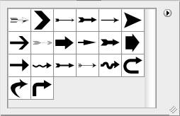
Although powerful, an arrow usually can’t demand much of the overall design time. Luckily, there are a lot of resources for repetitive use shapes like arrows. Designers using Photoshop have access to a default set of arrows. Photoshop’s shape palette are easily editable using points to adjust to your desired shape.
There is also a vast collection of stock arrow illustrations and fonts containing arrows available for download on the internet. With options galore, designers still tend to use the same arrows or slight variations of the same arrow over and over, myself included. With an urge to harness the power of arrows and not feel like a broken record, I set out to collect a set of arrows that work on some well-designed sites and add to my arsenal for future projects.
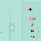
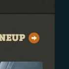
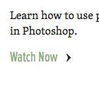
I found that most arrows commonly used fit into 4 shapes: a simple triangle, a triangle (head) with a protuding line (shaft), single angle quotes and double angle quotes.
Here are my favorites:






Related Posts
4 AI Resources To Add To Your UX Design Toolbox
By:Morgan Plappert on 7/18/2023
These AI-powered tools can help you streamline your workflow and empower you to take your designs to the next level.
Read More »Component-Based Web Design
By:Morgan Plappert on 8/9/2024
Designers and developers are always looking for ways to make handoff easier, collaboration more seamless and our processes better aligned. Automation, consistency and efficiency, without compromising creativity. It’s a constant battle and often times, a balancing act.
Read More »