The Internet's Bubble Wrap: Your 404 Page is More Important Than You Think
In most cases, landing on a broken link is a UX nightmare. The user is moving right along, exploring all that the site has to offer and wham! ⦠A brick wall – an ugly one at that, with “404” graffiti’d right on the front of it. It just feels so abrupt, so intrusive â Like a dead end to your otherwise seamless flow. But does it have to feel like that? If you plan ahead with good UI and empathy for your user, you can turn a bad user experience into a quick smile and encouraged exploration.
Turn that UX frown upside down:
Ever hit a 404 page, only to be met with “Go back to exactly where you just were”? … They’re out there. Let me phrase it this way – Would you enjoy getting lost on a trail, only to hit a dead end and be forced to go back the exact way you came? Of course not. The internet is just a different platform for the same problem, except here you have the opportunity to carve out a solution. Users want to feel like they are making progress, it’s your job to help them.
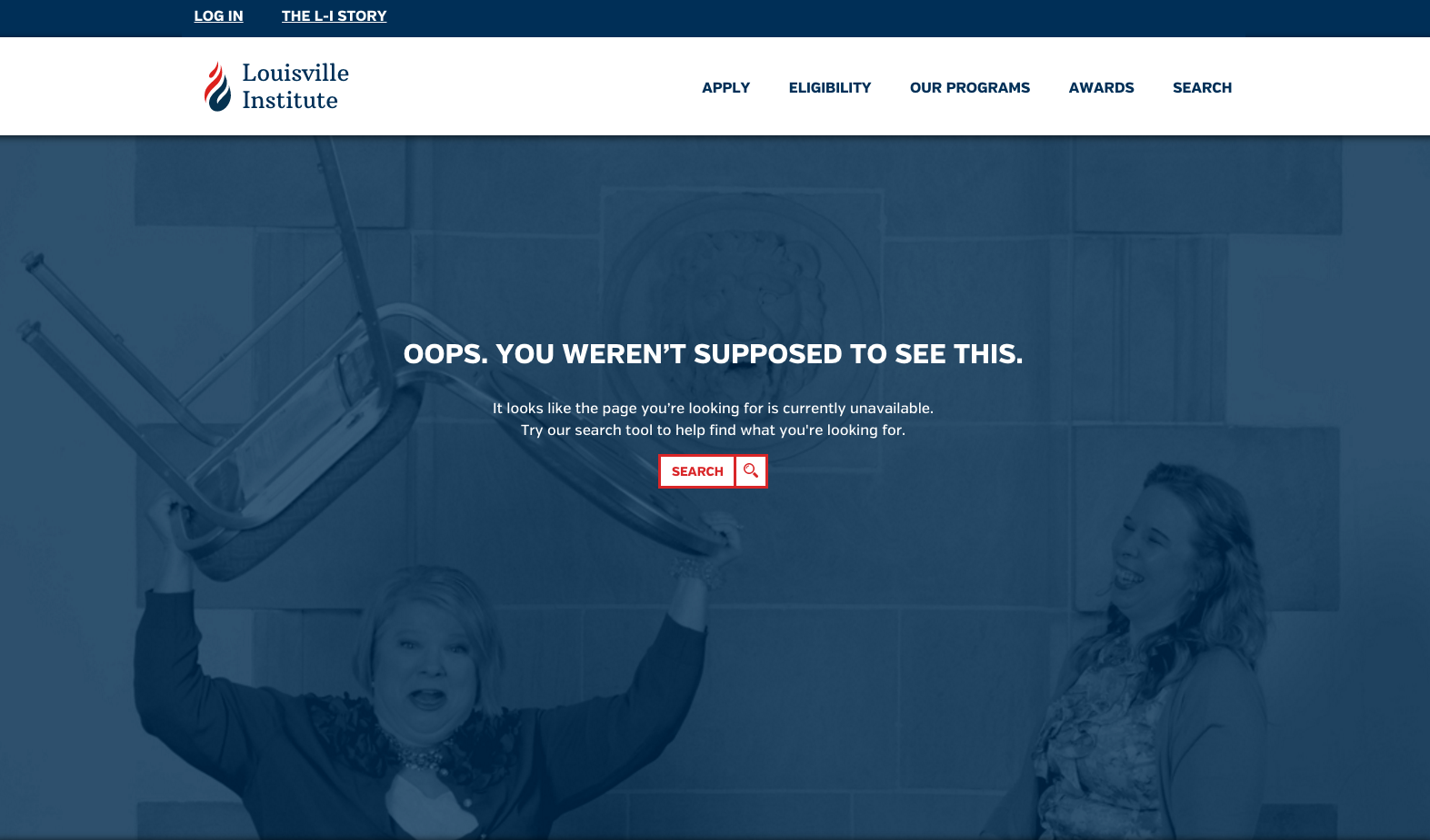
Sidenote: You may even get lucky and have clients that are hilarious enough to pick up a chair and pretend to throw it during a photoshoot and you find that photo later down the road and think “This would be pretty funny to use here, but I don’t know if they’ll go for it ⦔ And they totally go for it.
Not making any promises though.
https://louisville-institute.org/404
Keep it concise, but not too concise:
There’s nothing worse than getting an error modal. Ok, yes there is. Getting an error modal with an ambiguous message like “ERROR TYPE: 00000xCVnnn25” ⦠Because we all know what that means, right?
Simple solution here: Explain what went wrong and tell the user what to do next.
Some movement to add a little visual interest doesn’t hurt either.
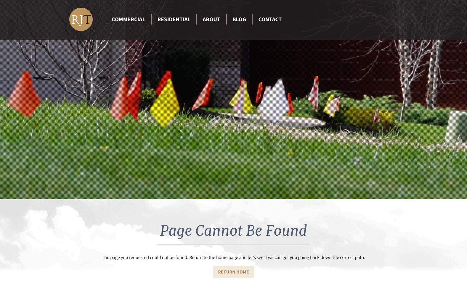
Remember the goal – Sell the brand:
So, what if the very first interaction a user ever has with your site is the 404 page? Not an ideal start, but see it as a challenge. Make the page enough to keep the user engaged and committed. Functionality still needs to take front-seat over aesthetics but if you can blend the two to create an enjoyable user experience with a concise and sensible flow, well, then you may have just won this battle:
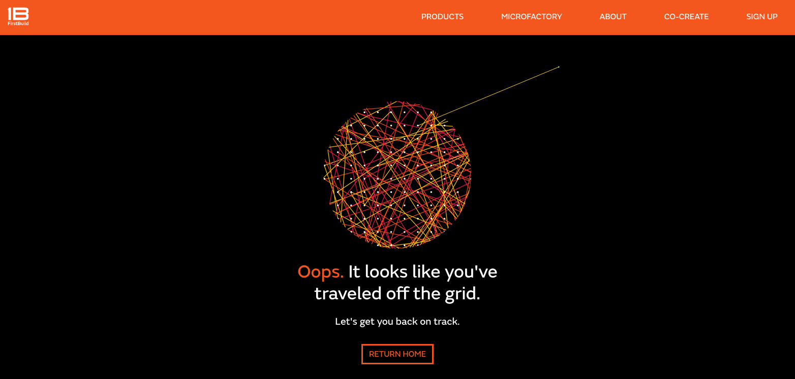
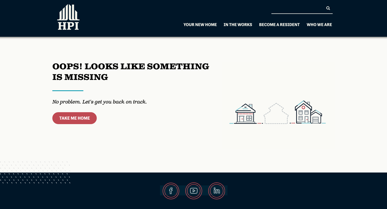
https://ghazalichildren.org/404
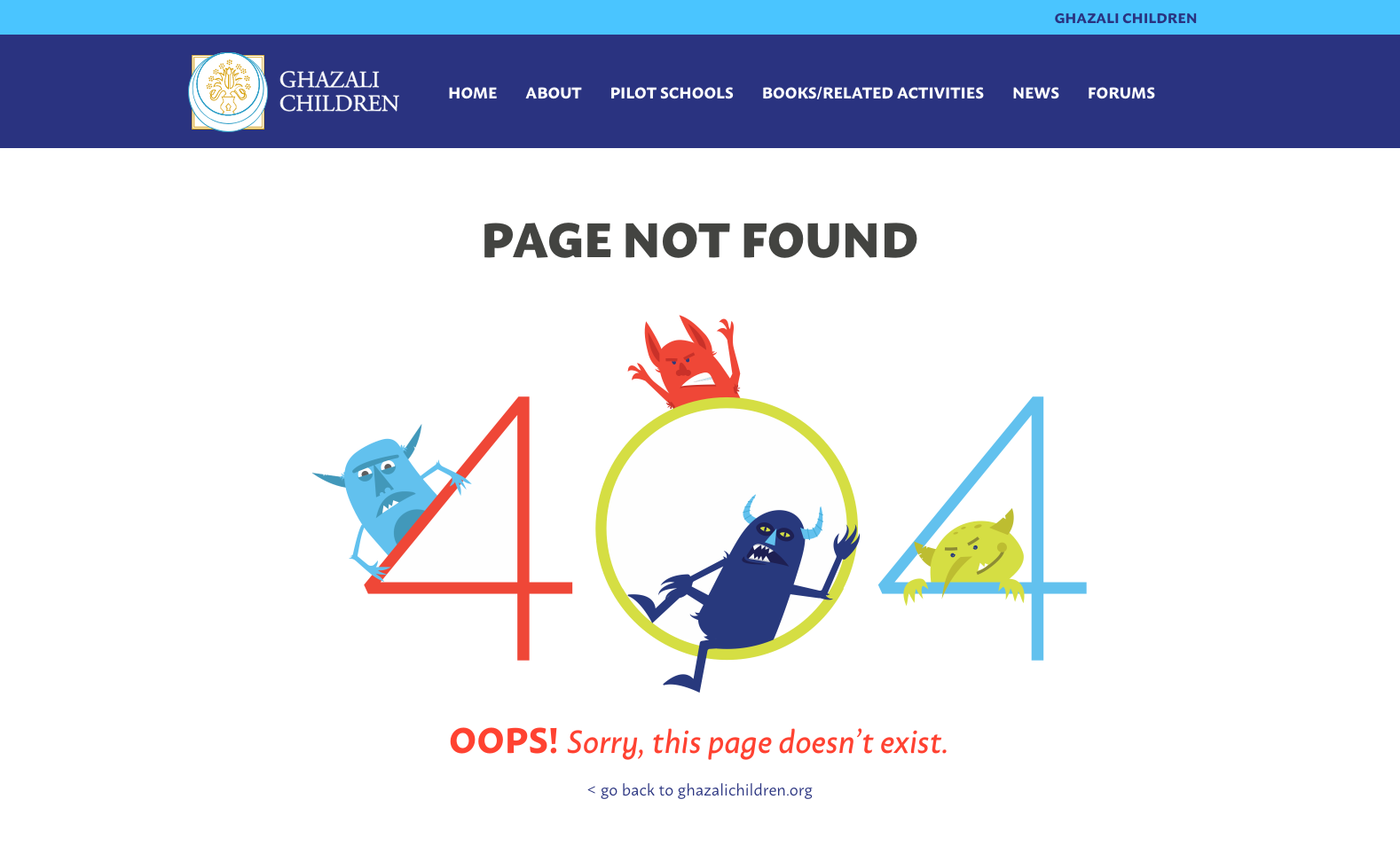
Virtual bubble wrap: Make it fun!
Humor can take you a long way in life. Everyone loves to be happy and everyone loves to laugh. These can often be the fastest methods to putting a band-aid on a UX boo-boo. Deflating user frustration is not easy, but adding a splash of humor or some smoothed out edges to your interface really can go a long way.
Take for example the gem of a mobile micro-interaction that Apple utilizes when you reach the bottom of a page. Instead of an abrupt end, you get a little rubber band-esque snap back. This subtle but ever-so effective technique helps the user feel less frustrated⦠As does a duck butt:
https://louisvillewaterfront.com/404
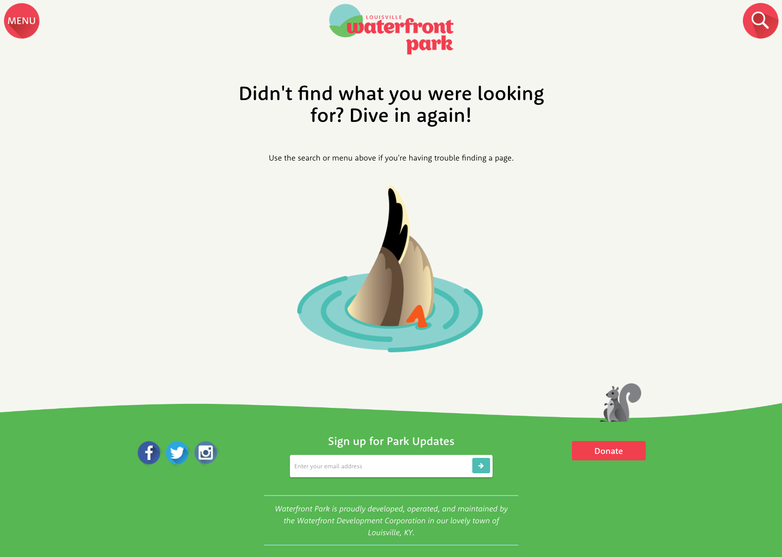
Lesson learned: Mistakes happen. No one is perfect and no matter how awesome your site design is, people will inevitably type in a wrong URL from time to time. Instead of clinging onto false hope that this isn’t going to happen, go ahead and make that page something you are happy for the user to see.
So go ahead and use that next 404 page of yours as a blank canvas for user engagement, brand awareness and maybe even a chuckle or two. A pleasant surprise beats a major inconvenience every time.
Related Posts
4 AI Resources To Add To Your UX Design Toolbox
By:Morgan Plappert on 7/18/2023
These AI-powered tools can help you streamline your workflow and empower you to take your designs to the next level.
Read More »Component-Based Web Design
By:Morgan Plappert on 8/9/2024
Designers and developers are always looking for ways to make handoff easier, collaboration more seamless and our processes better aligned. Automation, consistency and efficiency, without compromising creativity. It’s a constant battle and often times, a balancing act.
Read More »
