Some Do’s
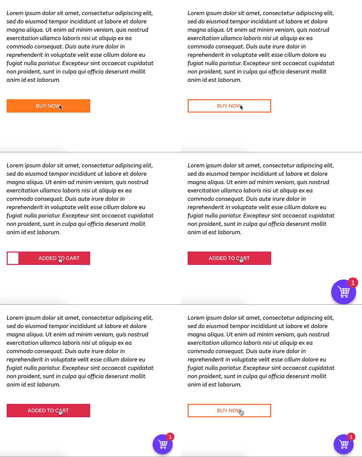
1. Encourage the user to purchase your products

2. Take them along a prescribed path

3. Assist with search & wayfinding

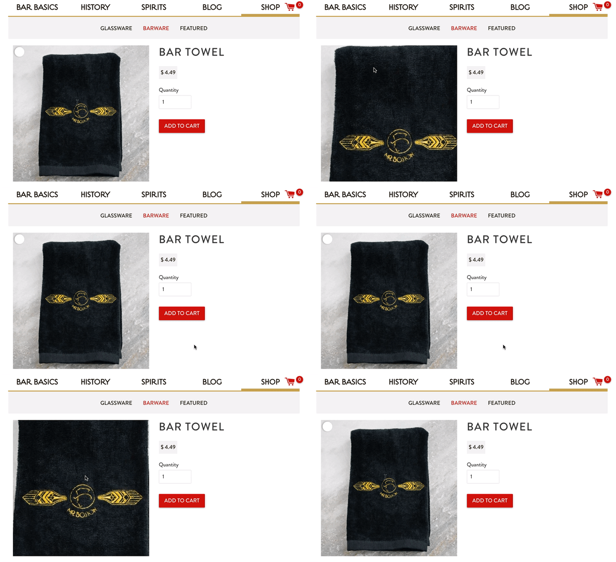
4. A common ecommerce feature – Hover zoom. Let’s the user to get a more detailed peek at the product, and allows for better small screen experience.

5. Enhance the user experience and alleviate frustration by keeping them in the know, every step of the way. Add personality and branding.


Some Dont’s
Generally speaking, don’t do anything that doesn’t lend to a usable, clean and sensible flow/experience. Don’t design for your ego or add to your users cognitive load – It will sacrifice your narrative. Lend to the experience, don’t add. Be aesthetically-pleasing, but more importantly … Be problem-solving.
- Animation for the sake of animation – Have a purpose. Not everything has to move. Make sure you are fully acquainted with the brand (tone, look, feel) and put that brand in motion. Tell your story. Mailchimp is a great example of how to express brand through aspects of the UI.
- Confuse the user. UI motion design needs to tell a story, connect the dots and give the user context. Use animation for validation and transitions.
- ANIMATE ALL THE THINGS – Overwhelming the user with movement will result in an annoying experience and bogged down site. Compliment the visual design and create motion that will go unnoticed by most. A UI animation should take 100-500 milliseconds from start to finish. Don’t get too flashy (pun intended)
- Design for “likes” instead of your user. If animation is taking the lead role, you’re no longer designing with a purpose. BE INTUITIVE. Don’t try to entertain the user, try to help the user.
Related Posts
4 AI Resources To Add To Your UX Design Toolbox
By:Morgan Plappert on 7/18/2023
These AI-powered tools can help you streamline your workflow and empower you to take your designs to the next level.
Read More »Component-Based Web Design
By:Morgan Plappert on 8/9/2024
Designers and developers are always looking for ways to make handoff easier, collaboration more seamless and our processes better aligned. Automation, consistency and efficiency, without compromising creativity. It’s a constant battle and often times, a balancing act.
Read More »

