Top Web Design Trends 2019
By:
Mitch Wiesen
on 9/27/2019
Breaking the grid: a fresh face for web design
At a time when web templates and squarespace sites are increasingly more common, and websites are all starting to look the same, it’s so refreshing to see websites breaking the grid in ways that were traditionally only seen in print design.
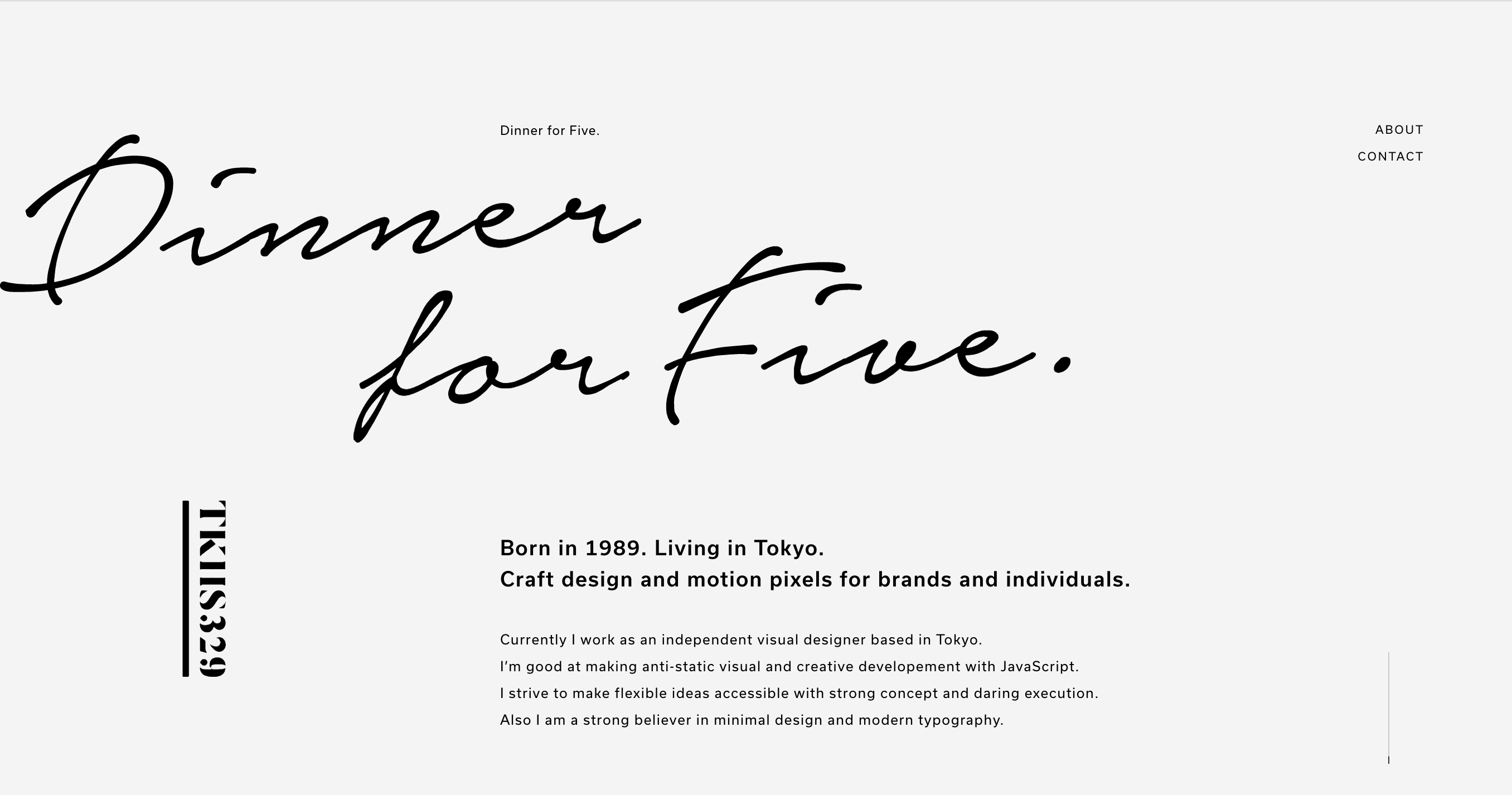
Sideways type, overlapping photos, unusual layouts, purposeful white space and color blocks are all popping up on screen due to new and constantly improving web capabilities. Grids provide order, rules, and other essential elements of user friendly, practical websites, but they can also hinder creativity and forward thinking.
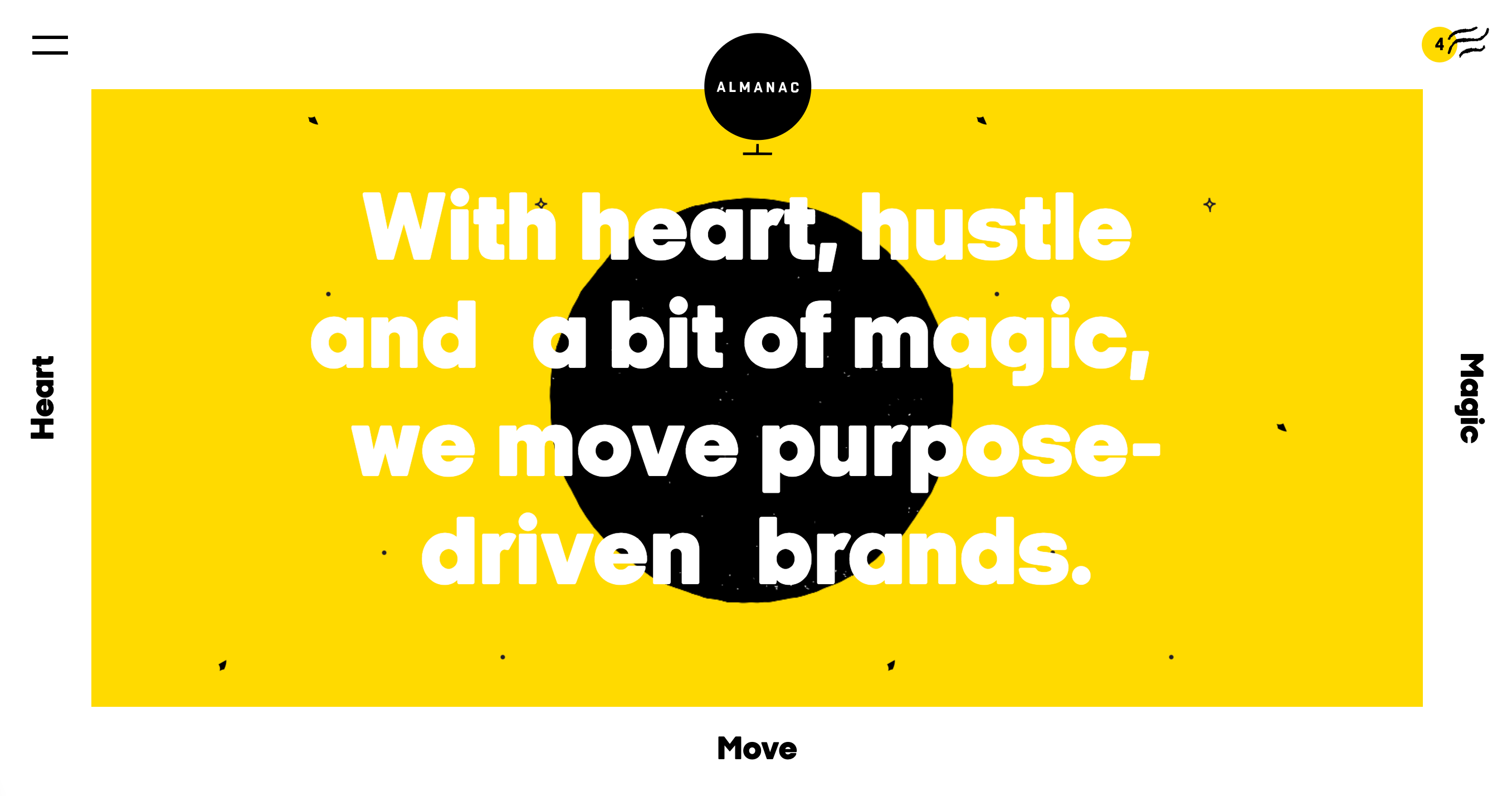
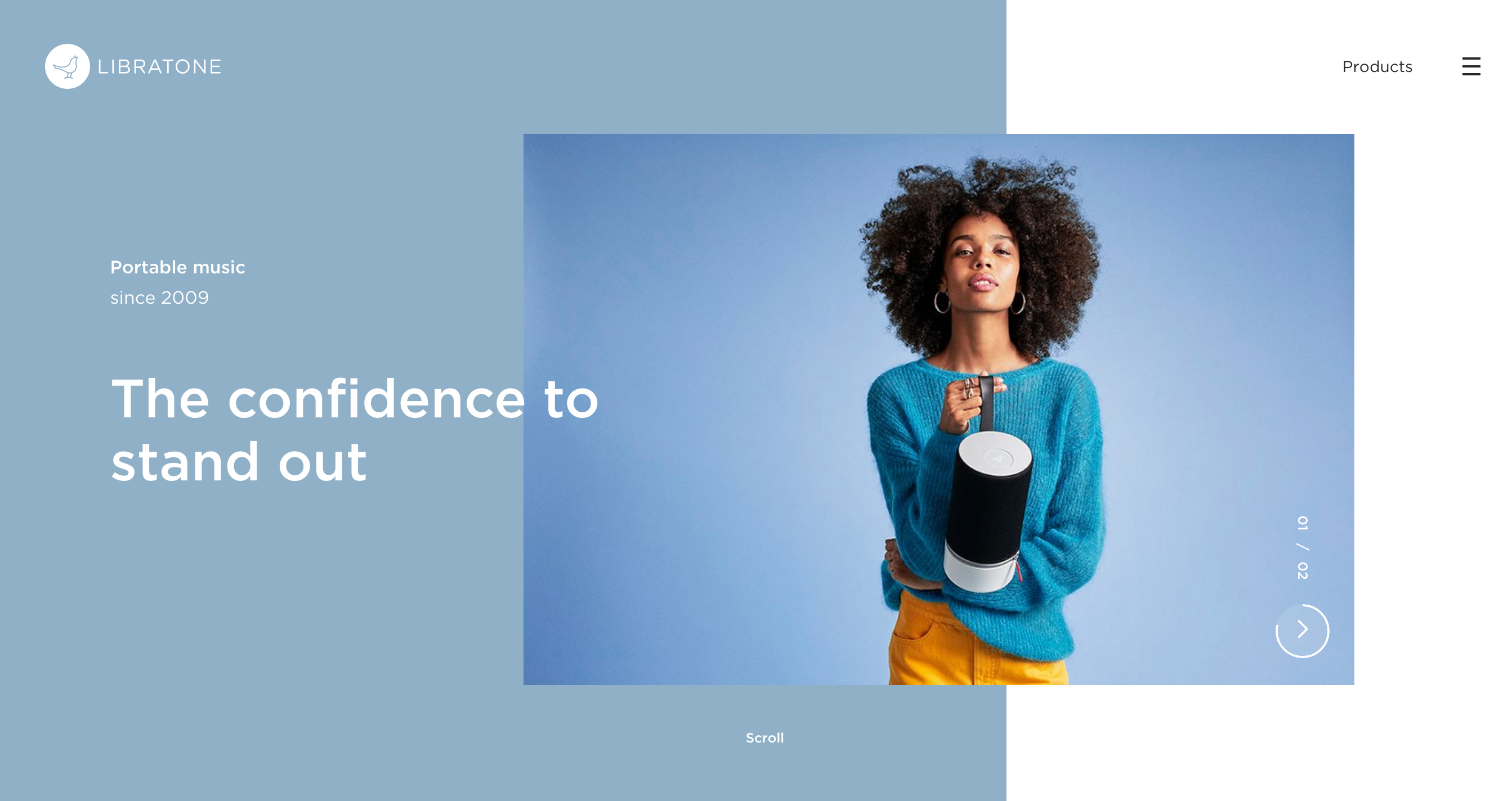
These sites are all expertly using their grid systems to keep things cohesive and organized, while simultaneously allowing type and photos to break out of those grids in ways that keep their sites fresh, interesting and fun to look at.
Microinteractions: New ways to use an old staple
Microinteractions have been gaining popularity for years, and designers are constantly working to create new, unique examples of microinteractions. Many common microinteractions have become so ubiquitous with good web design that if they’re doing their job right, they’ll go completely unnoticed.
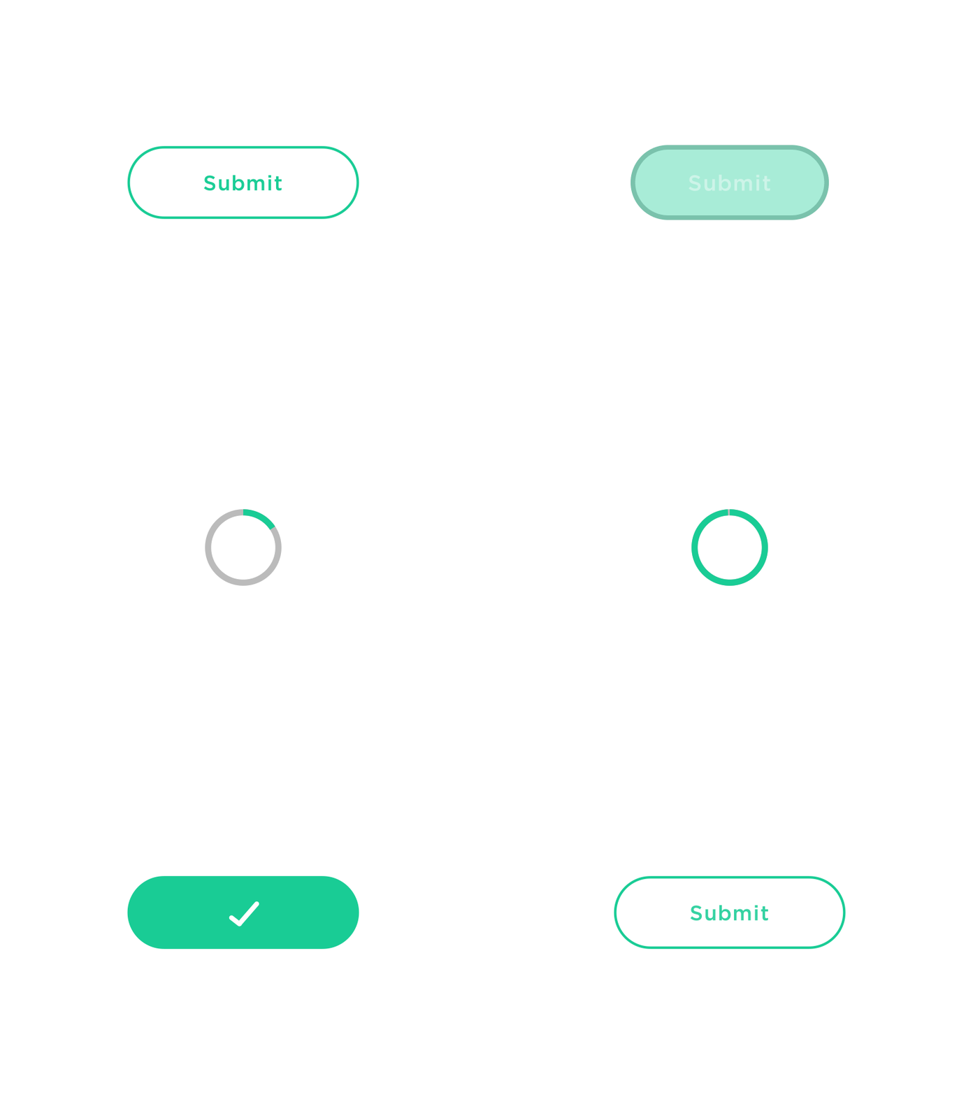
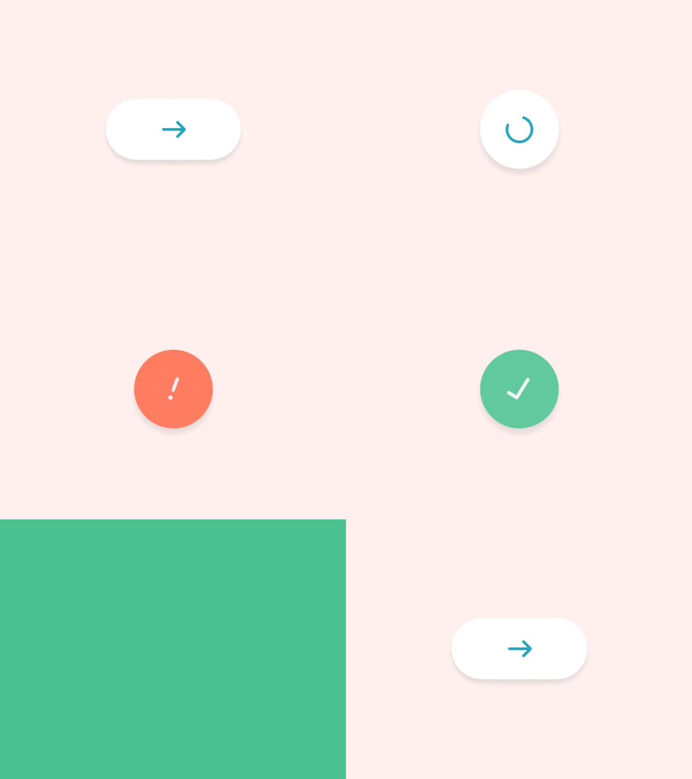
Picture the heart icon on Instagram turning red after you’ve “liked” an image, or a wheel spinning while you download a file. Essentially, a microinteraction is a change in the state of a website that helps people see the results of their actions. They make websites feel more friendly, and their purpose, beyond delighting and engaging the user, is to make a website feel more (dare I say it) human.
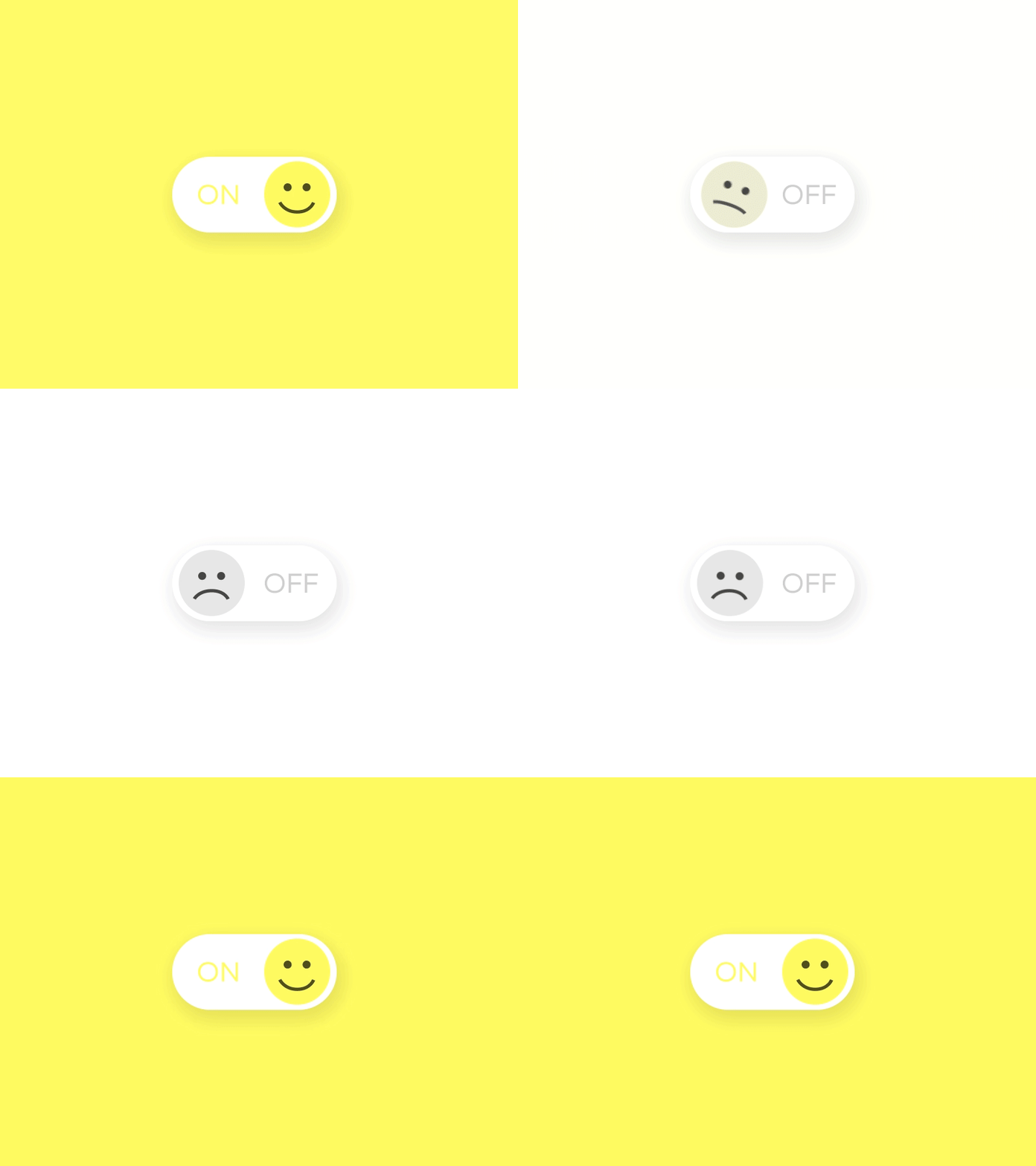
They may be small, but they make a huge difference; they make interactions with a site feel more natural, more gratifying, and more fun, while simultaneously rewarding the user for interacting with the site. They send a clear message to the user that the site they’re using cares about them.
Brutalism: My architectural nightmare is becoming my favorite web trend
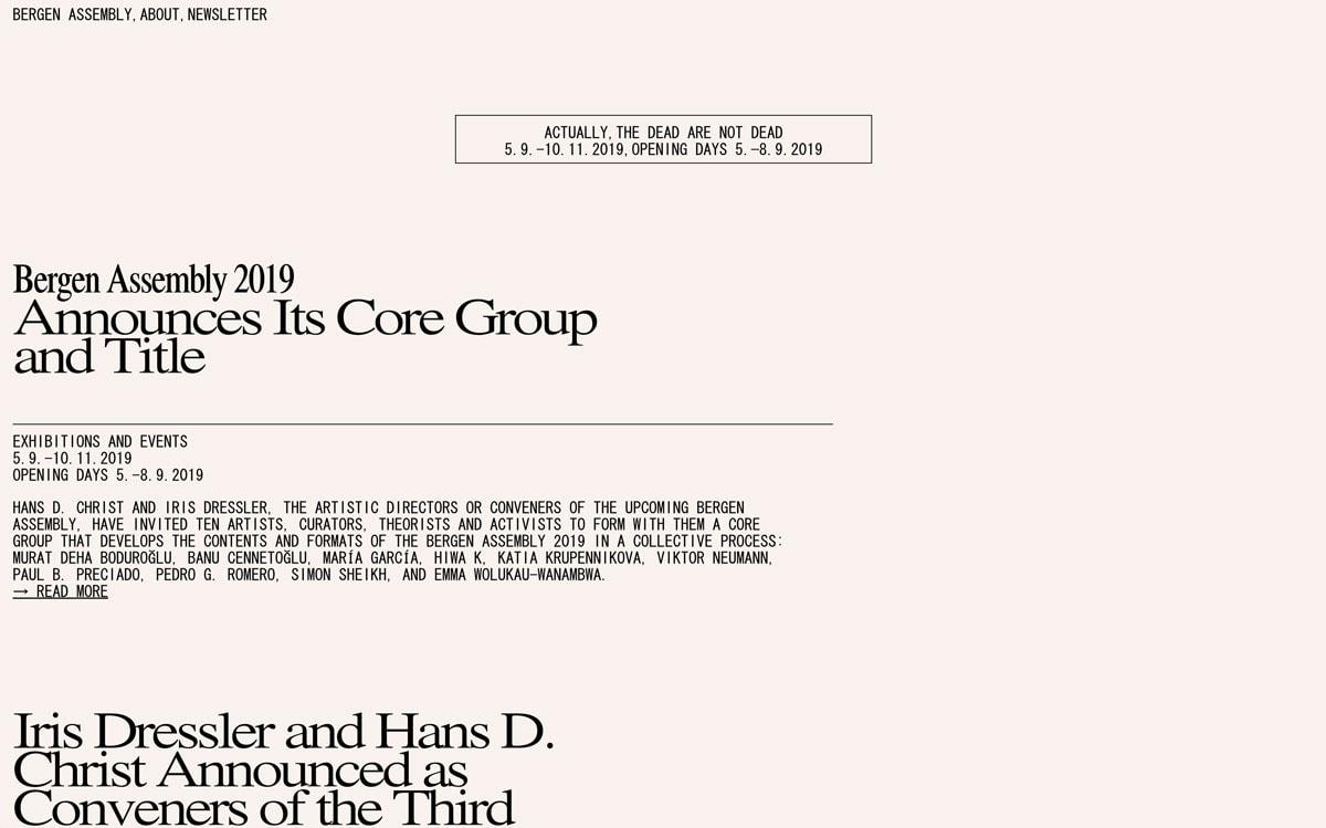
Brutalist websites are bold, excessively straightforward, and at times painfully simple.
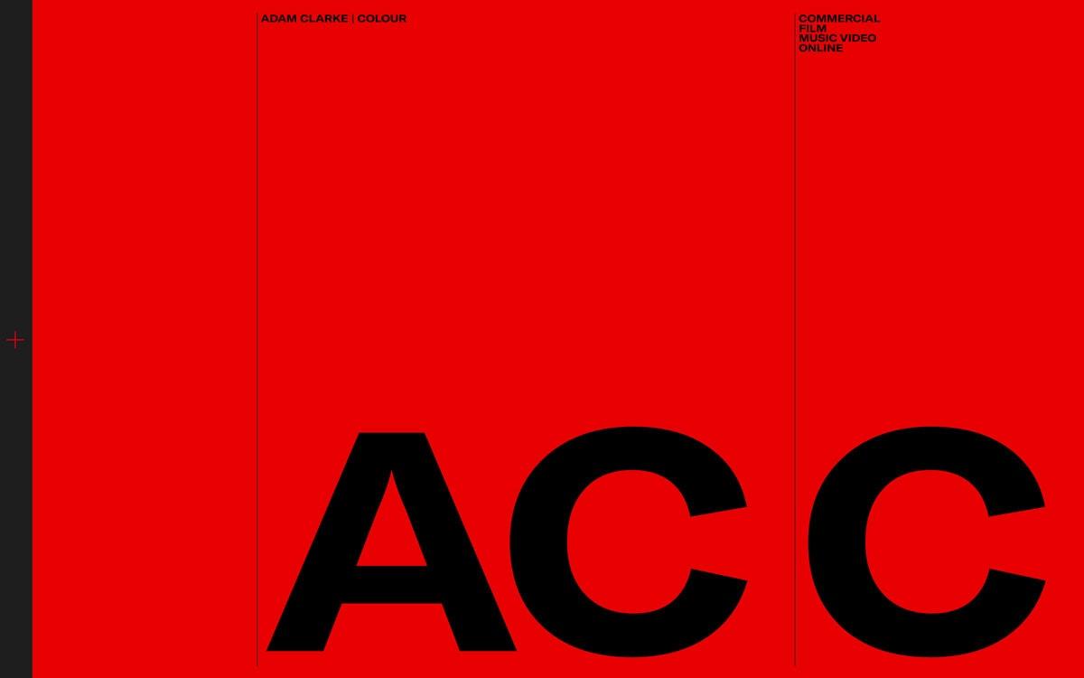
They point a cheeky finger at “overly” designed websites. Brutalist sites are a devil’s playground of anti-design, with little to no visuals, white space, or other frivolities. They rely on huge type, bold type, outlined type, unique type, and, you guessed it– more type; they revel in their rejection of optimism, light and user-friendliness.
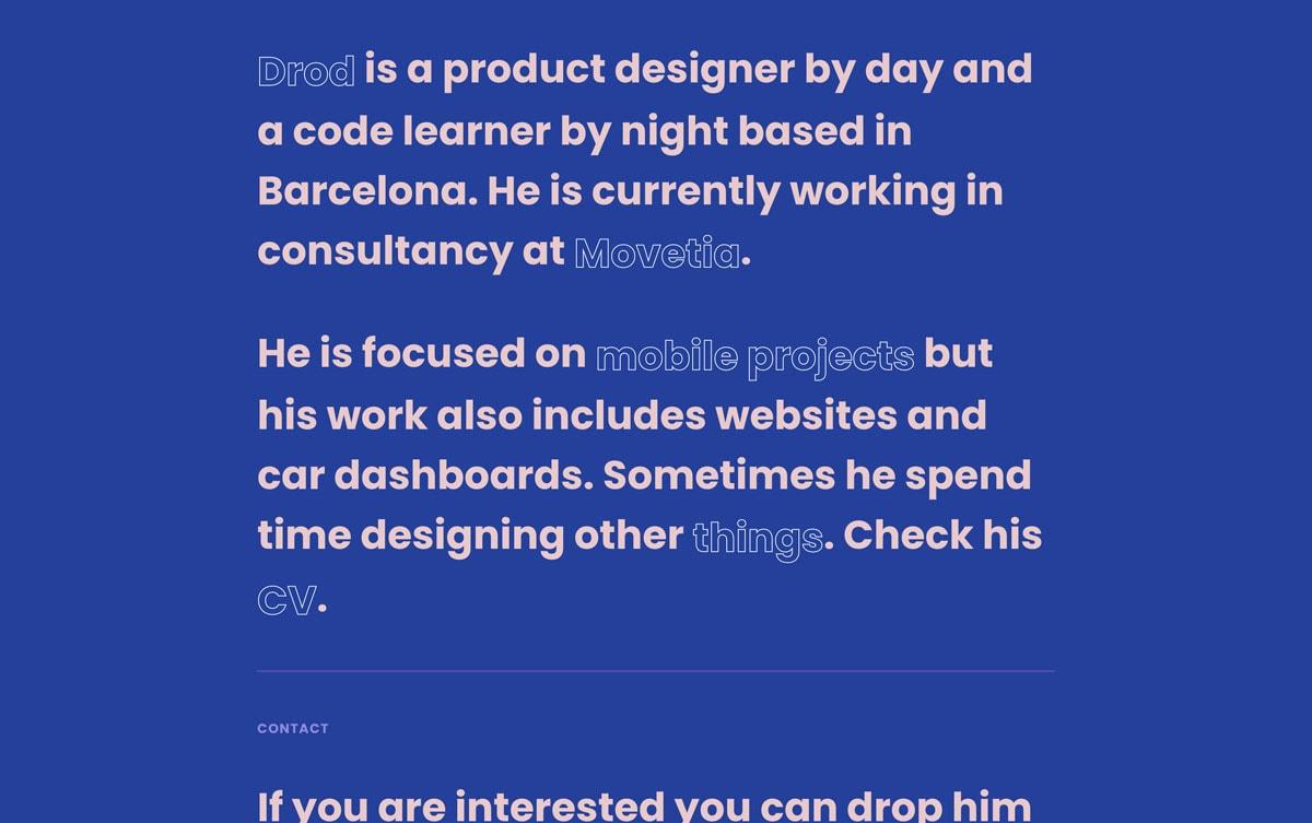
Images and other ornamental aesthetics have no home on these sites, which are brutal and rugged in their dissemination of information.
So what’s to come in 2020?
Your guess is as good as mine, but here are a few things I think you’ll be seeing a lot more of in 2020.
- Complexity and interactivity – Look for sites to be responsive to users wants and needs through better collaboration of strategy and design. More personalized interfaces that create a custom and catered vibe will be the result of companies finding ways to be better aware of who their audience is. User-experience will continue to push it’s way to the forefront of product design by leveraging personalized and curated content.
- AR/VR Website Features РThink Pok̩mon Go. AR and VR have already taken the app world by storm, but look for sites to start catching on. Plugins/site integrations/open source resources will also begin to roll out features that make AR more accessible, attainable and affordable.
- Dynamic illustrations and animations – Animated gifs and video integrations remains hugely popular, but site loading times and bandwidth continue to be an unresolved issue. So, how do we retain motion graphics, while keeping our sites functional and responsive? Look for After Effects plugins/solutions to bridge this gap between design and development. The need for designers to create beautiful animations without a developer having to painstakingly recreate it in code is there. It’s a problem that will begin to be solved.
- Voice navigable interfaces – People are beginning to prefer voice over text, and it’s happening fast. Think Siri, Alexa, Echo. Expediency and convenience are two massive factors that play a role in the popularity of voice-capable devices and interfaces, and I think that’s only going to continue to grow. Look for companies to cater to busy audiences by levering voice-powered products.
Related Posts
4 AI Resources To Add To Your UX Design Toolbox
By:Morgan Plappert on 7/18/2023
These AI-powered tools can help you streamline your workflow and empower you to take your designs to the next level.
Read More »Component-Based Web Design
By:Morgan Plappert on 8/9/2024
Designers and developers are always looking for ways to make handoff easier, collaboration more seamless and our processes better aligned. Automation, consistency and efficiency, without compromising creativity. It’s a constant battle and often times, a balancing act.
Read More »