In our industry, targets are always moving. Whether that be the applications we are using, the code we are writing, or the restrictions and limits that we are presented with. These days? The restrictions and limits to what you can build are few and far between – If you have the time to explore. So we made the time.
To demonstrate the power and flexibility of a headless WordPress install, our design and development teams got together to concept a site. The first challenge was content. We landed on finding an eBook that could be freely used in the United States due to no longer being protected by U.S. copyright law. Cue, The Curious Case of Benjamin Button.
Development
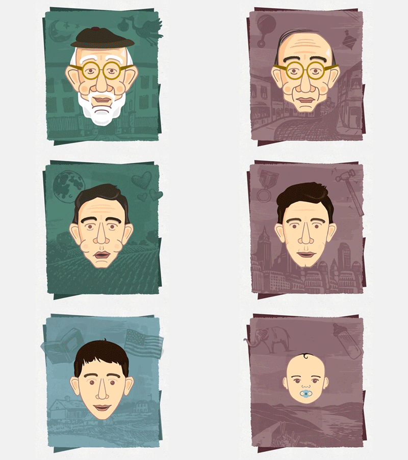
The morphing was accomplished by using the Green Sock JavaScript animation platform. And a TON of custom illustration. The unique challenge here was using the exact same shape layers to create the face for chapters 1-12. This way every single component could be morphed (facial features, hat, etc). Being in it’s own SVG path element; Green Sock allowed us to morph the shape of these paths to the corresponding path in the next illustration.
Meets Design
Now it was time to tie everything together to be one cohesive unit. We decided we needed a home page that set the scene for the story, a chapter archive page that allowed you to easily navigate, an “About” component that described the framework of the backend and each chapter page itself. *rolls up sleeves*.
The Homepage
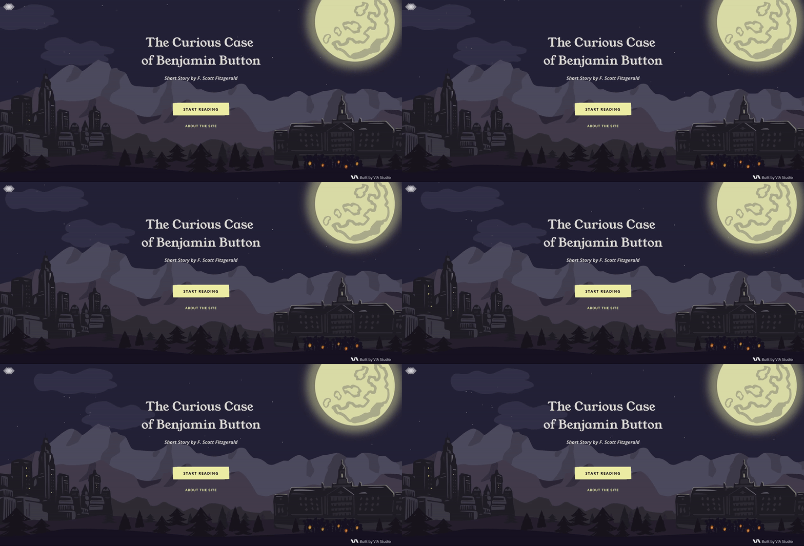
For the homepage, we used subtle CSS keyframe animations to add movement. The scene itself illustrates where the story takes place, adding little nudges to the content (the silhouette of Yale University and the angry mob).
Chapter List
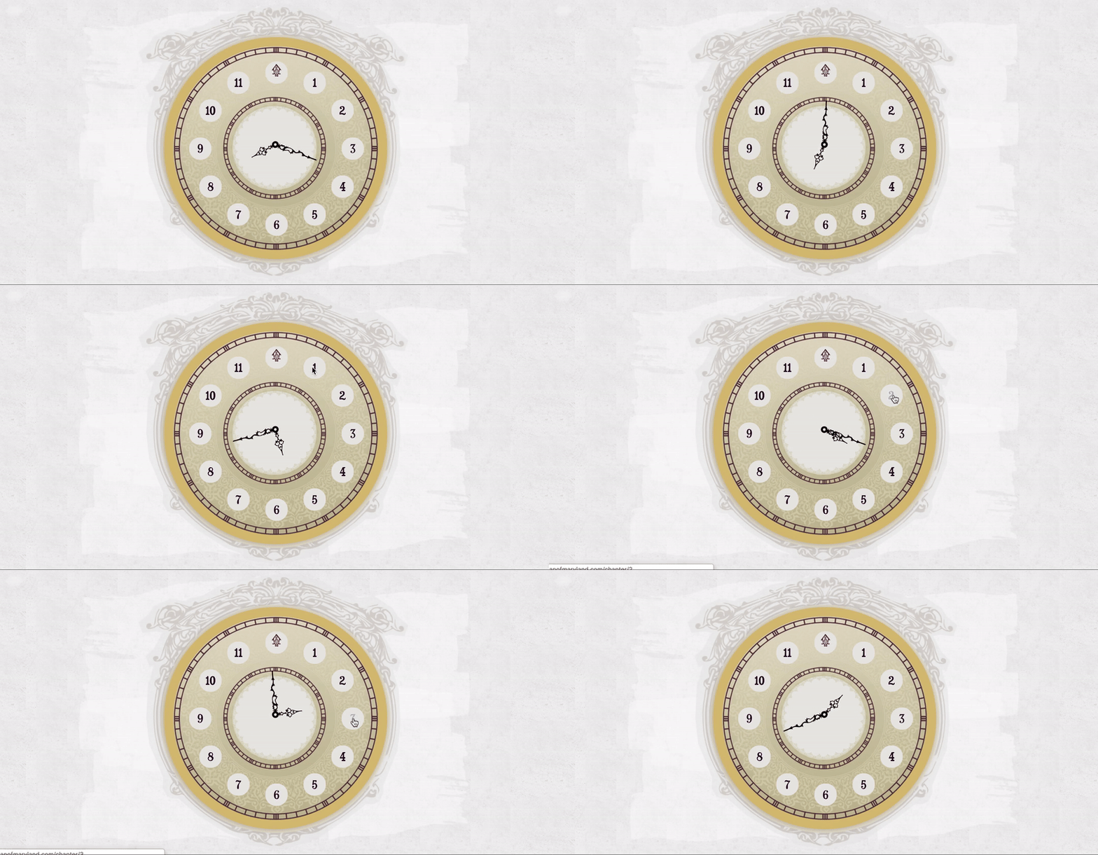
We had a little fun here with a backwards moving clock to further tie into the metaphor of Benjamin Button aging in rewind. If you click on one of the clock hours, you are taken to that respective chapter page.
Chapter Pages
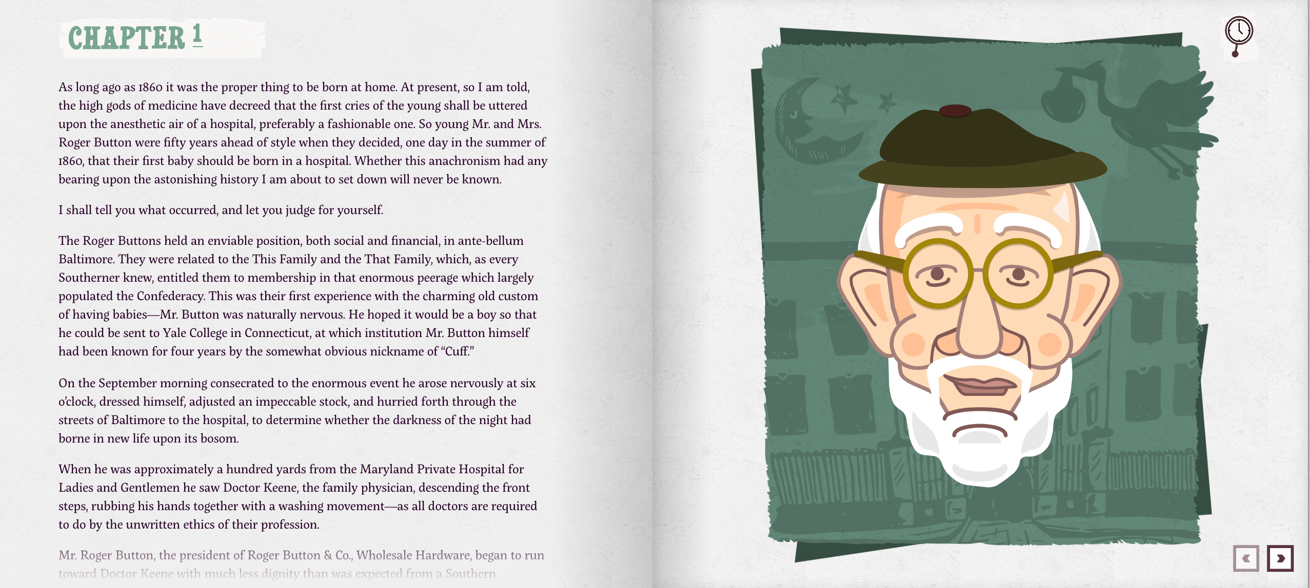
The design itself is meant to emulate the experience of reading a physical book. We used gradients, texture, and animation to communicate this.
The End
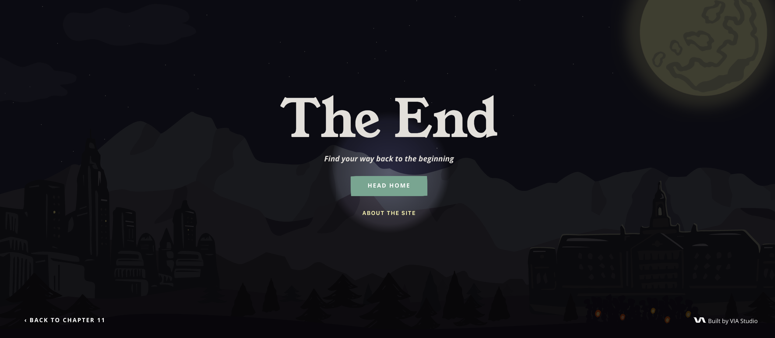
We needed a way to close the book (pun intended) just as strong as we started it, so we decided to continue the metaphor trend by allowing the user to “find their way back to the beginning” with a clever CSS flashlight effect that allows the user to explore the Intro page and eventually find the CTA.
The Takeaway…
Curiosity enables creativity. Creativity enables innovation. Curiosity is necessary for the innovation we aim to contribute to our industry. The result of this project was especially rewarding because it was a labor of love from the team. A willingness to collaborate and to grow our skills/expand our creative brains through the common motivator of curiosity. And in so many more ways than one, that will always be rewarding.
Related Posts
4 AI Resources To Add To Your UX Design Toolbox
By:Morgan Plappert on 7/18/2023
These AI-powered tools can help you streamline your workflow and empower you to take your designs to the next level.
Read More »Component-Based Web Design
By:Morgan Plappert on 8/9/2024
Designers and developers are always looking for ways to make handoff easier, collaboration more seamless and our processes better aligned. Automation, consistency and efficiency, without compromising creativity. It’s a constant battle and often times, a balancing act.
Read More »
