Sometimes the Hardest Brand to Define is Your Own
By:
Emilee Dover
on 2/14/2014
You may have noticed VIA has a new look. Well, we hope you’ve noticed.

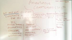
Jason’s chicken-scratch notes on our walkabout findings
The path to our new brand wasn’t without its obstacles. Our initial charge was to redesign the VIA website. Which, we began to do, until we realized: we weren’t telling our story. But this is what we do! We are in the business of telling stories! We quickly realized we needed to back up and find ourselves. So, Creative Director and President, Jason Clark and I went on a walkabout. A walkabout that consisted mostly of strolls to Please and Thank You and hours in our office huddle room.
We thought about a lot of things. But, in the end, there were two things that stood out about VIA and its people:
1. Our flair for exploration. We pride ourselves on being forward-thinking, and we put even more thought into the creativity behind our work. We ensure that any solution we provide isn’t the easiest solution, but the best solution to the problem. And we will search high and low to find it.
2. Being proud of the work we put out. Everyone on our team goes above and beyond to ensure that we are providing a quality product. Sometimes that means we have to work a little extra on our own dime (or a lot extra).

The big idea came to light when we discovered that we are often the guide for our clients. Whether we are guiding them into a better technology, creative strategy or marketing tactic, it is VIA’s goal to provide solutions that work for the client and never leave them in the dark about our process. This directly inspired the graphic style of the refreshed brand. On our site, you will see small elements of maps, guides, and connotations of discovery both visually and verbally.
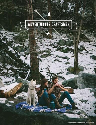
We also had to make sure it looked nothing like this hipster parody. The visual styles that accompany some of the words in our inspiration also carry with them some heavy trends. Be relevant, NOT trendy. However, if you are looking to follow the above trend, feel free to visit this Wired article. (Because we all know the fair trade coffee in that thermos is not keeping them warm enough for bare arms in the snow.)

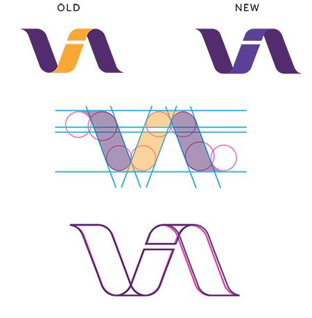
After we ironed out our Voice & Tone Guide in correspondence with our Values (which you can discover on our award-winning piece), it was time to work on the logo. If it ain’t broke, don’t fix it, amiright? Instead, we improved it.
We kept our strong mark and did a little work on the geometry of the curves and lines. The improved typography now balances with the thickness and visual weight of the mark and allowed for better alignment of the title, mark and tagline. The logo can be used in any of the colors specified in the primary color palette.
This provides more diversity in the creative usage of the mark. It was important that the visual identity of the brand not completely depend on one or two colors.
Another discovery we made in our branding process is that the brand needs attention on a very consistent basis. We immediately established a calendar for new opportunities to build our brand and make sure that the visual identity is never stale.
Check back in for our next design post on how to build a thorough, but beautiful brand guide.
Related Posts
Where Do We Start? The Technical Audit
By: Kim Clark on 3/15/2010
Any solid SEO program should begin with at technical audit of your website.
Read More »VIA Studio Joins Google Apps Authorized Reseller Program
By:Jason Clark on 3/25/2010
VIA Studio today announced it has become an authorized reseller of the Google Apps suite of communication and collaboration tools. VIA Studio provides setup, integration & support services for businesses and organizations using Google Apps.
Read More »
