Poster Illustration Process
By:
Mitch Wiesen
on 4/7/2020
Materials:
I keep it pretty simple. Tracing paper, Sketchbook paper, pencils, Sakura Pigma Micron pens in sizes 005, 01, 03, and 05, and two Sakura Pigma Brush pens.
Research:
Before I begin an illustration, I almost always find a ton of reference photos. I start by poking around Pinterest and Flickr looking for vintage copyright-free photos and illustrations in the theme I’m looking for. My latest Illustration a Valentine’s Day-themed poster for the Great VIA Speling Bee. I knew I was going to deep dive into some really cute vintage valentines cards, like these:
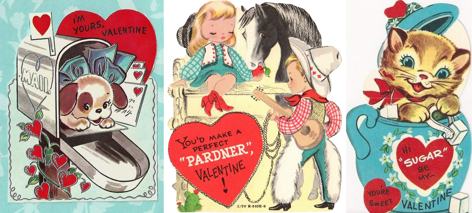
I loved the cute animal cards, but I was especially drawn to the cowboy valentines so I found a few more.
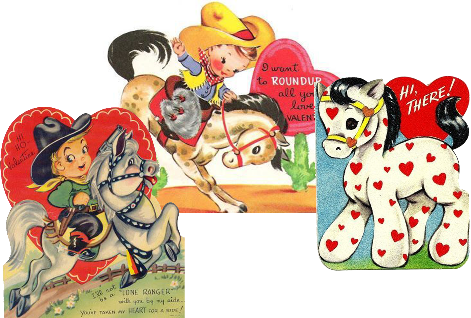
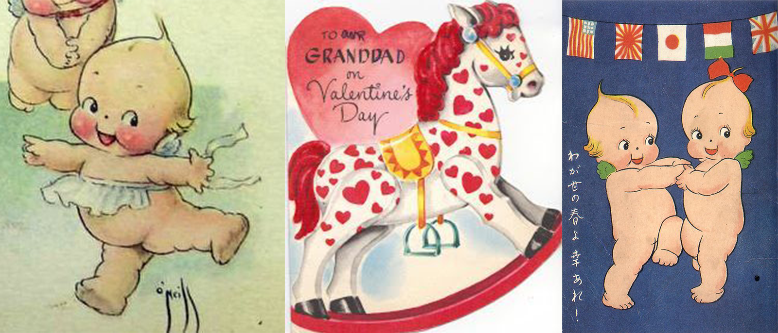
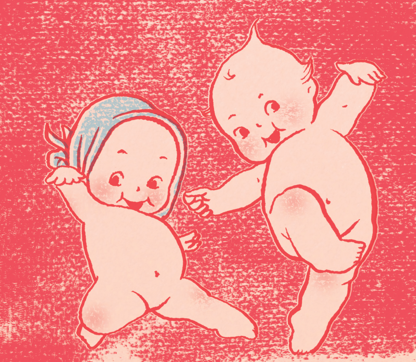
At this point, I had a clear image in my head of two cowboy kiddos riding on a heart-spotted horse with some kewpie babies dancing around them. I dug a little deeper and ended up with some vintage illustrations that were so perfect I used them as direct references.
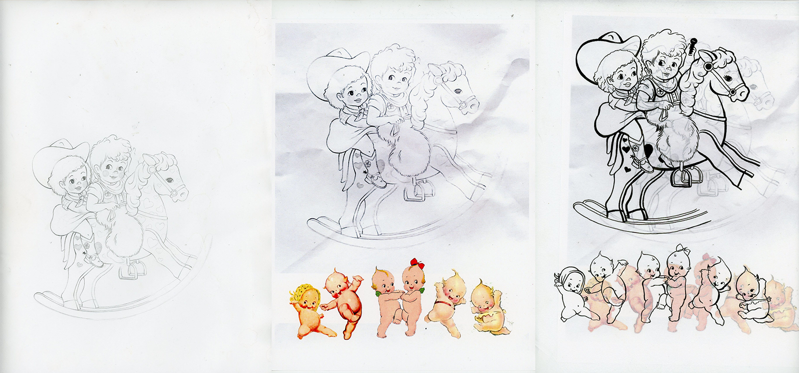
Art Phase I:
The first art phase is all done completely by hand. I collage together my sketches and my direct references, draw on top of them with pencil, and then pen, and then I have a piece of crinkled up tracing paper ready to scan.
Art Phase II:
The second phase is all digital. I make slight alterations to the drawing (Cleaning up ink smudges, moving elements around to slightly alter the composition, etc.), I color it, and then I add texture. Let’s start with the scan:
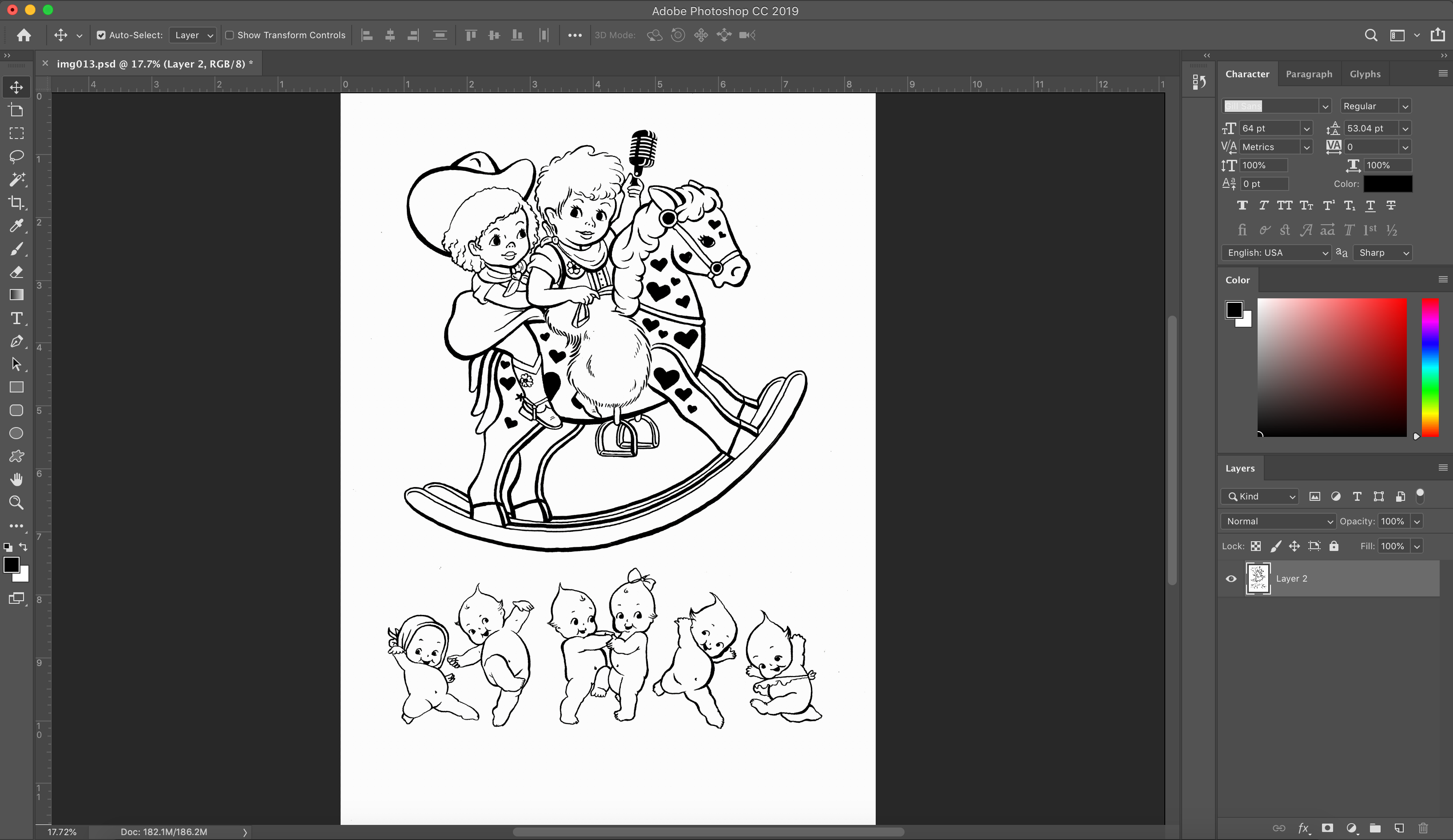
Here is my artwork after I cleaned it up and played with the curves and levels to get it nice and crisp.
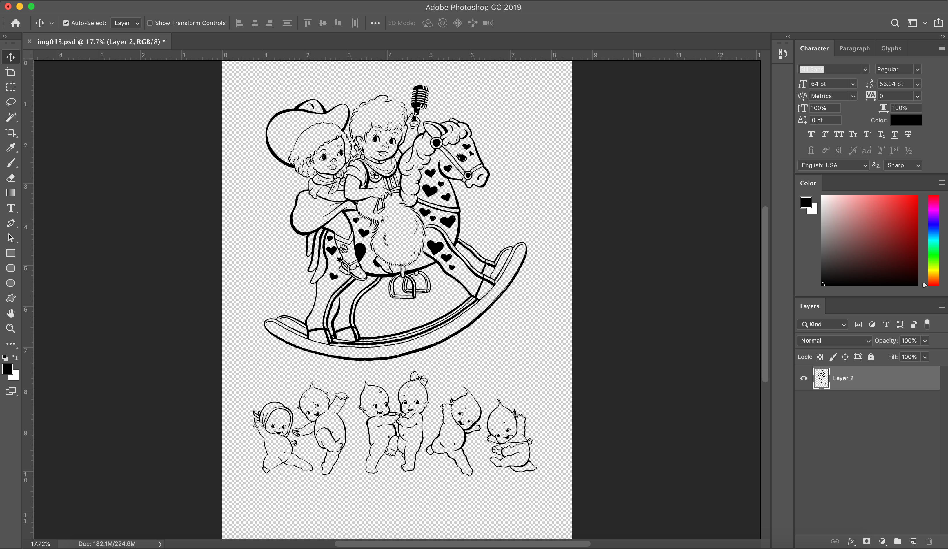
Next, I isolated the black using Select > Color Range and deleted the white background.
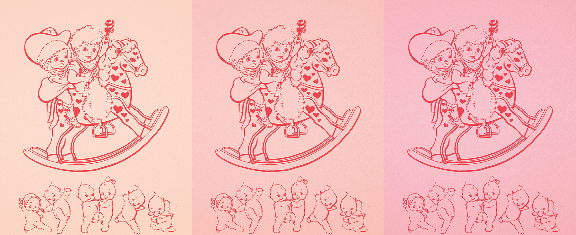
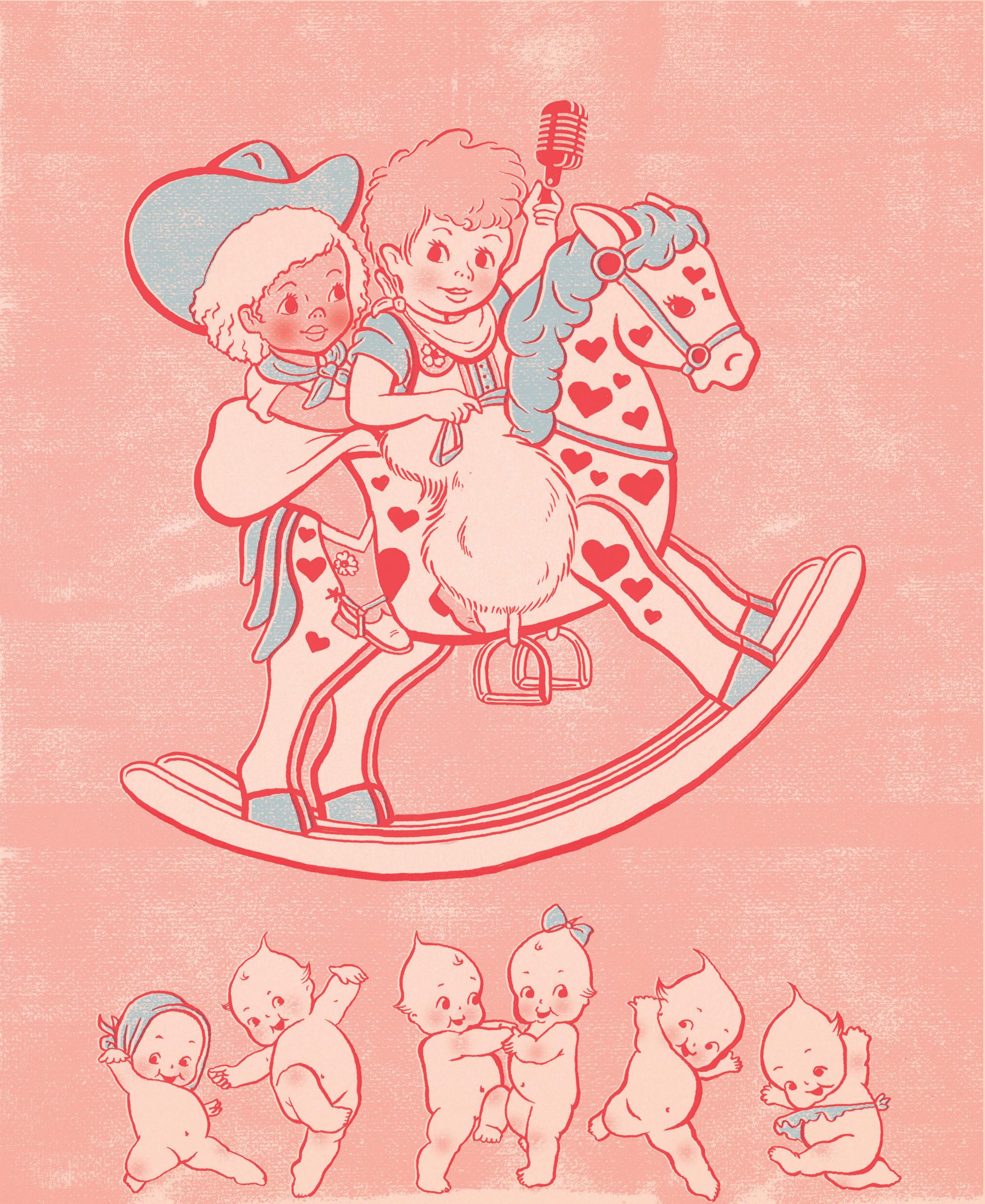
Then I pasted the black artwork in a new file, colorized it, and started playing with different background colors. I went with the first one so I could build more pink tones on top of it.
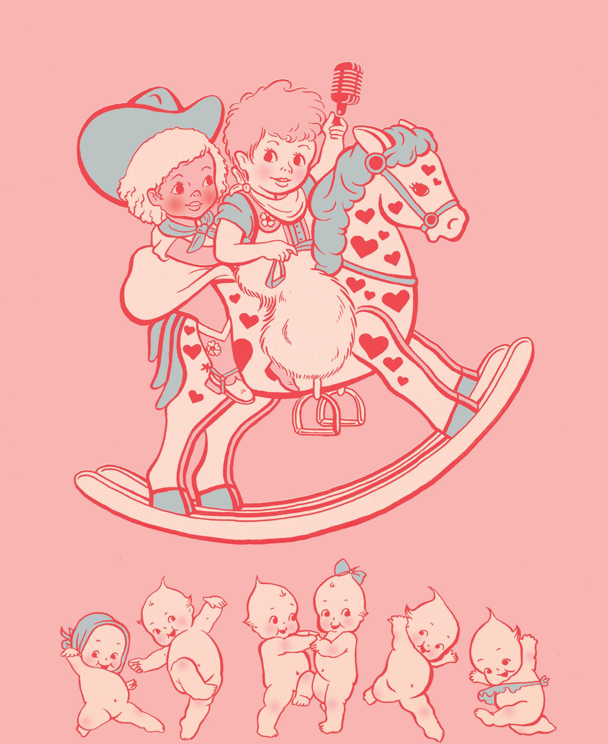
I selectively colored the illustration with two more colors. I always try to use one “paper color” and no more than three “print colors” to mimic the vintage printing processes I’m being inspired by.
The last step is texture. I always use something like this, either one that I made myself or something I find for free online, and I select > color range and choose either white or black, and with that selected, I delete the selection from the color layers I just painted, so it looks like this:
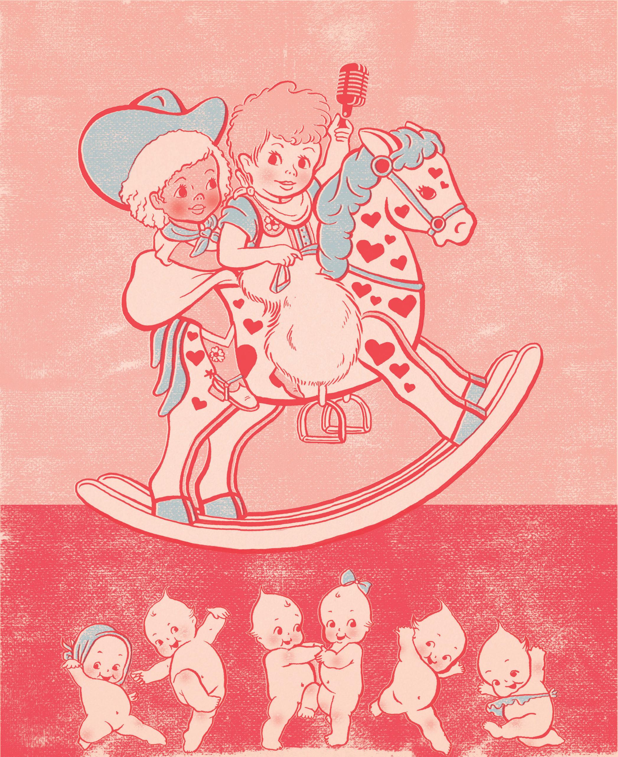
I’ll also take this time to make the color layers slightly off register, and I’ll play with their hue/saturation a bit too. I felt like this poster needed a little differentiation between foreground and background, so I added in another layer of color:
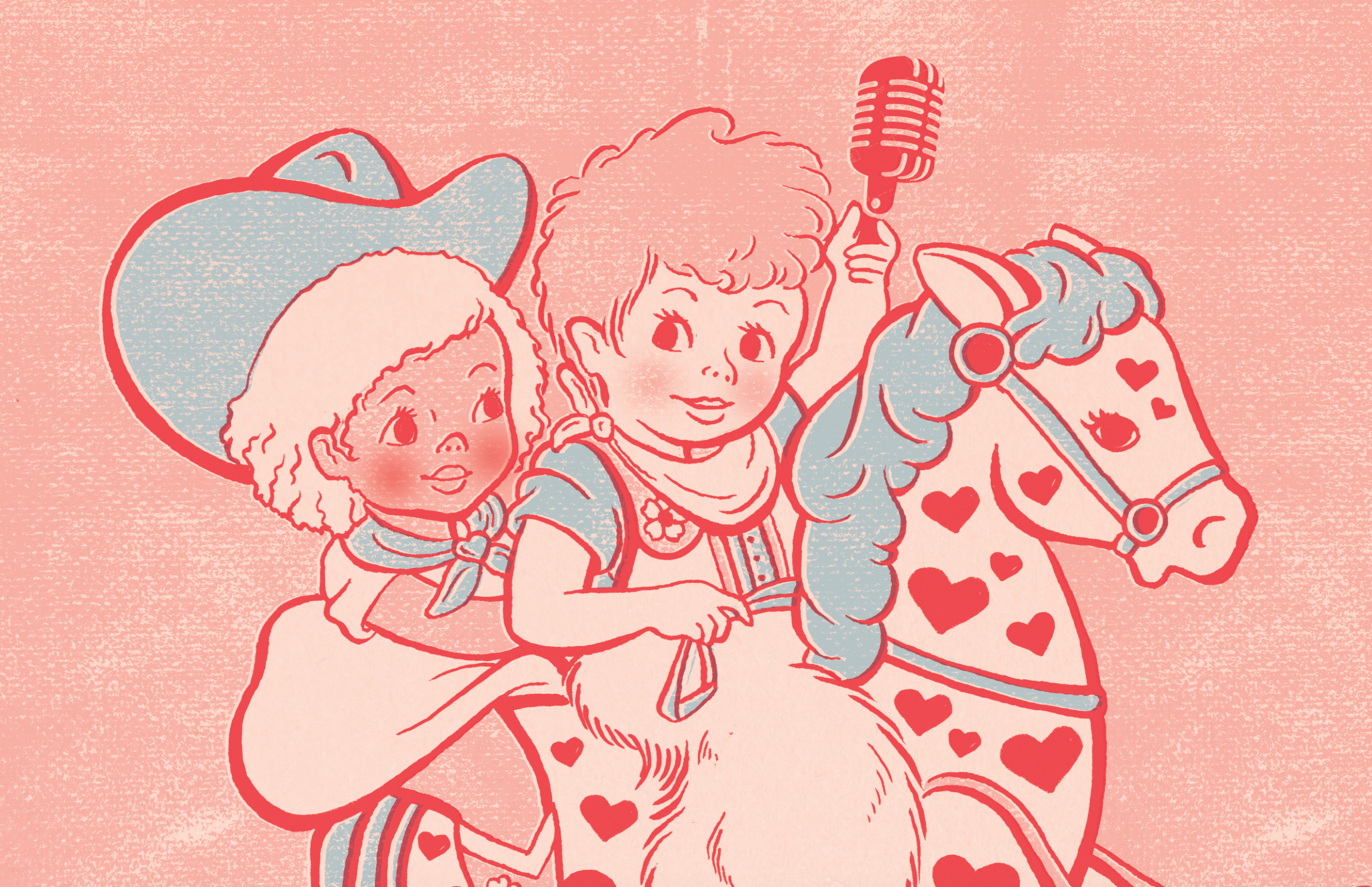
And that’s it! Illustration complete. All in all, it took about 10 hours. Here are a few close-ups to really see that texture:
Related Posts
The best things in life are free… Except for good type.
By: Mitch Wiesen on 5/17/2021
Why you should budget for typefaces in your next creative project.
Read More »
How to Make Your New Photos Look Vintage
By: Mitch Wiesen on 9/1/2020
I’ve always been drawn to the warm, friendly way film captures reality. I found my first analog camera, a Canon AE-1, sitting on a blanket at a flea market at age 14, and I was enamored.
Read More »