Embrace iterative design, create better products

Night turns to day, gravity keeps us grounded, user goals, motivations, and marketing strategies change - these are all facts. So, how does this pertain to web design? Well, we need to eliminate ego from our process and start making our user the hero.
You can try and predict users’ motivations and their tendencies (and this is super important to do, don’t get me wrong), but at the end of the day, it’s just that – an educated guess. In many cases there are no previously existing data or analytics to use to determine what a user is actually doing. You have to make assumptions upfront to create a first-round product that will likely reflect some “theoretical use” hiccups. And that’s OK. It’s to be expected. These hiccups are ultimately what can help you identify, diagnose and solve problems to create a better product in the end⦠which leads me to my point. Iteration in design is empathetic and human-focused at its core. Embracing iteration, and paying attention to your user, helps alleviate any faulty design hypotheses and will help weed out content that does not necessarily provide value to a user.
“But I did my research up front. This is what the people said they want!” What people say they’re likely to do and what they actually wind up doing are often two very different things. Ask any parent of a teenager. But it’s measurable data points that provide you true validation. Something not working? You now have proof and a reason to fix it. Something working? Kudos. Pat yourself on the back.
So let’s take a look at some examples of how we have embraced iterative design in the past:
Case #1 – Before
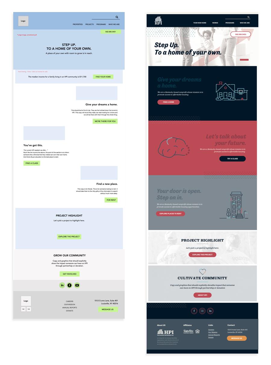
Problem: This design accomplished all of our initial goals and effectively targeted our audience and their motivations as users. And then, priorities changed. So, it was time to pivot. In brief, we needed to shorten the page, have a space for manageable, editable content on the admin end, and replace the phone number CTA with “Pay Rent”.
Case #1 – After
Result: The client now has the ability to influence the homepage with fresh content; it is more manageable. The page is about half of the original length; we don’t ask as much from the user. And the client is happy; success.
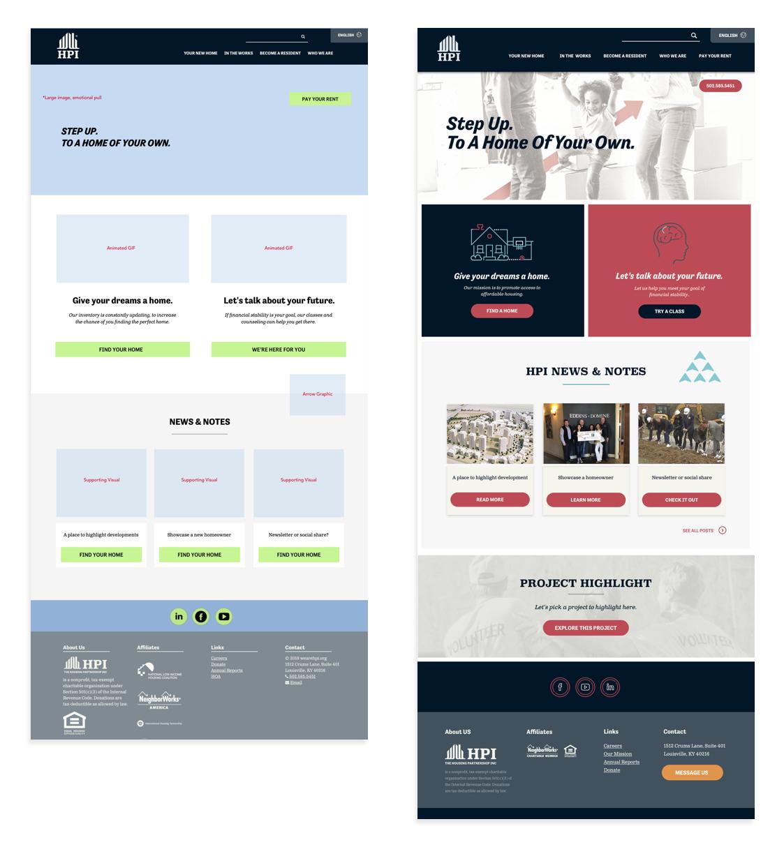
Case #2 – Before
Problem: To be fair, this homepage lived for about a year and a half. But it was time for a change. Instead of focus on one particular product, we wanted to re-position this space to tell the overall client story. This was our new order of priority:
1. Who are we?
2. Products
3. Co-create
Along with the new order of priority, we wanted to increase user engagement and interest by making the layout tell a story and lead the user down a path- much more progressive and innovative than the last iteration. *Rolls up sleeves.*
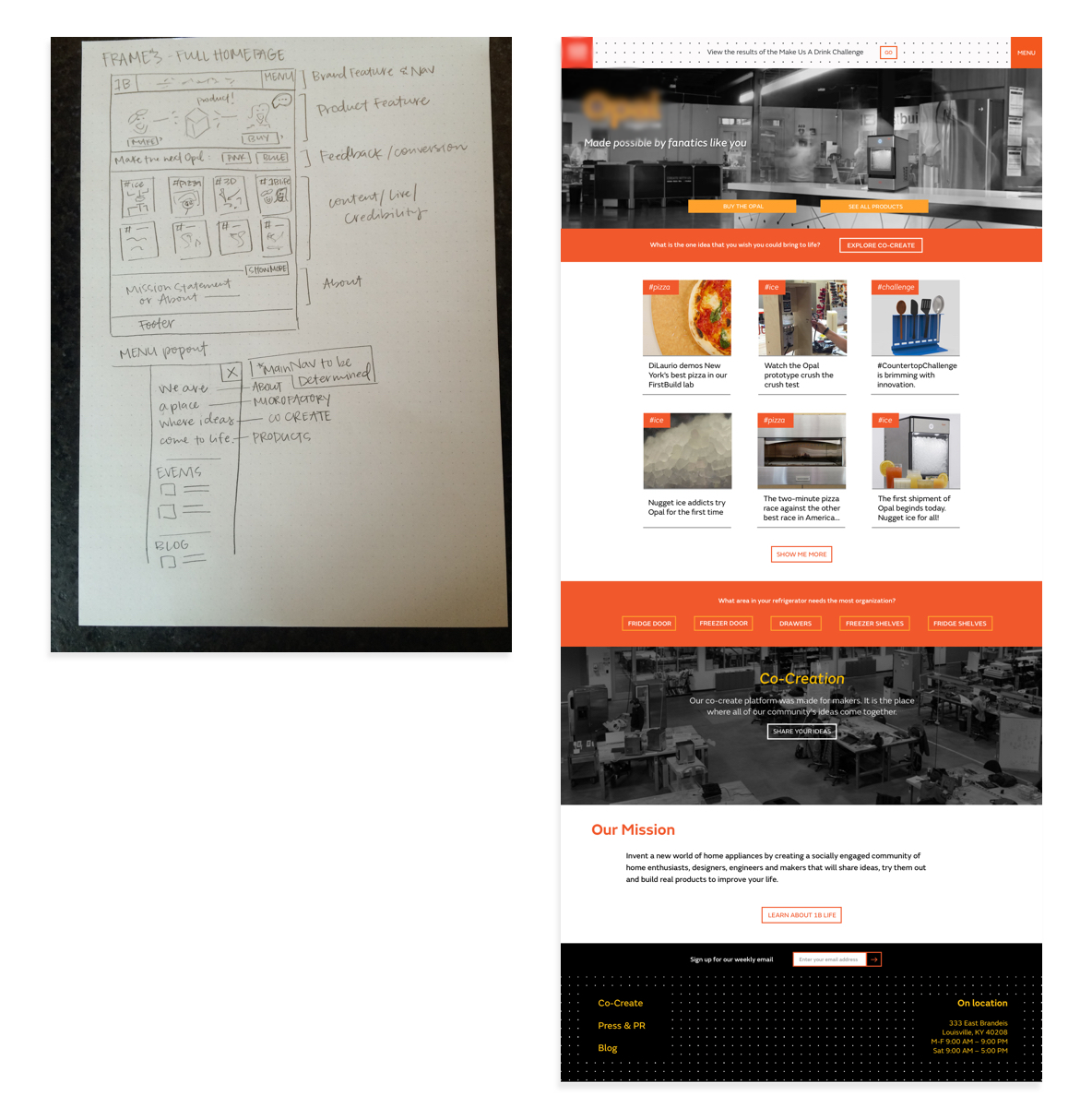
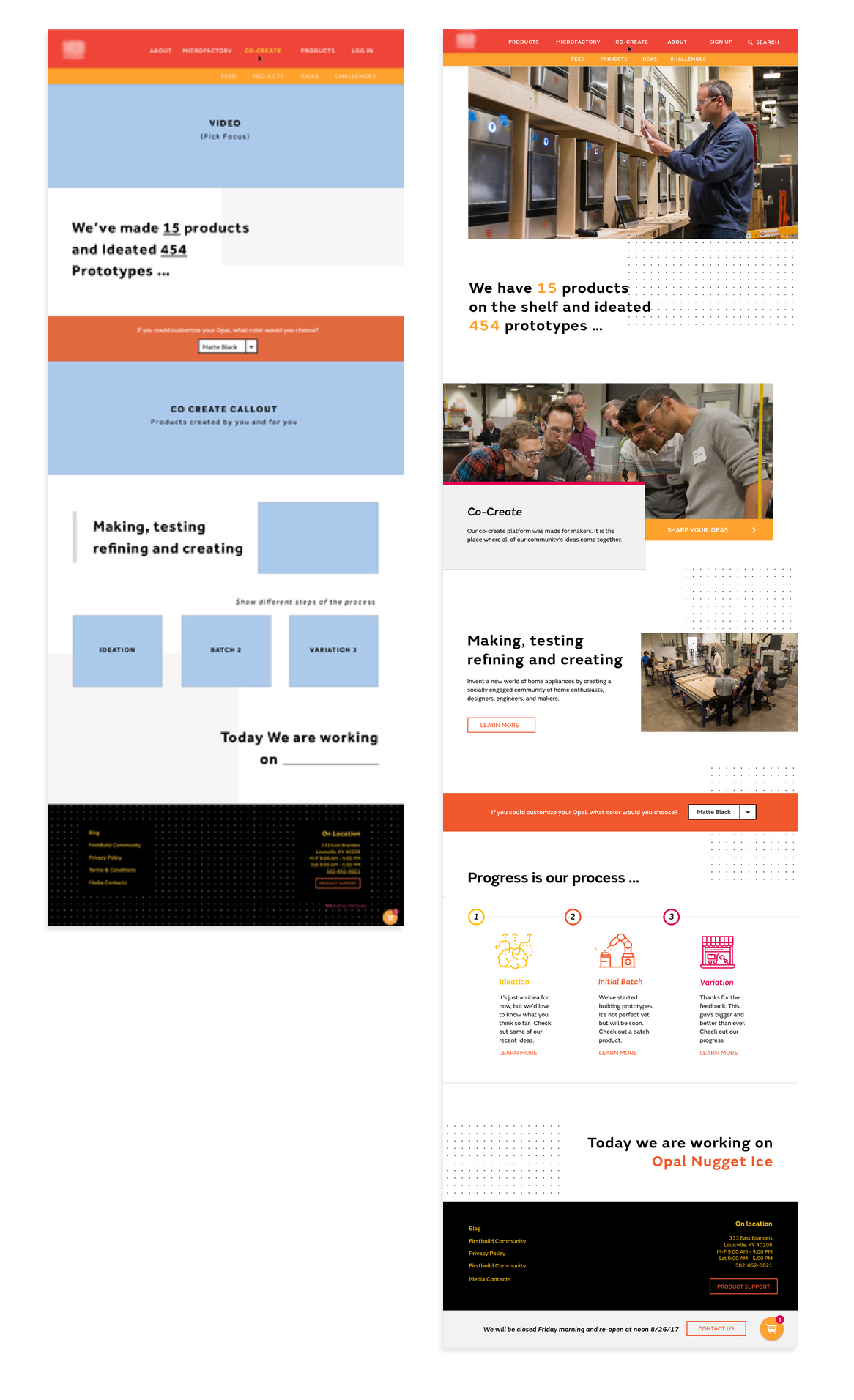
Case #2 – After
Result: This new iteration wound up being a huge success. The design was well received all around. We accomplished “movement in design” (from the creative brief) with the addition of a video collage and micro-interactions, we increased our analytics tenfold, and ultimately, we used a year+ of gathered data to re-position ourselves and improve upon the user experience.
Proof is in the Pudding
September 2016:
26,528 new users, 9,954 returning visitors
Average session duration: 00:01:18
September 2017:
111,506 new users, 24,429 returning users
Average session duration: 2:35
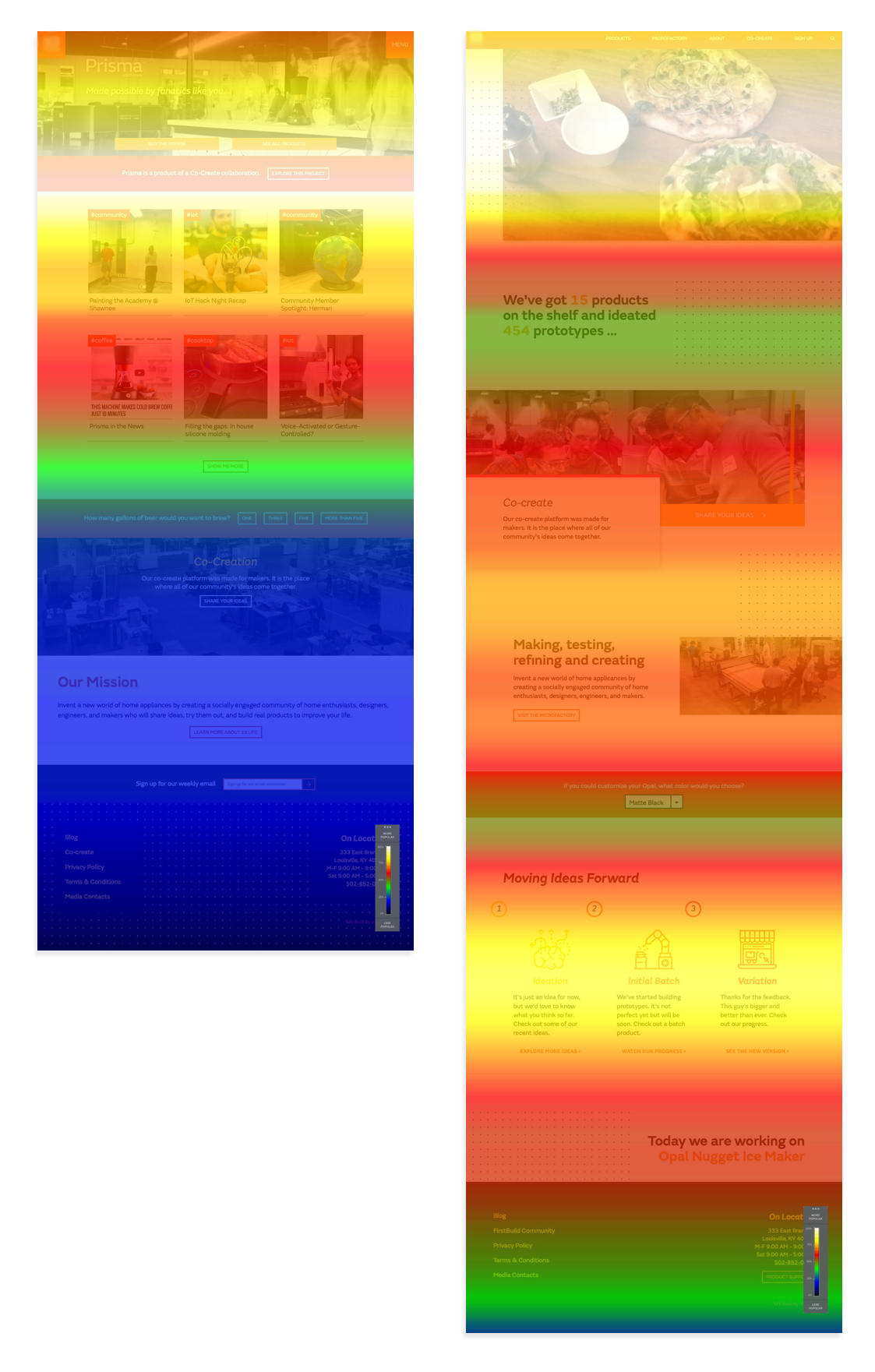
People be scrollin’
To explain above, the Scrollmap shows sections of the page that have been viewed the most. The warm-colored sections have been viewed the most number of times and the darker sections/cool-colored have been viewed the least. White represents most viewed, black represents least.
Design isn’t for a thing to have a bow on it at the end of the project. It’s not to hand off to a client with a “Good luck” and a firm handshake. Client and project relationships alike should be about evolving and solving the ever elusive, long-term problem. No one wants a product that sits on the shelf and becomes stale every few years. We want to strive to incrementally and consistently improve the user’s experience, dictated and driven by a constant stream of data.
So throw those cookie cutter solutions away. Pay attention to your users and be empathetic enough to design for the masses … not just yourself.
Related Posts
4 AI Resources To Add To Your UX Design Toolbox
By:Morgan Plappert on 7/18/2023
These AI-powered tools can help you streamline your workflow and empower you to take your designs to the next level.
Read More »
Component-Based Web Design
By:Morgan Plappert on 8/9/2024
Designers and developers are always looking for ways to make handoff easier, collaboration more seamless and our processes better aligned. Automation, consistency and efficiency, without compromising creativity. It’s a constant battle and often times, a balancing act.
Read More »