Introduction to Responsive Design
By:
Shawn Coots
on 10/10/2011
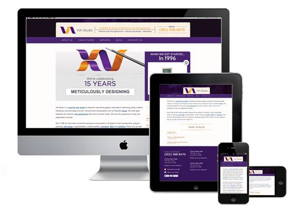
After reading Jason’s series of articles regarding Marketing for Mobile, I thought I’d add to the discussion. My favorite web geek topic as of late is Responsive Web Design. It allows you to create a mobile-ready version of your website, without needing to build separate content. With a large portion of the world now browsing the web via smart phones and post-pc tablets, it’s almost a no-brainer to offer mobile viewing experiences.
Responsive Web Design uses CSS Media Queries to define multiple layouts that are specific to a screen’s size. That allows the site’s content to be served in different ways, based on how you’re viewing it. The same site can be designed with both the desktop and mobile phone in mind.
Since Ethan Marcotte (and several other talented folks) developed a “mobile first” approach to building sites, several frameworks have emerged to assist us with responsive design. There are several best practices to consider, especially if you want to avoid unnecessary page load for slower mobile browsers. Let’s take a look at a couple.
Less Framework: Responsive Sites Made Easy
Joni Korpi’s Less Framework is a CSS grid system, but what separates it from the 960’s and 1140’s is that it’s responsive out of the box. The stylesheet generated from the Less Framework has four layouts:
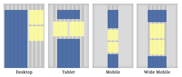
- Desktop (992 pixels)
- Tablet (768 pixels)
- Wide/Landscape Mobile (480 pixels)
- Mobile (320 pixels)
This is a good range that targets most devices and desktops. You can develop your site’s styles in the default layout, then use the included media queries to code child layouts. Each layout has a number of columns based on the Golden Ratio. Unlike most grid systems, Less doesn’t contain a complicated set of classes to define your columns. Instead, there’s a comment for each media query layout that tells you the width of each column and how many you can use. There’s also robust typography options that you can customize based on your default font size.
320 and Up: Designing both Responsive and Responsible Content
There are some drawbacks to using Less Framework. In a true mobile first approach, you would design the 320 pixel layout, then build from there. This prevents mobile devices from downloading desktop sized assets from the start. Andy Clarke and Keith Clark have developed a solution. With the advent of their 320 and Up, mobile media queries load first, just as they should for best practices.
320 and Up loads css rules in this order for a better mobile experience:
- CSS Reset
- Color Settings
- Typography Styles
- Media Queries load Assets and Layout Styles (but only as they’re needed)
The package contains five layouts, all of which are based on the vertical grid that Less Framework uses. It also includes a number of javascript extensions that help deliver more responsive images. It can be used as a standalone kit, or as an extension of the HTML5 Boilerplate.
What About My Existing Site?
How do you convert an existing site to be responsive? Here’s a series of steps I go through:
- Pick one of the above frameworks and incorporate it into my existing site’s stylesheet
- Use the Firebug extension in Firefox to determine which Layout Divs I need to alter
- Add the Divs into each Media Query (I focus on the mobile media query first)
- Adjust each Layout Div’s size to display properly in the chosen query (you can resize your browser window to test them)
- Make sure all pages in the site display properly in the mobile layout
- Copy the styles into the wide mobile and tablet queries, refining them to scale properly.
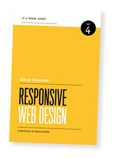
There are several other best practices to consider, and each site has it’s own set of problems to solve. Beyond altering the css to fit screen size, you should carefully consider your content as it relates to a particular device. If you’re interested in developing a better understanding of these practices, I highly recommend the book Responsive Web Design, by Ethan Marcotte. It’s a proverbial game changer.
Related Posts
4 AI Resources To Add To Your UX Design Toolbox
By:Morgan Plappert on 7/18/2023
These AI-powered tools can help you streamline your workflow and empower you to take your designs to the next level.
Read More »
Component-Based Web Design
By:Morgan Plappert on 8/9/2024
Designers and developers are always looking for ways to make handoff easier, collaboration more seamless and our processes better aligned. Automation, consistency and efficiency, without compromising creativity. It’s a constant battle and often times, a balancing act.
Read More »