Design Systems
By:
Ann Wood
on 7/5/2019
“Design systems” is a term that’s been floating around the design community for quite some time. It’s a very Silicon Valley-esque way of thinking, and it’s slowly been making its way across the country. But what is it exactly, and why should we care?
Design systems, according to Design Systems: A practical guide to creating design languages for digital products, is “a set of interconnected patterns and shared practices coherently organized to achieve the purpose of digital products.” IN A NUTSHELL, this means that you have a bank of repeating groups of elements that you can reuse throughout a design, depending on the purpose.
Keeping things connected
First off, there are patterns within design systems. They’re reusable groups of pieces that can be used throughout design to solve a problem. There’s functional patterns and perceptual patterns. Functional patterns define the structure of your design, like the backend layout, while perceptual patterns define the visuals like typography, spacing, interactions, etc. The combination of these two patterns help guide digital design forward in a reusable, efficient way.
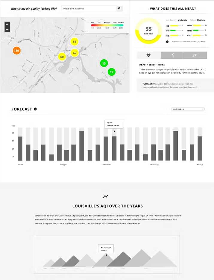
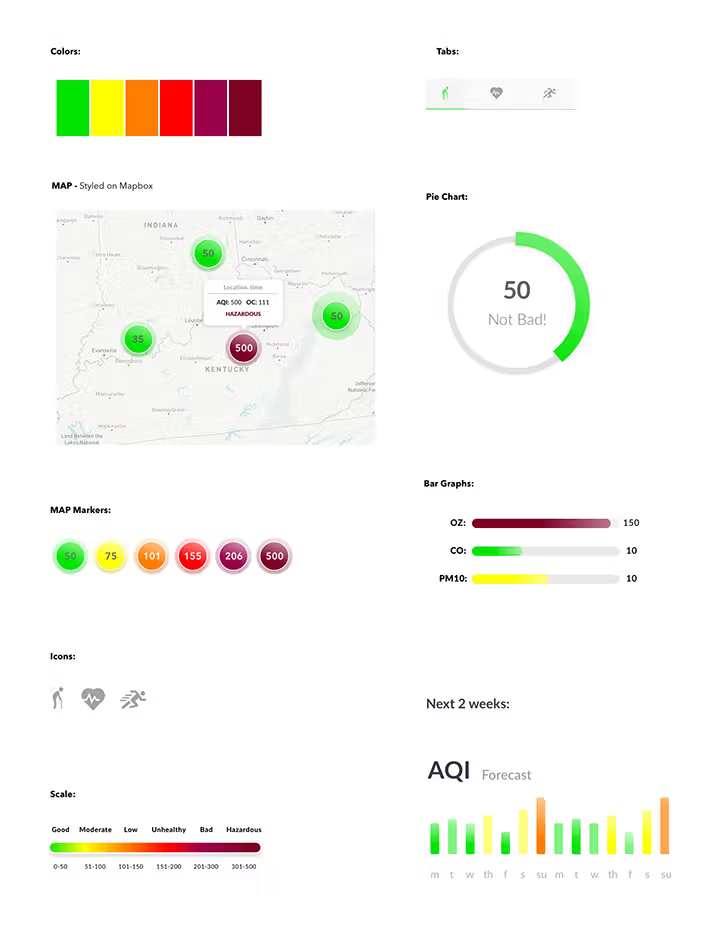
In my mind, it’s helpful to think of functional patterns as the wireframes, and perceptual patterns as the UI kit. There’s a ton of other comparisons, like HTML as functional patterns and CSS with perceptual patterns.
Wireframe and UI kit examples


Purpose, purpose, purpose
One of the biggest take-aways about design systems is that everything should have a purpose. Everything! When documenting patterns, you should describe the intent of each piece and when to use it. This way, it will be easier for people to use your patterns down the road. Everything in design should have a purpose anyway, but this way it can be documented to show others why things were created as they were.
What’s in a name?
Naming patterns is also super important. The book I mentioned above has a whole section on pattern naming. It keeps everything organized, which allows for easy hand off and collaboration with other people on your team.
Where to put things
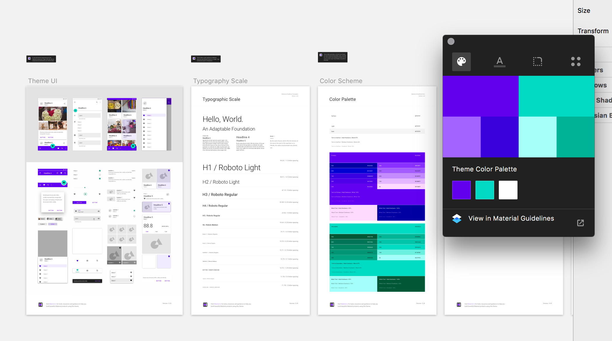
The Design Systems book lists all kinds of places you can house pattern libraries. There’s IBM’s Carbon design system and Google’s Material Design that have downloads and plugins you can customize, along with GitHub repos that people have put together. One guy in the book even mentioned having a google doc for his company’s design system. The point is that you have a collaborative place to house patterns, and a place to list the purpose of them.

Google’s Material Design Sketch plugin
But why?
Design systems may seem like a lot of work up front, but their intent is to make life easier down the road. By saving out reusable functional and perceptual patterns to a place that’s accessible, while describing the purpose of them, you can save time from designing down the road. It’ll also help with keeping design consistent across platforms over time.
Related Posts
4 AI Resources To Add To Your UX Design Toolbox
By:Morgan Plappert on 7/18/2023
These AI-powered tools can help you streamline your workflow and empower you to take your designs to the next level.
Read More »Component-Based Web Design
By:Morgan Plappert on 8/9/2024
Designers and developers are always looking for ways to make handoff easier, collaboration more seamless and our processes better aligned. Automation, consistency and efficiency, without compromising creativity. It’s a constant battle and often times, a balancing act.
Read More »
